

Feb. 28, 2013
This is a condensed version of my opening keynote at the Tapestry Conference, which was held yesterday in Nashville's beautiful Union Station Hotel.
I'm writing this from memory so at best it will only be an approximation of what I said.
Thanks to all the organizers and attendees for a great event.
Update: a video of the talk is now available.
Storytelling is a basic human activity. You may have noticed last night at the reception that when you tell a story to someone you've just met, you might use different phrasing, or insert more explanatory information, than you would if you were telling the same story to a friend.
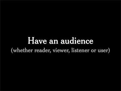
So whenever I look at a data set or try to build a graphic, I need to know who my audience is. I think of a reader, but depending on who you are and where you work, you might think of a reader, viewer, listener or user.
I work at The New York Times, so the question is: Who is my audience?
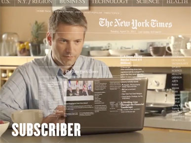
If you believe Times advertising, it might be someone like this: SUBSCRIBER.
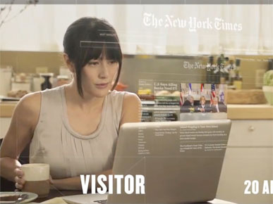
Or VISITOR, enjoying her 20 articles a month.
But this is not that a compelling or helpful an audience, and I'm not very inspired to tell them stories.
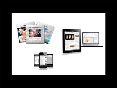
Sometimes we talk about print readers, web visitors, or tablet users. This can be very helpful for development, but it puts the focus on the mechanism of the communication, not the person at the other end who's actually receiving the information.
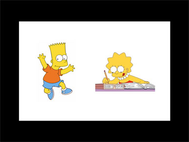
Shan Carter, who does many of our interactives, sometimes speaks about designing for both Bart Simpson and Lisa Simpson. The Bart Simpsons of the world might want a quick fix, a quick overview of an interactive, and then walk away.
But a Lisa Simpson might want to spend more time with the piece, and try to understand and explore it in more depth.
This can be a helpful way of thinking about audience, especially for interactive pieces, but for my own projects I like to think of three people.
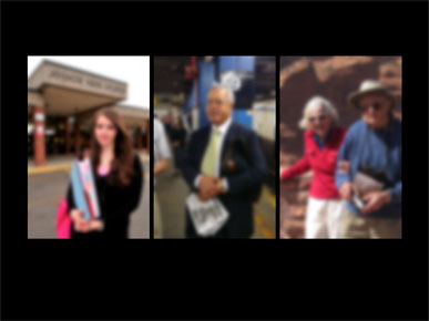
I work on many science graphics, so I think of a high school student who might be assigned to read one of my graphics. The photo here is fuzzy because the details of the person aren't important, it's more the general idea.
I also think of a commuter, who might subscribe to the print edition but who doesn't have a lot of time and could easily get distracted. If my graphic doesn't hold his attention, he could just as easily turn the page or play a game on his phone.
And finally I think of someone like my grandmother, who was an artist married to a chemist. She loved seeing my graphics in the paper, and usually looked at the art of the piece, whether it held together as a cohesive and attractive whole.
Because it's very hard to design for someone else. Once you start to research and understand something and have it fresh in your mind, you tend to produce graphics that sum up your own understanding.
These three people give me a range of ages and genders, a range of experience and possibly a range of interests in science. And my challenge is to design a graphic that tells a story to all three of them.
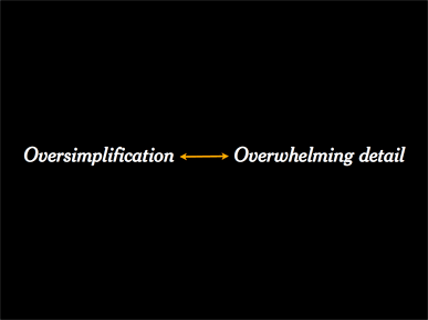
I went on to discuss some of the things that can happen when you design for yourself, using three arrow scales. The scales are not meant to be a coherent theory of graphics, but more an example of the kinds of things to think about when you're thinking of what form a graphic might take.
There are several pitfalls you can fall into when trying to tell a story with data. You can risk oversimplifying and talking down to the audience. Or you can do the opposite and try to cram too much overwhelming detail down their throats. I try to think of my audience and dial the graphic somewhere in the middle of this range.
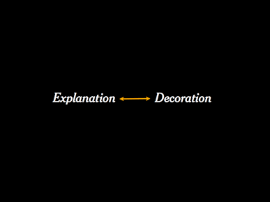
You need to take care that you are really trying to explain the data, not just decorate it. Sometimes we fall in love with a design because it looks cool, when it might not be the best design to actually explain the data. I try to keep my designs toward the left side of this scale.
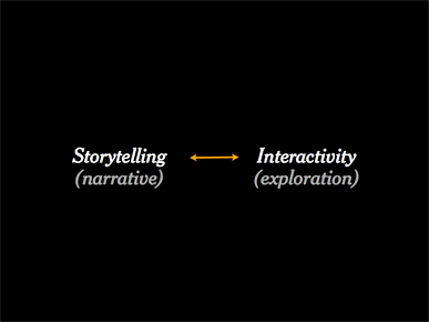
And you need to think about where on this scale you want to aim your design. Do you want something that's more of a narrated story, with maybe less interactivity, or do you want to point the reader in a direction and then let them explore on their own?
During the Q&A after the talk, Santiago Ortiz pointed out that narrative and interaction are not always mutually exclusive, which I certainly agree with. My point is only that most graphics tend to lean in one direction or the other.
I see this a lot in science.
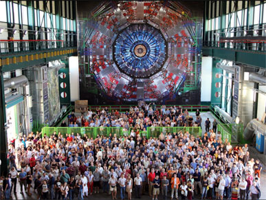
For example, this is CERN particle accelerator outside of Geneva, where thousands of scientists have worked for decades to build these multi-billion-dollar machines.
They gather up and process incredible amounts of data, and much of the work has gone in to searching for the Higgs Boson, a missing particle.
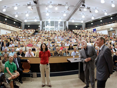
Last July there were rumors of a possible discovery or glimpse of the Higgs, and so the scientists all gathered together.
I was watching on webcast, as were many people around the world.
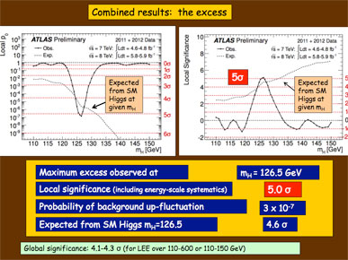
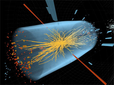
And when the big results came, the slide looked like this:
It's not that the design is bad, though the design has been criticized. It's that the design is speaking to itself.

If you're in the audience, you know the background, you know the history, you speak the language and you know all the hours that have been spent on this project, and so this means something to you.
But if you're like me or my readers, you need a translator.
And sometimes I think that much of the work that I do is translation.
I'm not going to try to explain the Higgs boson today, but I'd like to try to explain a simpler phenomenon.
Usually in science papers there are several ideas, and all of them might be interesting. But I try to think, if I had to pick one idea and extract it, which one would it be? What is the central idea I can pull out of here and explain?
And once I have that idea, I can't just present it as a fact. What set of evidence can I use to support the idea, and to give the reader a sense of the underlying science?
First I need to understand the idea, or I can't possibly explain it. Then I need to translate it for my audience, find a way of displaying it and make sure that I'm explaining the idea.
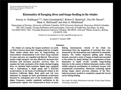
This is a typical science paper that I might read: "Kinematics of foraging dives and lunge-feeding in fin whales."
From the very first word, kinematics, I can tell that this is not for my audience.
But the central idea is very interesting.
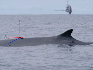
Basically the scientists went out and put these suction cups on fin whales, then tracked them as they went on these deep feeding dives. They are krill-feeders.
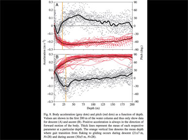
But when they get back with all of the data, they make charts like these, which I barely understand.
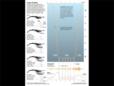
So I kept looking through the paper, and finally came on this chart.
It's a chart showing the depth of the dive, with the whale breathing on the surface, diving to about 250 meters, then making these four or five bumps, then returning to the surface. Finally this is something tangible.
But, being scientists, they cut out the whole middle of the chart, because they were only interested in what was going on at the surface and the bottom of the dive.
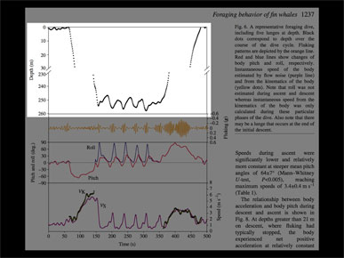
So the first thing I did was to contact the researcher and get the missing data.
And when you chart it, it looks like this.
There was an audible, collective "oh!" in the room for this slide, which I was not expecting.
Here is something tangible that I can use as a framework to build a graphic around, but I still need to explain these bumps.
The bumps are linked to this chart, which shows the whale speeding up, then coming to a stop, speeding up, then coming to a stop. And the fluking pattern is the tail moving up and down.
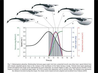
I think it was in a second paper that I came across this chart. The whale drawings are beautiful, and show what's actually going on.
Basically the whale accelerates into a school or pod of krill, then opens it's mouth. The mouth acts like a huge parachute, and takes in a busload full of water. It also brings the whale to a stop. Then the whale spits the water out, filters out the krill, eats it and continues on.
But the chart shows, what, four different variables? From volume engulfed to speed to gape angle.
I think I can pull one out of here, probably speed.
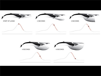
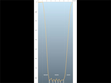
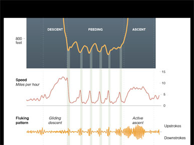
And this is what it looks like if you pull out speed and try to explain it. Now I have time, the drawings, and the speed of the whale.
And that is enough to make a framework for a graphic. I've got the micro scale, and the overview.
We do all our own writing, so add annotation to explain each of the pieces and this is the final graphic.
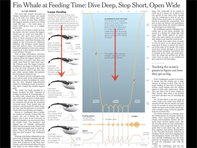
Here's how it appeared on the page. In this case I assumed that many readers would start in the upper left and read down, but I also wrote it so someone starting on the right could still understand what's going on. Usually I try to compartmentalize the text, so that the pieces add up, but it still makes some sense if you read the pieces in a different order.
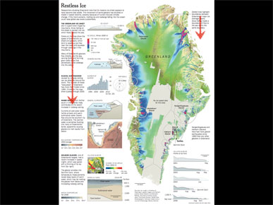
This is a more complicated graphic with a very similar design, trying to explain the movement of ice across Greenland.
This is pushing it farther over toward the "overwhelming detail" side of the scale. In this case there was really only one way to read it, from upper left working down, but I still tried to put a piece of text in the upper right to explain the general idea of the large image, before someone had seen the left side.
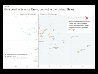
Those were print graphics, but this is another one that shows how you can change the highlight of a static data set. This is not my work, but by Hannah Fairfield, who is here and will be speaking later.
In this case the chart shows relative performance by girls and boys on a science exam, and although the data doesn't move, clicking through will change the highlight and pull out different parts of the data.
This is what we call a stepper, and in this case the annotation basically moves from left to right. But the nice thing here is that the reader can advance at their own speed, and not be forced along.
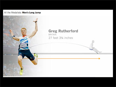
In this case, the news was that Greg Rutherford had won the gold medal in the long jump. This is not my work, but the work of Kevin Quealy and Graham Roberts.
I went on to show a partial video of Bob Beamon's Long Olympic Shadow and describe how the video starts at human scale, pans out to reveal all medalists in Olympic history.
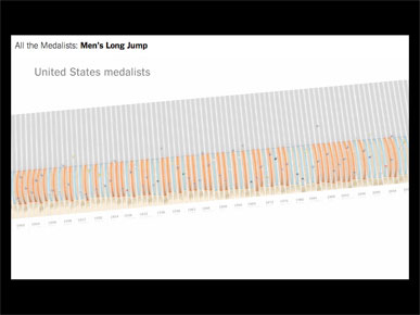
The video begins at a human scale, pans out, and then at some point you realize that the long jump tracks begin to form a bar chart.
Once you have a bar chart they begin to overlay data on it, highlighting U.S. medalists. And they keep panning out to show that most of the jumps have been 25 feet or longer. But how far is that?
The video moves back in in to give some sense of scale, showing that most jumps pass the free-throw line.
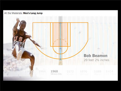
Then it moves across to show that only one person in Olympic history has jumped past the three-point line.
I talked some more about how the video moves through time, highlighting famous jumps that viewers might know something about, and pointed out the other two videos made by Kevin and Graham in this series, one on 100-meter sprint medalists and one on 100-meter freestyle medalists.
Later in the day (and entirely coincidentally), Nigel Holmes used a 29-foot string to demonstrate just how remarkable Bob Beamon's long jump was. Nigel put the jump in actual (human) scale, which was extremely effective.
My grandmother, an artist married to a chemist, used to say that when they went to museums, she looked at the art and he read the labels.
And that sums up most museum-going experiences: the art is over here, and the label is somewhere over there.
So this is what I try not to do — I try to combine the art with the text, and not keep them separate.

In science papers you see a similar thing.
Here are four pieces of art and a long label. This is a flea, and the parts of the leg are also labeled, but there is a lot of redundancy. There is really no annotation here.
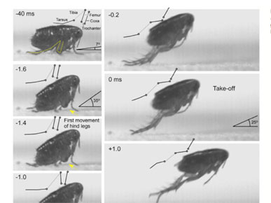
This is from a paper called "Biomechanics of jumping in a flea." It turns out there is a long-running controversy over whether a flea jumps — whether it pushes off with its feet or with the equivalent of its knee.
The paper has these amazing photographs of a flea jumping, but they are stacked oddly up and down.
In this detail there are nice diagrams showing what different parts of the leg are doing at each moment, but it's the same problem: there are really only two pieces of annotation here. One says "take-off" and the other says "first movement of hind legs."
So I tried to put this in sequence from left to right, and adding the diagrams with meaningful annotation explaining what happens in each step.
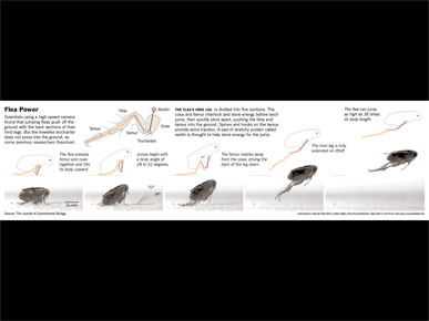
Here's the final graphic.
I forgot to tell the conference what the result was! It turns out the flea does jump by pushing off with its feet, not with its knees.
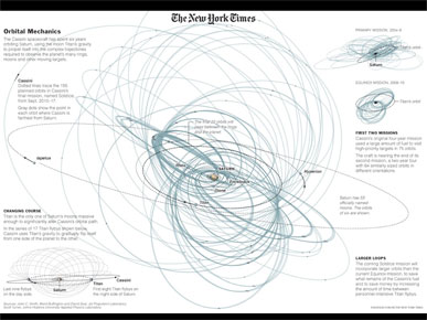
Or it could be the movement of a spacecraft around Saturn, trying to give readers a sense of the complicated orbital planning involved.
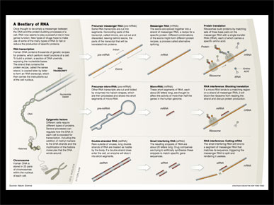
Or it could be change in state, here showing different types of RNA and how those types are changed inside the cell.
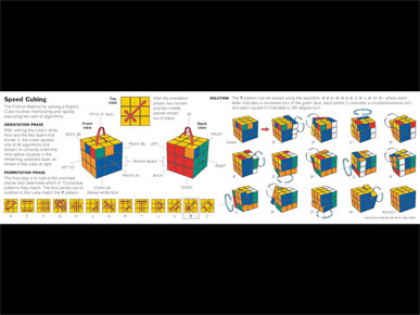
It could be a diagram explaining some of the patterns in speed cubing ...
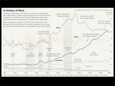
... or a chart showing meat consumption over the past hundred years or so.
This is a simple line chart, but I tried to underlay it with information. Bands show the World Wars and the Great Depression, to show how they might have changed things. And annotation shows where fast food restaurants like McDonald's opened, and how that might affect beef consumption. And I included some ad campaigns that people my age might remember, like "Where's the beef?" and "The other white meat."
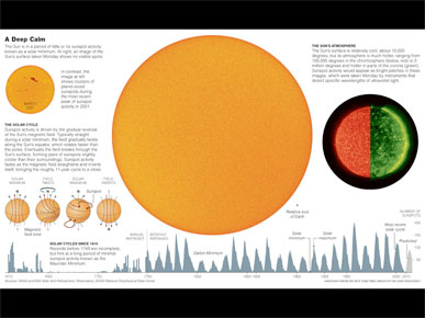
Or it could be a chart at the bottom showing 600 years of sunspot activity, during an exceptionally quiet period a few years ago.
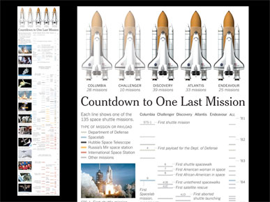
Or it could be a timeline of all 135 shuttle flights, with each column a shuttle, and each colored bar a different mission.
I tried to annotate this to show moments that people would remember. I remember exactly where I was when the shuttle exploded when I was a child, but I only had a vaque idea of how that fit. So I try to give readers little hints at things they might remember.
The online version of this timeline is 30 Years of the Space Shuttle.
In this case, this was a video, not my work, showing I think 1,300 pitches thrown by Mariano Rivera in the 2009 season.
But before it was a video, it was data.
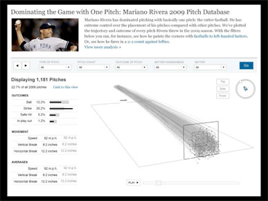
I went on to describe how they played around with the data and came up with an interface that allowed users to filter pitches by type, and see additional information on the side. But it's a lot of added complexity and fiddling with interface.
Could this have been made to work? Certainly, but in the end they decided to make a more narrative presentation, and a video.
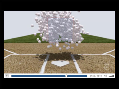
Description of the video, plus additional screenshots showing all 1,300 baseballs thrown toward the viewer. The video, Mariano Rivera, King of the Closers, was made by Graham Roberts, Shan Carter and Joe Ward.
Could this have been made more interactive? Yes, you could have a rollover for each baseball showing when and in what game it was thrown, but that adds a lot of complexity without much more information. They went on to make heat maps and show different types of pitches, and I recommend everyone watch the real video.
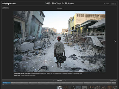
Every year the Times shows the Year in Pictures. This was from 2010, and there were 97 photographs, but it also required 97 clicks of the mouse on a small "next" button to get through. I wanted to see all of the photographs, but I think I made it to about 10.
In later years it was fixed, and at least you could use the arrow keys to move back and forth.
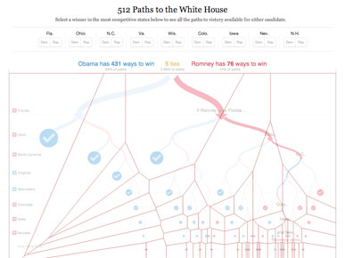
In a similar way, the amazing 512 Paths to the White House graphic, by Mike Bostock and Shan Carter, reduces tedium by using elegant rollovers.
Rather than making the user click on each of the small circles, the decision tree updates whenever you roll near.
And actually the whole area of the graphic is interactive, with the clever use of voronoi tiles. No matter where you hover, you will trigger the nearest circle. It's 512 paths, but not 512 clicks.
You can also click on any state to assign it to Democrat or Republican, which simplifies the decision tree.
Visualization can be a very important step in understanding a set of data, but the visualization itself often does not explain the data.
So we need to be careful to not let the tools make decisions, but to use tools to help explain the data.
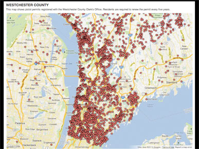
This infamous map from the end of last year is by the Journal News. They showed gun permit data for two New York counties, which led to death threats.
Leaving aside the question of whether or not they should have published the data, the problem is that the map shows a pattern but doesn't explain it.
It looks like there are more gun permits as you go south, near New York City, but is that just because of population density or is there something else going on?
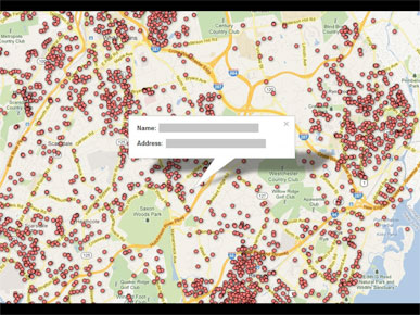
The map actively encourages you to click on the dots, which takes you to individual names.
I don't know the process that went into publishing this map, but from the outside it looks like they got the data and just put it up online, as the output of a tool. This doesn't even reduce tedium, because it requires individual clicks.
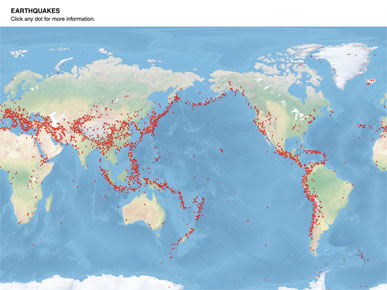
If I tried to do the same thing, like say "Here are earthquakes, click any dot for more info," then I'm missing a huge opportunity for understanding. There are clearly patterns here, but nothing between the overview and the detail.
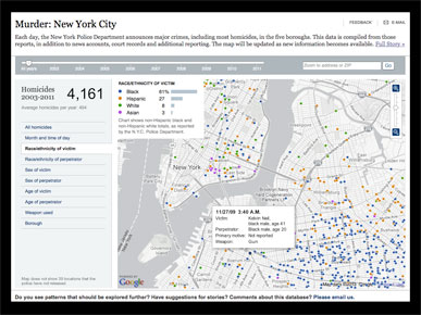
I described this chart, a point data map of homicides in New York over a decade, that allows filtering and provides additional data. The full graphic is Murder: New York City
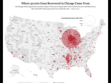
This chart shows where 50,000 guns in Chicago came from. I said something about how the map aggregates data and presents it by county, then scrolled down to show three blocks with more detail on patterns like the hot spots of guns from Mississippi. The full graphic is Where 50,000 Guns Recovered in Chicago Came From
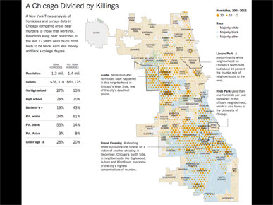
The final example was this map that uses a more abstract pattern, like a heat map, of homicides, and underlays it with additional data. The full graphic is A Chicago Divided by Killings
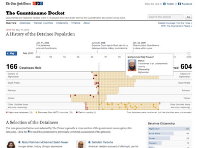
The Times has been collecting data for more than a decade on on detainees held at Guantánamo Bay.
This online-only graphic was done a couple years ago, and was not my work.
I explained how The Guantanamo Docket worked, with play or scrub features, showing the movement of detainees into and out of the camp, and that rolling over any square gave more info on that detainee. I soon realized that saying "detainee" over and over turns it into a tongue-twister, so apologies in advance if a video of my talk is ever posted.
At the last minute I was asked to make a print version of this graphic.
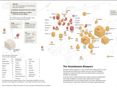
We've used this data before ... I showed a few earlier presentations where detainees were represented in aggregate as a line chart, as individual square, or as individual cubes, as shown here.
I wanted to try to find a different form, but I didn't want to make anything overly iconic, like using little icons of people, because I think that's been overdone.
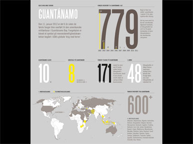
And I particularly didn't want to make anything like this, where numbers are used for everything.
The problem with this style is that it doesn't reflect any of the uniqueness of the data. You can use the design for almost anything.
My intention wasn't to pick on this graphic in particular, but to reference this big-condensed-number style of infographics. These kinds of graphics tend to always use the same style, no matter what the underlying data.
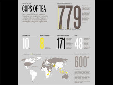
I don't drink coffee, but if I changed the headline to "cups of tea" I could use the same graphic to say something like "I drank 779 cups of tea last year, 600 of them were hot and 8 of them were herbal," and you wouldn't know the difference.
That tells me that there's nothing here that reflects the data.
In reality, I drink at least two (and often three) pint-sized mugs of rooibos tea each day, so I think my annual total would be closer to 1,826 cups. But I have no interest in this kind of meaningless vanity data.
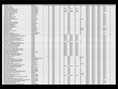
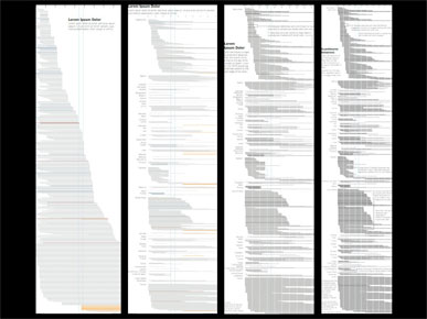
I started with a simplified export from the database ...
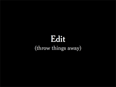
There's a reason our job titles include the word "Editor" — because we're supposed to edit. I really enjoy seeing how much I can strip away.
I can't remember if it was here or in the Q&A session, but at some point I said that if you find yourself spending more time editing your graphic than creating it, you're probably doing something right.
I explained how this graphic came together, but the details are also online at Behind the Lines.
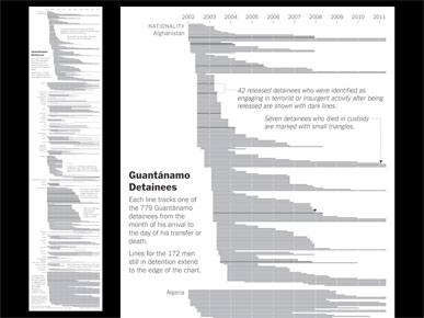
The finished graphic.
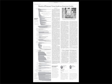
And how it appeared in two full columns on the page.
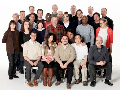
I've been on the Times graphics desk for almost 8 years.
This photo is about 3 years old — we have a few new faces now — but I think I'm still the only person on the desk with a formal design background. Other people comes from a variety of fields: journalism, cartography, geography, and so on.
There are a lot of things you can do with data, and it's very easy to get overwhelmed. Design is cumulative decision making, and it's easy to take a wrong turn.
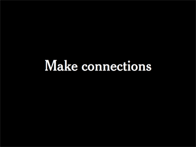
But I would suggest that if you are only going to do one thing, try to make connections. Try to find some piece of information, understand it, craft it and send it out in the world, with the hopes that your audience will understand it.
Thanks very much!
(To read what I left out of the talk, please see Deleted Slides.)