

March 21, 2013
While rehearsing for the Tapestry Conference last month, I noticed that my talk was running about 10 minutes too long.
I was practicing with an ironing board for a lectern and some hotel pillows for an audience, and the slides below just took too long to explain. So I cut them.
The commentary below was rehearsed several times but never delivered.
Sometimes information graphics seem so encrypted and encoded that they look like puzzles for the reader to solve.
That kind of complexity is often a sign that the designer was too focused on the design or the technology, and didn't think enough about the information.
New designs and technologies are fine, but not if they require readers to solve a puzzle or decipher a code. Your design should still make clear what you're trying to say.

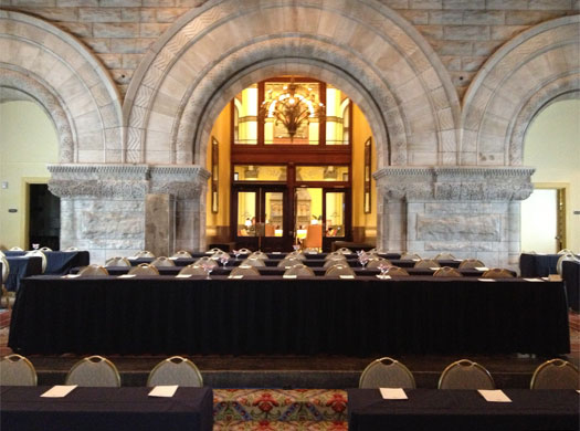
For example, the New York Times building has conference rooms and work rooms of different sizes, each labeled with a small glass plate.
I think this is a great example of a single design that contains both overwhelming detail and oversimplification, with nothing in between.
At the top of each plate there is a complicated room code in white type and in Braille, with seven letters and numbers: "02E3-251."
And this design is carried through the building, so you have many rooms with the same generic name, but with different room codes.

The design is by Pentagram, and it looks good — so what's the problem?
The problem it that, after more than 5 years in the building, nobody knows what the code means.
Most people realize that the first two digits show the floor number — these photos are all from the 2nd floor — but that's about it.
Maybe the code made sense to the designer, or maybe the designer was forced to use the code. But in daily use, the design assumes an overview and understanding of a code that was never explained and which cannot be deciphered by looking at the signs.
And the code isn't useful enough for people to spend time trying to decipher it, so they don't.
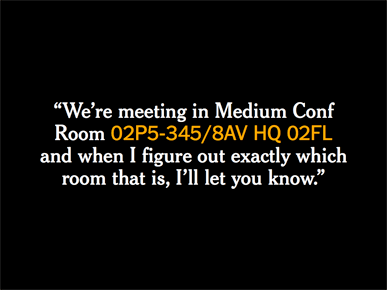
And because of this, when people organize a meeting they send emails like this: "We're meeting in Medium Conference Room 02P5-345/8AV HQ 02FL, and when I figure out exactly which room that is, I'll let you know."
Keep in mind that 16 digits are enough to distinguish my credit card number from the tens of millions of other cards out there, but these 16 characters don't contain enough legible information to locate a conference room.
And so employees solve the problem by talking about rooms in relation to internal landmarks. "We're in the room with the folding divider below the Page One conference room," and other descriptions like that.
If "Conference Room" is an oversimplification and "02P5-345/8AV HQ 02FL" is too much detail, a more useful and human-readable system would probably fall somewhere in the middle.
I'm not a signage designer, but even boring names like "7th Floor Southeast Conference Room" or "2nd Floor Sports Work Room 2" would at least hint at the code they contain, and allow people to ask answerable questions like "Where is the Sports desk?"
I think the full code is: 2-digit floor number, 1-letter region of the floor (e.g. 'E' for east side of tower, 'P' for podium), 1-digit area within that region, followed by a dash and a 3-digit room number.
The same problem of overly complex coding can happen in the design of a graphic or an interface.
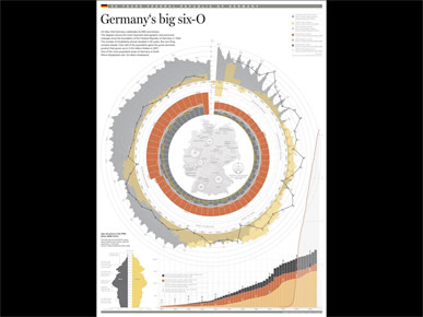
This example shows 60 years of German history, and includes data like population, income, inflation rate, unemployment rate, and so on.
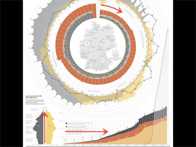
The graphic is essentially a timeline, but it shows time moving in three different directions: clockwise in a circle, vertically from top to bottom and horizontally from left to right. So the reader is forced to decipher three different representations of time before they can even start to think about the data.
If every graphic includes a visual code, or a unique interface, or a novel design, that's a lot of codes and interfaces to learn.
Good design should disappear, and let data reveal itself.
Design shouldn't be a mask in front of the data, or a code that needs to be learned before it can be used.
So when we design graphics we need to be careful about adding complicated codes.
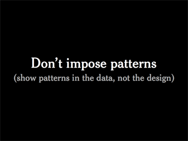
But we also need to avoid introducing patterns that don't appear in the underlying data.
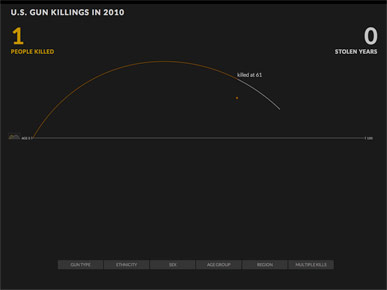
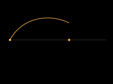
A recent example of this is a animated timeline by Periscopic that visualizes gun deaths. If you haven't already seen this, each of the roughly 10,000 people killed by gunfire in 2010 is represented by a projectile, which draws an arc as it moves across the screen.
(Projectiles seem like an odd choice for visualizing gun deaths, but let's accept the metaphor and see how it works.)
Each person's arc starts at year 0, then when they are killed their dot falls straight down and sticks to the horizontal line, which marks their age at death.
Update: The graphic has since been updated with new data and a few small design changes, but these images are from the original version.
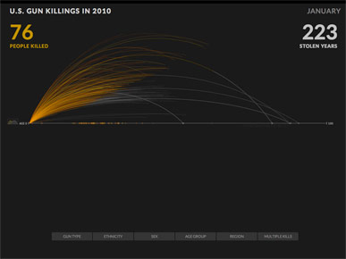
What's interesting about this graphic is that each arc changes color and continues past death, to represent how long each person might have lived had they not been killed.
The animation continues, each arc a new person ...
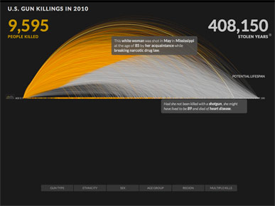
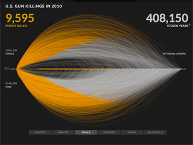
... until it stops at the total of 9,595 deaths in 2010.
At this point you can roll over any line to get details on that person, and see info on when and how they might have died in the future, had they not been killed.
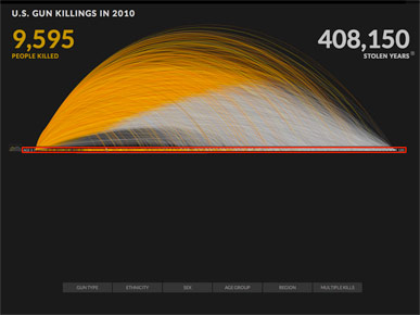
But when I look at this chart, I see a very thin strip of real data points, just a few hundred pixels, marked here in red.
The rest of the design is decoration.
And why is that?
Because the arc metaphor doesn't reflect the underlying data very well, which you can see by clicking a little button to reveal the actual data.
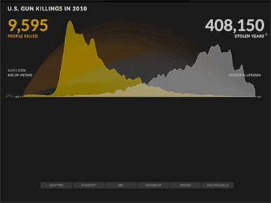
Here's how all those falling dots and arcs accumulated, with ages of death in yellow and projected lifespans in gray.
It's a jagged "M" shape, almost the opposite of the smooth semicircle in the other view.
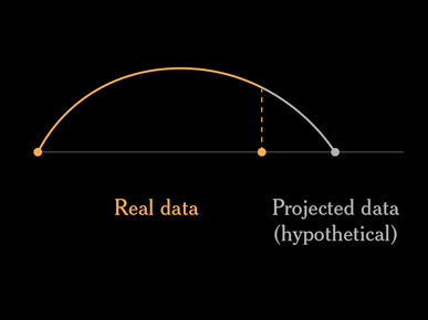
As I mentioned before, each person is an arc, which is a combination of real data (the person's age at death) and projected data (how long they might have lived, and how else they might have died).
The projected data is essentially a simulation.
And that's fine. But what would happen if you ran the simulation again, or if you wanted to turn off or hide the projected data and just look at the actual deaths?
If you could somehow turn off or remove the projected lifespans, the height and shape of the remaining arcs would be meaningless.
You would have partial orange arcs ending at random heights above their data points. This arc has no meaning.
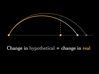
So one problem with this design is that every arc is a combination of real and hypothetical data.
If you ran the simulation again you would get different projected lifespans, and every arc would change.
What is the interesting lesson here? Projected data should not change the display of actual data.
Or, to put it another way: The display of what might happen in the future should not affect the display of what's already happened in the past.
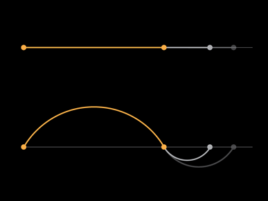
How else could we represent these lives, without mixing real and hypothetical data?
There are three data points for each person: birth, age of death, and projected lifespan.
Each person could be drawn as a straight line. This would allow the projected data to change without affecting the display of the past data, but it would also make it very hard to show 10,000 people.
Or you could keep the arc of life idea and show two arcs: one from birth to death, and a second arc for the predicted number of lost years. This would separate the two data sets: real data on top and projected data on the bottom. A change in the hypothetical lifespan would only affect the bottom half of the chart.
Another problem with this design is that the arcs make it difficult to compare different subsets of the data.
Here's a comparison with women on top of the line and men below. Looking at the chart, I would guess that about 40% of the people killed were women, and 60% were men.
But if you look at the actual numbers, which are shown in small type at left, only 15% of the killings were women, and 85% were men.
That's an interesting comparison, but it's not visible in the design. You have to read the numbers to understand the comparison.
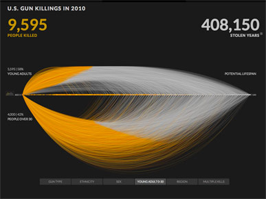
Here's another comparison: young people on top and people over age 30 on the bottom.
It's hard to know how to compare these groups. The colors look similar, but how should I compare short arcs and tall arcs? Do the short top arcs represent one third as much as the bottom arcs, or is it closer to an even split?
If you read the numbers, this comparison is supposed to represent 58% above the line and 42% below, which I don't see at all.
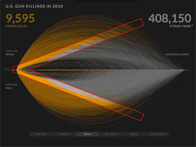
Another problem is that one of the most prominent parts of the design is this "V" shaped boundary, where orange gives way to gray.
It's a striking pattern, but I would argue that it has no meaning at all. The shape is only a coincidence of the design.
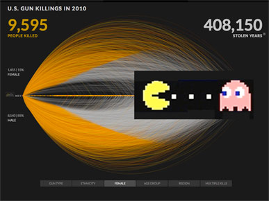
The first time I saw this graphic I thought of a Pac-Man eating a string of interesting data.
Of course, you don't have to agree with me. You could say that the timing of the animation and the power of the subject are more important than these design concerns. And you could say that anyone who wants to see the actual data behind the animation can just click a button.
And you might be right. But I think it's very important to think about why we decorate or hide or visually complicate our data, and what patterns we might be introducing with our choice of designs.
Ideally a design should let patterns in the data reveal themselves, and not introduce meaningless patterns.
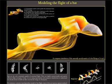
If you really want a complicated pattern, look for complicated data.
These dramatic arcs and colors are much more impressive in this beautiful graphic that shows the motion of a bat's wings in flight.
This image is by the Computational Flapping Flight group at MIT.
So we have to be careful not to hinder the reader's ability to read, compare and understand the data.
And one of the easiest ways to do that is to avoid introducing layers of dense design.
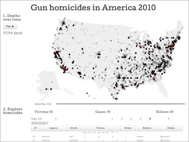
This graphic uses the same data set on homicides, but presents it as an animated map.
I think this is more of a proof of concept or an experiment than a real attempt to explain the data, so I won't spend much time on it.
But it is a good example of designing new boundaries instead of using natural boundaries built into the data. At least three structures were passed over in favor of the hexagonal grid: state boundaries, county boundaries and named areas like towns and cities.
The design looks interesting, but the lack of familiar borders makes it very difficult to locate anything or find meaningful patterns.
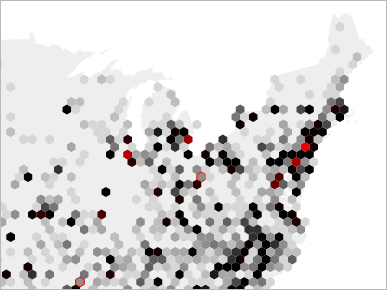
The first thing I tried to do was locate New York City.
I quickly found Newark, which is a bright red dot. One hexagon over from that was Jersey City, with a little New York data. Two hexagons away and I was in Connecticut. I only looked at three hexagons, and was already lost.
If a design doesn't allow you to find the largest city in the United States, it can only be an abstract representation that sacrifices legibility for design.
A table under the map gives details for any hexagon you click, but it's tedious to read back and forth between map and table.
The map is by Jerome Cukier, and I don't mean to criticize his interesting experiments. In other graphics this kind of tiling could be very useful.
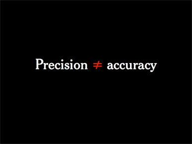
The previous two graphics used the same data on gun violence. Both were precisely drawn, but both were arguably lacking in accuracy, because of the complexity of the designs.
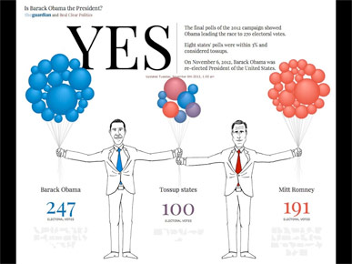
A simpler example is the pre-election cartoon web site: Is Barack Obama the President?
Depending on how you look at it, the site is either an homage or a parody of other graphics that represent electoral votes with squares or circles of different sizes ...
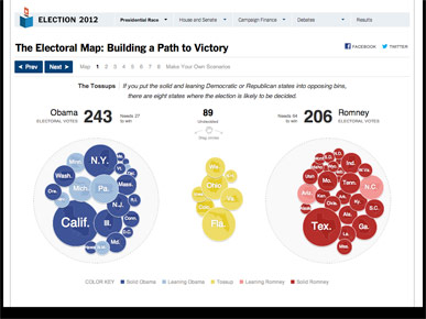
... like this one from the New York Times, which represents electoral votes for each presidential candidate with draggable circles. The area of each circle represents the number of electoral votes.
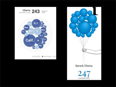
The difference is that, because it shows balloons instead of circles, the cartoon version adds a third dimension.
The designer went through the trouble of adding gradients and making the ballons look three-dimensional, but behind the scenes the formula used to calculate the size of each balloon did not change.
The cartoon treats the data as spheres with volume, but the code that renders the graphic treats the data as circles with surface area.
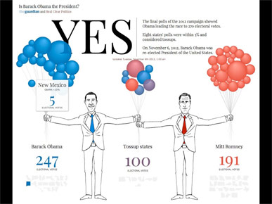
In the real world, you might tell someone: "Blow up these balloons with one puff of air for each electoral vote. New Mexico gets 5 puffs of air, and California gets 55."
That's easy — even a child could do it.
It's much harder to say: "Blow up this balloon until the area of its cross section is equal to the number of electoral votes." Which is what the graphic is showing.
So I would argue that this graphic is very precisely drawn, but there is a simple flaw in the code that distorts the volumes of the ballons, making it not particularly accurate.
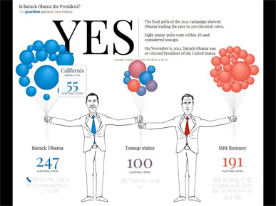
Does accuracy matter that much for a parody site? Maybe not. But why spend the time to draw a third dimension, if the data remains stuck in two dimensions? Changing the code to calculate volume woud be an easy switch.
And so as we develop more tools and techniques to render data with incredible precision, we need to make sure that the level of accuracy in the representation is just as good.
(Update: This graphic won a bronze medal at the international Malofiej conference, so even parody graphics can win awards. Congratulations to the team that worked on this widely-discussed project.)
And that's it. I'm glad I cut these slides, because they seem to be more about design than about storytelling, and I didn't want to be too critical in front of the audience, many of whom were not designers.
If you haven't read the original talk, it's here: Storytelling with Data.