March 24, 2012
Yesterday I was surprised to see that my Guantánamo Detainees graphic won Best in Show in the print category at Malofiej 20.
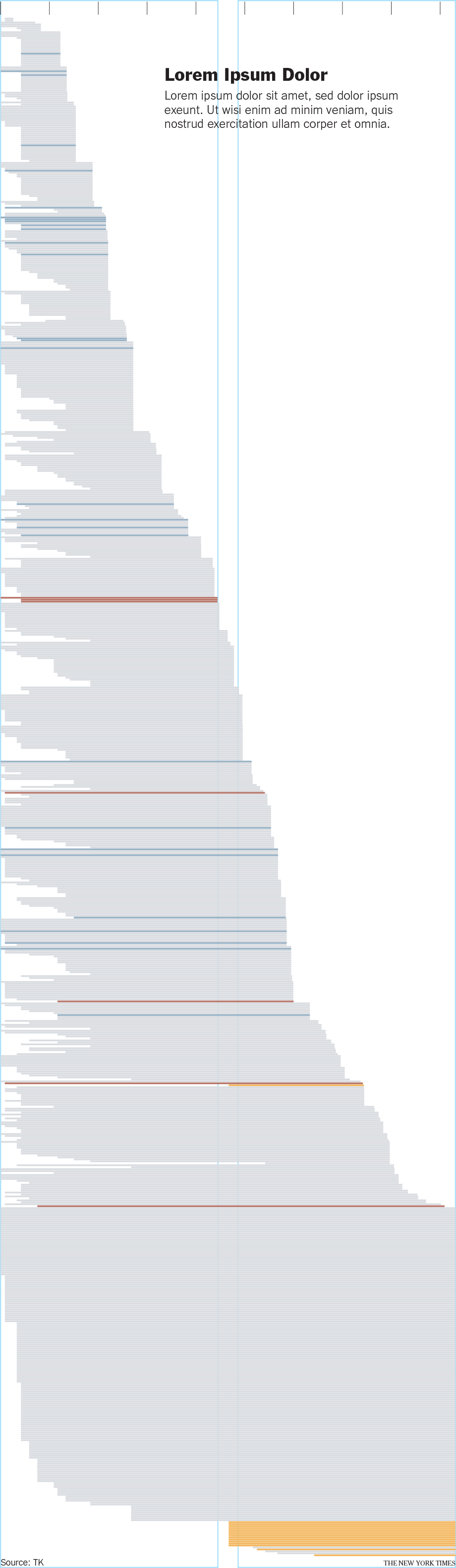
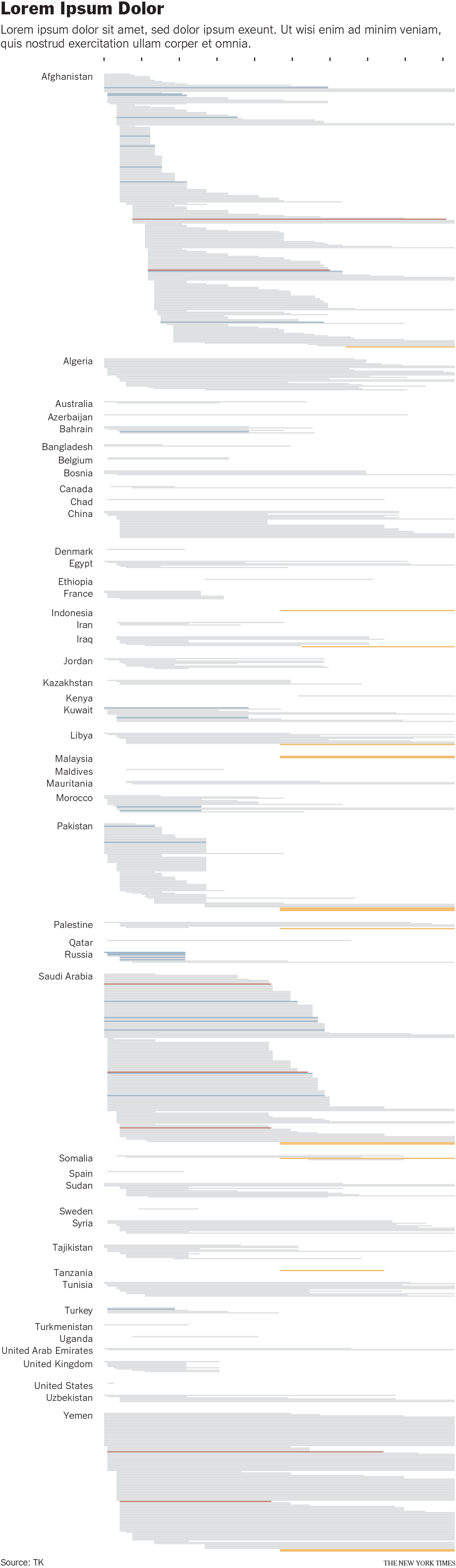
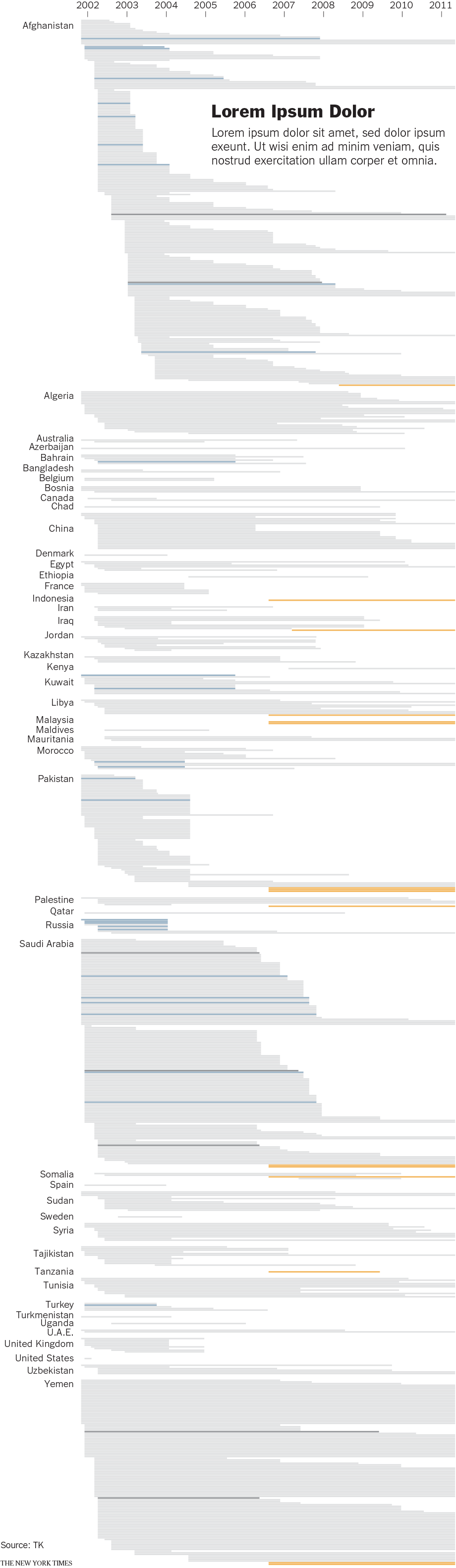
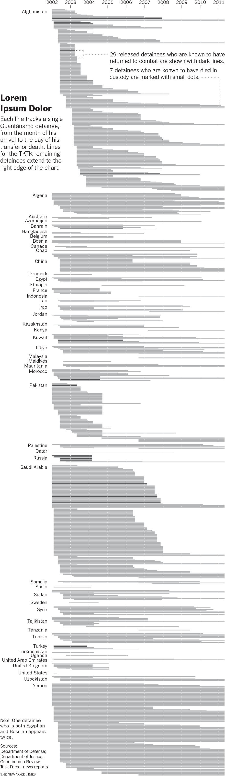
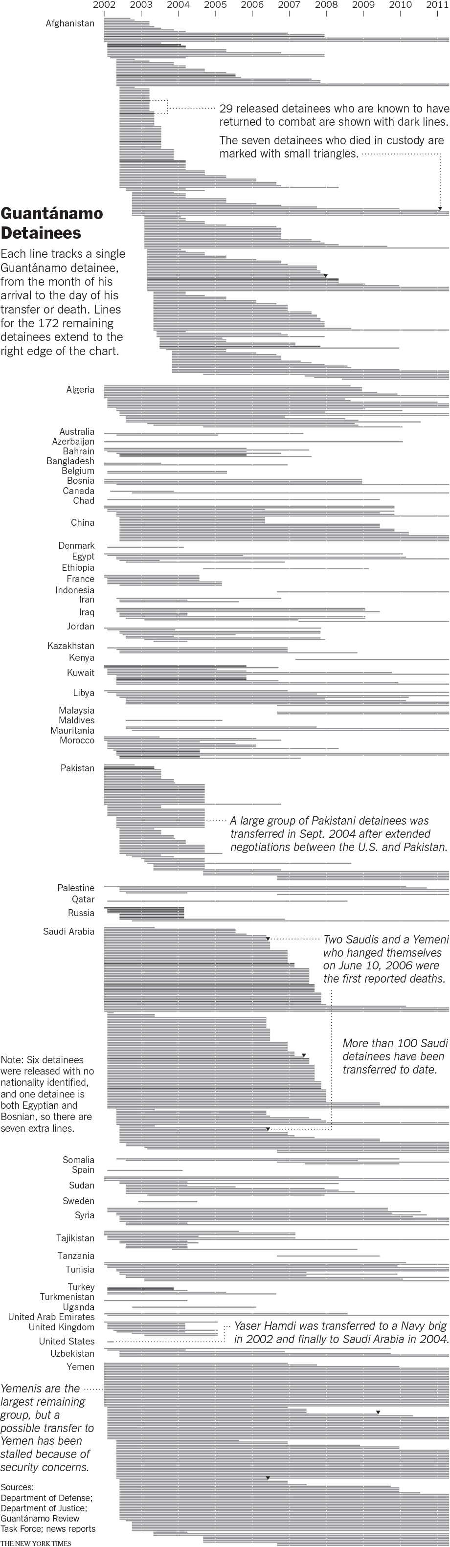
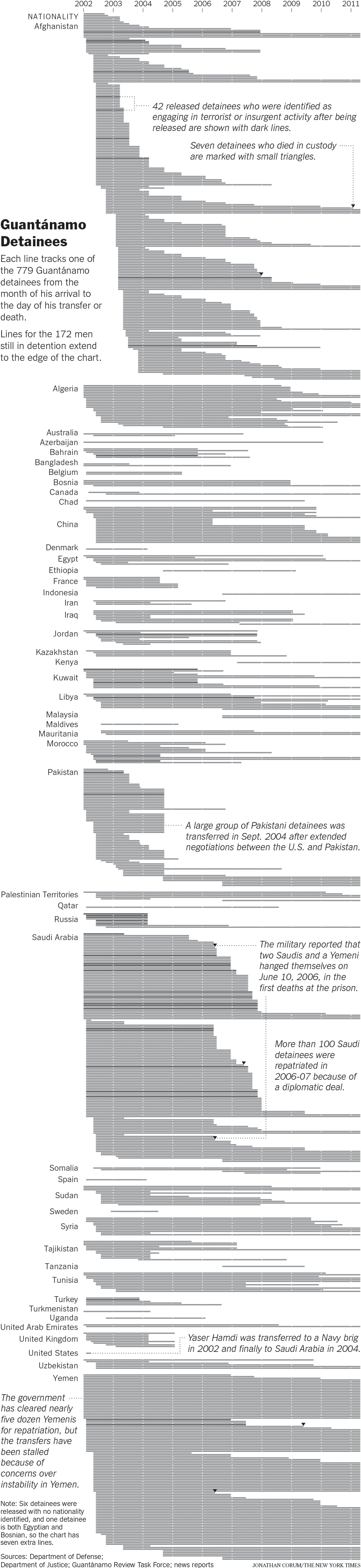
The graphic, which ran in The New York Times on two columns, tracks every Guantánamo detainee from the month of his arrival to the day of his departure or death:
Tabs at right show 6 of the 15 versions I saved while building the graphic.
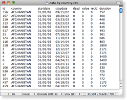
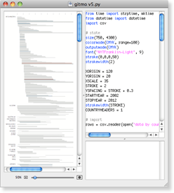
The detainee data is from an ongoing, decade-long research project at the Times. I started working with a simplified database export in CSV format:
Early sketches arranged the detainees by the date of their departure, but that format seemed too simplistic. Later versions arranged the detainees by country, which had a more interesting texture.
Once I had a working timeline in Nodebox, I exported the chart in EPS format and finished the design in Adobe Illustrator.
Most of my time was spent trying to present the information to readers in the simplest form possible, with minimal annotations to help them make sense of the data.
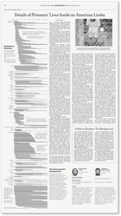
For a variation on this type of two-column timeline, see Countdown to One Last Mission.