

March 28, 2016
This is a transcript of my talk at See, Think, Design, Produce in San Francisco on Feb. 11, 2015.
The other speakers were Mike Bostock, Alyssa Goodman and Edward Tufte.
My earlier talk at STDP2 had the same four-part structure, but used different examples.
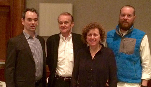
Me, Edward Tufte, Alyssa Goodman and Mike Bostock.
Thank you! Good morning.
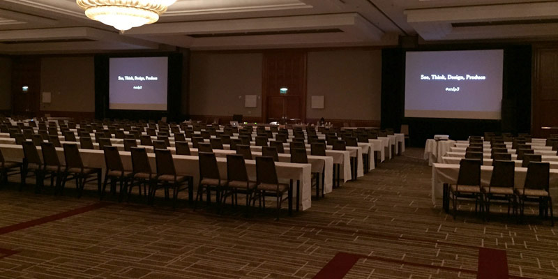
Welcome to the third See, Think, Design, Produce.
I’m Jonathan Corum from The New York Times.
I wanted to start this morning by walking through these four actions, these four verbs, to try to explain how I try to apply these to information graphics and data visualization.
And this begins with Seeing.

Most of the work I do involves patterns. Searching for patterns, trying to understand patterns, visualizing patterns and trying to explain them.
And when I was first studying design in college, I took a class in typography. And my teacher, it didn’t matter what I handed him, he could look at a printed page and he could start to show me patterns.
He’d say: “This is working and here’s why, this is not working and here’s why.” And so when he pointed things out, I could see what he was talking about, but I couldn’t sit down, look at a page and find those patterns on my own. My eye just couldn’t do it, and I decided that I wanted to learn to see this way.
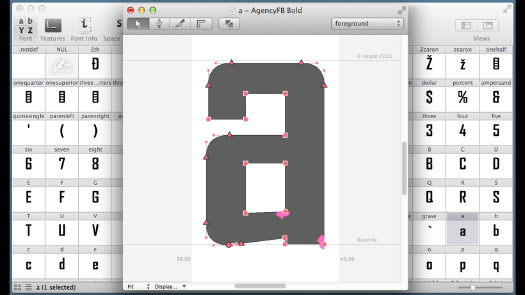
And so my first job out of school was working as type designer.
I spent a couple months drawing a large set of fonts.
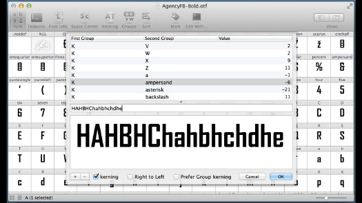
And when you’re done with the points and you’re done with the characters, then the attention shifts to the spaces in between. And this is kerning.
If you’re not familiar with kerning, kerning is looking at the white space in between the characters and trying to balance them so that on a printed page, there’s a nice even tone, and it doesn’t look like words are cut in half.

And so I was doing this day-after-day, just kerning. And in the beginning it’s kind of like Tetris. Right? It’s like: “Oh a little to the left, a little to the right. Okay, that looks about right.” I had to think about it.
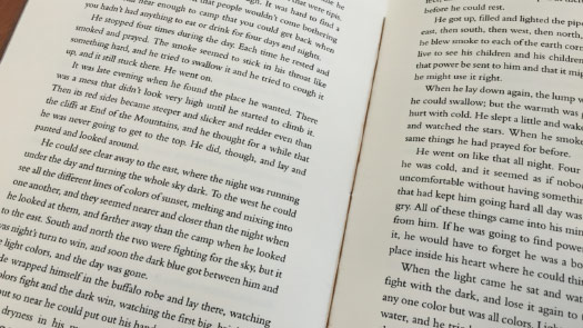
But about halfway through this process, I was walking down the street and I passed a sign that looked something like this. And after about 10 steps I realized that I had no idea what the sign said ...
... but I knew exactly which kerning pairs I would have gone back to fix.
So this can be something of a curse.
It’s been said that if you really hate someone, teach them exactly this. Teach them to recognize bad kerning.
But what it showed me — the reason I remember this moment — what it showed me was that if I practiced something long enough, that I could break out of that questioning every little step, thinking about it too hard. And instead let my eyes recognize patterns and bring them up to my attention. And that made a big impression on me.
And so whenever I wanted to learn something more about design, I tried to do this. I tried to just practice and practice until I could see those patterns in front of my own eyes.
And I thought about this last year when I picked up this book. It’s a field guide to identifying bumble bees.
And like a typical field guide it has images above and text below.
But this text was extremely dense, extremely technical. This is written for scientists, not for someone like me. It requires a detailed understanding of bees and bee anatomy.
But the beautiful thing is what it did. It showed images, but in these photographs the bees are kind of round, they’re kind of fuzzy. It’s difficult to see the pattern.
So they would take something like a queen of one species ...
... and they would extract the pattern.
And then once they’d done that, they could show the variation in design, the variation of patterns within that species.
And it went on from there. They tried to show time, the time of year that the species is active. The location, where has it been seen, where has it been found?
And I realized that a lot of the work that I do in making graphics is exactly this. It’s trying to show or explain pattern and variation and location and time.
And once you do that, then you’re beginning to compare. You can use that same format you’ve come up with to show differences with another species.
I’m not the audience for this book. I’ll never learn these patterns. But what it showed me — what the book is trying to do is teach someone how to see.
It’s trying to teach scientists how to see, to get out of that extremely dense written description of these insects, and trying to raise it up to a level where the eye can start to see these patterns. And I respected that.
So that’s a part of seeing. Another part of seeing in the work that I do is just literally seeing what’s possible.
Mike Bostock is speaking after me, he’s the inventor of D3, a programming language we use a lot in our information graphics.
And I think that one of the reasons that D3’s been so successful is this range of examples, the huge number of examples he and others have put together.
And so when I look through this, it’s like tiny, little design solutions — just a single-page, a single thought sometimes. But to me they represent the possible core of a future graphic, or a detail of a future graphic.
And so, whatever it is that you do, I’d encourage you to look at more than you can possibly use.
I find that if I read something, a month or two later it’s often gone. But if I can see something, particularly if I see an elegant solution to a problem, that visual image will stick with me and might then be available to come out a month or a year later, when I’m struggling with a problem.
And that brings us to our second action: Thinking.
And so when I’m working, the thinking that I’m trying to do is fairly goal-oriented.
And my goal is to find a clear though, find that one clear thought ...
... and then get it down on paper.
And for me this usually involves sketching.
So this is Times graphics desk in New York.
And so I went in, I got up early one day last week, and I just started taking photographs of what people had left on their desks.
And all of these — it’s evidence of people trying to struggle with problems ...
... and trying to come up with visual solutions.
And these people, many of them are much better coders than I will ever be.
Many of these graphics will never appear in print, they’ll only appear on screen.
But they’re still using paper as a medium to get these thoughts down somewhere where their eyes can see them.
And so that act of sketching — however you do it — it’s wrestling with a problem, it’s trying to come up with a visual solution. It’s visual problem solving.
So that’s one way to think about sketching. The other is that sketches are not commitments.
I sometimes find if I start designing something too early, if I get working on the computer, it aquires a certain momentum and it can be very difficult to throw something away.
But if it’s just something that you’re sketching, if I just sort of spend a couple of seconds with it, then it’s easier, it feels, to say: “Maybe this is not something I want to do. Maybe I should try something else.”
And this act of sketching, it forces you to grabble with that question: “What is it you’re really trying to do?”
And this can be a very difficult question to face. Sometimes it’s very easy, if I’m in the middle of a project, to think: “Oh, maybe I’ll just read one more paper.” But at some point, I know I’m going to have to grabble with this question. “What am I really trying to do?”
One of my favorite sketches in the last few years was this one, by Kevin Quealy.
It’s a drawing of the United States.
If you notice this little spike up here, on the northern border. And this is the Northwest Angle.
And then you notice this little bump down here, which he clearly forgot and had to come back and add later. That’s of course Texas.
And so part of the reason I love it is that it seems like a pure Minnesotan’s view of the country.
But the other reason I love this is that it was an elegant solution to a problem.
And the problem he was trying to solve was for the 2010 mid-term elections. And the Republicans had a huge sweep, they won many House districts. And what he wanted to show was, within each House district, how had the voting patterns shifted towards the Republicans or Democrats, compared to the previous election?
And so what this sketch represented, the thought he came up with, was: “What if I put a dot in the middle of each district, and then draw an arrow to the left or the right to show the shift and the degree of the shift?”
So it was a sort of ugly sketch, but then this is what came out. And I thought it was a beautiful example of trying to show patterns and trying to show locations.
And he didn’t stop there. He did the same analysis on three previous elections. So now he’s showing variations, and variations over time. It was a very elegant example of a progression from that ugly sketch to a finished piece.
And if you look very carefully right there, you can see the Northwest Angle.
So ugly is fine. i’d rather have an ugly sketch that expresses a core, clear thought, than a beautiful sketch that is not quite there. It’s much easier to begin with an ugly sketch and make it prettier as you work on it, make it more elegant during the design process. It’s very difficult to salvage a thought if you begin designing too early and you’re not convinced you’re heading in the right direction.
So we’ve talked about sketching on paper.
And of course you can also sketch on the screen and in the browser. And we’re doing much more of this at the Times.
One of Mike Bostock’s biggest contributions to the Times has been to give us internal tools — if you’re familiar with git, these are commits for a single project — to give us tools that let us try and sketch and share sketches on the screen in the same way that we might on paper.
And to try to reduce the momentum of the design so that we can try something, try something else, see what we like better and continue in that fashion.
So this is not my work, but I can go back and I can look at that history of the design desicions that were made from when he first started. All the things that were tried, all the false steps, all the comparisons up to the finished piece.
Whereas before these tools — well, it’s a pretty big graphics department, this might appear online and I would have no idea what thinking went into it. Or no idea how many steps it took to reach the finished design.
But however you sketch, if it’s on a screen or on paper, the goal for me is purely to find something that the brain recognizes. To get something down on paper or screen that my eye can judge: “This is something I recognize. This is something I’ve been struggling with. This is something I can explain.”
And so whatever it takes to get to that point, the discipline is to keep sketching until you find it.
I’ve tried starting a project before I’ve had that aha! moment, and it often does not end well.
But once you get that aha! moment, once that thing clicks, that’s a gift.
And you need to remember that.
So no matter where the design process takes you, no matter what you face in the production process, your goal is to keep that unit of understanding, and try to carry that through to the end, and try to communicate that to someone else.
Communicate that understanding. That becomes the goal.
And this brings us to the third action: Design.
And it must be third because we must go through that process of seeing and thinking and finding, struggling with that idea: “What are we trying to do? What is that piece of understanding we’re trying to communicate?”
E.T. says that “Good design is clear thinking made visible.” This is a very, very important point.
The goal of the design process, for me, is to find a clear thought and then show it. Try to show it elegantly and clearly.
So I work — I do a lot of science graphics. And this is a typical paper that I might start with at the beginning of a project: Kinematics of foraging dives and lunge-feeding in fin whales.
So from the very first word, I know this is not written for me. It’s not written for my audience.
Sometimes it feels like I’m not really a designer, I’m more of a translator between this high-level technical discussion — this is a scientist communicating to other scientists, where you have a shared knowledge, a shared terminology, a shared jargon.
So it’s my job to go in there and figure out what that clear thought was. What thought made them write this paper? Pull it out and find a way to translate that. And ideally translate that visually.
And so I had to look up every other word when I was reading the summary, but it turns out the idea behind it is quite elegant.
So what the researchers did is they went out and they put suction cups on the backs of fin whales. And then they followed them as they made these deep feeding dives.
And when you collect an enormous amount of data, you come back, and there’s a temptation to show all the data. And so the paper was filled with charts like this, which are very difficult to understand because they are so abstracted from that act of an animal making a motion, doing a dive. It can be difficult to hold these numbers in your head, at least for me.
But on a later page, I came across this chart, which is a depth chart. This black dotted line, this is a whale moving along the surface. And it makes a long, deep feeding dive. And at depth, around 800 feet down, it makes these four or five bumps and then comes back to the surface.
Here’s something I could show. Here’s something I could explain. Here’s something that’s closely tied to an actual, physical movement. But of course, being scientists, they cut out the whole middle of the chart! To make room for more charts. Which is fine.
So the first thing I did was I emailed the author, and I said, well, it doesn’t look like there’s a lot of data there, that’s missing, but could you please send it to me. So he did, and whan I graphed it at the same scale ...
... it looked like this.
So here’s something I can explain. This gives me an overview, but it’s only an overview, I still have to explain what these little bumps are down here.
So I try to check myself when I have these little aha! moments: “Am I trying to explain the overview and the relevant detail?” Because in most cases you need both. I try to make sure that I’m not just getting caught up in something that’s too detailed, or something that’s too high level. I try to have a range of, almost a range of scales in the explanation.
And so in another paper by the same author, I came across this chart. It has this nice set of drawings of whales, and then they are awkwardly linked to this very detailed chart. But there’s a clear thought in here somewhere, that this graphic does not really show. That clear thought is explaining what’s happening in each of those bumps on the depth chart.
So these whales are krill feeders, and the way they feed is they accelerate into a school of krill. They open their mouth, and the mouth acts like an enormous parachute. It engulfs a busload full of water, and then they spit out in the water and swallow the krill. And do it again. But it takes a huge amount of energy to do this, it brings them to a dead stop. And so the whale can only do a few of these before it has to surface for air.
So that was the clear thought — a detail now — and I need to figure out a way to show that. And I thought, well, these illustrations are quite nice, so I’ll pull those out. And this chart is trying to show all these different variables: the volume of water, the speed, the angle of the mouth, the area. And they are useful from an academic perspective, but for my explanation they did not feel right. So I took one piece of the chart. I took speed out, and tried to explain that.
Now I have the overview, I have the detail, and I need to find a way to combine them into a finished product.
But when I’m at this stage, I try to remember that I want to let the data lead me to the design. I don’t want to have a preconceived notion of what this is going to look like.
I have some sense — I want to keep this feeling of depth. I pulled out several layers of data from the paper, and i wasn’t quite sure which of those I was going to use.
And in the following sketches I’m trying to find all the ways this could go. I could make an L-shaped graphic.
Here I start to add small multiples under the whales to try to explain. I try to pair the image with the speed, breaking up that speed chart into different components. Fnd these moments in time and show that variation over time.
And so it’s sort of a trial-and-error, it’s moving things around and sketching with these components. Right?
This seemed like a design that might work. And then I threw out some of the data I didn’t think I needed.
And then this is the final piece. So there’s a column on one side, showing you small multiples about each step in the feeding process. And then the overview. And I tried to write in such a way that it didn’t matter if you started on the left or on the right. There was still a way into the graphic. I wasn’t mandating that a reader had to follow one path through this image.
And my favorite little detail here was putting the whale at scale, riding this chart up and down. So even if you didn’t see the scale right away, you can still get some idea of how many body widths down this creature is moving.
So that was an exercise in showing change. That graphic was trying to show change in time, change in depth, change in mouth angle, change in speed.
And about a year ago there was a pop-up store in New York that was selling information graphics. And I thought, well I can’t miss this.
So I went in and I just started looking at the graphics.
And it was things like a big poster for coffee. Showing different types of coffee makers and different types of coffee they produce.
There was a poster on typewriters, another on shoes worn by Carrie in Sex in the City.
And by the time I got to the dogs, I’d figured out the pattern.
And the pattern to me seemed to be: Pick a noun, and then go find instances of this noun. Put them on a page and make them look pretty, and then maybe add some connecting lines.
And that’s fine if you’re doing data art or making posters like this, there’s nothing wrong with that.
But what I realized was that, looking around, I saw no examples of change.
It felt more like collections of trivia that were made to look beautiful in some way, pretty in some way, without trying to show any transformation.
It’s a very easy trap to fall into. I try to remind to myself or question myself when I’m working: “Am I showing trivia about a whale? Or am I trying to explain something about it?” Because that can be a fine line.
But the reason I ask that question is that I believe that data should add up to something. It shouldn’t just stop with: “Here’s the data, here’s what it looks like. Done.” We have to do more than that.
This is my son. With a little light reading.
So he’s in daycare during the week. And when we pick him up at night, we’re given a sheet. And the sheet has some data that shows what he ate that day, how much he ate. It shows when he took a nap and it shows every diaper change.
So I’ve got a stack of these sheets going back two years. And now, I’m ok at D3. I’m a pretty good designer. I could do a beautiful interactive graphic of every diaper change over the last two years. Wouldn’t that be wonderful?
I’ll spare you. What would be the goal of that? What would I be trying to communicate? What would be that unit of understanding?
It wouldn’t be much different than this. It would just be marks on a wall.
It might be pretty marks on the wall, it might be interactive marks on the wall. But the end goal, the point of my making that visualization, the point of what I’m trying to communicate would be essentially this. It would try to get a reaction: “Wow, that’s a lot.”
So I try to make sure that I do not do this.
Because when I get that sheet at the end of the day — when I pick him up and I look at the sheet — the numbers are not that important on some level. This is not where I’m looking.
I’m looking down here: “Anderson helped two friends count and sort by color.”
This is a human annotation on top of that data. And it’s just one sentence, but it’s beginning to tell a story. It’s beginning to show transformation in time. It’s beginning to show some sort of a human voice on top of this data.
This is what I care about.
So I try to remind myself that visualization alone is not explanation.
If I visualize something and then walk away, my job is really only half done. I need to make sure that I’m explaining the data, I’m not just showing you what it looks like.
And I think about this often when I pick up my phone.
We carry these amazing devices for tracking ourselves, for tracking location, for tracking the number of steps we take.
This is the Health app’s visualization of a month of my walking.
When you strip away the design, what is it actually showing me?
It’s showing me 31 numbers, it’s showing me a random top number that’s not my goal. It doesn’t show me my goal. And it shows me a random bottom number that is not zero.
It also shows me three dates, but it’s very difficult to match the lines — I find myself counting: “What is that day? What day was that?”
So there are clearly patterns here. They’re clearly patterns that I, as a user — the person who did this walking — I may have something to say about that. Or there might be patterns that I recognize. But there’s no way for me to add any of that annotation, any of that human overlay on the numbers.
So it’s very good at counting, but that’s it. This might be encouraging you to see patterns, but it’s not letting you record them.
Here’s another app — and this one actually syncs up with my doctor’s office — it’s using the same data in a different presentation.
But what’s it showing me? It’s showing me that it’s incredibly good at counting in many different ways.
All these different numbers. It’s very good at giving me trivia about my walks. It tells me I’ve walked around Loch Ness. It let’s me share that accumulated trivia.
But it does not let me make any sort of annotation. I can’t write anything about these patterns.
So this is — it won’t show me a month of data, it’ll only show me a week — but in these two weeks there’s no way for me to say ...
... that this is was a blizzard and this was a day I took off and spent with my son.
And so I’m able to recall that, I’m able to look at this app and explain that now, or in a month.
But if we’re actually using these phones to accumulate data over time, there’s no way that, a year from now, six months from now, I’ll be able to remember these patterns.
And this data collection doesn’t have to stop when we sleep!
I can put my phone on the corner of my bed, and it will measure how much I move when I’m sleeping. And from that it will estimate how deeply it thinks I slept. This is a pretty good night, a lot of deep sleep.
And this one is not as deep.
But the only input I can make, apart from turning it on and turning it off, is this:
Right? I don’t wake up in the morning and turn to my wife and say: “How did you sleep?”
She doesn’t say, “Oh, smiley face.” There’s a little story. Just a one-sentence story that summarizes the night. But I can’t add it to this.
And even this sort of data — even this sort of one, two, three, smile or frown — will not appear in the overview charts!
So this is looking at a couple months worth of data. I can’t see my basic like-or-don’t-like annotation.
And there’s no way for me to add any other meaningful annotation. Anything to state: “Oh, it looks like I’m sleeping a little better during breaks, and when I’m working on big projects my sleep suffers.”
So again, I can remember this now, but it’s something that I had to go back and look at my calendar and think about what was actually happening.
And this data may be — I haven’t tracked it for very long — this may be interesting at some point. At the moment it’s sort of in the realm of trivia. But I think what would bring it out of that level of trivia is allowing people to add their own annotations.
So these apps are extremely good at counting and they can count in many different ways. But we have to do more than show: “Hey, here’s that count.”
Visualizing what that count looks like, it’s just not enough. We need to do more.
We need to find and show meaningful patterns in the data wherever we can.
We don’t do this. We don’t say: “Here are some words, I hope you find something interesting.”
We certainly don’t do this in print.
I stole these two slides, this idea, from Amanda Cox.
So why would we do this with data?
Why would we say: “Here are some data points, I hope you find something?”
We need to be able to point, we need to able to annotate.
What have I been doing all morning? I’ve been pointing at things and talking about them.
This is a fundamental human activity. We’ve probably been pointing at stuff and annotating, as humans, since before we had language. Point to something, draw attention, try to explain why it’s relevant.
So this chart was by Hannah Fairfield, a very good designer. It’s a connected scatter plot, which can be a little bit difficult to read.
Basically what she’s doing is she’s looking at 60 years worth of driving data. And so the farther up on the chart you are, that’s more deaths, per capita, from automobile crashes. And the farther right you are on the chart, that’s a higher number of miles driven per capita.
So if you look back around 1950, people are not driving very much, compared to now. There’s a high rate of deaths. And if you look as the chart winds its way down, around 2011 and 2012 people are driving quite a lot, but with many fewer deaths per capita.
And it’s not a straight line. There are bumps and patterns along the way. So she writes a small article, which is essentially a long caption.
And this combination of caption and data — caption over here and data somewhere else, or data on another page — this is very common in scientific communication. But we try not to do this.
If you remember that kerning was looking at the space in between letters and focusing our attention there, we often think about using the space in between the data as a place to add annotation.
So what’s she’s doing is she’s finding moments in the chart that she can point to and say something about.
She’s using small multiples here to show exactly what part of the chart she’s talking about. And so she’s trying to show how oil prices, or the design of a vehicle, or a book about highway safety might have affected these trends over time.
And that annotation carries on throughout the graphic, so you can follow — you don’t have to read the caption.
You can start looking at the data and you can start finding your way through.
She’s trying to help you. She’s trying to anticipate confusion.
We can’t look over the shoulders of our readers and say, “Oh, that’s actually supposed to be like this.” We have to build that kind of thinking into our graphics. And that is often just by thinking about where someone is likely to get confused. Trying to anticipate that, trying to build the solution or the answer into the piece itself.
And she’s also trying to reveal a pattern that is in the data itself.
She’s not trying to impose her own preconceived pattern on the data.
And you can see this quite a lot in infographics.
This is a graphic that shows you 60 years of German history.
It’s a striking design. But when you actually start to read it, when you try to get some information out of it, you realize that time is moving in three different directions.
So this is not the kind of pattern and variation over time that we would like. I guarantee that the data did not lead itself, did not lead the designer to come up with three different ways of showing time.
This feels like a design that was imposed. The designer chose this design and then made the data fit.
And once you begin trying to read this format, you realize that the chart itself, the information you need to understand, is tucked up in the corner.
So the act of reading becomes a zig-zag, back and forth, looking here, looking there, essentially teaching the brain what the connection is.
And then if you do learn that, we get to the bottom of the page.
The chart above was circles, mostly about people. You get to the bottom and you have a chart over the same time period about money, but the same colors are being used. So in effect you’re writing a micro language that the reader has to learn before they can begin to extract any information out of the design.
So I try not to do that. I try very hard not to write micro languages that someone has to understand. I’d rather have them interacting or thinking about data, and patterns in the data, than thinking about trying to decipher the pattern that I chose to encode that data with.
So please be skeptical when you see things like this that are beautifully designed. Just think: “Is the design helping me understand? It’s helping me read?”
There are clearly some intricate patterns in that circle that would be very difficult to explain, but this presentation of wrapping it around in a circle is not really helping. It makes it very difficult to read and compare across time.
There’s no place here to annotate, to point out things that are interesting. It’s essentially: “Here’s the data, here’s a key, and now you have to decipher between the two. Read it, and we’re not going to provide much annotation.”
This brings us to our fourth action, our fourth verb: Produce.
So I think of the production process as the point when that idea, that ideal design you have in your head, sort of bumps into reality. You have to deal with browser bugs, deal with limitations of time or size, or printing on newsprint.
But as designers we have to embrace those limitations and incorporate them as part of the design process. And not to forget that idea, that piece of understanding you’re trying to communicate.
So we don’t want any problems in the production process to get in the way, to make us change what we’re trying to communicate. Maybe it changes the form, but we want to keep that goal of clear communication in mind.
And production is also — sometimes I think of it as practice, as an opportunity to practice. It’s an opportunity to hone your design, to hone your ideas. Either within that one project, or in multiple projects on the same theme over time.
And one series of graphics that I’ve been working on has been on the Kepler space telescope, which was launched in 2009.
So Kepler was designed to stare at one small patch of sky, just stare at that spot for years. And it was looking for little dips in light, tiny dips in light.
It’s as if we were on a field and a mile or two away there was a light bulb, and there was some moths flying around it.
And just by measuring the light, we could figure out how many moths there were, how big they were, how far they were from the light bulb, how hot the light was. It’s that kind of pulling from the data.
And so before Kepler launched we made graphics explaining what it looked like, what it was planning to do.
And as it started finding results, as it started finding planets around other stars, I tried to give a little clue of what the data looks like. What are these repeating dips of light? I tried explaining what light curves are, what happens when a planet passes in front of its star.
But it’s very technical, there’s a lot of information here. You have to read a lot to understand what’s happening. So it’s asking quite a lot of readers.
And then as Kepler started finding more planets, I started doing these little one- and two-column graphics about planets around individual stars.
And it took me a while, but after a while I realized that I don’t want to be doing a graphic every time they find another planet!
Maybe I should just step back — these graphics are explaining maybe one system, but they’re not giving a bigger context. So maybe I could step back and try to build a graphic that shows what they found and then leave room for what they might find in the future.
So I started sketching, and I thought: “What’s the smallest amount of data, the smallest number of data points I’d need to draw a planet moving around a star.”
And so that was that the sketch.
And I was just learning D3, so after a week of swearing at my computer, I came up with this. Which is a very, very simple form. But it was that aha! moment: “Yes, I can build this!”
If I can build one star, I can build all the stars.
So the data was not hard to find, it’s available from several sources.
This is what it looks like on the Kepler site.
I pulled it in as a text file, just a CSV file.
But this table goes on quite a ways, and I realized I only needed a small number of columns.
Most of this data I don’t need. So I knew I wanted to pull in data repeatedly, over time, and throw out large chunks of it.
I knew I wanted to be able to add a few data points, like the Earth and Sun, as a comparison.
And then maybe in the future there’d be planets that were under embargo, that I was told about but which were not available in the public data. So I wanted to see what they looked like. And I also wanted to make some calculations on the data.
None of that was very difficult, but I wanted to be able to repeat it, and I wanted to understand every step along the way.
I didn’t want any magic transformation in my data. I wanted to be able to go back and say: “I did this and then this and then this. Here’s the input. Here’s the result.”
This could have been done in Excel, but then I probably would have had to redo it over and over again every time a new planet was found.
It certainly could have been done in R, and several people on the graphics desk use R for most of their work. I find it difficult to understand.
And it certainly could be done in JavaScript. Different people would have different solutions.
For this graphic I chose to use something called IPython Notebook [now Jupyter Notebook], which looks something like this.
And I use it because it runs in the browser. And because it has a beautiful way of letting you run a line or two of Python code, and then it shows you the result. This is showing one interaction, and there were about 24 lines of code before this. This line pulls in the data table, deletes some things and then shows me the transformation. So I’m seeing every step of the way, I’m seeing where things can go wrong, and I’m correcting them as part of the process.
And so this is the final table, after all those transformations. This is the final data I will feed into that graphic.
And so my goal is to have each row in the data represent one planet. So each row here knows how to draw itself — or will know when I’m done. And it’ll also know how to draw its star.
And these are the steps in the process. From source data, through the transformations of the data, into the final graphic.
I use CoffeeScript on the way to D3. I use CoffeeScript because, at the level of programming that I do, which is fairly low, CoffeeScript and Python are very, very similar. So it feels like I’m working in a coherent environment, even if it’s not, even if it’s multiple steps.
And then these three steps get automated, so I can just run a little script and it goes and finds the data and does all those transformations.
So the end result is effectively from source data straight to the graphic.
I’m trying to get out of the way, trying to automate the process as much as possible while still understanding every step along the way.
And the beautiful thing about D3 is once you have a prototype like this — once you do it once — then you can do it multiple times.
So this is literally the next sketch after that.
I’m playing with color, I’m adding additional pieces of data trying to figure out this format.
And this is the piece as it published: Kepler’s Tally. So when it launched there were about 150 planets that Kepler had found, and now there are over 1,000. So the planets have begun to outgrown this design. If I started sketching when there were 1,000 planets I probably would have come up with a different design.
But this is it. I’m trying to show the pattern and show variations, I’m trying to pull in these artists’ renderings that NASA has, just to give some context of what we think might be there. I’m trying to show scale. I’m trying to highlight some of the interesting systems, like planets orbiting two stars, a binary system.
I’m also trying to add annotation — not a lot, but enough annotation along the way for planets that might be interesting. Trying to show things like this, a relatively large star, and it’s very volatile.
And if you scroll all the way down, you can see Earth. So there’s at least something here — you might have some conceptual idea of what the Earth-Sun distance is — it’s at least something that we can imagine. A rough sense of scale. A rough sense of a human scale, even if we’re not working at human scale.
There were five scales in this chart: two for size, one for distance, one for temperature and one for time, relative time.
And so a lot of the design work was just trying to make these scales feel intuitive. So that someone arriving at the page — seeing these things moving, your eye is probably drawn there. I wanted to give visitors an idea of what I was communicating without them having to look up and decipher each part of the scale.
So there is a code here, just as there was in that Germany graphic. But I’m trying to make it as intuitive a code as possible.
I often think about design like this: It’s not one design decision, it’s a series of small design decisions, a series of small decisions that add up. And any of those decisions can change the way you work and change the direction you’re headed.
So as I was working on this graphic I chose very early on to throw out a large part of this data. I was not using things like distance from Earth, for example. But other people certainly can use this data and go in different directions and use different slices of the data.
If we remember that Kepler was designed to stare at this one patch of sky ...
... I was able to mimic that patch using a recent NASA tool called Eyes on Exoplanets.
And the beautiful thing about this tool is that it lets you move around in space. Here we are at Earth looking at that Kepler field of view. Pulling out, passing the Moon. Soon we’ll see the inner solar system. Mars. Saturn’s coming into view. There’s Pluto. Here are the Voyager spacecraft and the two Pioneer spacecraft. So all of mankind’s exploration is coming down to one pixel.
As we pull back farther, each of these stars we’re seeing is a star with at least one planet around it. And as we pull back and we start to move we realize that that Kepler field of view is not flat! That it’s a cone, extending through space, and through time.
And this tool is letting us move around — we’re not seeing any planets here, we’re seeing stars that have planets — but it’s a different view of the same data. We’re getting a very different experience, a very different understanding.
And as we pull out we can see these known planets, where they are in relationship to our Milky Way galaxy. And we can see what small percentage we’ve explored in that way. So this is very beautiful tool — a little difficult to work with — but a very elegant idea.
So I’ve been at the Times for almost 10 years.
This is the group in New York City, as it was, I think, last year. There have been some changes. And we have two satellite offices in D.C. and San Francisco.
And for a long time I was the only person on the desk who had a formal training in design. People come from urban planning, cartography, geology, certainly journalism, and other areas.
And our deputy director likes to say that: "We are not designers.”
And I usually raise my hand and say: “Well, yes I am!”
But his point is that we’re not really — it’s not about design. It’s about communication. It’s trying to find those patterns, find that variation and try to explain that. Whatever it is.
And what I’ve seen in working with these people, what I think they have in common, is just the ability to apply common sense.
I think that much of design is just this. It’s applying common sense. And I’ve been surprised and impressed with how they’re able to ruthlessly do this. To not get so much momentum in a design that they’re unwilling to consider another alternative, or unwilling to throw it away.
These people are very — they want to communicate and they’re trying not to fall in love with a design. It’s been very nice to see.
And so when I work, when I’m trying to follow a design process, I try to think about what it is that I can control. I’ve been working on this graphic. What are the pieces that I can control?
Certainly I can control accuracy. I don’t want to introduce anything in my design or in my process that makes or introduces an error.
I can certainly control clarity, just the ease of understanding. Clarity in the presentation, not trying to overwhelm with data. And not trying to show too little. You’re trying to find the right balance.
I can control legibility, how it looks on the screen. How it looks on paper. Can someone read it?
I try to work with empathy. Am I anticipating where people might have problems? Am I trying to empathize with somebody who is going to pick this up in the newspaper, or look at it in another form?
And I can control the level of simplicity. So I’m not trying to make simplistic graphics, but I’m trying to make simple graphics.
If I get these five things right, what might emerge from that?
For me the goal is understanding.
I would like to condense time into a graphic. All my work is condensed into the piece. And I’d like that to be understood. I’d like somebody to be able to pick that up and to get some of that aha! moment, or some of that feeling of understanding something that they didn’t know before.
I would hope that if things go right that the reader might have a sense of elegance. Might feel like — even if they’re not conscious of it — they might think that, well, this is a nice solution. This is an elegant solution. I get it.
And then maybe, occasionally, a graphic might be beautiful. But really, that’s not the goal for me. It’s nice when it happens, but I’d much rather have an understandable graphic that’s not incredibly beautiful than a beautiful graphic that’s just trying to impress, that’s not really trying to communicate.
So as we meet today to talk about these four actions, I’d like to leave you with the thought that:
Seeing and Thinking, this is how I understand.
And Designing and Producing is how I explain. Or try to explain.
And this is really, this is why I get out of bed in the morning. I’m not going to work to design things, I’m going to work to try to do this: understand and explain.
There are many ways to explain, and I think we’ll see many more later today.
But for me helps to have a rough framework, which I’m trying to talk through today.
But summing that up, I try to design for someone else.
After I’ve done the research, after I’ve come to some understanding of the material, in a way I know too much. So if I make a graphic that only sums up my own personal understanding, that’s not really communicating. I want to put myself in the reader’s position and try to design for them, not for myself.
And I try to remember what it was like not to understand something.
If I could go back two weeks, or a month, and talk to myself before I understood the problem, how would I get myself from that point to this aha! moment? And how would I avoid the dead ends? What would be the simplest way for me to bring someone from not understanding to that point of understanding? Somewhere along there is probably where the graphic lies.
And then, whatever I do, whatever you do, I hope that you do it with respect for your readers. For your viewers. For your users, if you’re developing apps or software.
And of course, for your listeners.
Thank you very much.