

Nov. 16, 2016
Last month I gave an informal talk on step counters and other tracking apps. This is a slightly condensed version.
For a talk with similar ideas in a broader context, try: See, Think, Design, Produce 3.
Good afternoon, thanks for having me.
For this talk I tried to think back and remember the first time I ever used a computer.
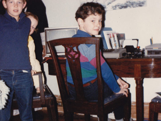
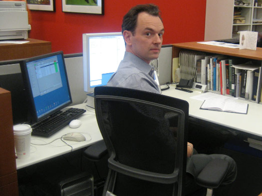
This was the earliest photograph that I could find of me with a computer — a Commodore 64, complete with floppy disks and joystick.
But I also remember my friend’s Atari console, and learning Logo in elementary school on an Apple II.
Here I was then ... and here I am today.
(Drag the slider to compare then and now.)
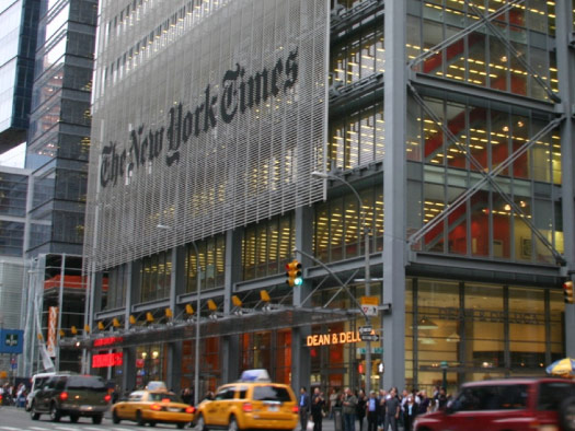
I work at The New York Times, and have been there for 11 years.

I’m part of the graphics desk, which has about 40 people.
My role is to handle science and health graphics.

Maybe five or six years ago, most of my work was focused on the print paper, making graphics for newsprint.
But in recent years, as you can imagine, that process has shifted.
Now one of my projects might begin with a storyboard and script ...
... which becomes a narrated video.
Then I might take the research I did for the video and pull out pieces of it for a web graphic.
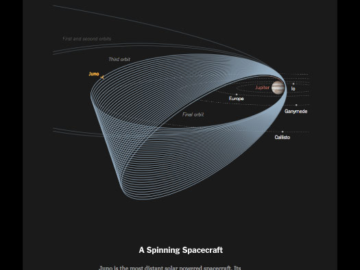
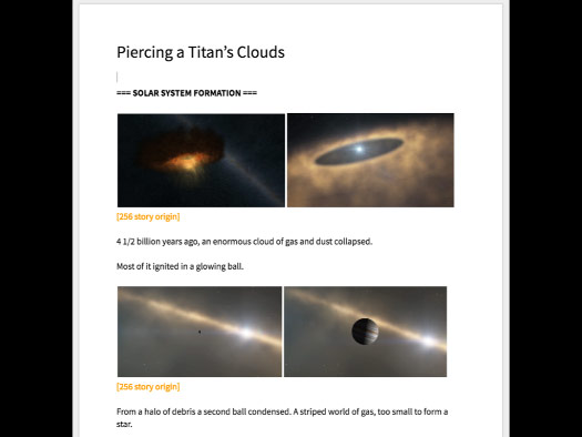
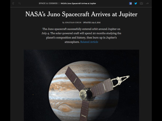
Here I was trying to explain how the Juno spacecraft reached Jupiter, and give an overview of its expected mission.
And with space projects in particular there might be a huge amount of material available from NASA and other organizations.
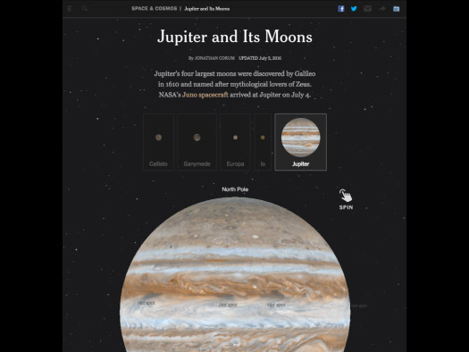
So I might also try to make an interactive graphic. This one was on Jupiter and its moons. I wanted readers to spin these globes and get a rough sense of what we've learned so far about these worlds.
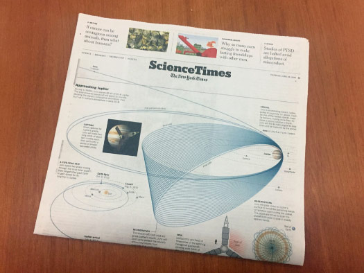
And then, at the end of the process, I might pull some of those graphic elements into a print graphic.
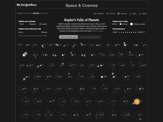
And even in cases where there is not a lot of good imagery, there might be great data.
This is an old project about planets orbiting distant stars, discoveries made by the Kepler space telescope.
And in the last year or so I’ve started to work with virtual reality — you might have tried VR before, on a headset or as a 360° video.
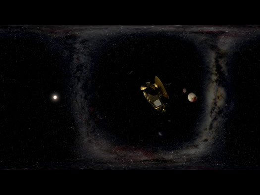
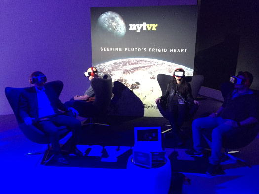
Here we built a model and placed a virtual camera inside. This is one frame of Seeking Pluto’s Frigid Heart, rendered for one eye.
A second rendered image can give you a stereo view ...
... so that a viewer wearing a headset will have a sense of depth.
(YouTube 360° version.)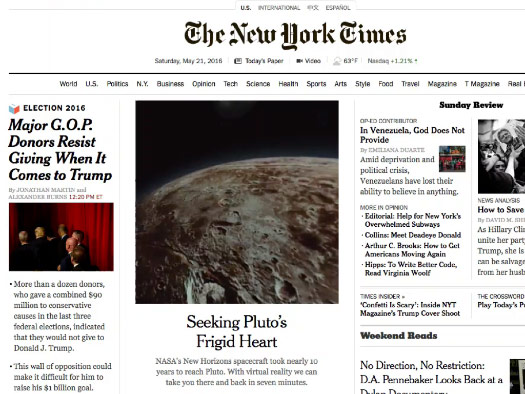
And I learned a lot from this project: How the pacing of a VR project is so different from a typical video, to give people time to look around. How to avoid or minimize motion sickness when moving. How to cue someone to look around without overdoing it and sounding like a tour guide.
And, of course, we also learned that nobody looks good wearing VR headsets, no matter how dramatic the lighting.

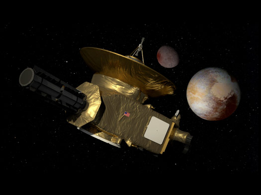
But it was a fun project, trying to explain the New Horizons spacecraft and its Pluto flyby in 2015.
This is an informal talk, but when I give formal talks I often include a lot of space projects, because the imagery is so good ...
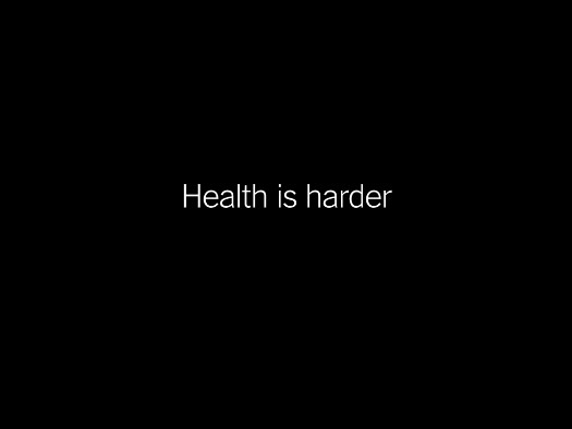
... and also because health is harder.
The “Science” part of my job is often a lot easier than the “Health” part.
People are kind of squishy, and it can take a lot of work to show how blood moves through the heart, or to locate a small part of the brain.
And sometimes health data can feel a little squishy as well.
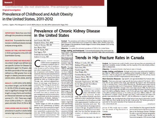
These are some typical studies I might work with. You have to deal with uncertainty, or results that differ from previous studies, or a trend that might only have two or three numbers.
It can also be difficult to make graphics for some studies. If my graphic can be replaced with a single sentence, then maybe it should just be a sentence. There is a minimum level of complexity for a graphic to be useful. If it can replace a paragraph, then maybe the graphic is worthwhile.
What do I think about when I work with health data?
First I look for any way to humanize the data. Sometimes studies are so far removed from the events or people that were involved that they feel way too abstract.
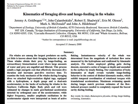
This is an example that I’ve used in other talks:
From the very first word of this paper — “kinematics” — I can tell that I’m not the audience for this. These are academics talking to other academics, and my job will be to understand what’s going on and then try to translate it.
And there is a lot of data here, but it feels very far removed from the action that was being studied, which was a deep feeding dive by a fin whale. The scientists put a tracker on the whale and followed the whale making a deep feeding dive.
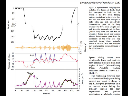
And you can see at the top of this chart that there is some relation to the real world. The dotted black line shows depth, but the middle part has been cut away as not very interesting.
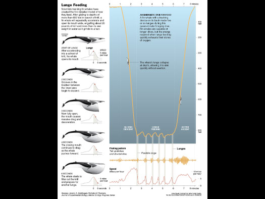
But depth is something I can build a graphic around, and so my version pulled some of the data from the paper and tried to connect the dots. Tried to explain what was happening as an overview, and at smaller scales.
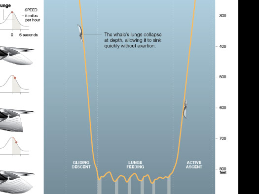
And here you can see the whale, at scale, riding the chart. As it was tracked.

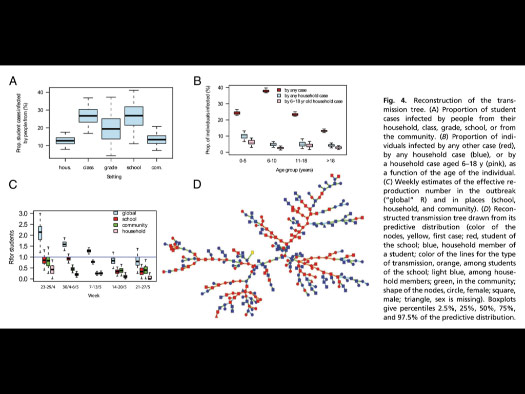
A similar abstraction can also happen with medical studies. Here’s one about a virus spreading through a few hospitals in the Middle East.
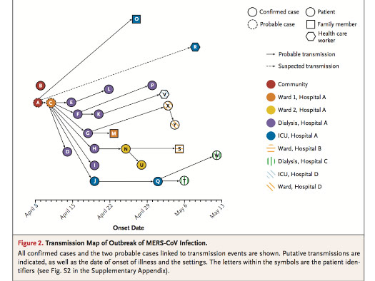
The researchers made this study, and reported the results of how this virus spread as a chart ...
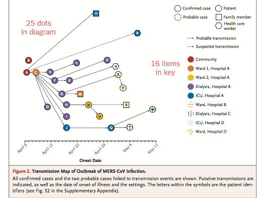
... but there are 25 dots in the chart and 16 items in the key.
So here we’re nearing a one-to-one relationship of items and their key.
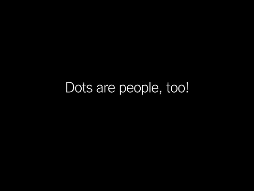
And when I see charts like this, sometimes I think “Dots are people, too!”
Even if I can't report on the individuals because of privacy restrictions, or limitations in the data, I can at least try to convey that they are real people.
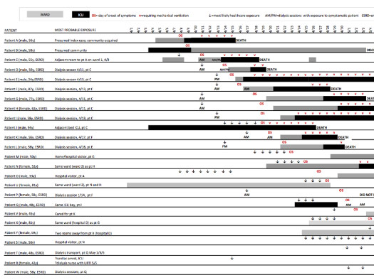
And in the supplemental info for this paper, I found this chart, which gives ages and genders for all of the people who were in the study.
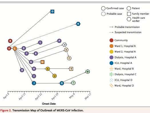
And so I can go back to the original chart ...
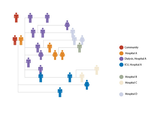
... and start to add a little humanity back into it. This sketch adds gender, and cuts the key in half.
And maybe I can clean up some of the lines, so it's not a starburst pattern. Here I’m constrained on the horizontal, because that represents date, but I can clean up the vertical.
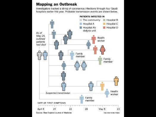
And this was the small print graphic.
It’s pretty simple, and not that different from the original, but hopefully it helps the reader get a sense of the spread of the virus through a group of people. And I try to hint at some of the connections between people, whether family member or someone working in the hospital.
Here’s a similar example, showing swine flu spreading through a group of students.
The chart is over here, but in order to understand it ...
... you have to find the part of the paragraph that refers to it, and then hold that description in your head.
I try to avoid situations like this, where the graphic is over here and the information you need to read it is somewhere else. That feels like I’m writing a micro language, and asking people to learn it just so they can read one graphic.
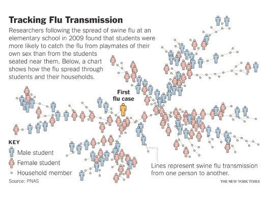
Here's the version I made, which is nearly identical.
But I tried to highlight the first case of flu and emphasize how it spread through boys and girls in the school. Family members of the students remain these small dots.
It’s not a huge change, but maybe this will help a reader imagine the flu spreading through the school, or compare it with a school that they know.

Annotation is one of the most important things that we do on the graphics desk. It is a huge part of our design process.
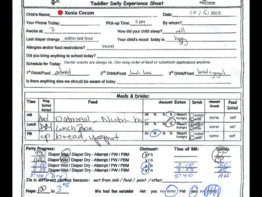
When I pick up my daughter from day care, I get this sheet. It’s a tracker — it tracks what she ate, when she slept, how much exercise she had, and when she had a diaper change.
It’s a set of data about her day. But when I pick her up, that’s not the part that I look at first.
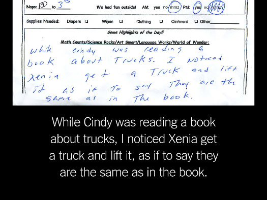
The part I read first is at bottom, a little note about her day: “The class was reading about trucks, and Xenia got a truck and held it up.”
That gives me some human annotation on top of the data!
It tells me something I didn’t know, and gives me a sense of a moment in time, something to mark the day.
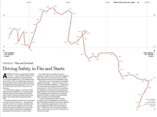
We try to keep that in mind when making graphics. Here’s a graphic by Hannah Fairfield, about driving deaths over time.
It’s a connected scatterplot, which can be unfamiliar and a little hard to read.
She wrote a short article to go with the chart, but that’s not enough. She can’t expect viewers to read these paragraphs first and hold the description in their heads as they look at the chart.
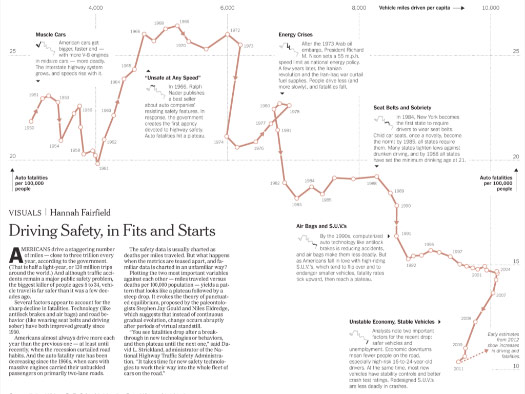
Instead, she uses the space around the chart to add focused annotation. Annotation where it’s needed to understand and explain the chart.
Even for a very simple chart — this one has only four lines — we might spend more time working on the annotation than on the chart itself.
Annotation is one way to help give context.
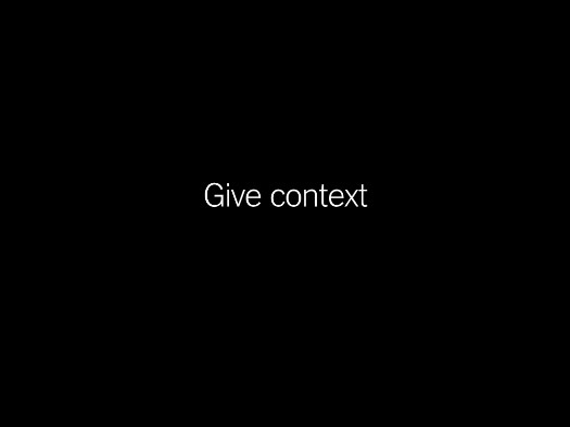
You can also highlight bands of data or bands of time as a way of providing context.
This is another simple chart, with only six lines, but it spans eighty years of time. Anything I can do to help put that time in context can help hint at possible causes or trends. For example, birth rates falling during the Great Depression and rising after World War II.
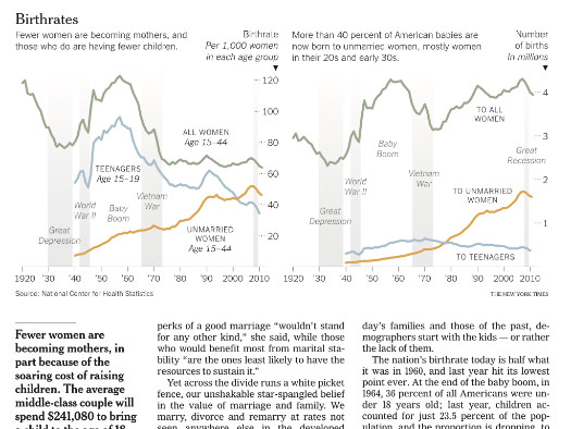
And I do this kind of thing all the time. Here is life expectancy since 1900, with some peaks and valleys that call out for an explanation.
And here patterns of meat consumption over a similar period of time.
I’m trying to underlay the data with bands of annotation, to help you locate specific time periods and to point out specific moments in time that you might remember or recognize.
Beyond annotation and context, we care about making meaningful visual comparisons.
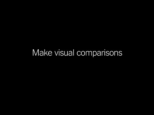
This graphic by Amanda Cox makes an elegant comparison about size: this microbe is to a period as the period is to the page. It relates this microscopic form of life to an object we might hold in our hands.
Many presentations of health data are numbers changing over time — months, years, decades.
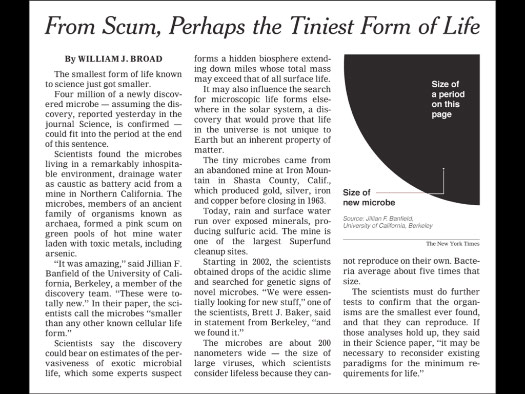
We try to show visual comparisons, either for broad categories like Cancer and Heart Disease ...
... or for smaller categories that have been broken apart to encourage visual comparisons.
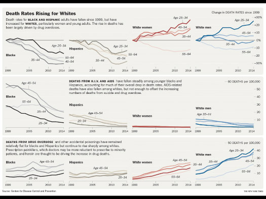
Here trying to show how death rates have changed by race, gender and age.
Even if a graphic is fairly sterile, it can still try to convey a sense of human beings behind the data, provide annotation where possible, give context over time and allow viewers to make comparisons.
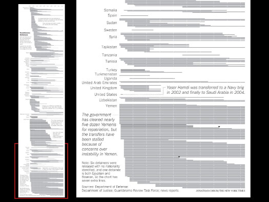
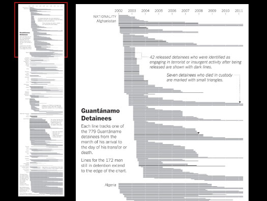
This graphic was about the 779 Guantánamo detainees over time, but I tried hard to make the graphic about more than just that number.
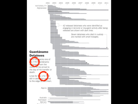
We have to take numbers like these and provide context and background.
And I think many tracking apps are still in this mode — counting and charting numbers, instead of showing meaningful patterns.
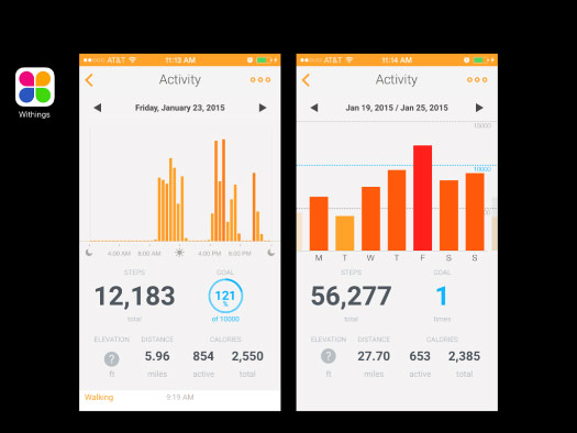
I tried a few different tracking apps early last year. This one was very good at counting, and made a point of showing many different numbers.
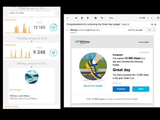
It gave me trivia about how much I walked, gave me badges and emailed me about certain milestones.
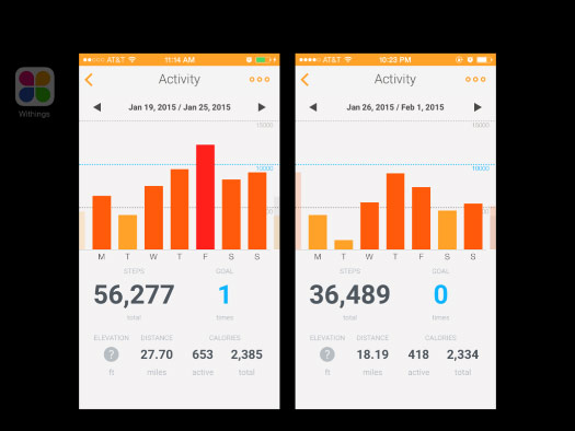
It used different colors in these bar charts to emphasize how high each bar was, but there was no way to see more than one week at a time.
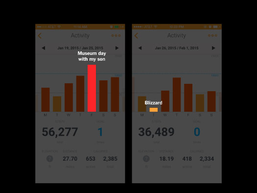
And there was no way to mark or note what happend on significant days. For example, here was a day I took my son to a museum, and here was a big blizzard where we barely left the house.
The app was great at counting my steps on individual days, but didn’t help me find or remember meaningful patterns over any stretch of time.
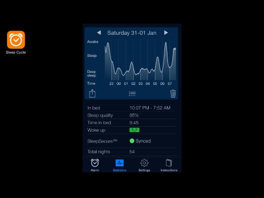
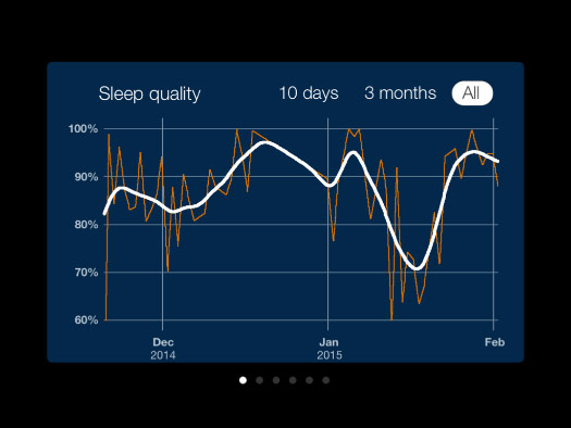
I also tried tracking my sleep for a few months.
Here is a chart for a pretty good night, with lots of deep sleep.
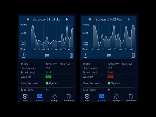
And this night was not so good. Probably my children waking up.
The data appears to be very detailed ...
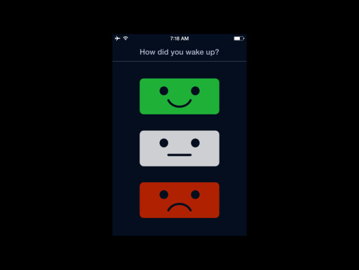
... but the only human annotation I can add to it is this.
When I wake up and ask my wife how she slept, she doesn’t reply: “Um, smiley face?” There’s a little story, even if it’s just one sentence.
And even this simple annotation does not appear anywhere in the overview charts.
There are some patterns here, but I had to look back through my calendar to figure out what they were.
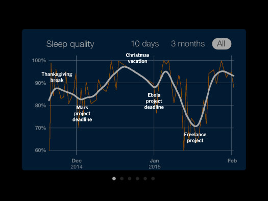
And basically it shows that my sleep tends to improve during vacations, and decline when I have big projects due.
Is that interesting? Maybe over time this might add up to something, but a few months after this I probably would not remember what caused these patterns.
I stopped tracking my sleep because there seemed to be little value in it, and no way to record even basic patterns like these.
I don’t use many apps — this is about it. But usually I do check Health at least once a day.
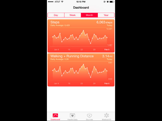
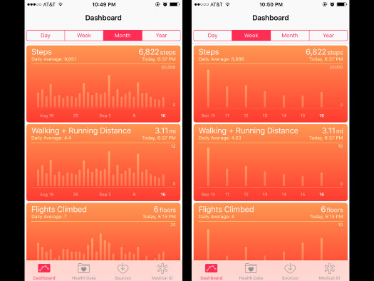
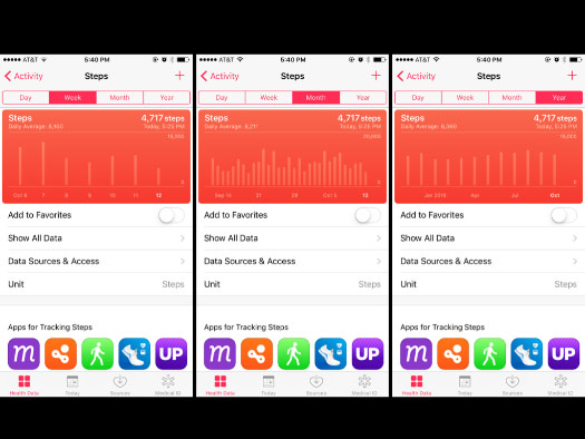
When I first started using it, about two years ago, the charts looked like this. This was probably iOS 8.
Most of the charts were line charts with a faded fill underneath, which gave this mountain range effect. Line charts can also imply continuous data, instead of a series of separate days broken up by sleeping.
The charts didn’t start at zero but at a seemingly random number: here 1,067. And the top number was also fairly random, and would change from day to day. I never figured out what the thin dotted line was, but it’s probably my daily average.
This kind of chart also makes it hard to count backwards, dot by dot, to figure out which day is which. And it also makes you translate in your head to the day of the week: “Today is a Tuesday, so count back Monday, Sunday, and so on.”
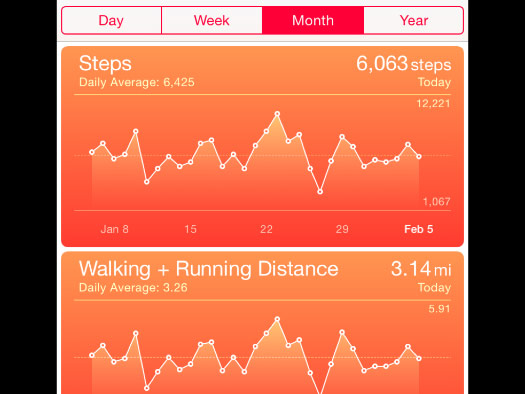
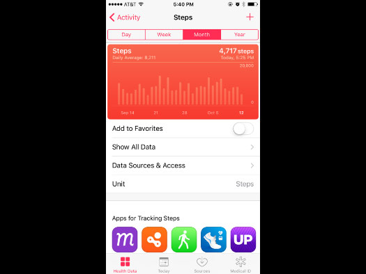
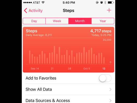
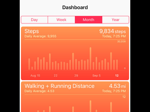
But at some point, maybe in iOS 9, many of those things were fixed. The charts are now bar charts, starting at zero, with a nice round number as the top line.
I tend to use the Month view most of the time.
The Year view seems pretty thin in comparison. I think it’s showing monthly averages, but there is enough room to draw a thin bar for every day of the year. That kind of continuous data might give a similar effect, hinting at monthly and seasonal averages while also showing the very high and low days.
The Week view is even thinner, and again it uses the numerical date instead of the day of the week. I don’t use this view.
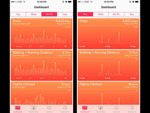
And I find the Day view to be very hard to understand. I’ve tried to match up this chart with my memory of the day, and it's very hard to do.
Maybe a cumulative line here would be better, starting from zero and working its way up over time.
The bar chart still makes it a little hard to work back and figure out specific days.
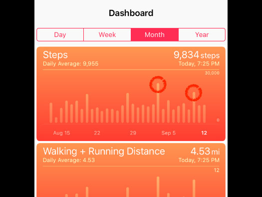
And I don’t really think of a month as a series of 30 days in a row. I tend to think of it as a series of weeks, or a weekly cycle.
There are some high bars in this chart, but they don’t seem to have a regular pattern.

But if the chart somehow highlighted the weekends, then the pattern starts to become a bit clearer. My weekday pattern seems pretty consistent, and the high points are now clearly during the weekends.
A view like this might make me think more about when I am likely to walk, and maybe figure out why some Saturdays and some Sundays stand out, but not both. Maybe it would also encourage me to walk more on weekend days.

Highlighting the weekends might also helps call attention to sudden changes in the overall pattern. I went back and looked at my calendar, and the lowest day of this month was on a Sunday when I went in to work.
iOS 10 came out recently, and I’ve been using it for about a month now.
And I think it’s the first software update that has made me use my phone significantly less than before.
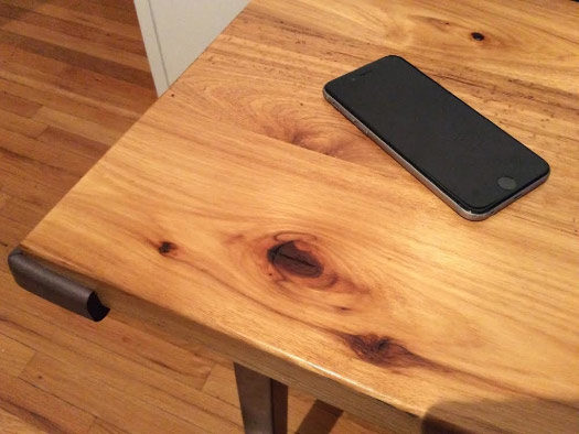
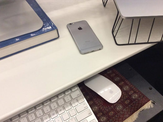
I’ve been leaving the phone on my desk at home a lot more — my toddler-safe desk, as you can see.

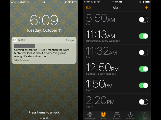
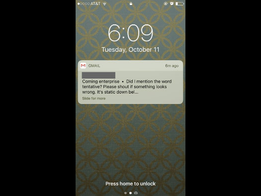
The biggest reason I’m using the phone less has been changes to the lock screen. The notifications have become low contrast, gray type on a tan background, and it makes it very hard to read them in the middle of the night, or first thing in the morning.
This change made it much easier for me to stop sleeping with my phone next to my bed, which is probably a good thing.
And the apps seem to have diverged, with some going low contrast and some going high contrast on a dark background, which I actually prefer.
But the main reason I use my phone less is that notifications are now much less useful.
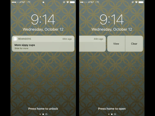
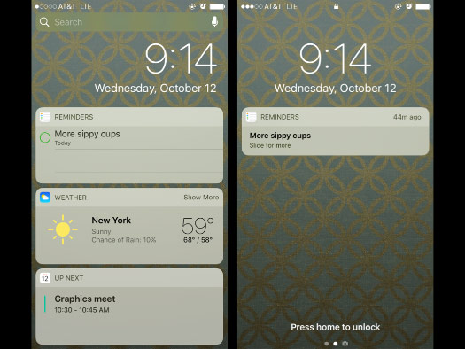
If I get something like this ...
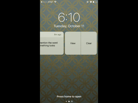
... I can no longer take any direct action on it. Just “View” or “Clear.”
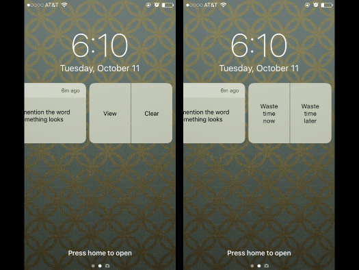
Whenever I see these options I get a little infuriated, because to me it seems to be saying “Waste time now” or “Waste time later.”
There’s no action I can take right away, like archiving the email and never having to see it again.
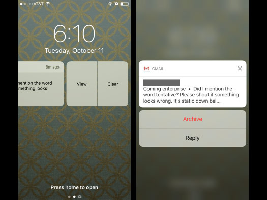
Yes, I could click “View” and then “Archive” — but to do that I have to look at a completely different screen, with its different design and colors, and buttons in a different place.
Maybe dealing with notifications like this doesn’t take any more time than it used to, but it definitely feels like it does. It certainly takes more clicks, and they add up over time ...
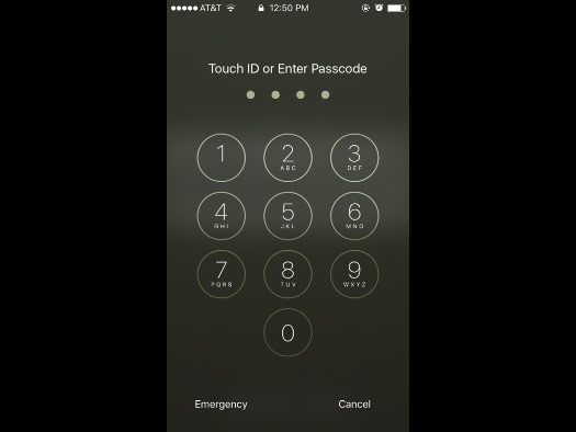
... especially if I have to give my fingerprint to finish the action.
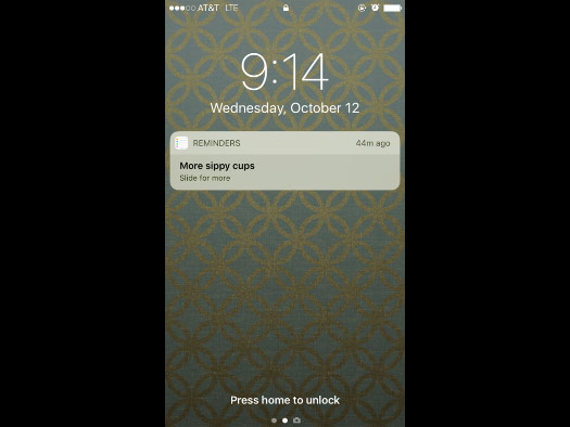
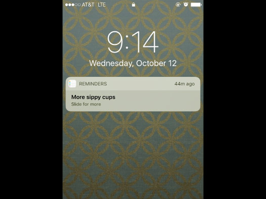
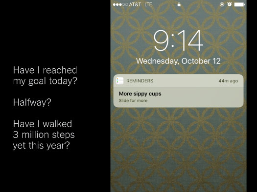
I have a very active social life, as you can see by reminders like this: “More sippy cups.”
And I’ve stopped using reminders as much as I used to, because of similar lock screen problems.
This is a reminder for an action.
I’ve either completed the action or not, but my options are the same: “View” or “Clear.”
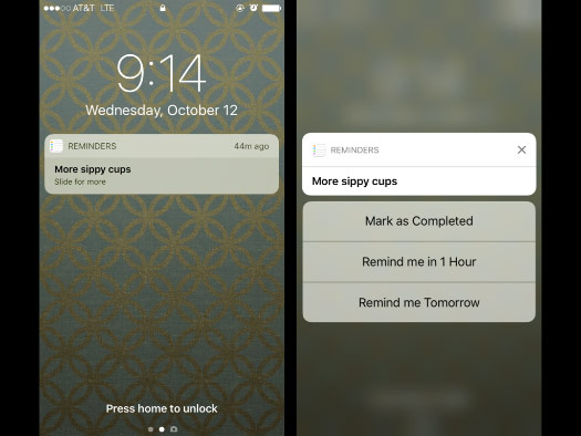
I want to mark it done and move on! But to do that I either have to click “View” and see the screen design and layout change ...
... or swipe right and see a different screen entirely, where I can actually tap a checkbox.
But if I use reminders a lot and have more than three unfinished items, then I can’t mark the new reminder done because it appears at the bottom of the list.
Either way, it’s annoying. And it makes me feel that iOS 10 has added a new layer of clicks in front of most things I want to do.
Even at work, I’ve been leaving the phone face down on my desk a lot more than before.
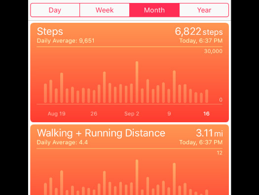
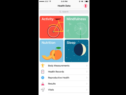
I’ve been using the iOS 10 Health app since it came out about a month ago.
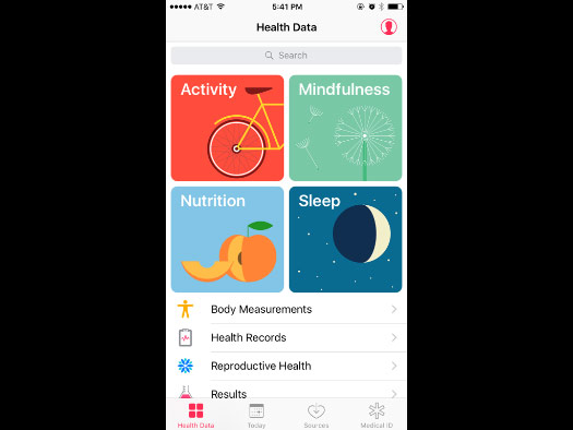
And in general the app looks great. The new home screen is nice and clean, the illustrations are well done ...
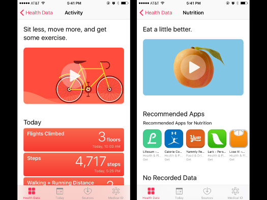
... and the introductory animations are beautiful. Very well done.
But the new design also adds a couple clicks before I can get to what I want, the monthly overviews of my data.
Maybe I’m not a typical user, but this is the screen I want to see: my daily step count in monthly context.
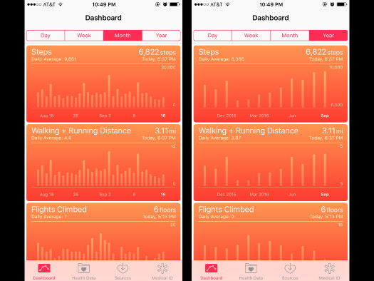
The Year and Week views still feel pretty thin. I don’t use them.
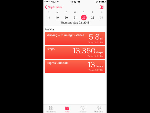
And I tried the new Today tab, but it doesn’t give me any context — I would have to click back and forth between days to make comparisons.
So if I was going to make suggestions about what might be helpful to me as a user, my first one would be: Don’t hide my data!

The app is supposed to collect personal data, but the overview screen always looks the same.
This screen won’t change if I’ve used the app for a year or just one day, and it looks the same for all users.
If the data is personal and meant to be used, let me set simple personal goals.
Or even let me set one number: 10,000 steps as a daily goal.
A simple line across this chart would show immediately which days I met my goal and which days I didn’t.
I’m not a fan of notifications, and I disable most of them, but I actually wouldn’t mind an occasional note on how much I've walked.
And honestly I could use an occasional break from this kind of notification.
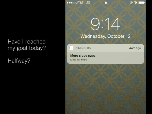
Have I reached my walking goal today? Am I halfway there?
Maybe if I had an Apple Watch I would know, but an option for phone notification would be nice.
I can guess from my daily averages that I’ve walked at least two million steps so far this year. When will I hit three million steps? My phone knows, but has no way of telling me.
Most users might only have a year or two of health data on their phones, but that history will continue to grow.
A tracking app should reward my long-term use and allow me to look at charts of all the data I have collected over time, which might eventually stretch to a decade or more.
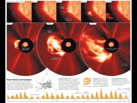
I love long-term data. I will find any excuse to add charts like this to my graphics. This timeline shows over 250 years of sunspot activity.
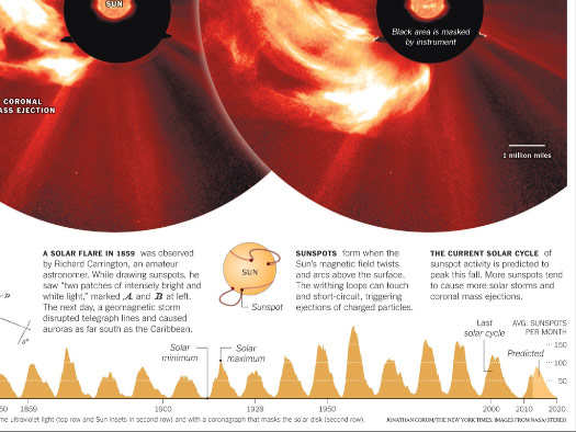
And our eyes can handle that much data with no problem. We can see repeating patterns, highs and lows, recorded and predicted counts. And we can immediately begin to make visual comparisons.
But when I have more than a year of data in the Health app, those data points just fall off the chart, never to return.
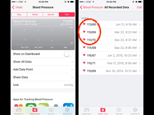
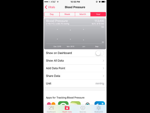
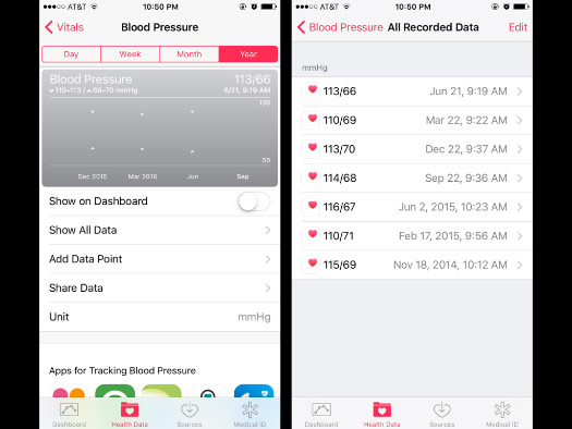
Here’s my blood pressure. The graph shows me three data points, but I’ve recorded over a year of data that does not appear on the chart. It only appears as text when I click “Show All Data.”
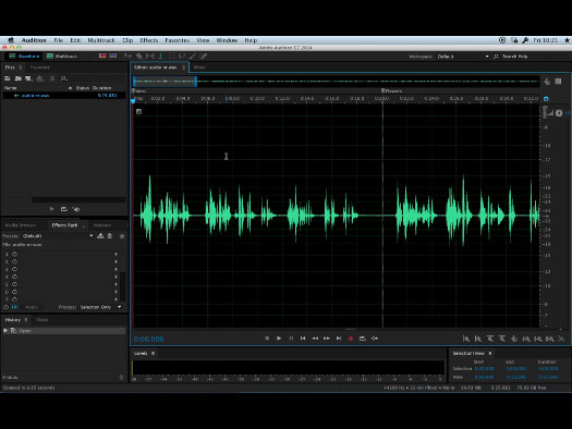
When I edit audio clips in Adobe Audition, that’s one of the smoothest experiences of moving freely through time. I can slide time back and forth, zoom in and zoom out, look at less than a second or pull back to show the whole timeline. All with very simple gestures.
I don’t think an app needs that level of freedom, but I do think that data shouldn’t just fall off the end of the chart and never be visible again.
Even a simple gesture to scroll or condense the chart might let me see all my data, in one place.
Right now I only have seven data points on blood pressure, with no real trend, but over the next decade a pattern might emerge here. Give me a chance to see that pattern.
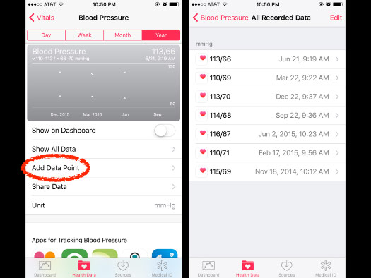
And as a side note: I always record this data by hand, after tapping “Add Data Point.”
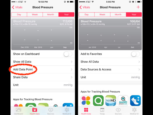
But when I upgraded to iOS 10, “Add Data Point” disappeared.
I spent about five minutes looking for it, searching through other screens, and finally had to Google “how to add new data Health app.”
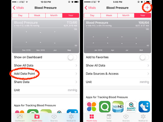
It turns out the Add button moved to the upper corner, as a plus sign.
It’s a simple change, and a change I should have noticed earlier, but I was looking for the button near where it had always been in the past.
It made me feel pretty stupid.
Apps that count and collect data are not very useful if we can’t use them to see patterns.
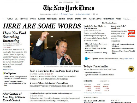
For example, at the Times we would never do something like this: “Here are some words, hope you find something interesting.” (I stole this slide from Amanda Cox.)
But it feels like many tracking apps are still stuck in a world of: “Here are some numbers, hope you find something interesting!”
Anything that makes it easier to see patterns over time, or notice cyclical or seasonal patterns, would be welcome.
And finally, the app should feel alive.
Living people are using these apps, but the app doesn’t always reflect that.
This overview tells me nothing about myself, or my day, or my week. It looks good, but just sits there, unchanging.
The design is a grid, and I’m very used to working within a grid, while also fighting to break out of it.
So when I’m designing on a grid, I look for ways to add some visual tension, or some motion.
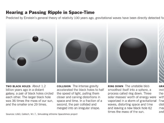
Even black holes can have a hint of movement, or change, or tension.
Or I might try to break the grid in some way, or highlight the pieces that move.
Trying to reveal a visual hierarchy, while letting the background fade away.
And iOS 10 does add new moments that make the phone interaction feel alive.
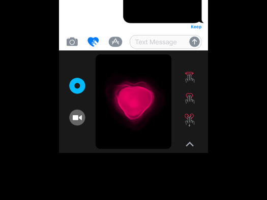
For example, I will never send my heart beat in a text message, but it’s nice to see the flat screen of the Messenger app responding to the pulse of my fingers on the screen, somehow acknowledging that I’m alive.
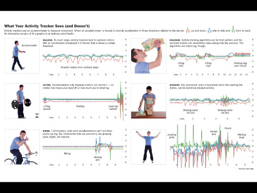
And this wasn’t my graphic, but I thought it did a nice job of showing what an activity tracker’s underlying data actually looks like.
The graphic tried to link the abstract motion data to a real person doing real things, instead of staying in this abstract world of lines.
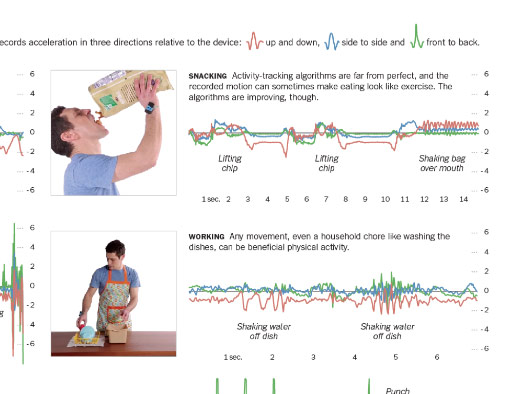
And so you can see what lifting a single potato chip looks like to a tracker, or what shaking the whole bag over your head might record.
I may not be typical, but I’d love to see — in real time — exactly what my phone is tracking. Maybe an app for that exists and I just haven’t seen it.
Seeing what the data looks like might help draw a connection between the physical object and the living person, instead of recording movements and presenting them in static form, long after the motion has ended.
Thank you very much for your time.