

March 27, 2016
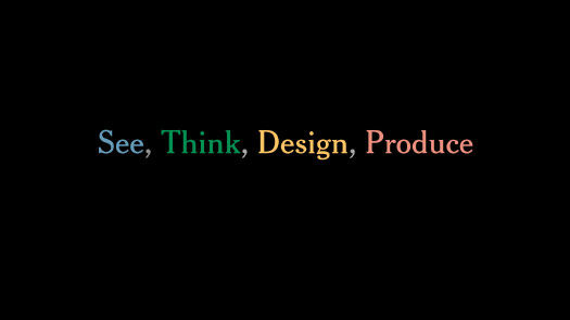
This is a transcript of my talk at See, Think, Design, Produce in Seattle on Aug. 7, 2014.
The other speakers were Maria Popova, Randall Munroe and Edward Tufte.
My later talk at STDP3 had the same four-part structure, but used different examples.
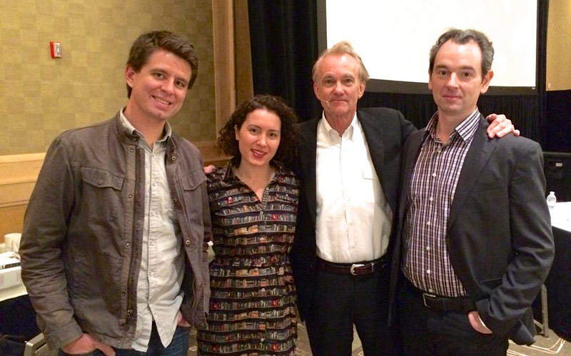
Randall Monroe, Maria Popova, Edward Tufte and me.
Good morning!
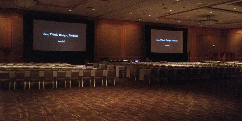
Welcome to the second See, Think, Design, Produce.
I’m Jonathan Corum.
Thank you all very much for being here, and a special thanks to E.T. for hosting us today.
I wanted to start this morning by walking through these four actions, these four verbs, and to try to explain how I try to apply them to information design and data visualization.
And this really begins with the act of seeing.
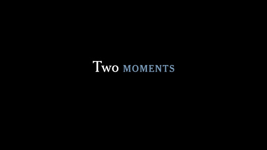
So for me there were two moments that really changed how I thought about sight and human vision, and the first one involved pattern recognition.

I was in high school, and it was something like this: I was walking on the side of this field and there was someone quite a ways ahead. And I wasn’t paying any attention. I was sort of thinking about something else with my head down.

But after a few moments there was sort of a click, sort of an aha! moment, and I knew, without even looking up, who that person was.
And it wasn’t as if I was trying to recognize the pattern of how he walked, but it was that my eyes had done it, my peripheral vision. So what this showed me was that, as humans, we have this amazing capability of recognizing patterns, even if we’re not conscious of the patterns being in our brain.
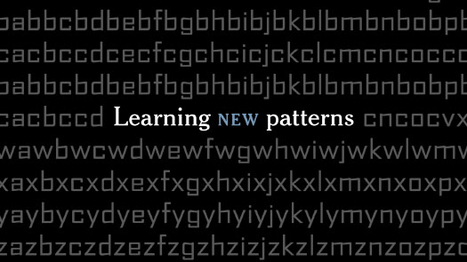
And the second moment involved learning new patterns.
My first job out of school was as a type designer. I’d drawn a large set of fonts, and I was spending a month just kerning them. Kerning is adjusting the space between the letters to try to get an even tone.

And so, probably halfway through this month-long process, I was out walking and I passed a sign. It looked something like this.
But I realized, after about 10 steps, that I had no idea what the sign said ...
... but I knew exactly which kerning pairs I would have gone back and changed.
So this can be something of a curse. It’s said that if you really hate someone, teach them to recognize exactly this — bad kerning.
Thank you, Randall.
But what this showed me — I mean, this is a fairly small moment — but what it showed me is that, if I practiced something long enough, that I could take those decisions that before I had been making in my head — “Are too close together? Are these too far apart?” — I could take those decisions and essentially outsource them to my eyes, so that my eyes started learning these patterns and raising the problem pairs to my attention.
And so, this was a minor moment, but it really changed how I thought about vision. From them on, no matter where I was as a designer, I tried to learn things until I could trust my eyes to recognize them.
I thought about this a couple of months ago when I picked up this book. It’s a field guide to bumble bees.
It’s really written for scientists.
The language that’s used here is extremely technical and very dense.
And then, as a typical field guide, it show images. This is the queen of one species.
But these insects are kind of fuzzy, they’re rounded, it’s a little hard to see the patterns when the wings get in the way.
But the beautiful thing about this book is that it took those fuzzy, imperfect images and it abstracted out a design.
This is the queen of one species.
And once it had shown you that pattern, it then stepped back and tried to show you variation within that species. What does a drone look like? A worker?
And then once they’ve done this for a single species — showing the pattern and the variation — once they’ve explained that, they try to add the element of time. When is this species active? Where is it active? What location?
And I thought this was just a beautiful condensation — beyond the technical, scientific detail — a beautiful visual explanation of a single species.
And once you have that, of course, you can apply it to multiple species.
So I am not the audience for this book. I’ll never learn these patterns.
But I really respected this book, because it is trying to teach you to learn new visual patterns, and to get that information out of your head and into your eyes.
And in a way, much of my work is about exactly this. It’s trying to find ways of showing pattern and variation and location and time.
Part of seeing is also just simply seeing what others have done.
And for me, that’s how I see what’s possible, what’s out there.
At the Times we use a programming language called D3 for most of our online graphics. And I think that one of the reasons it’s been so successful is the wealth of examples by its founder, Mike Bostock, as well as other people, I think some of whom are in the audience today.
Each of these examples, for me, represents the core of an idea. A core that could become a graphic, or could become a detail of a graphic.
So for example, last year I saw this one about interlocking gears. And I thought it was a beautiful demonstration of rotation and interlocking, but I had no real use for it at the time.
But a few months later, cicadas started popping up out of the ground on the East Coast. And so I was thinking about these 13-year cycles, and 17-year cycles, and insects popping up in different parts of the country in different years.
And something in my brain pulled out that rotation example, the interlocking gears, and so I started sketching.
I came up with something like this, where I show each of these different groups of cicadas as a gear. And when the little colored tooth breaks the surface, that’s when those cicadas are out.
So it was a fairly simple graphic — with different insects — but it’s the same idea of trying to convey pattern and variation and location over time. To take that single event, that isolated event of cicadas popping up in one year, and trying to put that into the larger context of a full hundred years.
You may not be a designer, but whatever you do, I would encourage you to look at more than you can possibly use.
Because for me, when I read something, often a month or two later, it’s gone. It’s just a faint memory. But if I see something, particularly if I see something that’s elegant, or just a nice, coalesced, well-thought-out design, that image tends to stick with me. So that months or years later, as I’m wrestling with a problem, that sort of visual can come out and help me with a solution.
This brings us to our second action, our second verb, which is Thinking.
When I’m working or thinking about design, it’s usually not deep thought, it’s not pondering the mysteries.
There’s nothing wrong with that. But the work that I do is very focused and very goal-oriented. And my goal is to find a clear thought.
When I’m learning something new I can have a jumble of ideas in my head. And I try to sort through that jumble and find the one clear idea that I can pull out and get on paper, or get on the screen.
And for me this usually involves sketching.
So this winter I went to visit E.T. at his sculpture farm. And his desk there was piled with sketches. There were sketches on paper, sketches over photographs, sketches that had been cut up and pasted in new orientations. And for me, it was all evidence of him grappling with problems and trying to come up with visual solutions.
It reminded me that sketching really is just a pure form of exactly this. Of visual problem solving.
And it also reminded me of The New York Times.
This is the Times graphics desk. I came in early one morning this spring, and I looked to see what was on people’s desks, and I photographed some of the sketches I found.
Some of these sketches are quite well thought out, quite refined, and some of them are not.
But they are all evidence of people trying to solve problems visually.
Some of people are very talented programmers.
They’re much, much more talented than I am, but they’re still using paper.
And they’re using paper because paper sketches are not commitments.
Sometimes I feel that if I get started too early on the computer and I make something that looks refined, then, okay, I’ve got my direction set. But maybe that’s not the best idea, that’s not the best solution.
So by forcing myself to stay until I get a sort of aha! moment, then often I find a better direction.
Because sketches really force you to confront that problem of: “What are you trying to do?”
And if it’s just your pen and paper, you can’t hide behind a programming language or making things look cool. It kind of forces you to grapple with that question.
One of my favorite sketches in the last few years was this one, by Kevin Quealy.
One thing I love about it, is that it shows his view of the United States.
And when he drew it, you can see this odd little bump up here. If you’re not familiar with that, that’s the northwest angle of Minnesota. Population: 119.
And then there’s this other bump down here, that he clearly left off and had to come back and add later.
So this is just a pure Minnesotan’s view of the country.
But the real reason it’s beautiful is that it’s just a very elegant solution to a problem.
The problem that he was wrestling with was the 2010 midterm elections. He was trying to show how the vote in different House districts shifted, relative to the last election.
So the thought that he pulled out of his head with all these ideas floating around was: “Well, what if I put a dot in the middle of each House district, and then I draw an arrow left or right, for Democrats or Republicans?”
So this was the idea, this was the expression of that idea, and then this is the piece that came out of it.
So I thought it was beautiful. You can see the work that went into it. You can see the core of that sketch — it reflects in the design.
This is showing pattern, and this is showing location.
And then, he went a step further.
He backed out and said: “Here are the previous elections. Here are the variations, and here’s the timing.”
A lovely representation of information.
And so, as you’ve seen, ugly is fine. An ugly sketch can be a wonderful thing.
I would much rather have an ugly sketch that expresses a clear thought than a beautiful, polished sketch that has a poor idea behind it, or a weaker idea behind it.
It’s much easier to clean up an ugly sketch in the design process than it is to salvage an idea that’s not quite there.
We’ve looked at sketching on paper. You can also of course sketch with data.
This is the Cassini spacecraft. It’s been orbiting Saturn for the last 10 years.
And I wanted to get some sense of the orbit it’s going to take — it has this very elaborate orbital plan as it orbits Saturn and tries to look at the different moons.
I found a tool online that let you plot orbits, and it gave me a very small window into that data set. I could look at one orbit at a time.
But I was on a deadline, and for a deadline that’s was enough. So I could get a sense of what it was doing.
I could pull each of these single orbits out and stack them up in time, and then came up with this.
So in a way, this is that ugly sketch, that ugly sketch of data. But once I saw this I realized, “This is something I can explain. It’s something I can clean up.”
... and this was the final graphic.
And nested there in the center is Saturn.
And you can see an echo of the graphic this week, on the cover of Science Times.
It’s not as complex, but a similar idea. It’s showing comets coming in, recent comets that have visited the inner solar system.
And now more and more we are sketching in the browser.
So you may have seen this graphic, the “512 Paths to the White House.” It was by Mike Bostock and Shan Carter in our San Francisco office.
It was trying to show what would happen if different swing states voted for Romney or Obama in the last election. And it was this elegant — almost more of a tool then a visual presentation.
It’s a really elegant way of navigating that explains the information. But it didn’t start that way.
It took them 265 iterations to come up with the final image.
And because of the process they went through, since then they have been working very actively developing internal tools at the Times, that encourage us to do exactly this. That encourage us to use the browser as a sketching platform.
And so, this is an example. I can’t say what it is, but this is something that Mike Bostock is working on. I went in two days ago and scrolled through his sketches.
This is based on git, if you’re familiar with that. These are all of his commits. But essentially, every time he reaches a point where he thinks a stage of work is complete he can save and post it.
And this becomes a look back in time over the designs that he’s tried, the things that he’s tried.
So in a way, it is online, but we’re getting back to that idea of paper, where he’s able to try a design, and then throw it away. Try something new, throw it away.
And he’s looking for that aha! moment, that moment where he says, “Aha, this is something i can explain. This is something that makes sense to me, that I can use.”
So that is the goal, to find something that your brain recognizes. To put something on paper that your eyes say: “Ah, yes, this is what I’ve been learning. This is what I’ve been thinking about. This coalesces what I’ve been trying to come to grips with in this topic.”
And once you have that — however long it takes you to get there, whatever steps you took to get to that point — that is your little aha! moment.
And that’s what you have to remember.
I don’t know if there are units of understanding, but that’s your one unit of understanding that all your prior work has come up with.
And you have to be very careful to remember that, and not say: “Oh, I’ll make something pretty,” and lose track of that idea. No, that aha! moment, that is the point of Seeing and of Thinking, to find that.
And once you have that, please, whatever it is that you do, keep it. And then try to communicate that understanding. Your goal becomes: “Okay, I have this little piece of understanding. How can I find a way to communicate that to others?” That runs behind most of the work that we do.
And that brings us to Design, which is our third verb and action.
And it must be third, because we have to use the process of Seeing and Thinking to come up with that clear thought that we can then take through the design process.
E.T. says that “Good design is clear thinking made visible.”
And I think this is a very, very important point.
One night last summer, a large percentage of New York City was woken up at 4:00 in the morning by this — smart phones buzzing and vibrating in a way they had never heard before.
I was one of these people, who at 4:00 in the morning, kind of bleary-eyed, grabbed my phone and made it stop vibrating. And I looked at the message, and it was this.
And it took me a while. I could kind of feel my brain waking up as I was trying to process what it was telling me.
And after that, I could feel my design brain waking up as I looked at this message. I remember thinking: “This is a little redundant, you’ve got two different capitalizations.”
And it said “Manhattan, NY.”
I don’t think I’d ever seen that written before.
I remember thinking: “Okay, you’re telling me it’s an update, but you woke me up and I have no idea what this is about. This can’t possibly be an update.”
And then: “Is this Long Island City or is this a license?”
It’s still early morning, so I’m not really thinking clearly.
You’ve got this odd double parenthetical, which I was also trying to figure out if I had seen in the last few years.
Tan is uppercase, and Lexus is misspelled.
So I realized that I had been woken up and then had to spend all this time trying to figure out what was going on. I finally had to Google it to figure out what was going on.
But I realized that after this effort, that there were only two numbers in there that I had no problems with. Everything else I thought just was not news.
Where was the clear thought?
Someone clearly paid a lot of money to develop a system that could wake me and a major city up in the middle of the night to give me a message.
But then when that message was sent, there was no clear thought behind it.
Design is not always about icons and graphics.
This is pure communication design, and most of the work that I do is along the lines of this. How can I communicate that clear thought?
And so, whatever it is that you do, I think one good test is this: If you had to wake up a major city and hand them your chart, your graphic, the login screen to your app, whatever it is that you’re working on, could they take any information out of it? Could they act on it? Would they understand what was going on, half asleep? And if not, how could you improve it?
So for this, it should just be common sense. Amber Alert.
Most of you probably know, but I did not know what an Amber Alert was. In this case it was an abducted infant. A mother had abducted her son from a supervised visit the day before.
(Someone in the audience got a little offended that I didn’t know what an Amber Alert was. Maybe it’s because I have no television.)
So, first tell people what has happened.
And then once you’ve done that, say what you’re looking for.
And if you have additional information, add it.
And then, finally, give people something to do if they know something about this!
It’s just communication, written communication.
The first message looked like it was vomited out of a computer. Take that and speak to humans.
And really, I think this applies to a lot of design in communication. Don’t be your own audience!
By the time you’ve learned something, by the time you’re in the middle of something, you know too much about the topic.
Don’t just regurgitate what you've learned to yourself. Communicate. Really try to speak to a different audience.
And part of that is remembering what it’s like not to understand something. This is very important.
Whenever I work, I try to actively think: “What was it like two weeks ago, when I hadn’t done any research on this topic?”
If I could go back and talk to that person two weeks ago, how would I lead them, with no dead ends, on a simple path to whatever I’ve come to understand?
One of my favorite examples is this. These scientists went out and put these suction cups on the backs of fin whales, and they tracked them as they made these deep feeding dives, searching for krill.
The scientists come back, and they have all this data, and they write a paper. And from the first word — kinematics — I can tell that it’s not written for me, and it’s not written for most of my readers.
This is a scientist speaking to another scientist, and there’s a good reason for that. That’s the structure of an academic paper. But my job then becomes translating, and I feel that much of my work is really more translation than it is design.
So I go in, I read the paper and I try to figure out what they were doing, what they found out, what their piece of understanding is, to see if I can glean a little of that.
And so they had gathered all this data. And there’s a temptation to show all the data.
The paper has all these very dense charts like this, and I probably still don’t understand every one.
But then a couple of pages later, there was this chart, specifically this one at the top.
And I realized that this is a depth chart.
So that black line, that black line is a whale. It’s bobbing at the surface, and then it makes this deep, deep dive. These bumps at the bottom are feeding, and then it comes up, rises, and breathes again at the surface.
So this is something I can explain. This is something that is closely tied to what actually happened. But of course, as scientists, they cut out the entire middle of the chart, to make room for more charts. Which is fine.
So the first thing I did was I emailed the author and I said, “It doesn’t look like there’s a lot of data missing there. But would you mind sending me what you cut out?”
And when I went back and graphed the missing data at the same scale, it looked like this. So this is something I can design. This is something visual. This starts to show you how deep this whale has been. And it gives me this beautiful overview of the process.
But I need to be careful when I’m working that I explain both the overview and the relevant detail.
The depth chart gives me half of what I’m looking for. This gives me an aha! moment for the overview. And now I just need to explain what these little bumps at the bottom are.
And in another paper by the same author, I found these really quite elegant little sketches, but they’re kind of oddly tacked onto this chart, which is displaying many variables. It’s displaying the angle of the whale’s mouth, and the volume and area of water engulfed by the whale’s mouth.
But really the idea is very simple. And the idea is that these whales, when they get down to the bottom, they accelerate at a school of krill. And when they’re at top speed and run into the krill, they open their mouth, and it acts like this enormous parachute, and it grinds the whale to a stop. And they engulf a busload full of water, and filter out the krill and eat it. And do this again. So that idea is hidden in that chart and in those grapics.
But it gave me something that I could pull out and then combine with text explanation. Something to show the speed of these animals.
Then I tried to write the text so that, whether you started on the left, looking at the details, or whether you started on the right, with the overview, you could still understand the graphic. I’m trying to give you an entry point either way, however you approach the material.
And this is the final piece. And there is a scale here, they’re diving down about 800 feet.
But I wanted to make the scale intuitive. So even if you never saw the scale, you might get a sense of how deep this whale is diving.
So I put a little whale riding the chart, all the way down and all the way back.
So that graphic was really an exercise in showing change, and probably most of the graphics I do at the Times show change of one sort or another.
There are many ways to show change.
You can show change over time. These are islands deteriorating, eroding.
You can show change in form. This is the development of feet over 100 million years.
You can show change in orientation, change in position. This is sign language of science concepts.
And you can show change in state. So if you are a Web designer, or if you’re developing apps, then probably much of what you’re doing is managing and trying to find ways of visually explaining changes in state. In this case it was showing the different configurations of the Soyuz capsule, into space and back.
And this spring there was a pop-up store in New York that was selling infographics. I walked by and said: “Well, I can’t miss this.”
So I went in and started looking, and it was things like coffee, a graphic about coffee.
There were typewriters. There were Carrie’s shoes from Sex in the City.
And by the time I got to dogs, I realized what the pattern was.
And that pattern was to go and take a noun, and then find many examples of that noun. Put them on paper and make it look beautiful, and then draw some lines. Which is fine. There’s nothing wrong with that if you’re making data art, or if you making a poster, that’s fine.
But I realized as I was looking that there was no change in any of these graphics.
When I walked out of there, I thought: “You know, the graphics just felt like collections of trivia.”
So whatever you do, please, don’t collect trivia. Don’t visualize trivia.
I really believe that data should add up to something, something meaningful, not just: “Here’s the data I found.”
When the Space Shuttle program was winding down, I wanted to do a graphic that explained the history, all the launches of the Shuttle.
An early sketch looked like this, where each row is a different shuttle, and then maybe I could mark each of the missions. You can imagine this moving from the sketch to a finished design.
But I didn’t want to make something that was just Shuttle trivia, and this was feeling sort of along those lines. I don’t want to just say, “Here are the launches, done!” It didn’t feel like it was enough.
So I made that visualization at a large scale, and then I read about every mission, and I started annotating. I started figuring out, “What are the interesting ones? What are the ones that I remember?”
I still remember where I was when the Challenger exploded. And I assumed that many of our readers had — they would have seen a Shuttle launch, or they would remember something about the program. So I was trying to build a framework, so that whatever understanding you have coming into the graphic, that I gave you a place to put that knowledge: “Oh, this is the launch I saw.”
So the final piece, it was a data visualization, but the data was almost the least important part of it. It was really the annotation that I put on top of it, and in it.
That was really where I was trying to communicate. It’s not just a sterile chart, with just lines.
And this is what I was trying not to create, something like this. Which you can buy for $15, if you want.
We would never say on our website, “Here are some words. I hope you find something interesting.”
I stole these slides from Amanda Cox.
We certainly wouldn’t do this in print.
So why would we do this?
Why would we say: “Here are some icons. I hope you find something interesting here?”
This graphic is about Guantánamo detainees.
Or why would we say: “Here are some numbers?”
I think that, if the work you’re doing as a designer, if that work is just summing something up to a single number, and then adding some design to it ...
... then you’re not really visualizing, you’re just counting.
So I strongly believe that, as designers, we have to do much more than just show we can count something accurately.
And especially for something like Guantánamo, which is a very complex topic. A lot of politics behind it, a lot of history.
I think we owe it to our readers, our audience, to do more than just say: “Here’s the top-line number. 779 people at that point in time.”
So when I try to do a graphic about Guantánamo, I’m using essentially the same numbers, so I’m still showing the 779 people, but I’m trying to remember that they are people.
And so I’m using abstract forms here. This is a fairly simple chart, it could have been done in Excel. But I’m using a line for each person. I’m showing when they arrived, and then extending that line to when they left, or when they died, or if they’re still there.
Then they were grouped by nationality or country, then arranged by arrival date.
So I’m trying to show some of the — I can’t explain it all — but I can show you some of the complexity in that single number. There’s a lot of variation.
And there wasn’t much room, but I tried to add annotation to people that our readers might have heard about. Show how they fit into that larger picture.
And this is how it worked on the page.
So please, whatever you do, please try to find and show meaningful patterns.
There are plenty of meaningless patterns out there. Many of them you can download and use in your own graphics.
This is some data visualization clip art, sort of a “Just add numbers!” way of designing.
But you can tell that the numbers don’t actually mean very much, because this 75% here is not actually 75%.
And this 25% over here is the same size as the 35% next to it.
So this is sort of the facade of communication. It’s trying to look cool without actually communicating.
Here’s a style that is available for you to apply to your numbers, no matter what your numbers are.
It’s not: “Here’s a pattern in the data.” It’s a pattern you can kind of force, cram down your numbers’ throat.
So I try to be very careful not to do this. It can be very easy to fall into this pattern, this habit.
John Grimwade, a designer in New York, he calls this the “language of infographics.” He sees it in students’ work often, where the point of the work is to look impressive, and not to communicate.
You show someone the graphic and all they can say is “Wow.” They’re not taking anything out of it, other than “Wow.”
The problem is, if your design is impressive, there’s always someone who can be more impressive than you are.
You maybe saw the movie Oblivion. This is her clip art, this is her Retina Display.
But at least here it’s a stage set. There’s an excuse.
This is a facade of communication, not actual communication, which is essentially the same thing that many infographics today are doing.
So I try to avoid falling into this habit, and I think that many of the — there are some impressive infographics out there, but many of them skirt this issue.
Here’s a beautiful graphic about 60 years of German history. As we look at it, it’s quite lovely.
But then when you get in and try to decipher it, try to extract some understanding, you realize that time is moving in three different directions. It’s a lot to ask a reader to understand.
And then when you get closer and you try to decipher what all these different things mean, you realize that the labels are not next to their graphic elements. They’re over here, in the corner.
So the reading experience becomes: one finger up here, one finger down here, trying to go back and forth, when they could have just put the labels where they would have been useful.
And then when you move down to the bottom of the page, you see a similar thing, but now it’s the same colors being used. Above it’s people, and here it’s money.
Now your brain has a lot to hold. You’re asking the reader to do a lot of deciphering of this code.
So I try to not write micro languages like this, that my reader needs to understand and learn just to extract some information.
I really believe that visualization is not, on its own, an explanation.
If I visualize something and then I walk away, my work is really only half done. You need to add that extra layer, that extra work of trying to explain what you’re showing.
So I have a son, he’s about two years old. Here he is with some light reading. He goes to daycare. It’s a lovely daycare.
And whenever we pick him at the end of the day, we get a sheet that looks like this. It shows me what he ate that day, it shows me when he took a nap, and it shows me every time they changed his diapers.
So you can imagine, I’ve got a stack of these things going back a year and a half. I have some knowledge of D3. I could make an elaborate infographic showing you every diaper change my son has had in the last two years, and then promote it on Facebook.
No, I’ll spare you that. Because the communication, the actual communication that would go into something like that is essentially this. Right?
It’s no different from marks on the wall. It’s just counting.
So don’t count diapers, or whatever it is.
A more polite way of saying this would be to say: “Be skeptical of vanity data.”
If the only reason data is being shown to you is so you can say: “Wow, that’s a lot! That looks cool!” then this could be vanity data.
It’s just meant to impress you and not communicate anything of substance.
Because when I pick my son up, yes, there are numbers here.
But the story is not in the numbers.
This story is at the bottom of the page: “Anderson helped two friends count and sort by color.”
That communicates something to me. That encapsulates his day in some way, that shows progress over time, in a way that the numbers alone do not.
So be very careful with your data. If you’re running a marathon and tracking your time, that’s great, you’re doing it for a reason.
But if you’re collecting data — the number of beers I drank, the number of coffees I had — please be very conscious of how you’re using that data. Are you actually explaining something on top of it? Or are you just trying to show that you have a lot of data?
And you see this sort of vanity data all over the place.
It was all over the World Cup: “4.9 million tweets in this match.”
Or you might see it in the number of Facebook “likes” for the Boston Red Sox.
But the problem is, what is that number telling you? It’s saying there’s a lot, but compared to what?
You really need some context to make any sense of the number, or to have any sort of takeaway, anything you can understand from that.
So of course, you could put the Red Sox next to some other team, like the Yankees, and ask which is more?
But now we’re still in that arithmetic level of visualization.
But if you could take that information, take all those millions of aggregate actions of people liking something, and you could split that apart, and combine it with something like the zip codes the people live in, then you could begin to see real patterns, not just: “A is bigger than B.”
You get to see things that E.T. has been fascinated with for years, such as: “Where does that line actually run through Connecticut, dividing Yankees and Red Sox fans?”
And exactly which side does he live on?
And of course, once you do this for two teams, you can back out and you can do for an entire league.
This is not my work, but I thought this was a beautiful example of taking data that is — it’s not meaningless, but it doesn't have a lot of meaning — the number of “likes” something has, combining it with another data set, and coming up with a visualization that actually begins to raise questions, answer questions, and prompt further study. And this is interactive, so you can zoom in and see exactly what’s of interest to you.
And if you can aggregate data in Connecticut, you can aggregate data on Mars.
Some of you know that NASA’s Curiosity rover celebrated its second Earth-year anniversary on Mars yesterday. And it’s this car-sized thing that’s been driving around, sending back data. And much of that data is in the form of images.
So I would look through these images as they were coming in. This would be a typical day’s worth of coverage.
So I thought I could take raw imagery like this and stitch it together in panoramas, and begin to show you what the rover sees at each location.
Here is Yellowknife Bay, from early in its travels.
And this is a little more recent.
So I thought, if I have this series of images, maybe I could build a tracker to show where the rover is each day? So I started to sketch. What would I need for this? And again, this is an ugly sketch.
I think as I get older, my sketches get a little uglier, but I’m hoping they’re getting clearer.
So what would I need? I need some sort of map, showing where the rover had been, to give a little overview, and then I need the photos for that day.
Actually, on second thought, I need a map and maybe a paragraph or a couple of sentences to show and tell you, explaining what happened that day, and then the images below.
So this was trying to come up with that clear thought of: “How could I explain? How could I come up with a coherent narrative for this?”
Maybe I need more of an overview. Maybe a timeline, showing what it’s been up to.
That was the sketch, and this is the timeline as it looked this week, coming up on two Earth years. Trying to give a little overview of the rover’s main stops along the way.
So this is the framework. The rover has almost reached the base of that mountain you see here.
This page is for a single day, and I just went through — I think there are about 500 days worth of imagery.
And it’s been a challenge to try to keep a narrative going, when it hasn’t reached an end. It’s hard to know what’s significant in any given day.
And I’ve enjoyed that process of trying to communicate something that is not over — there is no result yet. But it’s been a fun challenge.
And that really brings us to Production.
I think that producing, in some ways, is where a design meet reality. It’s where your beautiful concept meets browser bugs, or printing limitations, or time limitations.
And so as designers, we really need to — especially designers on deadline — our work is really about embracing these limitations.
So with something like the Olympics, we’re actually not allowed to show video. We do send graphics people to every Olympics, but even if they shoot their own video, we’re not allowed to show it because the rights are owned by the broadcaster.
To get around this in past years we’ve tried things like this, where we’ve showed a grid of still frames. Then we tried to find ways of annotating the moments that were important to that performance in some way.
But over time, it’s been interesting to watch as what started out as a fairly rigid structure has become much more fluid with the last Winter Olympics.
And I felt that this was a beautiful use of composite imagery, to get a sense of pattern and variation and location over time. And using the human body to give scale to this event.
But we probably would never have done this if we had the rights to use video. So by embracing that limitation and trying to work within it, we came up with something that was — I don’t know if it’s better, but it’s just a very nice visual summary of that event.
So you could take something like a winning slalom run, and by changing the number of images you use it’s becomes a very sinuous and beautiful curve.
And of course this lets you annotate. So we’re trying to annotate where the information is useful. Not on the side, not in some key somewhere, but where it actually applies to that visualization.
Pointing and annotating is a fundamental human task.
What have I been doing all morning? I’ve been pointing at things and talking about them.
So in our graphics, we sometimes say that the annotation layer is more important than the visual layer, the data layer, and that is where we are making sure we are communicating.
Part of that is combining — really making sure that you’re combining the art and the label.
You go to museums and this is the typical experience, where the art is over here and the labels are over here.
And if you go look at a scientific paper, you’ll see the same thing. The art is over here, and the label is over there. Or it’s “See Figure 2” on some other page.
So I struggle with that every day. And every time that I see something like this, it’s just begging to be broken up. Remove the redundancy and annotate it. Make it something that communicates, that’s not just sitting on the page.
So in this paper, the researchers had gone to the trouble of studying whether a flea jumps with its feet or with its equivalent of knees. It’s a big, important question. But they did beautiful work, with beautiful images of this flea.
So for my graphic I tried to combine, I tried to basically pull their paper apart and recombine it, using the great images they had taken. To kind of redraw their idea.
Why don’t we put a structural diagram here of how this leg works?
And then add annotation, where it’s needed, so that by following along, as this flea leaves the ground, you could begin to see what is happening in each step.
Now your eye is travelling with the flea, not jumping up and down to a different piece of text somewhere else.
And if you’re wondering, the flea does use its feet to jump. It does not use its knees.
And as we’re going through the process of producing a design, we want to try to be very careful to avoid confusion. To anticipate moments where a reader might have a question, or where they become confused.
Hannah Fairfield, a wonderful designer, she’s done a series for the Times about driving death rates. This is showing miles driven per capita from about 1950, and the number of deaths.
Then she writes a short article to go with it. And this could be enough. There is an explanation here and a design here, but there’s no link between the two.
So to make that link, to anticipate the reader’s confusion of “Why is there a loop there? Why are these patterns appearing?” she then adds this annotation layer to it.
Which is pointing and highlighting: “This is the part of the chart I want to talk about, and this is a possible explanation for why it’s like that.”
She mentions President Nixon, and the Iran-Iraq War, and Ralph Nader’s book.
She’s trying to anticipate those points where a reader might wonder why the chart is moving in a certain way, and giving them the answer at that location.
And this is possible, in part, because she’s done a series of these. She’s experimenting with different ways of annotating: Maybe it’s better at the bottom of the page, with small multiples. Maybe it depends on the shape of the chart.
So I’ve definitely learned at the Times that when you put something in the paper, or you publish something online, it’s not really done.
A published graphic is one attempt to explain, and then you need to see what worked, see what failed, and then try to build on it. To keep honing your ideas.
And one example for me has been graphics about the Kepler space telescope. This is a telescope that launched in 2009.
It’s designed to stare at a small patch of sky and look for planets orbiting other stars.
So before the launch we tried to show what it is, how it works.
And then after it launched and started sending back results we tried to show how it finds these planets. It’s looking for moments when a planet passes in front of a star. It’s a tiny — 1% or smaller — dip in light, and if that happens on a repeated basis you can estimate some information about that planet.
So it’s as if there was a light bulb a quarter of a mile away with a moth going around it. Through binoculars what you would see is a tiny dip in light. It's as if you could take that dip and try to figure out how big the moth is, its density, how far away from the light it is. Things like that — which is fascinating.
And then I tried to explain what the mission’s goal was: To find a planet in the habitable zone around a star, like Earth, where liquid water can appear on the surface of the planet. It’s not too cold, it’s not too hot.
So I tried — it’s a fairly dense graphic, but I tried to explain that idea. But I’m always trying to show, trying to include the Earth, to give some point a reference to what can quickly become a fairly abstract discussion.
And then as more and more planets were discovered, I found myself making these small, daily graphics, explaining what these planet systems looked like.
And after a few of these — it took me a while — but I realized, “I don’t know if I want to be doing this every time they discover a new planet. They’re finding a lot of them.” Maybe I could go back and design a graphic that tries to show every planet it finds.
The data was readily available, and I tried to ask: “Well, given that data set, what’s the smallest set of data I could use to show a planet orbiting a star?”
These are my ugly sketches.
But then from here, after about a week of work, trying to learn D3, swearing at my computer ...
... I came up with this, a single functioning star system.
And the beautiful thing about d3 was that, once I did the work to get to this point ...
... it didn’t take much more work to get to this: Kepler’s Tally.
When this graphic launched, it was showing 150 planets, but now it’s sort of outgrowing itself. It’s up to about 950 by now.
If you haven’t seen this before, these are star systems. You can sort them by size, or by the order in which they were discovered. I tried to include anywhere that NASA had an artist rendering, or some image, some sort of visual of the star, a representation of the star or its planet.
As you can see, I did add annotation. And you get interesting things like binary stars that are orbiting each other. Different numbers of planets around each star.
So the graphic has become quite long over time as they find more planets. And at the very bottom we see the Earth and the inner solar system, to give some sense of scale, to try to keep it just from being Kepler planet trivia. To try to compare it to something that you have some understanding of, something approaching human scale.
This graphic does have four scales plus time. It has two scales for size, one for distance, and one for temperature.
And a lot of the work was just adjusting these scales to try to make them feel intuitive.
So that, when you arrived here, if you never saw the scales, you could still have some idea of what I was trying to communicate.
They looked like planets orbiting stars and not some odd colored arrangement, misshapen in size and location.
I’ve been at The Times for a little over nine years now.
This is the group in New York, roughly how we looked last year. And then we have two satellite offices in D.C. and San Francisco.
And for many years, I was the only person on the graphics desk who had formal training in graphic design. I studied that in college. Most people had come from widely different academic backgrounds.
So the deputy director of graphics, he likes to say that “We are not designers!”
At which point I have to raise my hand and say: “Well, actually I am!” But his point is that it’s not really about design. We’re not looking at designs. We’re trying to communicate.
So with the wealth of backgrounds that are in the department, the wealth of skills — there’s always somebody you can go to when you’re having trouble communicating, having trouble with some topic. It’s been a richer experience than I ever expected.
And what they have in common is this ability, this willingness to ruthlessly apply common sense to their work. To not fall in love with a design. To not fall in love with a graphics. To be willing to throw things away.
I had to learn that one. When I came in I was still at the level of: “Oh, this looks beautiful. I’m heading in the right direction.” And that definitely was not the way to work.
And they all have a willingness to use brute force, when it's required. They are all willing to throw time and throw effort at a problem.
But tools can help. This is not really a talk about tools, but I wanted to show — these are some of the tools that help me See, and Think, and Design, and Produce.
But the important thing to me is not the tool. Sometimes I’ll post a graphic and I’ll get an email from someone asking, “What tool do you use?”
It’s really not about what tool you use. For me, the more important thing is that thought process, that design process, that production process. Then you’re not grabbing a tool, or grabbing a design style, and applying it to your data. But you’re looking at data and you’re seeing what tool might help you bring out understanding from that data set. So in a way there is no fixed tool. It depends on what you’re trying to communicate.
But the important thing to me, no matter what tool I’m using, is to understand every step in the process, to understand how you get from a data point in this table to a representation of a planet orbiting a star.
I don’t want any magic steps where I feed it to a tool, then something comes out the other side and I’m not quite sure what happened.
So whatever it is you do, I would encourage you to try to follow that chain of thought working its way through from your starting point, and to be very skeptical of tools that offer a magic solution, or tools that offer: “Just give us your numbers and we’ll give you a visualization!”
This is all part of understanding what you can and what you can’t control when you’re working as a designer.
And so for me, the most important thing is accuracy, that I’m trying to be accurate and truthful with the information I have at that time.
And beyond that, I’m aiming for clarity — some clarity of the presentation, some clarity of the thought that has gone into this design.
I try to have my graphics be legible. Can this be read?
And then, there’s a sense of empathy. Where might someone looking at this for the first time, where might they have questions? Where might they have points of confusion? And can I anticipate those, and add something to the graphic that addresses those needs?
And then, finally, simplicity. I’m not aiming for simplistic designs, but I’m trying to take complex ideas and present them in a simple way, that is not being inaccurate.
And so, if I know that those are the things that I control and I spend the time to work with them, then what might emerge from that process?
For me, the one that I always hope for is understanding. I have an idea that I want to communicate, and I hope that some part of that idea is communicated through the graphic to my reader.
And I would hope that a reader looking at my graphics would have a sense of elegance — that there is some elegance to the way this is structured, to the way this is presented.
And then maybe every once in a while, you can get a sense of beauty.
But to me beauty is really not that important. I’d much rather have an ugly graphic that communicates than a beautiful graphic that does not, that just looks nice. So I always try to make sure that the goal of understanding is ahead of beauty.
This is Andrei Linde. He’s a theoretical physicist. He came up with a theory of inflation, which is what happened to the universe in the trillionth of a trillionth of a second after the Big Bang —I think it was about the size of a grapefruit. He had a theory about the way this universe expanded in that very tiny, unimaginably small amount of time.
And earlier this year, a telescope seemed to find some confirmation of this thought. So when they went to tell him about it, he said: “For 30 years, I’m living with this doubt. What if I fooled myself? What if I tricked myself? What if I fooled myself into believing my own theory because it was beautiful?”
I thought this was really a lovely point that he made, that it’s very easy to fall in love with a design or a visualization, something you see, or something you’re working on, that you’ve spent X amount of time on.
We need to be careful that we’re not putting a graphic out there just because it’s beautiful. We have to make sure that it is communicating, that it is understandable.
So as we meet today to talk about these four verbs, I’d like to leave you with a thought that:
Seeing and Thinking are how I understand something.
And that Designing and Producing are how I explain.
And for me, this is really why I get up in the morning, this is why I go to work. This understanding and explaining.
It’s not about design. It’s about trying to understand something and trying to come up with a visual way of explaining it.
There are certainly many, many ways to explain. And I think we’ll see some more later today. But for me it helps to have a framework in the back of my mind.
The framework for me, for the last several years, has been to try to design for someone else. To make sure that I’m not my own audience. To make sure that I have that unit of understanding I want to communicate, and I’m trying to do whatever it takes to communicate that.
And as part of that process, to try to respect the reader. It could be anyone: a reader, a user, a listener. Whoever it is, treat them with respect.
Then I showed and briefly discussed the most recent Out There episode about a hexagonal hurricane on Saturn’s North Pole.
So this week has taken me from Saturn to Seattle — and the weather is much nicer here.
Thank you very much for your time.