

Photo by Ben Shneiderman
March 29, 2018
On March 13 I spoke at Revisiting Cybernetic Serendipity, an event at the National Academy of Sciences.
The conference celebrated the 50th anniversary of the 1968 Cybernetic Serendipity exhibition, which examined relationships between computing and the arts.
The talk is available as a video or as a lightly edited transcript, below.
Thank you.
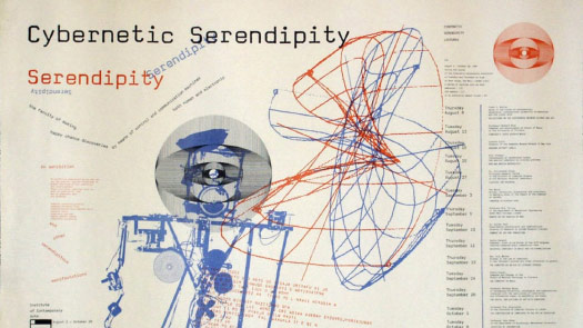
We’re here today in part to celebrate Cybernetic Serendipity, 50 years later.
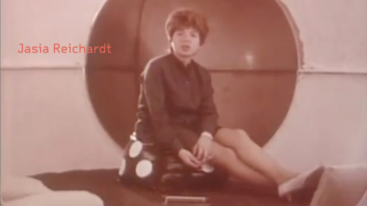
Jasia Reichardt spoke this morning, and 50 years ago she was in a video introduction to the exhibition, and in it she said this:
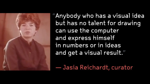
She said: “Anybody who has a visual idea but has no talent for drawing can use the computer and express himself in numbers or in ideas and get a visual result.”
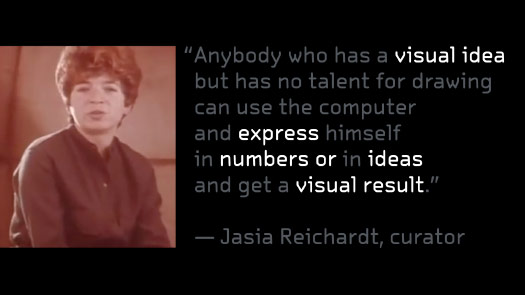
And if we pare this down a little bit, she’s describing a process ...
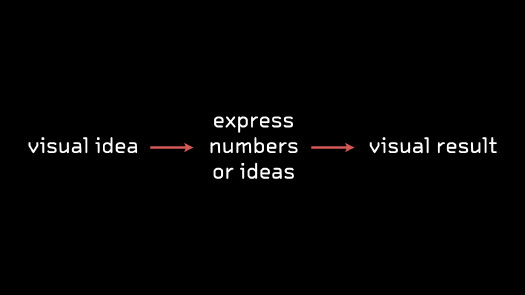
... and it’s a process that is still relevant, and still used, 50 years later.
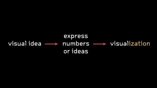
Today we might call a visual result a visualization, but it’s essentially the same process.
But I think that many visualizations stop here — you express some numbers, you express an idea into a visualization and then you’re done.
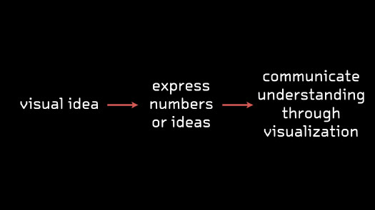
But in the type of work that I do, which is communicating scientific information to a general audience, I really care that that visual idea makes it across — that it makes it into the visualization.
So what I’m looking for is to communicate some type of understanding. That original visual idea, does it carry through to the final visualization?
And so another way of putting this might be to say that my job is to communicate visual ideas.
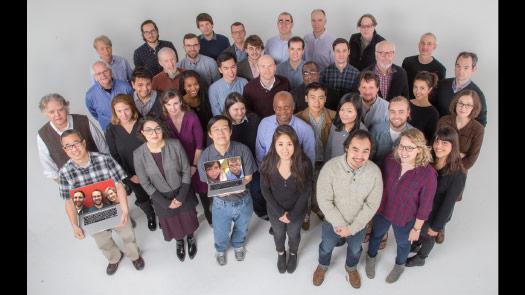
I work on the graphics desk at the Times.
This is how we looked about a year ago, and I think everybody here — though they might express it differently — that’s their role, that’s their job, that’s what they care about: communicating visual ideas.
I’m the Science Graphics Editor, so I work with a lot of science publications and scientific data.
So I’m trained as a designer but I work as a translator.
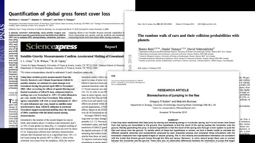
I’m actively trying to take scientific papers and break that chain of communication from one researcher to another researcher.
I want to intercept that idea, but I’d like to find a visual way to communicate it to someone who does not have this terminology. Who may not understand the jargon, as I often do not.
So can I take this idea that the researchers are trying to communicate to each other, and can I then take that out and find a visual explanation for it?
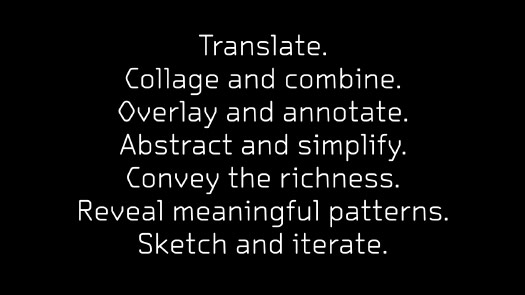
I try to collage and to combine.
Often you may have multiple different sources or different figures throughout the same paper.
Can I pull them together instead of having them scattered across, in this case, two different papers by the same author.
Can I find a subset of these? Can I pick little pieces that I think will work together?
And then can I combine them into a visual whole, something that tries to sum up the idea of that paper, and then present it visually?
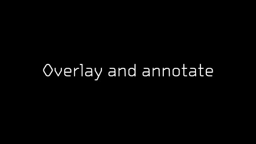
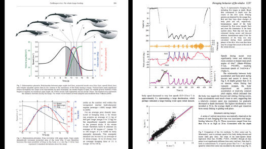
I try to overlay and annotate.
If you’ve looked through scientific papers, you see that there tends to be an image or a photograph over here, and then right next to it is the text that you need to read to understand what’s going on.
And so the act of reading a paper — or many visualizations — is this sort of zigzag back and forth, where you’re looking at the image, then reading some text, then trying to apply what you just learned to the visualization.
So can I take these pieces of text and this artificial separation between image and text, and can I find ways to combine them?
Can I rewrite the text, can I break it apart, can I put it where it’s needed in the graphic so that it stands together as a unified whole and I’m not looking in multiple different places to try to come up with the story, or to understand the graphic?
I’m trying to abstract and to simplify.
And so it may be that a New York Times reader first thing in the morning may not want to see this level of detail, right?
So maybe it’s abstracting that away.
Or maybe it’s finding a hybrid version that references the real world, and then from there to quickly move to something that is a little bit more abstract.
And if I’m working on a cellular level or a molecular level, maybe most of the cell gets abstracted away, and the only thing that I’m really emphasizing is that one mechanism, or that one piece, or that one interaction.
Can I really dramatically simplify this to convey that visual idea?
But no matter how much I’m simplifying or abstracting, I don’t want to lose sight of the full data set.
I want to find a way to hint at or to convey the richness of that data.
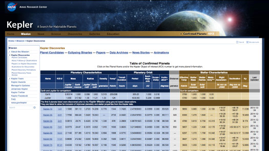
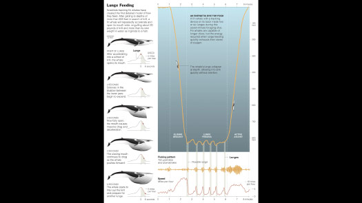
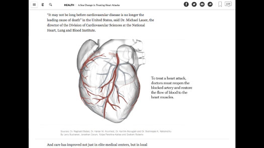
And so one of the examples that Maneesh referenced was the Kepler data set.
The Kepler Space Telescope spent years staring at one patch of sky, and it found thousands of planets by looking for little dips in light as the planets went in front of their stars. And it was this enormous data set.
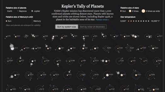
Can I take a small subset of that dataset, and can I find a way to draw little diagrams, to make little star systems, where each of these dots is a planet going around a star.
Can I highlight outliers, and can I try to convey a sense of the variety and the richness of what was found.
And can I do that by using similar scales in the sizes, or the times of planets orbiting.
To give a sense of the richness of the data, of what this device has found.
But along the way I want to make sure that I’m always revealing meaningful patterns.
I am a designer, and at the end of the day I would like to have a nice design, but I want to make sure I’m not imposing a design on the data, or making the data fit a preconceived design.
I always want the imagery, or the data, the numbers, to lead me to the solution.
And then find a way to then take my annotation, my explanation, and fit that into the design or the pattern that’s been resolved.
And that can take some time, sometimes that could take weeks to find the right combination of imagery and numbers.
And I think that everyone in that photo you saw of the graphics desk, they’re all very comfortable with the process of sketching and iterating, trying things quickly, being very free to throw them away if they’re not working, and start again.
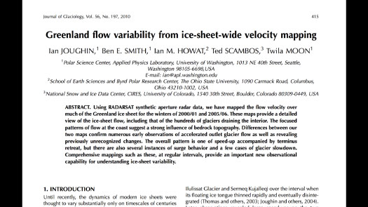
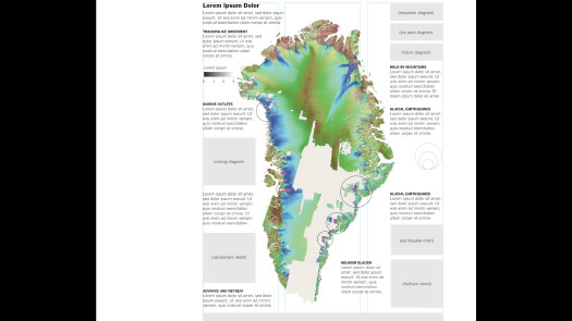
So one example of this is: I was trying to explain how ice moves across Greenland, and I looked through dozens of papers, and I was getting a little worried because I hadn’t found anything that really made the point to me visually, that I could then explain.
And I finally came across this paper, and when I saw this image I thought: “Oh yes, this is something I can explain!”
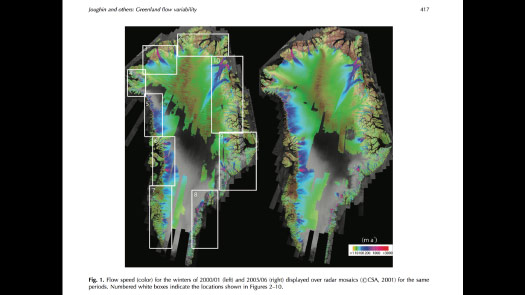
These colors are showing how ice moves and flows across Greenland.
So I contacted the scientist and got the data set and basically put it on a blank sheet of paper and then started sketching around it.
I know this is the core of my graphic, this is what I want to explain, but what are the pieces that I need to explain this to somebody who may have no technical background, no technical knowledge?
(Here I showed a video of dozens of versions of the graphic in progress.)
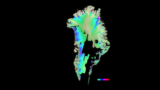
Maybe I need a little more height, maybe I need more width. I start to overlay data on top of it. I start to pull from other sources and make these smaller graphics that support the visual idea that I’m trying to communicate.
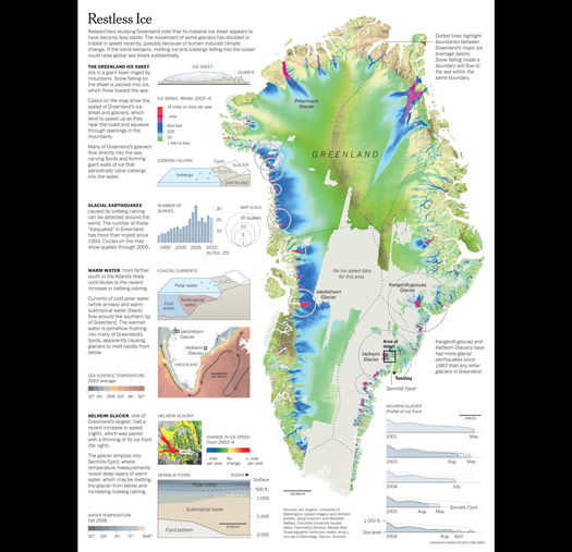
So this was about two weeks of work — and then here is the final version.
And so the graphic is fairly dense, and it does take some time to get into.
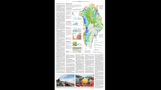
But this is something that can work, especially in a printed format where I can give it a large amount of a printed page and have it sit next to the article.
So these are some of the things that I think about when I’m trying to communicate scientific ideas and scientific concepts to a general audience.
But I’d like to show how they might fit together for a larger project that involves many people at the Times.
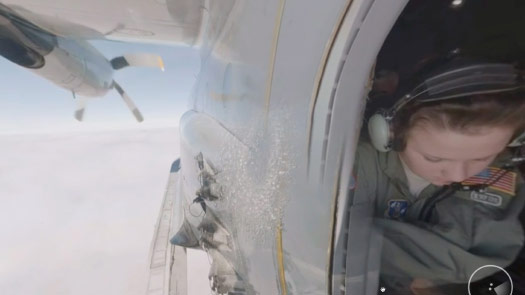
So last winter four of us went down to Antarctica and spent two weeks there.
We were there on a media grant from the National Science Foundation, and we were embedded with the Rosetta Program, which is a project out of Columbia University and other organizations.
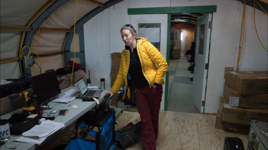
They are set up in a heated tent on the edge of an airstrip, and the airstrip and the tent are both on the flat white plain of the Ross Ice Shelf, and that whole plain is slowly moving towards the ocean.
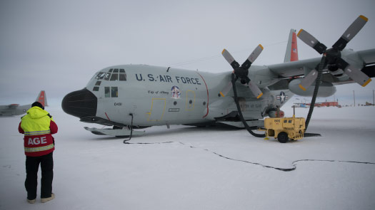
So what they’re doing is they’re flying in the back of these LC-130 Hercules, which are the largest planes that can land on skis.
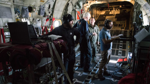
And all their equipment is designed to be forklifted up and put in the back of these planes.
And so we’re flying with them, and the whole reason for this project — what their equipment does is it looks through this ice, which can be 1,000 feet thick, both visible and underwater. And they’re trying to map the structure of the shelf and they’re trying to map the structure of the bedrock underneath it, which we know very little about. Some of the most unmapped sea floor in the world.
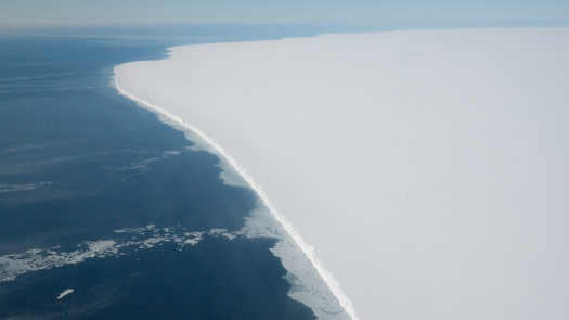
Another hour into the flight and you’re just surrounded — you look out the window and it’s just white as far as you can see in all directions.
And you’re told — they tell you — that this ice is moving, everything is moving towards the ocean. But you can’t really picture it.
And so we knew that, when we got back, this was the visual idea that we had to explain.
The ice flows, the ice moves.
How can convey that to someone intuitively and immediately?
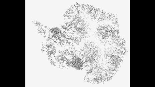
The data is not that hard to find.
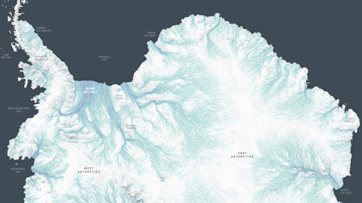
Just like in the Greenland map that showed the velocity of ice, there are maps showing velocity data for Antarctica.
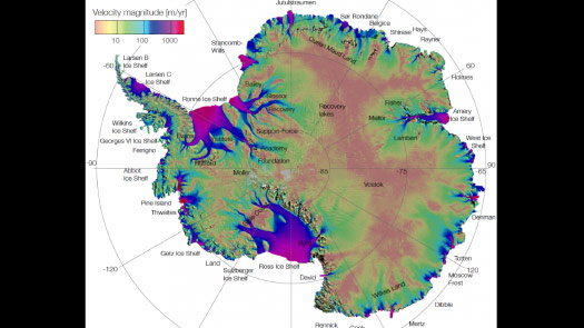
But this rainbow color scheme is difficult to parse.
It’s difficult to get an immediate read of where the ice is moving fastest and what the pattern is like.
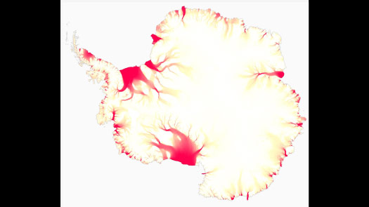
And so we took the data and started to play with it.
Can we show movement as solid fields of color, accelerating out into these huge ice shelves?
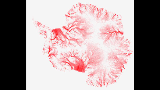
Do we break it up, sort of like the wind map that Fernanda Viégas mentioned?
Or do we try to give it some texture, do we try to — instead of long streams of ice, do we try to give a little bit more texture to help the motion?
And this was the direction that we finally settled on, this was one of the sketches that we iterated through ...
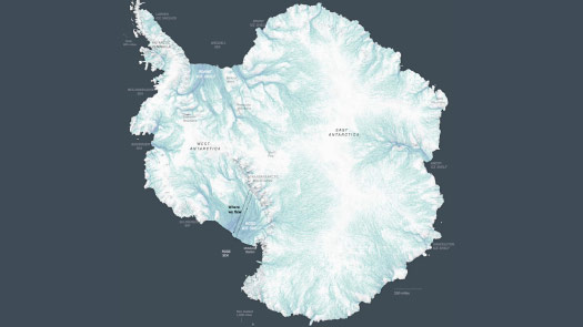
... and then this was the visualization.
It’s a little hard to see it moving on this screen, so I’ll show a detail.
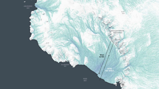
But it’s basically showing that ice from East Antarctica and West Antarctica — which is grounded, which is on the ground — is flowing through mountains and down over the ocean.
We wanted to convey a sense of scale, and this let us start to overlay information like where we flew.
And so the response, we took the two scientists we were working most closely with, and we brought them into the Times and we put them in front of a monitor where we had a prototype of this. And then we just kind of sat back and watched them.
And it was this really wonderful interaction where they imemdiately were pointing at things and naming things and saying, “Oh, that doesn’t look right,” and coming up with the explanation. So they were finding their own outliers, they were applying their own knowledge.
But just the way that they looked at the graphic and interacted with it — it wasn’t that they hadn’t seen this data before, it was just that we were trying to show it to them in a different way.
That was heartening because if they, who are very familiar with this data, saw it as something new or a different way of visualizing it, then we thought that this is something we can explain to a general reader.
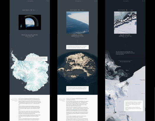
And so we ended up making three online articles, each topped with a large graphic.
And again, it wasn’t that the data itself was hard to find or hard to use, it’s that we were pulling it out and treating it in such a way that we were emphasizing communication.
We were trying to hone the visual idea and to put it in front of a reader with no technical knowledge. Trying to make that connection, to let them come to the point of understanding it — in a way that we had understood it after many months.
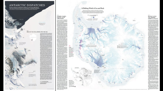
And then in print it looks something like this, we were able to use the beautiful resolution of paper to — we can’t show animation, but we can hint at that movement, hint at that texture, hint at the rich data that’s behind these pieces.
But can we go a step further? Can we place you there?

We took photographs while we were there, but we also brought virtual reality cameras.
(The slides that follow were video clips from The Antarctica Series)
We could put cameras in the window of this plane — it’s basically a bubble window — and we can give you a sense of what it feels like to see that 100 foot wall of ice coming at you as you’re flying towards it.
And we can use the voice of the scientists to narrate what’s happening, and narrate their sense of wonder and why they’re doing this work.
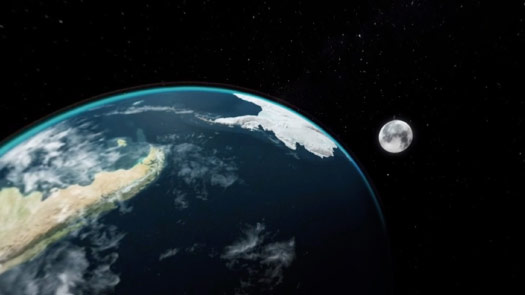
And we can combine that with — we can pull that flat visualization into this three dimensional world, put it on a globe and, whether you’re looking at it like this or in a VR headset, have that world beneath you.
We can start to overlay information on it, and show every flight that this group of scientists has taken, how they’ve divided this shelf in a grid and are flying back and forth over multiple years to obtain their data. And we can convey a sense of scale, using the outline of Texas.
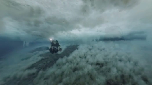
And so we filmed above the ice, we filmed on the ice, but we wanted to show you underneath the ice.
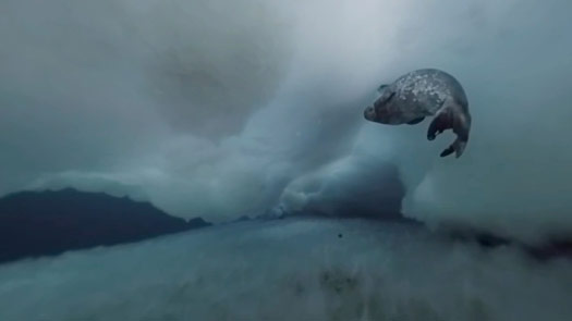
We worked with research divers who did an incredible job filming underwater while swimming with seals.
Although there’s data visualization involved, we tried to make it seamless — or as seamless as we could with the actual footage.
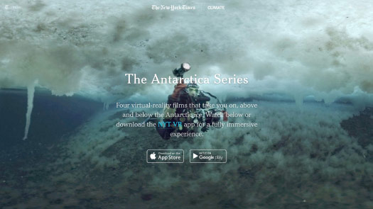
And this became a series of four films called The Antarctica Series.
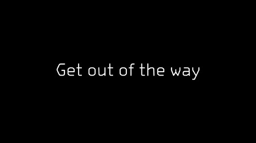
And what I enjoyed in working with virtual reality was that it was a reminder to just get out of the way, to just get myself out of the picture.
When we set up a camera we set it up about eye height — human eye height — so that you get a sense of scale.
But then we very quickly go run behind a rock and wait while it’s filming, because we don’t want to be in that image.
We want you to appreciate the scenery, the landscape, the place that we’re filming.
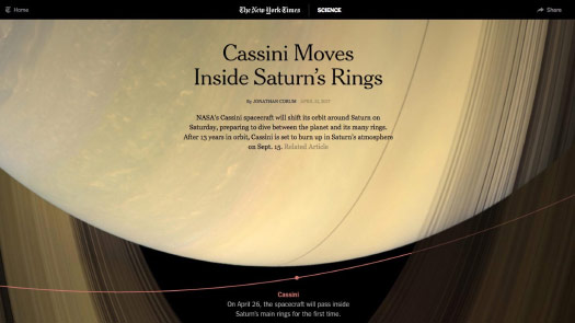
And when the Antarctica project was over, the next big project I worked on was the end of the Cassini mission, which was last September, where the spacecraft flew into Saturn.
And I realized that the virtual reality had reminded me to take myself out of the picture.
Can I just show the data and have little — not interference, but not burdening the reader with lots of technical detail.
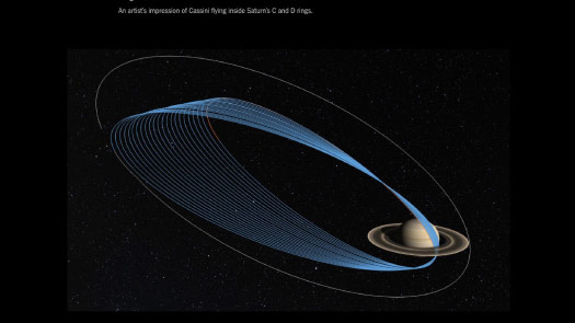
And so in the months leading up to the end of the Cassini mission, I made graphics about Saturn’s rings and where the spacecraft was flying.
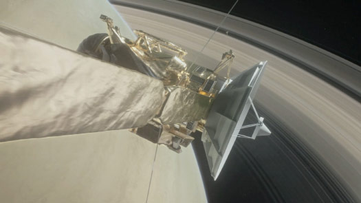
We made movies explaining what the spacecraft has done for humanity and what it’s taught us about the Saturn system.
And we published this video about a week before the spacecraft met it’s end, diving into the planet.
And I thought, that’s it. This has been an incredible run for Cassini, but I think that’s my last Cassini project.
But then I started looking around and realized that all these other publications were starting to make their own galleries of images.
And when I was looking at them I was realizing, well, it doesn’t feel like they are getting out of the way, right?
I didn’t disagree with their selection of images, but it just felt like an image and then a huge block of text.
And if your block of text is larger than the image that it’s trying to describe, to me that feels like it’s not trying to help the viewer or the end reader.
This feels very similar to what I’m working with on a daily basis: scientific papers. To me it didn’t feel like that different of a presentation.
And so seeing this made me realize: “Okay, I’ve got a week, but I’ve got to do something with the Cassini imagery.”
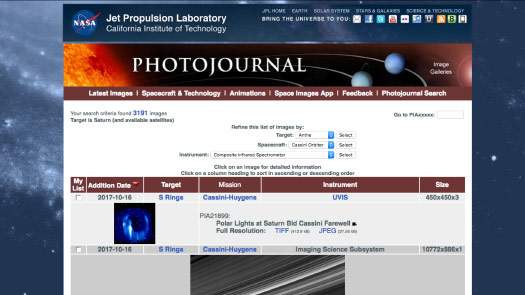
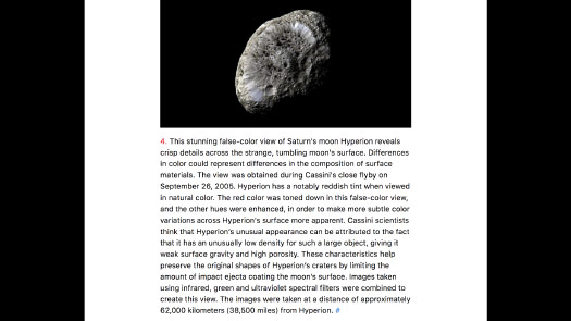
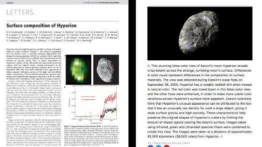
And so Cassini took about half a million images in its 13 years around Saturn, and I knew that it wasn’t possible for me to go through those.
So I went to look at these roughly 3,000 images that were officially published by NASA and I condensed them down to 400, and from there I got to 100. And that was some of the hardest work that I’ve done because it was like throwing away family photographs. It was these incredible things that I’d seen.
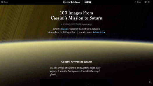
But I finally got it down to 100 images, and in a way I treated it like a virtual reality script. I tried to write in scenes, I tried to make every word count, to not bombard the reader with numbers that — yes, are relevant, but may not fit the larger picture, or the long term mission.
I tried to have it so that each image sort of spoke to the next one, so that there was a nice flow through, a nice texture as you worked your way down the page.
I wasn’t sure if people would even make it to the bottom of the page, scrolling on a cell phone it’s a commitment. But they did! People were spending minutes of time looking through this and making it all the way to the bottom.
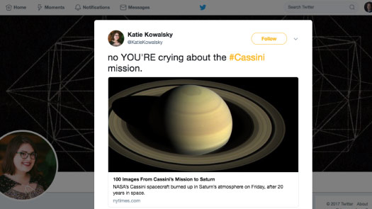
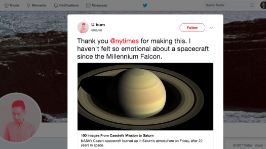
And so I think there was a collective, kind of, despair about the end of this mission.
And so the comments that I got were really lovely and many of them were like: “Oh, I was crying halfway through.” And that’s great!
If I can make a reader cry then I’ve communicated something. Some part of that idea I was trying to get across has made it there. So if I can make you cry, then yes! I think that work is complete.
(Laughter.)
I’ll let this one go.
And so I was very happy that our afternoon session today was called “Revealing Hidden Worlds” because it feels like that’s what I’ve been trying to do for the last few years.

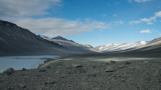
Whether it’s this world ...
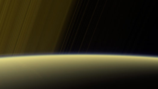
... or this one.
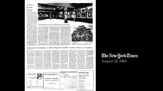
And I wanted to go back and see how the the Times covered Cybernetic Serendipity.
And we did — there was a review in 1968.
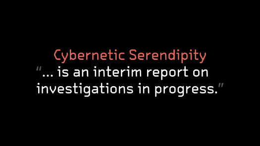
And the reviewer — he said something that I thought was really lovely, he said that Cybernetics Serendipity “is an interim report on investigations in progress.”
And it feels like that is still applicable today, 50 years later.
And the reviewer went on to say that: “The computer is a tool to extend our intelligence.”
And that: “How we see, hear and understand, how we process information, articulate and communicate it ...”
Right, these are all things that I care about! These are all things that I have spent a lot of time thinking about.
But with the computer, all those processes “become capable, not merely of investigation, but of reformulation.”
“And somewhere in there are some of the processes by which we create art.”
Thank you very much.
Thanks to the organizers and the other speakers at Revisiting Cybernetic Serendipity.