

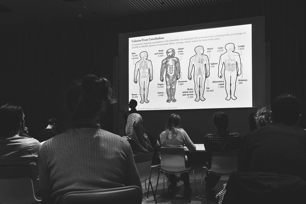
Photo by Niamh Higgins
April 16, 2018
I gave a workshop and talk at SUND, the University of Copenhagen’s Faculty of Health Sciences.
Here’s a lightly edited transcript:

Thank you very much for being here. Thank you for the introduction.
It’s great to be back in Copenhagen.

One of the first times I was here was in 2001, and after a week or two my laptop broke.
And so I went to get it replaced ...

... and for the next four or five years my laptop had all these extra keys.
Eventually I got pretty good at using it, but it definitely slowed me down and made me think.
And I realized it was a reminder that designs are made for audiences, are made for people. And if there’s a mismatch — this design was not made for me — then it can cause confusion, it can make you think, it can make you try to decipher what’s going on.

And in my work — in trying to explain scientific ideas and concepts — I try to avoid that kind of a mismatch.
So the title of my talk today is “Design for an Audience.”

And so the question is: Who do we make graphics for?
I know many of you make graphics. I make graphics. Who are we making them for?

I work at The New York Times, so I have the luxury of having a pretty well-defined audience: Times readers.

And, by extension, the larger public — who might not yet subscribe to the Times, but maybe we’ll try to get them to do so.

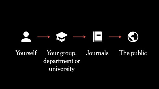
But as scientists or researchers or students, you might have many more audiences than just one.

You might be making graphics for yourself — and you might be making many graphics as you’re trying to come up with an idea, or process data.

And then some of those graphics might find their way to your group, or your department or the university. And maybe they’re vetted, or presented and revised.

Maybe a small number of those graphics find their way into a published paper.
And that might be the goal for you as a scientist: To get work into a published paper.

And then, beyond that, maybe you’re interested — or maybe you’re pressured — to communicate your work to the public.
So in a way, you might have a harder job than I do, because you have many different audiences that you’re trying to reach, and they might require a different level of terminology, of writing, of simplicity versus complexity.

Normally when I give talks I try to talk about the bigger projects, the projects that take many weeks or months of time, or involve many people on the graphics desk.

This is one we did last year about Antarctica, and how ice flows across the continent. And you can see this in virtual reality.
But today I thought I’d rather talk about some of the smaller pieces, which might be only a day of my time, or a couple days, and that are more closely tied to scientific papers.
They’re small graphics that might serve a purpose with one article, and then disappear.
But they’re just as important because we need to explain, and sometimes an article alone might not be enough. So I try to look for those moments when I can make a graphic that helps explain, or helps communicate a scientific idea.
And so when I’m trying to figure out what that graphic might show, this is what I’m doing.
I’m trying to find a visual idea somewhere in that work, somewhere in that research or in that paper. Something that I can communicate.
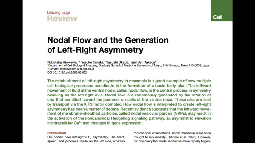
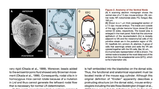
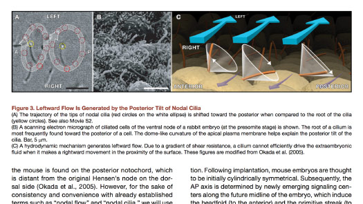
And so, for instance, it might be something like this: What is the origin of left-right asymmetry?
So a developing embryo, maybe it knows its head and tail. How does it determine what is left and what is right? I have no idea, and so I start to talk to the reporters, I start to read papers.
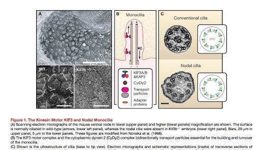
But often it feels like the graphics in papers start halfway through the process.
They might assume a level of technical knowledge that I don’t have — but maybe some of you, or many of you, do have.
So I need to look up the words and try to understand what the paper is saying.
And then maybe there are pieces in here that make me think: “Oh, ok, I think I’m getting the picture.”
Here’s a picture of a mouse embryo. This is at least giving me some context.
This is something that’s starting to get into that visual idea.
It looks like there are these cilia, and that they’re pointing downward, and that as they wave around some fluid flows to the left.
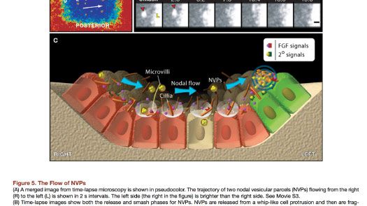
That flow is detected, and the direction the liquid is flowing toward becomes the left side of the body.
So that’s fascinating, right? I mean, it’s covered with acronyms and things like that, but it’s really interesting.
So then that becomes a kind of “aha” moment. This is something that I can explain.
Probably not with these words, maybe not with this level of detail, but it’s a visual idea that I can find some way to translate for my audience, for the general public.
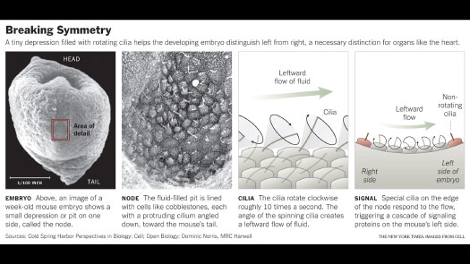
This was a fairly small graphic, but in making it I tried to pull pieces from the different papers, from the different figures to try to explain the idea.
So starting with the large scale, focusing in on the area where this mechanism happens, then showing that leftward flow and what it means. And trying to break it apart into a series of steps so that someone with no technical vocabulary can find their way through.
And if there is any kind of technical term that I want to use, I need to introduce it and define it. So I’m really looking for ways to communicate with plain language.
And I’m trying to tell a story. Even if it’s a very small story. Even if it only takes up this much of a printed page, or a small part of an article.
I’m trying to find something that would resonate or communicate as a story.
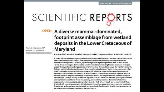
And so, for example, a couple of months ago they released this paper.
A scientist was waiting outside a NASA facility for his wife, and he noticed a patch of dirt that looked like a dinosaur footprint, and it was.
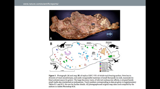
And they discovered this fairly large slab covered with tracks — small mammal tracks, and then small dinosaur tracks that seemed to be hunting them, and some larger dinosaurs as well.
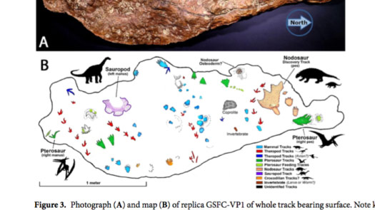
So the graphic they used to explain this — to sort of decipher the slab — was quite lovely.
They’re using color-coding, they’re using these small icons, but it has this elaborate key. And so I thought this looks like a great story, but I don’t want people zig-zagging back and forth to try to decipher this.
Can I refine it a little bit for the public, to take it out of the context of a scientific paper?
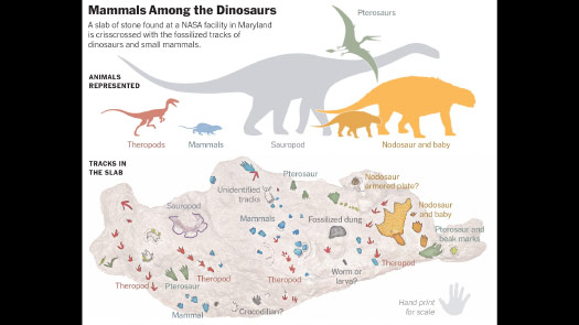
And so here’s my version.
I took those small icons, which were kind of put into the space wherever they fit, and with the luxury of space — not being in a scientific paper format — tried to use a relative scale, tried to introduce something that you might picture as a story.
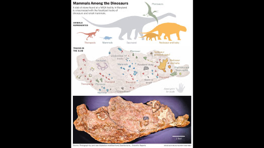
These are the kind of animals that were walking here. These are the tracks that they made, in the same colors.
And then pair those illustrations with the actual image of the slab.
So it’s not a huge difference from what the scientist originally did, but I’m trying to clarify and refine it a little bit, and then give it to the public and make it easier for them to understand.
So whenever I’m working on a graphic I try to think: “Is there a way that I can focus the reader’s attention?”
I want to make graphics that are worth paying attention to, even if it’s only for a few minutes.
So can I focus that precious attention and not immediately scatter it, or make someone wonder, or make them think about what I am trying to show?
You’ve all seen this “infographic” style of graphics, and many of them feel like they are not respecting my attention.
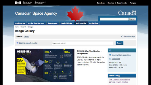
This is a spacecraft that’s on its way to an asteroid. It should arrive in August.
And if you look at a graphic like this, it makes me think: “Ok, what should I be paying attention to?”
Yes, there’s a big spacecraft, but it’s next to this big block of yellow text. Is that what I should be looking at, or something else?
It feels like I’m being pulled in different directions, and I have to kind of assemble the idea for myself.
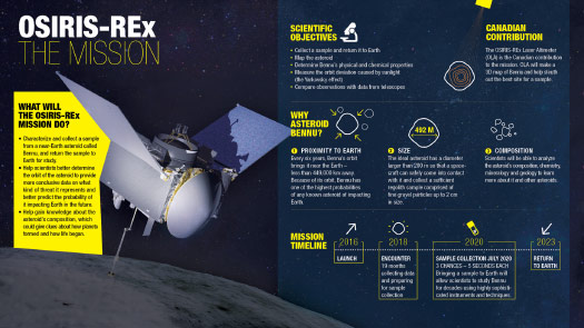
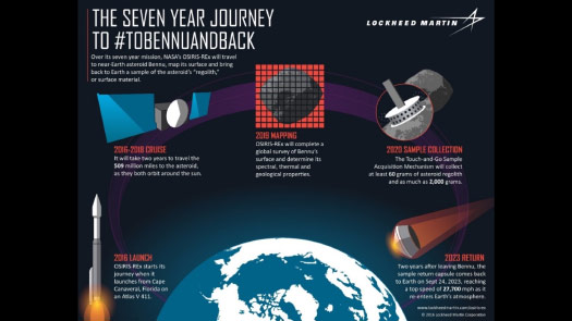
Or something like this. There’s a lot of information here, and it’s separated in boxes.
The numbers are trying to help me through the visual, but it still feels like I’m not quite sure where to look, where I’m supposed to start.
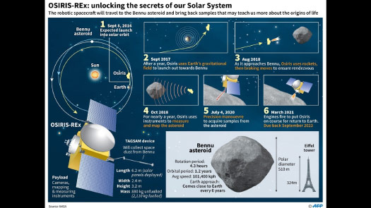
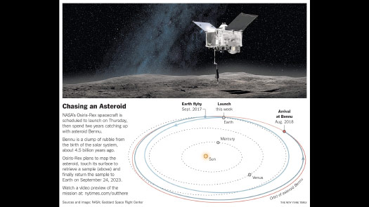
This is a simpler presentation. It’s giving a visual arc, but it doesn’t quite match the text’s “seven year journey.”
It looks like the spacecraft’s just going a little bit above the Earth and coming right back down, which is not the case. But this is doing a better job of focusing you, and leading you through the graphic.
So my version for print was actually quite simple. It was just an image of the spacecraft and then a detail showing — this is from when it was launched — showing what it was planning to do, how it was going to get to the asteroid.
It wasn’t the full picture, but I was trying to edit it down and just give a piece of information that begins to tell the story of the spacecraft.
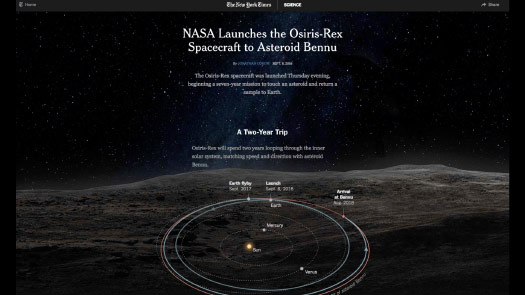
And then online there’s much more space. I can start to add animations. I can start to show what we think the asteroid looks like, from radar imagery.
I can start to tell a more elaborate story than in the small printed piece.
And as I’m doing this — especially as I’m looking at scientific papers — I’m really trying to show the content.
I’m thinking: “Am I looking at the data, or am I looking at a framework that somebody has put around the data?”
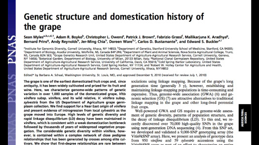
And so this was a paper about grapes and wines — how different varietals are related to each other — and my Times readers might be interested in this.
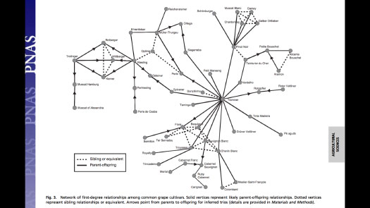
The chart that goes along with it is a sort of family tree, and it’s just very — everything is bold, right?
It’s really hard to interpret because the lines are quite dark. The text is, in some cases, overlapping the lines. It’s difficult to know where to look, and it’s difficult to read.
And if I can’t read it, or if I’m forcing my reader to spend a lot of effort to read it, then that’s counterproductive to communication and to telling them a little story.
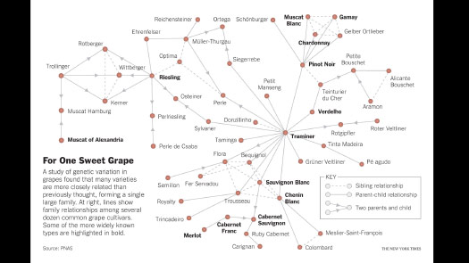
So can I take the same figure and then try to differentiate a little bit? Can I let the lines fade out? We can still see they’re there. We don’t need them shouting at us.
And can I start to make the text more legible? Can I highlight some names that readers are likely familiar with, so they have an idea of some of these wines? Can I help them find a way to put their knowledge into the graphic, so that they can see: “Oh, yes, I know these five. I can see how they might fit into a larger family tree.”

So I try to eliminate that kind of heavy visual framework and get closer to the data whenever possible.
And also I often want to show an image that can be read fairly quickly, and not a table of data.
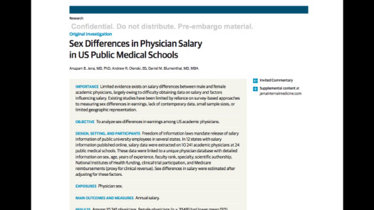
This is a paper about pay differences among doctors in U.S. public medical schools.
It’s pointing out the difference between men and women, but they’re presenting the data in a table — which is great if you’re looking up a specific number, but it’s not great if you’re trying to make a comparison, or if you’re trying to encourage people to make visual comparisons.
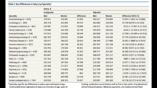
So if I ask you, or if I’m looking to figure out: “Well, who’s paid the most? Who’s paid the least? What’s the greatest difference here?” It’s difficult. It will take some time. You have to scan through.
It’s difficult to get an immediate sense of what these differences are. To build a mental model of what’s going on you’d have to read through it, right?
The table certainly has a place in an academic paper. But I immediately want to take the data and try to visualize it, even if it’s a very small visualization.
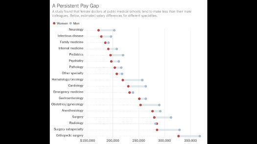
So this was a simple graphic. It took just a few minutes to make, but now the data is sorted in a way that tries to communicate something.
Whereas before, the table order was alphabetic, right? I know the alphabet. My readers know the alphabet. I don’t need to reinvent it for them or show it to them. They can find letters if they’re interested.
(This graphic was made with an internal NYT tool called Mr. Chartmaker, by Gregor Aisch.)
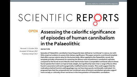
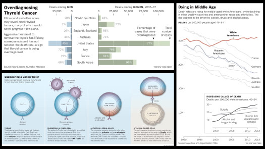
So here is a paper about cannibalism.
This is great! This is something that people are going to want to read.
But again, it’s just a table, and it seems to be in a sort of semi-random order.
So how do I convey this information? This is something that you want to see.
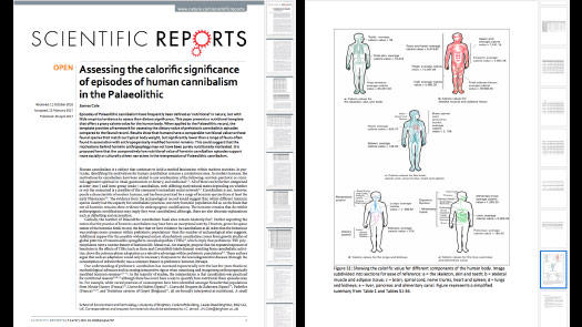
And so I think there were no graphics at all in the original paper. It was just table after table.
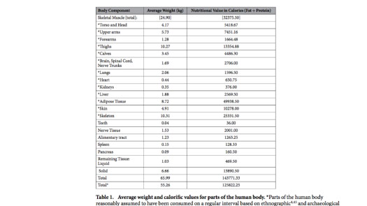
But in the supplemental information there was this chart, which is great.
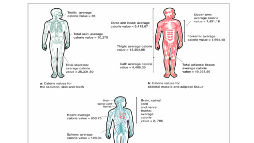
It’s trying to break down, by body part, the estimated calories that each contains.
But there’s a lot of redundancy here, right? The word calorie I think appears 20 or 25 times on this page.
So it’s a very formal presentation with a lot of redundancy, and it’s spread out. They had a whole page to fill, so it was a lot of empty space.
But the illustrations are great. This is that “aha” moment. This is something I can explain visually that will catch someone’s eye. And it will help lead them to an understanding of what these scientists were trying to show, what they spent all this time and effort to come up with.
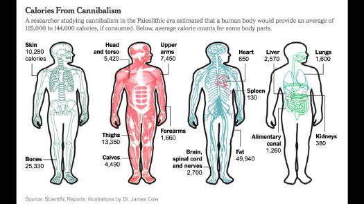
So I basically took the same illustrations — and credited the researcher — but I just tried to remove that redundancy, to bring them together into a unified whole.
And then I tried to put a sentence or two on top that conveys the essence of that paper.
So it’s not a table format. Maybe there’s a little data that got left behind, but I think the immediate read for the general public really outweighs that kind of problem.
So a big part of design is just being consistent across the board.
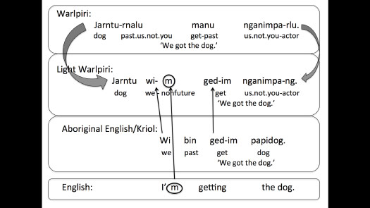
This is a chart about the development of a new language that’s emerging in Australia. And it’s a nice idea, showing the three other languages that are influencing this language.
But when you look at it, there are some curved arrows, some three-dimensional arrows, some other arrows that are straight. Some arrows point to circles and others don’t.
It’s hard to know immediately if there‘s some difference between the 3D arrows and the straight arrows. Is there a reason that some words are circled and some are not?
It’s a lack of consistency that raises questions that may take some time, or some effort, to answer.
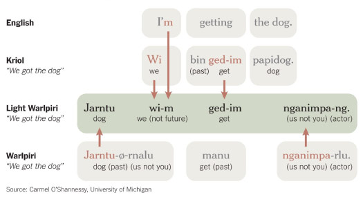
It turns out there’s not really any difference in meaning. It’s just a stylistic difference. So can I make this a little more consistent in the way that it’s presented?
So here — picking one style for arrows, using color to link words to arrows and help differentiate what had been done with circles in some places.
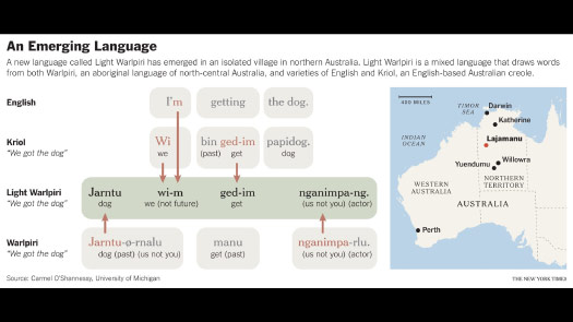
And then can I add a little more context? Can I show where this is happening, what part of Australia this language is emerging?
So I’m basically recreating the chart, but I’m trying to turn it into more of a visual story that’s easier to read. And make it easier to convey the idea of borrowing influences from other languages.
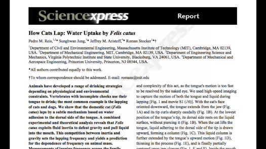
How cats lap, how cats drink.
This is someone who really wants to be on the front page of The New York Times.
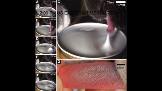
So this is great, right? They took the time to use high speed cameras — I don’t know how many tries it took them — but they took the time to get a cat drinking on a high-speed camera.
The images are great, but there’s a little bit of inconsistency here: A, B and then C becomes much larger, and then back to D, E, F, right? And I know why they did that, because C is the moment that they’re interested in.
It turns out that cats don’t drink like a dog by scooping water, but the tip of their tongue — being held right here in G — is smooth. And so they just tap the surface and it raises a column of water that they can bite off. So that’s great. That’s a lovely visual idea. But having one image much larger makes it a little bit of extra work to scan down and try to compare this to that.
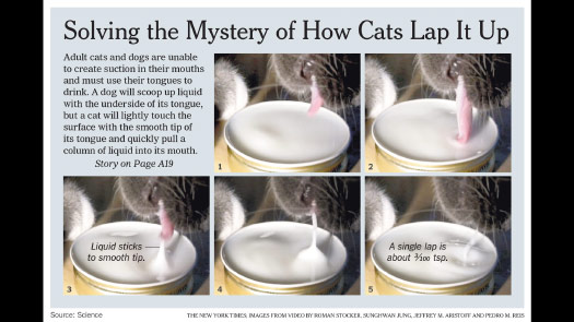
So it would be much better if these were the same size running in a strip.
And I couldn’t quite do that because of space limitations, so I at least put them side by side and gave a little bit of text emphasis. The moment that’s important, let me actually put some text there to tell you what is happening.
So that even without reading the introduction or reading the story you can get an immediate sense of what’s happening here.
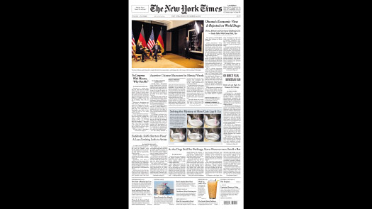
And the reason I couldn’t do it in one horizontal strip is because it did actually make the cover of the Times.
So if you’re interested in that, then yes, I think cat and dog research is the field to be in.
(The headline immediately below the cat graphic was “As the Dogs Sniff for Bedbugs, Some Homeowners Smell a Rat.”)
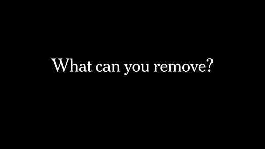
So what can you remove — that’s the question, right?
Even if I’ve been working on a graphic for a week or two and I feel like it’s almost done, I still ask myself: “Is there something here that I could remove, that won’t change the story but will simplify the presentation, or will smooth the understanding, or will make it quicker to read or understand?”
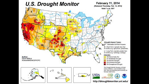
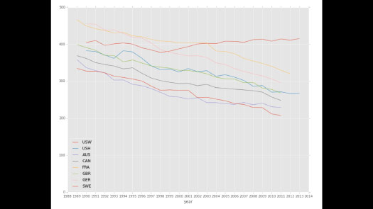
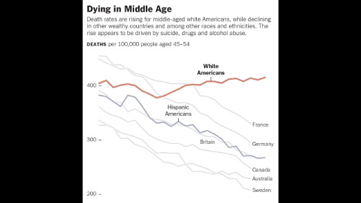
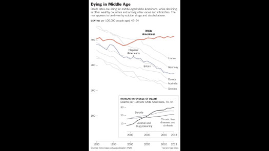
Many scientific graphics, and many graphics published by the government, tend to have a lot of stuff between you and the data.
There are a lot of lines here. There’s a bunch of logos, heavy dark lines, heavy rivers. I might be interested in the drought data, but it feels like layer after layer has been stacked on top of it.
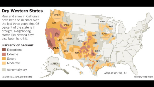
So what happens if I start to pull that away? Can I try to reveal the data a little bit more? I probably could’ve gone farther than this, actually, but can I add a little more context? Can I start putting labels on some states so that people can identify themselves, or find themselves more easily in the data?
So it’s not a dramatic change, but it’s really just a process of removing, and then slightly reworking what’s left behind.
So just like the cat drinking, I always want to find a way — if I can — to reference the real world in my graphics.
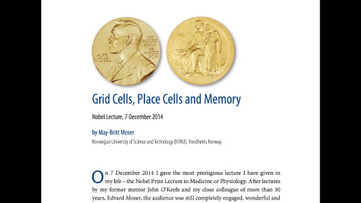
So I think the 2014 Nobel Prize in medicine was about grid cells. How we — or how mammals, at least — develop mental maps of the world.
And so the way this was done was by putting a rat in a box, and tracking where these grid cells were firing as the rat found its way around.
But the charts that made it into the paper — a Nobel Prize winning paper — are incredibly difficult for me to understand.
I remember looking at this and thinking: “How am I ever going to explain this to the public, to my audience?”
But it turns out that these black squares are the physical boxes — are representations of what was happening inside the box as the mouse walked around.
And so I think this graphic was done under deadline, the same day the prize was announced, and I had to come up with an explanation for it.
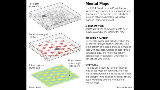
So fairly quickly I realized: Ok, well, I could pull some of those boxes as an example and I can show a line where the rat was running — where these cells were firing— and explain why it’s called a grid cell. And I could add that explanation right next to the images.
So in a way it’s a large caption, but it’s right where a reader might need to see it to understand.
I basically put the rat back in the box, and I think I’ve done that three or four times — putting a mouse or a rat back in a graphic, to give a sense of scale and to convey what actually happened.
Sometimes it feels like I’m adding a little bit of reality back into a scientific result.
I’m trying to draw connections between the images and the data.
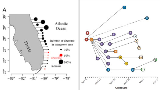
So this was actually a very nice chart about mangrove trees that are slowly expanding north into Florida, through climate change.
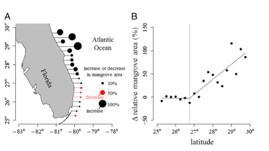
So the visual idea is great but the execution — you can see it kind of ran into some problems.
In some areas the mangroves were decreasing, so they had to introduce a color and explain what the color meant, and in some areas there was so much growth that the bubbles can’t be aligned, and so you get some strange offset patterns. And it’s also quite difficult to compare the size of circles. But the idea is great.
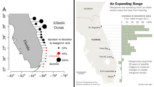
So can I take this and just try to redo it a little bit?
Can I use a bar chart instead of the circles, but show the same data? Then I don’t have the problem of adding a key, and I can use the extra space to explain what this pattern means.
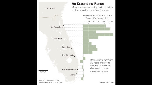
And can I make it a little bit more of a real map, so that people who live in Florida — and who might be very interested in this — can start to place themselves on the map?

So I think the theme here is really to explain why.
Not just what happened, or where it happened, but why this science is important.

So my daughter is almost three years old, and she’s at a point now where everything is a “why?” question. If we read a book, every page has two or three why questions.
And it’s a great stage. I mean, it can sometimes be a little frustrating to have to come up with answer after answer, but it’s a reminder that “why” is such a powerful and important question.
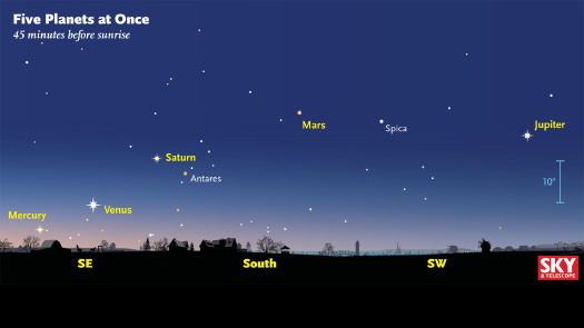
So in a graphic like this — this happened a few years ago. There were five planets in a line in the sky.
And so this is a very effective graphic at showing where to look to see it and what the structure is, how to identify the pattern.
It’s showing the planets relative to bright stars, so that you could theoretically bring this outside and find this line of planets in the sky.
But it doesn’t explain why they’re in alignment, and to me that’s the interesting thing. Why are these five plants in alignment now, and not at other times?
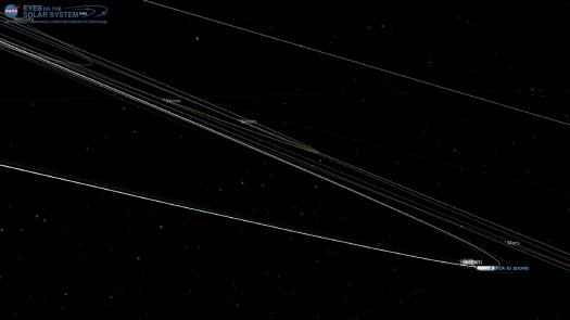
And so using free NASA tools you can spin the solar system around, get to roughly Earth’s perspective and you can see that lineup happening.
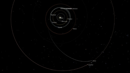
And from a top-down view it’s a little easier to see why the planets happen to be at this point in their orbits.
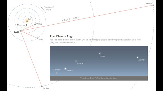
And then from this source I can make a graphic.
It essentially recreates that “what is happening and where it’s happening” graphic, but then it gives it a visual explanation why.
So that was an effort to provide some level of context.
Sometimes I’ll look at a chart — or you might look at a chart, and you might see patterns in the data, bumps here and dips there, and you might intuitively know the reason “why.”
But can you communicate some of that reason? Can you put some of that into the chart, and not into the text that accompanies it?
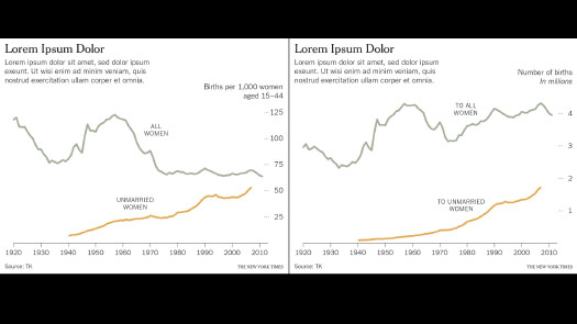
So here, this is looking at birthrates. This is an unfinished sketch of birthrates over about a hundred years in the United States.
And so how can I find some way to explain what these bumps mean?
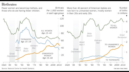
So one way to do that is to overlay or to underlay data. So I can highlight wars — you can see an immediate correlation here.
I can label things like the Baby Boom. People in the States have an understanding of what the Baby Boom meant.
I can start to add things that people will understand — will recognize — into this chart, so that they can start to answer questions on their own or come up with ideas for why there might be patterns in the data like this.
(Note that I want to be careful not to imply false causation, but events like world wars or depressions that affected the whole country are often fine to overlay on historical charts like this.)
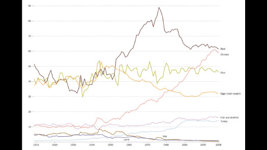
Take a chart like this. This is a chart of meat consumption over roughly the same time, about a hundred years.
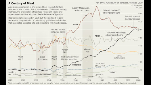
So can I underlay data to put this in context?
And can I add some annotation to show how beef consumption might have changed between the first McDonalds restaurant and the thousandth McDonalds?
Can I put things here that I think my reader might recognize, to help them find — not find themselves in context but maybe say: “Ah, ok. This is how much we eat now and then. Wow. I didn’t realize that trend existed.”
Can I provide a little bit of context to help the reader find something they recognize in the data?
And a lot of the time that’s easier to do — or it’s more helpful — if you stagger the information in a sequence.
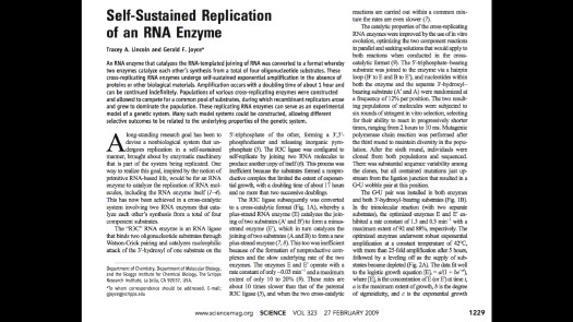
So this paper was about RNA enzymes that are replicating themselves.
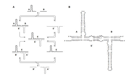
And there’s this elegant graphic in the paper, but it’s tough to — this kind of flowchart, it’s very difficult for me, without a lot of technical knowledge — where do I start and what does this mean?
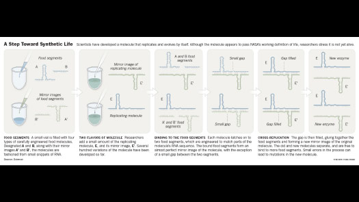
So can I break this apart? Instead of being a looping diagram, can I turn it into a sequence?
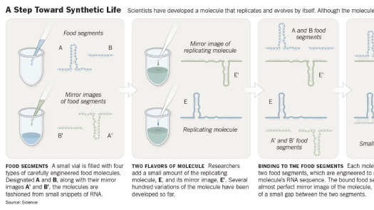
Can I add a touch of reality to hint at what the laboratory process might have been?
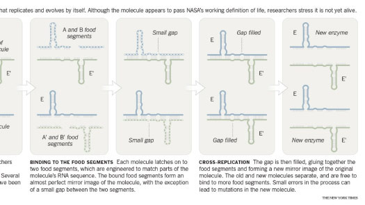
And then can I lead the reader through with annotation, to try to explain what’s happening at each step?
And so I spoke about trying to tell little stories, even very small ones, and it’s hard to have a story if nothing moves or nothing changes.
So I’m always looking for moments of movement or change.
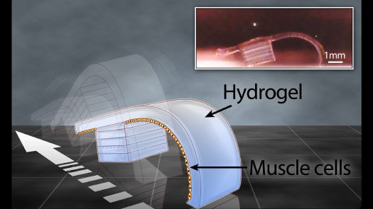
This is an interesting “biobot” that is coated with heart cells, and when the heart cells beat it moves along.
So you can try to show movement with this kind of ghosting, with the white directional arrow, but this was hard for me to read. It was hard for me to figure out exactly how this worked.
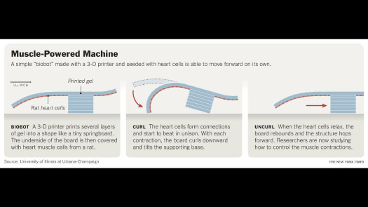
But after a while I did figure it out.
And I thought it might be better as a sequence, so that I can attach a little bit of text to each step and lead the reader through it.
And so as the heart cells beat, they pull the tail in. And as they relax, the biobot moves forward.
And I use this kind of sequencing all the time, to show things like cell motion.
To show development over time, or evolution over time.
And also to show mechanisms.
If I’m working at the cellular level, or the molecular level, and I’m trying to explain something, then often I’m editing away so much.
I’m just trying to focus on that one mechanism, or that one process, that I can explain.
And then I’m trying to draw and simplify it in such a way that I encourage people to make visual comparisons.
Whether it’s through illustration ...
... or photography.
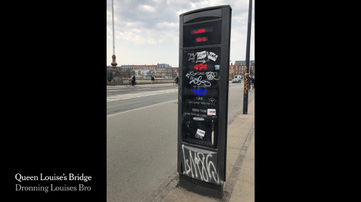
This is Queen Louise’s Bridge today.
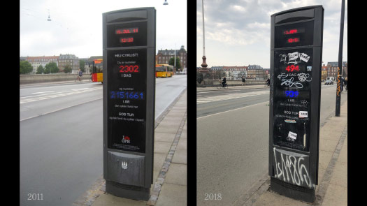
And when I was last in Copenhagen.
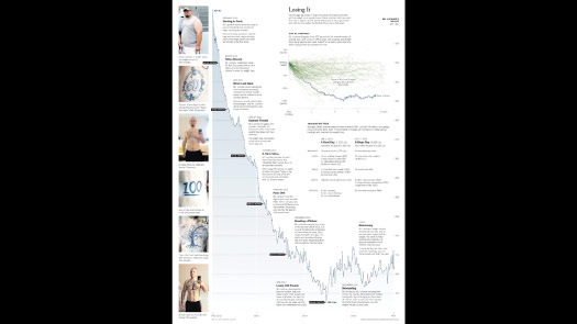
So you can see what seven years of time has done, right? In a way that if I said, “I was last here seven years ago,” it doesn’t necessarily convey.
So imagery, illustrations. Side-by-side comparisons are an incredibly powerful way to tell a small story.
And I know that many people here make a lot of bar charts. And they can be an effective way of making comparisons.
But here it feels like the graphic has a lot of graffiti on it, right?
It feels like there’s all this added text, this key, these confidence intervals, these footnotes down at the bottom.
It feels like a lot has been added to this data. It’s not particularly complex data, but it’s kind of hiding in this frame, and the labels are jumping around at different heights as you try to read it.
It’s not really encouraging a comparison, or at least a quick comparison.
So can I take that same chart and try to simplify it?
So place it side-by-side.
But with bar charts I often use a format that’s a divergent chart, where you can compare either side and compare up and down.
This is not a particularly interesting comparison, right? It’s almost the same on either side.
But this format gets much more interesting — and much more visually interesting — if there is that discrepancy.
So I use this format quite a lot. It’s good at showing rankings, and showing outliers, and it’s nice because it avoids diagonal labels or vertical labels.
It’s a nice way to present the text in a horizontal format that is easier to read and easier to understand.
And it can take some fairly large data sets.
And often it leaves you room around the chart to make annotations and to point out examples.
And that’s the part of what I’m doing — can I directly label pieces of data, and not tuck that information away in a caption or in a key?
So this chart has three lines, but they’re not labeled.
You have to look at a key and understand it. So you have to — even though it’s a trivial task, in this case — you have to look up and see: “Ok, this is this, this is this, this is this.”
So immediately you’re going back and forth, three times.
So can’t we just put the labels on the chart itself?
And similarly, every year here is labeled, right? I think we can all count. Our readers can all count. There’s no reason to do this.
If someone is really interested in 2003 they can count their way over and find it.
So just to try to simplify the presentation — I’m trying to encourage people to look at the lines, and not look at what’s been added around the lines.

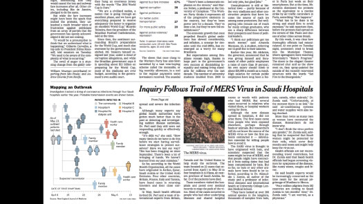
This paper is about cancer after — sorry, after Hiroshima and Nagasaki.
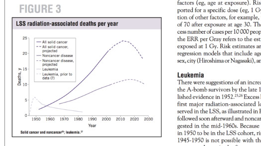
So here it’s similar: three lines.
But now there are six elements in the key, and then the key has a box around it, and the whole thing has a box around it, and the y-axis is “Deaths comma y” — and in vertical type, right?
It’s this formal scientific presentation that may have a place in a paper, but doesn’t really have a place in my graphic. All that stuff is just slowing people down.
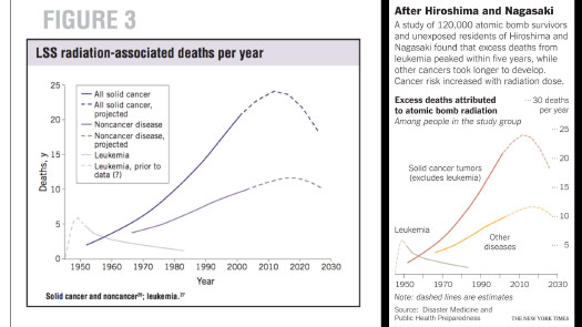
So can’t I just put those labels directly on the chart?
This is a very small graphic in the paper, but can I use that little extra space to start to tell the story, to hint at why this is important, or why this is interesting, and to point out some patterns in those lines?

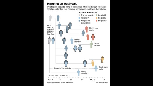
This is one of my favorite examples. It’s tracking the spread of a virus in Saudi Arabia.
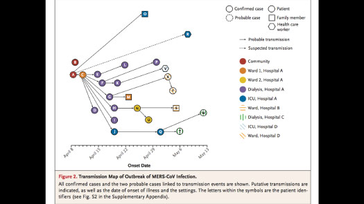
And so this virus went through several different hospitals, and this was the chart — this was the research that was explaining the really interesting work they did of tracking it. Who gave it to who?
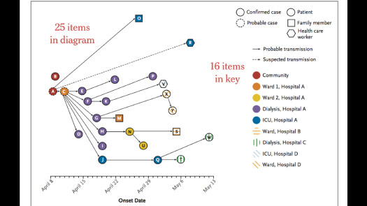
But if you look at it, there are 25 people in the chart, but the key has 16 items.
So we’re almost at a one-to-one ratio of the actual people and the key that’s used to decipher them.
I mean, it’s an interesting idea. I like the visual idea behind this chart, trying to show how this virus spread across multiple people, 25 people.
But there must be some way to simplify this key and not require so much interpretation. It’s almost like learning a mini language over here that you can then apply to the figure to see what’s going on.
But luckily what saved this chart for me is that in the supplemental information there was a list of the people.
And so at least I could get their gender and their age, which is rare. Often we have no real information about people in medical studies. And so I can start to use that.
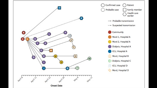
Can I take some of that information and put it into the chart, instead of using these arbitrary circles? Can I start to use international icons for men and women?
And instead of having this ray of lines moving in many different directions — it’s unclear if that does or does not have meaning — can I standardize that? Can I be a little consistent?
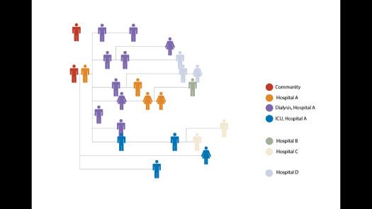
So this is an early sketch ...
... and then this was the final graphic.
So there is a key, but it’s gone down from 16 elements to about six.
And this is a very small chart at the end of the day.
It was probably a day or so of work, but it gives a little bit of context. It starts to tell a story and it really helps that textual presentation of the study, and of the event.
So that process of annotating, of putting text where it belongs — or where we think it belongs in the chart — is incredibly important.
We often say that annotation is the most important thing that we do on the graphics desk, that it’s more important than the design.
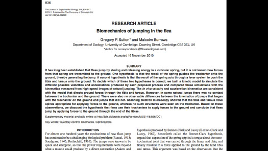
And so this was an example of trying to figure out how fleas jump.
And for years it was unclear: Do they jump with their knees, by pressing on their knees, or do they jump with their feet?
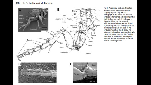
And so this is the introductory graphic.
And there is this scientific convention of: “You put the images on one side, then you put the text to decipher it on the other side.”
In this case, the researchers did a good job. They’re actually trying to label things directly. There’s a lot of redundancy here in imagery and in words, but it’s a nice attempt to try to clearly explain the structure of this flea leg.
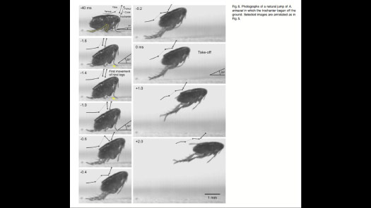
And then they show these really lovely images from a high-speed camera of this flea taking off.
And they’re really — they’re actually — this is great!
They’re trying to annotate. They’re trying to put text in the images themselves.
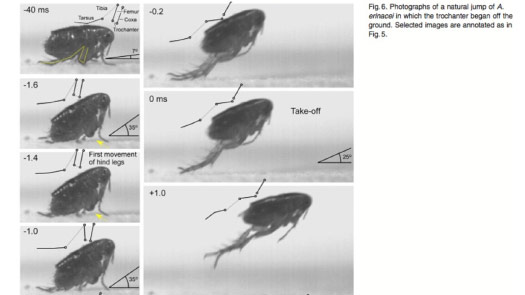
They’re actively putting in angles and schematics of the leg, to try to show you what’s happening.
But there’s not quite enough space and it’s not — well, you’re kind of limited in the amount of words you can fit here.
But this idea, this visual idea, is great.
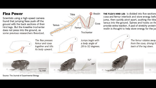
So can I take that and can I simplify it a little bit more? Can I introduce color?
Can I take what had been that redundant mechanism, or that sort of highly redundant imagery of the leg — my readers do not need that. This paper may need that, but I do not.
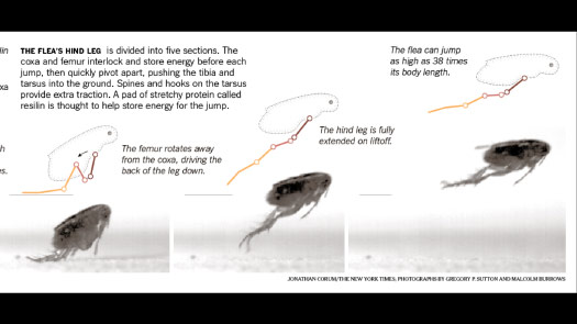
So can I simplify that? Can I show the whole flea body, and then can I have this sort of mirror flea above the photos, taking you through each step of the process?
And at each step can I add text to show what’s happening, and tell you what’s happening?
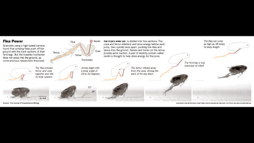
This single event — can I try to break it apart and show it in a series, and not have you looking in different places, or at different pages, to understand what happened?
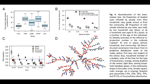
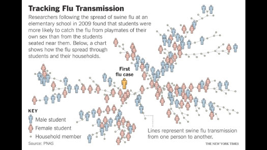
Ok, so I wouldn’t say this is typical, but you sometimes see graphics like this where there’s clearly been an effort made to visualize the data.
In this case — this is a spread of, I believe, swine flu through a school — there’s essentially no explanatory information in the graphic.
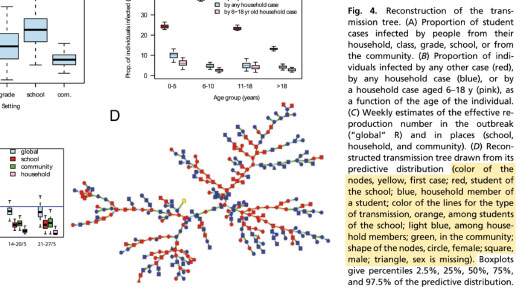
So in order to understand it, you have to start reading through this caption to say: “Ok, the first flu case is yellow. The boys are this color. The girls are this color.” Actually, sorry, no, the shapes are genders, and then the color represents whether they were a student or not.
You have to hold that information in your head and apply it, piece by piece, to the chart. So that’s a lot of time, that’s a lot of effort, and most of that information can be put — or we could find a way to put it — into the chart itself.
That way the understanding might come much faster, and not after reading to the bottom of this long paragraph, with three other charts’ explanations above it.
So in this case, it feels like there’s some assembly required. And I don’t want that for my graphics.
I want to do the work. I don’t want my reader to do the work. I would like to do the work to try to present it in a clear manner.

So in this case, can I show essentially that same chart, but can I try to put a little more information into it?
Can I more clearly highlight the students, to emphasize how this flu might have spread through the school?
And I think the finding here was that the children tend to catch it from members of their own sex that they play with, rather than people they sit next to at school.
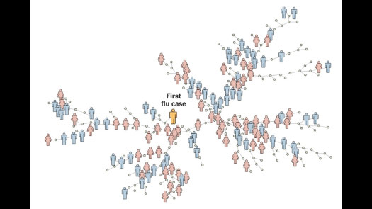
So can I encourage you to think about, or imagine this virus spreading through this network of people?
And even without text, can you get the general idea? You might start to get the picture that this is a chain of events, or a chain of transmission happening.
So Matthew asked me to speak a little bit about data visualization.
I know there are many different levels of experience here, and there are many different types of charts that you’re making.
But I think my advice would be to just use the tools you have.
I think some people think that: You do all the work, you come up with the graphics, you publish the paper, and then that’s the time for data visualization. And I feel like that should not be that way — or hopefully not that way.
The right time is that initial period, when you’re trying to work with the data, you’re sketching with the data. That’s the time to try to visualize, to see what you have, to see what you’re working with.
And many of you may already be doing that — and that’s wonderful — but if you’re not, and if you’re interested in data visualization, or interested in making better graphics, I think that’s a first step to take.
There’s no magic tool at the end of the process, so can you work with what you have? And can you expand how you use the tools you have, earlier on?
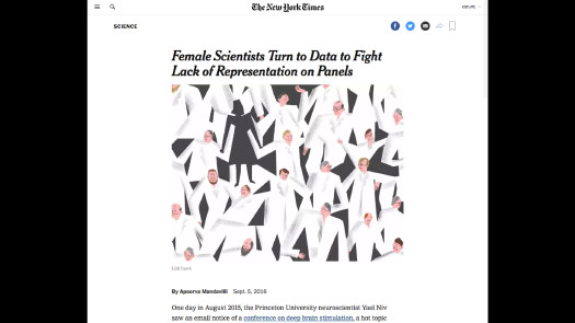
So this was a story about gender representation on scientific panels.
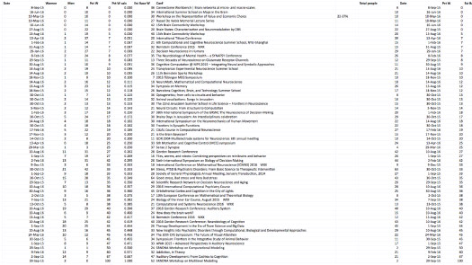
And so this blog had been tracking how many men were speaking, how many women were speaking, and they were doing the math from there.
And so I got this spreadsheet ...
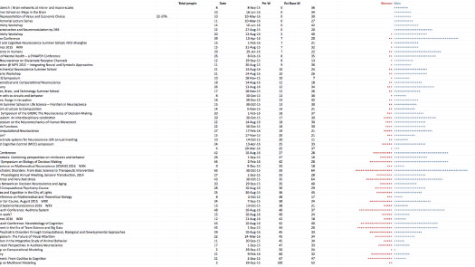
... and then right next to it I started to visualize it a little bit. Instead of counting numbers, can I make a dot for each person, and is there a pattern here that I can explain? And it looks like there is.
This simple visualization helped me sort the data, and helped me think about what that visual idea might be, and how to present it.
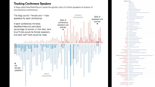
And the final graphic ended up being almost exactly like this sketch, right — effectively what you could do in Excel. I’m just working with it a little bit afterwards.
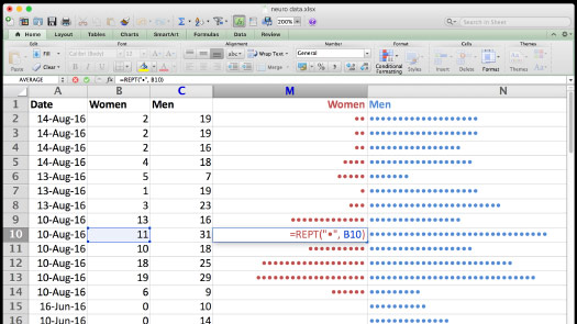
And I know in our Friday workshop someone asked me how do you do this? And so I added this slide.
So if you haven’t used the REPT function, you can put a dot or a line and tell Excel to repeat it that many times.
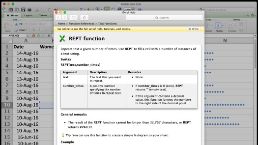
And here’s the explanation — and it even says at the bottom: “You can use this to create a simple histogram.” So this is great.
If you’re using Excel then please try to expand how you use it.
If you’re using other software packages, is there a way that you can start to incorporate visualization a little bit more in your day-to-day work?
It’s ok to start small.
I think most of the big graphics that I have done came out of small experiments or small projects that I did much earlier. Maybe I wasn’t happy with them, or they served some use, but I realized later that they could be expanded.
So these are all impressive attempts by scientists to communicate something, to visualize their data.
And it feels like I’m just taking it a little bit farther, a little bit out of the journal and then toward an end reader, toward my audience.
I’m sort of changing the intended audience for these graphics.
And when you’re visualizing data it’s very easy to get caught up and say: “Oh, this is beautiful. This really looks impressive.”
But I try not to lose sight of the real world.
So you have something like a neural network.
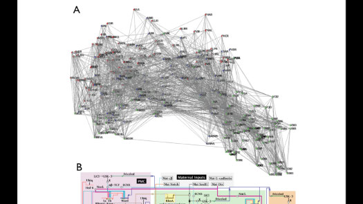
It’s very — I wouldn’t say easy, but you can make graphs and charts like this. And if you understand what the codes or the names mean then maybe there’s something here for you.
But it’s very dense. It’s very hard to read, and there’s no connection here with the actual animal.
So can I introduce that, or can I reintroduce that connection?
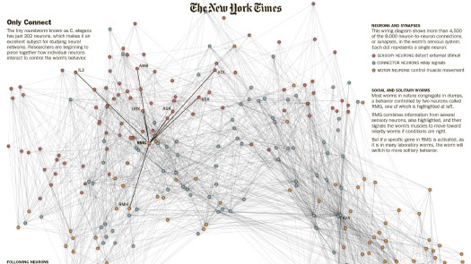
In this case I’m using the same network, but I’m suppressing most of the information and then just calling out a group of six or seven of these neurons.
And then can I visually show, can I draw a link between the network chart and the real world?
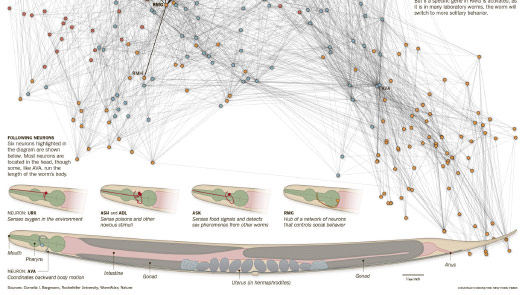
Can I show you what these neurons look like, where they are in the body, and can I start to give you just a hint of what these might control, or sense?
So can I make that connection between that data visualization and the physical reality that it’s trying to represent?
And so for my audience I think it’s very important to draw those kinds of connections. And that should be where I spend my time, and my work, so that I’m encouraging them to understand.
If you’re at the point where you’re mostly working with bar charts, or charts that come out of another software program, can you find a way to edit the vectors? To edit the lines that come out?
Can you take things away? Can you remove things and simplify? Can you add annotation?
This is straight out of Python and matplotlib.
But I can export this as outlines — as a PDF or an SVG file — and then I can work with it from there.
And I can turn it into a chart that actually calls attention to certain parts of the data, and that can be paired with other information.
So a lot of what I’m doing is just taking something that’s been exported, bringing it into something like Adobe Illustrator — and there are several free alternatives to Illustrator out there — and then editing the linework.
If you’re already coding, then using interactive notebooks might be another great way to start data visualization.

If you’re using Python there are projects like Jupyter, which was formerly IPython Notebook.

And then many people use R, or R Studio.
And on the Times graphics desk we use both. I think more people are using R, but certainly we’re free to use any tools that we choose.
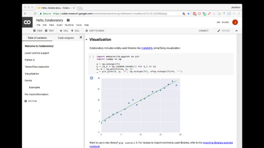
Google recently released an internal tool called Colaboratory.
And this is a way to try Jupyter on the web. You can write a line of Python code and then you can see a chart appear below it.
And the reason this is useful is that if you are sketching with data, you can make a change in one line and see it take effect immediately. You’re not exporting and then opening up a separate file.
It can be quite a nice iterative process of making a change, seeing an effect, making a change, seeing an effect. And a lot of the work that we do is based on processes like that.
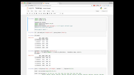
So I could use Jupyter to read some data ...
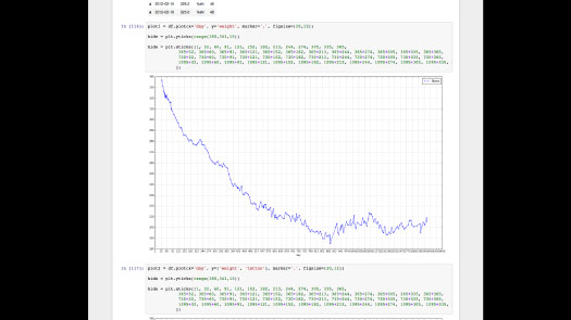
... generate a very simple chart ...
... and then export it and turn it into a graphic. And I do that all the time.
Or it might involve reading in a data set.
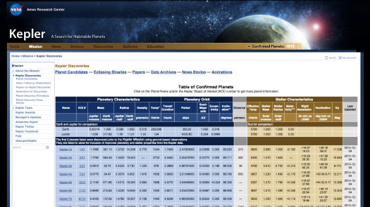
These are the planets that the Kepler Space Telescope discovered over many years, staring at a small patch of sky. And it found thousands of them.
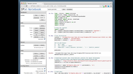
And so every time there was a new planet I didn’t want to have to perform a bunch of manipulations in Excel, or whatever spreadsheet I was going to use.
So instead, can I write an interactive notebook that pulls in the data, that performs the sort of changes that I need?
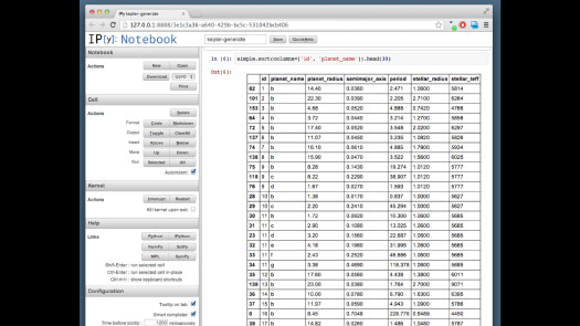
A lot of that is just throwing away data I’m not using.
And then I can take that data file and feed it to a data visualization, which in this case was in D3. I know at least a couple of people here are using D3.
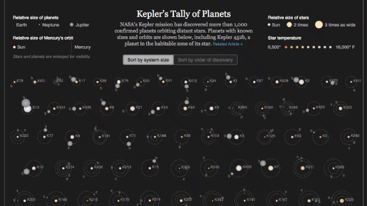
Kepler found all these planets. Can I give a simple representation of what these planets are? So each of these diagrams is a system, a solar system of the star and the planets around it.
Can I call out outliers? Can I show some of the interesting things that have been found, like planets around binary stars?
In all these cases, the goal is really to communicate that visual idea.
Often I might have the idea at the start of a project, but then I get sidetracked, or things happen, or the final graphic is not actually communicating my original idea.
So I always need to go back and check: Am I actually communicating the scientific research, or did I get sidetracked into showing something that I think looks cool or interesting in some different way?
I want to make sure that the idea — that original visual idea — makes its way to my audience, however that happens.
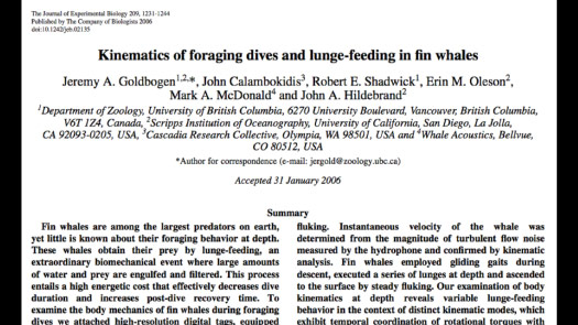
And so one example of this, where I think many things came together, was this paper: “Kinematics of foraging dives and lunge-feeding in fin whales.”
And so from the first word, kinematics, I know this is not written for me. It’s not written for my audience, and I’ll need to translate it.
(I use this example in many of my talks. I wasn’t planning to include it in this one, but it was received well in the earlier workshop so I put it back in by request.)
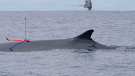
But the idea — it’s a beautifully simple idea, which is the researchers went out and they put these suction cups on the backs of the whales, and they tracked them as they made these deep feeding dives.
They’re krill feeders, and so they’re looking for swarms of krill.
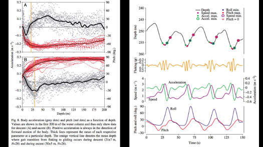
And so the temptation when you collect all this data is to show all the data. And I think I never actually figured out what this chart on the left meant.
But on the right, there is still a level of abstraction, but you can start to see things like: Here the whale is rolling, here it’s pitching, here’s the tail. The yellow line is the tail beating up and down.
So I’m beginning to see the traces of a real action, what really happened. But I haven’t quite found the visual idea yet.
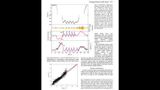
But then on another page I found this chart, which is a depth chart.
So the black line is the whale at the surface. It makes this deep dive, then does these feeding lunges as it’s gulping swarms of krill.
And that takes a lot of energy, so it needs to come up relatively quickly to breathe.
But the scientists cut out the whole middle section of the depth chart, to make room for other charts. So I contacted the researcher and said something like: “It doesn’t look like there’s a lot of data there, but could you please send it to me? I’d like to see the full graph.”

And when I charted it at the same scale, it looked like this.
And so that sound that some of you just made, that is a little “aha” moment!
There’s a story here, or there’s something here that wasn’t apparent in the original chart.
So this gives me an overview, the big picture of what this animal is doing.
Now can I explain what these lunges are, what’s happening down here at the bottom?
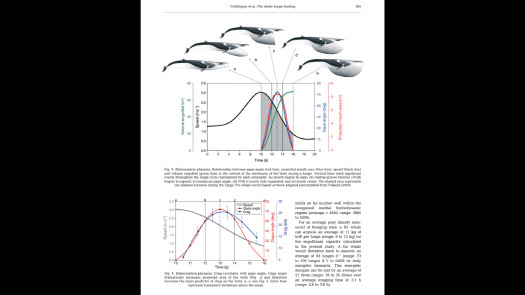
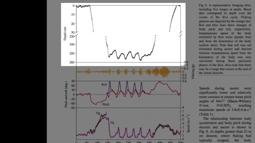
And so in another paper by the same researcher I found this chart, which is actually quite lovely.
These are beautiful illustrations, but they’re kind of awkwardly tied to the chart in this arc, with arrows pointing out.
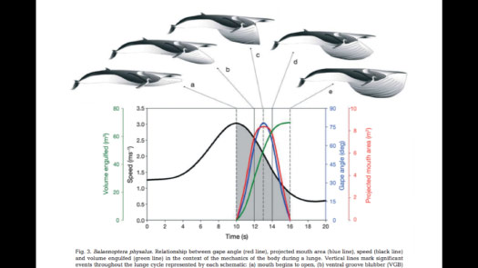
And the chart itself has many different layers of data, which are overlaid.
So what is it showing? Mouth angle, gape angle, the area and volume of the mouth. I don’t need all this, right? I have the visual idea. So what can I pull from here that will help me explain that idea?
In this case, I took the illustrations and I took the black line, the line showing the speed. That line shows how the whales swim, get up to speed, open their mouth, and then their mouth acts like a parachute.
They engulf the krill, engulf a huge amount of water and come to a stop. Then they filter out the krill and do it again, and that takes a huge amount of energy.
So now I have the big picture and I have the small picture, the individual steps of this feeding process.
And then from there I can start to add the annotation.
How do I explain this, or how do I help this visual explanation with words?
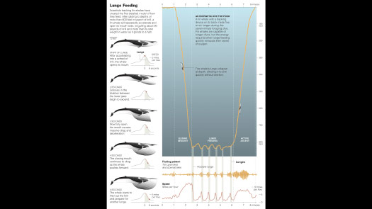
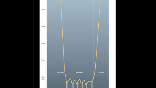
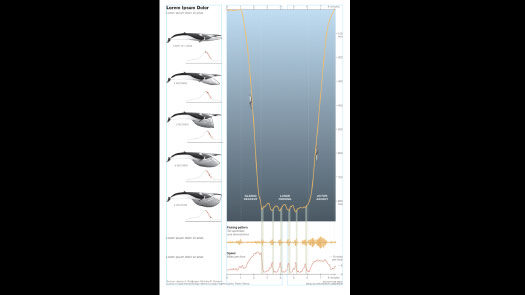
So this is the final graphic ...
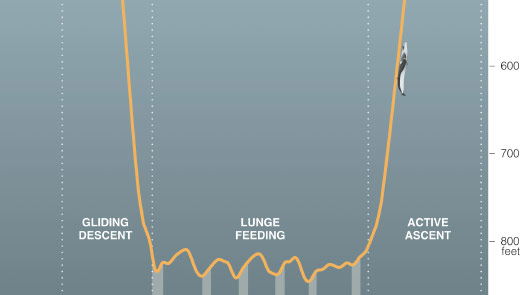
... and the little whale, at scale, riding its chart.
So even though there’s a depth scale here, I’m still trying to give you a visual sense of how deep this thing is diving.
So I felt like this graphic incorporated a lot of the things that I was talking about today, about trying to tell a visual story.
Can I find a visual idea, and can I get it down on a page — to encourage someone to understand it, to pay attention to it, and to pull some understanding out of it?
So I’ve been speaking a little bit about four audiences.
You may have four, you may have less, you may have more, but I hope that you’ll think about how you address each of those audiences.
And I hope you’ll think about what changes when you shift from making things for yourself — where you don’t even necessarily need to label the axes because you know exactly what you’re looking at — and work your way toward communicating to the public.
And so I hope that some of these things might help you if you are interested in communicating to the public, or if that’s something that you’re already working on.

And another way to think of this might be as a process — that you’re sketching for yourself, you’re refining for your group or your department, you’re publishing your findings and then maybe you’re explaining it to the public at the end.
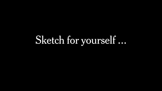
And I would just encourage you, if you think of it that way, to sketch for yourself.
You know a huge amount about whatever it is that you’re working on.
So you can sketch however you want for yourself ...
... but then please try to design, please try to explain it to someone else.

Tak!
Thanks to Baylor Fox-Kemper and Kaustubh Thirumalai for their thoughts on audience, which helped me structure the talk.
And many thanks to Matthew Paul Gillum for the invitation to speak.