

Photo by Amanda Montañez
Dec. 4, 2017
Below is a video and transcript of my keynote talk at the second SciVizNYC conference, which was held on December 1.
Thank you.
I’ve really enjoyed the talks today and the chance to meet many of you.
I’m Jonathan Corum from The New York Times.
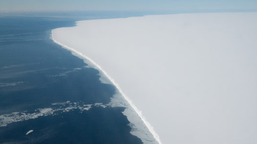
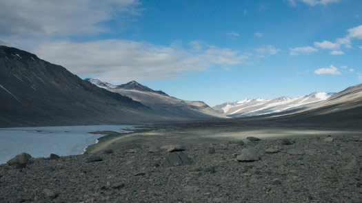
One year ago today, I took this picture.
I was flying over the Ross Ice Shelf in Antarctica ...
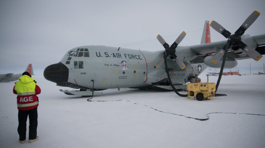
... in the back of an LC-130 cargo plane with three other journalists from the Times.
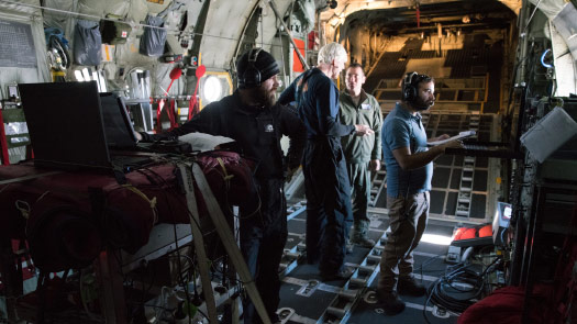
And we were there to try to understand: How do you conduct research from the back of a cargo plane?
How do you run a science program from a heated tent on the edge of an airstrip on this sheet of flat white ice?
And we also wanted to know: Who are the people who travel halfway around the world to spend the Antarctic summer supporting science, and keeping a small town running on the edge of this inhospitable continent?
And of course we were there to try to gather as much of the incredible scenery of Antarctica as we could.
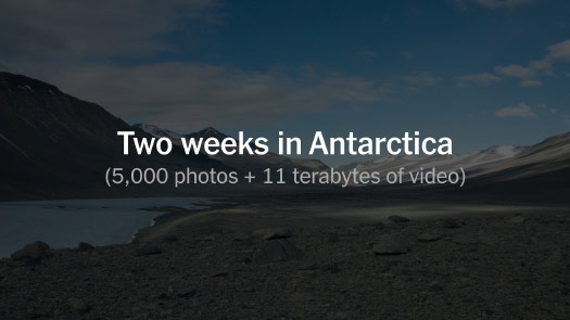
We spent two weeks there.
And we came back, I had taken over 5,000 photographs and we had about 11 terabytes of video data, most of that 360-degree video.

So the question was — we came back to New York and thought:
“Well, that was a great working vacation. But now what do we do with all that material?”
And so I’ll try to answer that.
But before I do, I want to talk a little bit, just quickly, about how I work with other people’s data, with published data.

I’m the science graphics editor for the Times. A lot of the projects that I’m involved with begin like this, with a published paper or a paper that’s about to be published.
There are many specialists in this room, and I don’t have the vocabulary to talk to you at a high level about your specialties.
So one of my roles at the Times — in some cases it feels like I’m less a designer and more of a translator.
I’m trying to go and I’m trying to understand the academic terminology and then try to find a way to translate that to a general reader.
And if you’ve seen my talks before, you’ll know that one of my favorite papers is this one: “Kinematics of foraging dives and lunge-feeding in fin whales.”
My job is to go into that paper and to try to pull out the essence of it. Can I figure out what the scientists found, what got them excited? But maybe I won’t use these words to try to explain.
This is part of the process of simplifying.
There may be some level of complexity that is required or expected at an academic level.
But maybe I can put some of that to the side and instead try to focus on the core of what that scientist was trying to communicate.
And the idea itself was quite simple: You go out and you find a whale, put a device on its back.
And the scientists were tracking these fin whales as they make these deep feeding dives for krill.
But the temptation once you’ve gone through that process of finding the whale, collecting the data, coming back, is to show all the data in your paper.
And that may be more than what I need to convey the idea to a reader.
And so my goal then is: Are there little ways that I can find to be more concrete?
Can I move from the abstracted data that has come a pretty far distance from an event that actually happened — like a whale diving — and can I try to be a little more concrete?
And so a little later on in the paper I found this chart, and I was very happy to find this.
It’s a depth chart. So the black line is the whale at the surface, and then it makes this deep feeding dive. And each of these little bumps here is the whale lunging at a school of krill. And then it comes back to the surface to breathe.
But the scientists — you can see they cut out the whole middle section of the chart, to make room for more charts.
But I have the luxury of more space, so the first thing I did was to get in touch with the researchers and say: “Could you please send me the data? It doesn’t look that there’s much that’s missing, but could you please send it?”
And when I charted the data at the same scales, it looked like this. So now, this is great, this is something I can explain. This gives me a visual framework for a part of the study.
So now that I have that overview, I’d like to find ways — can I show movement? Can I show change?
It’s very hard to tell a story, even a small story, without that sense of movement or change.
And in another paper by the same researcher I found this chart, which is great, it’s actually a quite elegant set of drawings of a whale.
But they’re attached with these radial lines to this very complicated chart that’s trying to show, you know, four or five different things about the angle of the mouth, the volume engulfed by the mouth. It’s more than I need to tell this story.
So maybe I’ll pull one line out, maybe I’ll pull the black line — speed — out.
And instead of one chart, maybe I’ll split up and give each of these whales its own line.
So this becomes the framework of the graphic. I have the large scale and then the smaller scale.
We sometimes say, on the Times graphics desk, that the most important thing that we do is to annotate.
And particularly in science communication, I want to try to avoid what I sometimes think of as the “Figure 1” problem, where the text to understand a graphic is over here and then the graphic itself is here, or on a separate page.
So the act of reading becomes this zigzag back and forth between trying to read some text here and remember it, apply it to the chart, then come back for the next little piece of information.
I don’t want my reader to have that kind of zigzag reading and understanding experience.
But the chart itself gives me space that I can use to put the text, put the annotation where it belongs, where I can help explain what’s around it.
So this was the framework ...
... and then this was the final piece.
And if you look closely, you can see a little whale at scale riding its chart up and down. To try to give a sense of — even though there’s a scale printed here — an intuitive sense of scale.
So I think each of those steps, it’s trying to reveal patterns that are in the data and not to impose patterns that I create myself.
So yes, at the end of the project I might be looking for a cover graphic or a nice design. But I don’t want to have a preconceived notion of what that design might be.
I’d like the data or the imagery to lead me to that design decision. And then I use text around and within that design to then explain the topic.
I think this adds up, for me at least, to this idea of respecting the reader, respecting that somebody else is going to receive this graphic.
By the time I’ve done the research, I don’t want to just spit back what I’ve learned at myself, all the knowledge that I’ve just acquired.
It may have taken me days or weeks to come from not understanding to understanding, and there may have been dead ends along the way. But can I cut those dead ends out?
Can I lead the reader on a simple path from where I was before to what I’ve found out or what I’ve understood about the scientists’ work?
I’m trying not to be my own audience for my graphics.
This is the Times graphics desk as it appeared last year — and we have some very recent additions. So it’s changed a little bit.
But I think that everyone here, although they might phrase it differently, I think they all have that kind of respect for the reader, and they’re not making graphics for themselves.
And they’re willing to throw out ideas that they might really enjoy or love, if they feel it’s not communicating to somebody else.
So I’ve been at the Times for 12 years. The last 10 of those have been working with the science desk.
And so as you might imagine, in 10 years the work practices have changed quite a lot.
When I started it was really focused on the print paper, making cover graphics, making large graphics for print.
But today a large project might begin with a script ...
... that then gets turned into a short explanatory video.
And then maybe the research that I do for those pieces, maybe that finds its way to a web graphic, whether interactive or not.
And then maybe at the end of the process, little bits of all of that work then filter out and find their way onto a printed page.
Sometimes you might see — on old maps or old diagrams — you might see this stamp: “Not for navigational use.”
And sometimes I think that way about my graphics, that because I’m working for a general reader I have the luxury of choosing an appropriate level of abstraction.
I don’t need to make graphics for surgeons or for scientists. I can speak to a general reader and I can pick different levels of abstraction.
So if I’m trying to make a graphic about anatomy then maybe I will stay fairly close to reality, that physical structure.
But if I’m explaining something on a cellular level, or trying to show a mechanism inside a cell, then maybe there’s room to be a little more abstract about it, maybe pick a geometric form ...
... or try to do something a little more artistic.
And so I can try to abstract away some of the details, to focus on the process or structure that I’m trying to explain.
And also — Times readers, maybe over breakfast they don’t want to see something with this level of detail.
So maybe we don’t use this level of realism ...
... maybe we abstract it away a little bit.
Or maybe we find a middle ground that can ground us in some level of reality.
And then we can quickly move away from that and work on a more abstracted level.
(I showed part of this animated graphic: What is a Heart Attack?)
So apart from things like illustration, one of the great joys for me in working in science is just working with raw imagery and raw data.
So we have things like the Curiosity Rover, rolling around Mars for several years, sending back pictures.
For me, one of the great joys is taking that raw imagery — that was just taken on another planet yesterday ...
... and then turning it into a panorama.
And so we realized a few years ago that there’s so much of this imagery — especially about space topics — out there, produced by NASA or another agency. It might be used once and then it’s just sitting there.
We realized that a lot of this imagery could be used and pulled into explanatory videos about different space topics.
So I produce a series called Out There.
We’ve made about 21 episodes so far.
They might be about, you know, 2 1/2 or 4 minute pieces, and we might pull from 10 or 20 different sources of imagery.
And so the challenge is kind of like collage. It’s taking the best moments, and can I piece them together into a story that makes sense, that feels like a unified whole?
And I think it’s interesting to go back and see some of the earlier episodes, because they were quite rough and they’ve gotten, I think — I hope — better.
And it’s not that our production skills have gotten better, it’s that we’ve learned how to write scripts.
So our first script looks like it came out of a typewriter, right? There’s no imagery, it’s just pure text. And then we try to fit the images onto the words later.
But our scripts today are much more based on visuals.
We’re writing to the actual images; the images are there on the page. And we’re trying to make each scripts a complete recipe for how you create one of these videos.
(I showed a short video scrolling through a recent Out There script.)
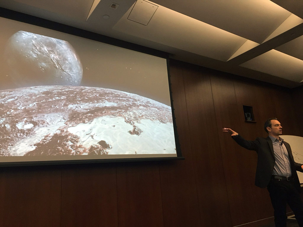
One of the episodes we made was when the New Horizon Spacecraft was on its way — it was about to reach Pluto, which it did in the summer of 2015.
And we made a 13-minute documentary.
And, at the time, this was the best imagery we had of Pluto.
So here’s Pluto and its largest moon, Charon.
And you have 13 minutes to fill. And this is the best image you have.
So we used artist representations, which are literally the only detailed images we’ve had of Pluto for the many decades since it was discovered.
And this is one of the things we talked about in the film.
The wonderful thing about the spacecraft is that it would make many of these obsolete. Many of these images would immediately become obsolete when it flew past.
And so we produced this video, put it out there, and then the real imagery started coming in. And every day it got better.
And it was — you know — we’re seeing this one. It was a little fuzzy, but you start to see something here.
And then I went in early one morning and this came up on the screen and I was just stunned.
I thought this was one of the most amazing photographs that I’d ever seen. It was a world revealed.
And so we knew immediately that we wanted to make some kind of a follow-up, we wanted to do something with these incredible images that really the whole world saw.
At the same time there were other people in the Times who were working on virtual reality.
We thought, well, maybe we could combine the two.
And so I’d worked with the Lunar and Planetary Institute on some other Out There episodes.
They were collecting data from New Horizons and they were building these terrain maps of Pluto, which were quite stunning. And so they provided us with this data.
We then started to — we got a model of the spacecraft and started to build a virtual world that we could fly a virtual camera through and film in all directions, for virtual reality.
So this is the spacecraft in that rendering environment ...
... and then when you have the headset on it looks like this.
And so this was my first VR project. It was one of the first ones that we’d done significantly in-house. And so there were quite a few design challenges.
One was to show scale — to try to convey planetary scale in this limited number of pixels that you’re holding up to your face.
So this is about the relative size of Pluto and Charon, and it’s about the right distance.
It’s a little awkward, right, for a video.
So at the time NASA was using many images like this, sort of a hybrid — maybe the relative size is correct but they’re compensating for the distance.
So we thought, well, if NASA’s doing it, then maybe we can find something in between that and the actual scale.
So this was our rendering of Pluto and Charon.
We wanted to show motion but not too much motion, right? We wanted to avoid any kind of motion sickness.
So we learned fairly quickly that if you’re moving in a straight line you’re fine, moving forward. Or if you’re moving in a straight line sideways you’re fine.
But all those kind of dreams we had of spiraling over the mountains and coming in, none of that was going to work.
So as soon as you hit a curve like this your inner ear starts to complain, and you can’t handle that. So we used simple flight lines.
We wanted to narrate and guide.
Just as annotation is the most important thing that we can do for our graphic, we realized that this piece would only work if we figured out how to narrate it.
And so I work with Dennis Overbye, who’s the voice of Out There and the cosmic affairs reporter for the science desk.
He’s wonderful with words.
Our first draft of the script was quite — the narrator’s kind of acting in his very omniscient way, speaking about things around you but not speaking to you directly as a viewer and not really giving you any direction.
So it was like: “Here are beautiful things around you.” But we weren’t bridging that gap between viewer and place.
So when we started testing this with the head of science and one of the deputy science editors at the time, the comment that came back was: “You’re not speaking to me like a person.”
“You put me in this virtual space but you’re not giving me anywhere to look. You’re not being a tour guide.”
So this really changed the project for me.
And we went back and we completely overhauled the script.
We tried to find a happy medium between an omniscient narrator and a too-obnoxious tour guide who’s saying, “look here, look here, look here.” So we tried to strike a balance there.
We wanted to orient you correctly in space.
We were working in environment that didn’t make this easy but we spent a lot of time trying to make sure that the stars just simply lined up. When you are at Pluto, what would they look like?
And I’m glad we did, because the first astronomer that we showed it to, within about ten seconds of looking around, he said: “Oh, you got the stars right.”
And that would have been very embarrassing if we had not.
And then the whole reason to do this project was so you could stand on the surface, right?
Many people have already seen the incredible imagery that came back from Pluto. Can we take you to the surface?
And so this is about as close as you can get with the New Horizons data.
We didn’t feel comfortable extrapolating down to a surface level, but the Lunar And Planetary Institute did.
And so working with them, and the scientists there, we came up with ground scenes for two locations ...
... one in the mountains on the edge of this icy plain ...
... and one in this crater, this ancient impact crater.
In our VR we can’t — at least not yet — we can’t tell exactly where you’re looking.
But if we have scenery like this we can say: “Look at that icy rim.”
And then when we’re pretty sure you’re looking at that direction, we can say: “Behind and above you is the distant sun.”
So we can start to cue you in subtle ways. Encourage you to look in different places without saying: “Look here, look there.”
So this was Seeking Pluto’s Frigid Heart. You can find it here.
It’s very difficult to share virtual reality with an audience. I can give you a glimpse of it.
We’ve tried things like giving everyone a headset — which you have — and then saying, you know: “Press play now.”
But that can get a little awkward.
You at least need to stand up, or sit in a swivel chair to look around.
And I really wasn’t sure what response to expect from this, but I thought it was a great response.
And I particularly enjoyed this comment because it really rang true to me.
In a way it is this awkward experience, where you’re pressing something — basically a cell phone in a cardboard box — to your face, and it takes a little time to get it set up and make sure it’s working.
But then we can try to transport you to this other location. And speak to you in a different way.
So this is my son watching Pluto ...
... this is my cat ...
... and this is Alan Stern, the head of the New Horizons mission.
It’s a 7-minute film. And this was one of the longest seven minutes of my career, waiting for him to finish it and give us a thumbs up or down.
And we finished it, we put it out there, and I thought that would probably be the end of my virtual reality experience.
But then the opportunity came up to go to Antarctica.
And so, a year ago today, we were in this plane.
And so we had a number of goals that we wanted to try to accomplish.
One was to show that Antarctica is a dynamic place, that it’s not the static ice cube that I think many people have as an image.
We wanted show that the ice moves. It moves slowly, but it does move across the continent.
We wanted to show that the scale matters. That what happens in this place will affect coastlines around the world for decades to come.
We wanted to film on, above, and below the ice, for a different change in perspective.
And then we wanted to get some penguins.
I thought we couldn’t come back to New York without at least a couple penguins.
So I was looking for inspiration, and I think we all were looking for inspiration in different ways.
And two things that stuck out to me:
One was a paper about Greenland that I’d seen years ago and used in a graphic.
And at the time I was really struggling with the question: “How can I show that ice is moving across Greenland?”
And I found this chart, this image. And the colors are indicating how fast the ice is moving across the continent.
And I thought this was an incredible image.
So I got it from the researcher, I put it on a blank piece of paper, and then I started designing.
(Here I showed a video of dozens of versions of the graphic in progress.)
So this is probably over the course of two weeks. I’m trying to figure out what sequence of smaller graphics can I use to help explain this larger image. I’m trying to figure out how does it fit in the page, do I need more width, do I need more height, how much is too much text, how much is too much supporting material?
I'm kind of iterating over this image, spending time with it, trying to figure out: “How can I turn this from a single image to a small story?”
And this is the finished piece.
And how it appeared on the page.
And the second project was — I had nothing to do with it, but I thought it was really a stunning use of drone imagery of Greenland.
(I showed a scrolling version of Greenland Is Melting Away.)
You see the drone image, you start to read the story, and then fairly soon you’re brought into what looks like a map, an almost continent-level map.
But then as you scroll it starts to bring you closer and closer.
If you’ve you seen the movie “Powers of Ten,” it’s almost like that in reverse, where you’re given a box with a constantly updating scale.
And we’re going from that continent level down to essentially ground level. We can see the actual tent that the researchers are using.
So I though this was an incredibly effective way of linking those scales, linking that continent level scale with people on the ground doing the research.
So for this project we needed to come up with a way to show that flowing ice.
To kind of make a similar connection in virtual reality.
So we worked with data from the British Antarctic Survey to get down to bedrock.
And you can see here some of these areas are quite fuzzy — actually we know more about Pluto’s terrain than we do about some of the under-ice-shelf geology of Antarctica.
And this was our version of that data after we worked with it.
And then from the National Snow and Ice Data Center ...
... we got velocity data similar to Greenland.
And so bringing this into a 3D model — and I should say that many people on the graphics desk were involved with this work — this is the model.
This was the initial prototype of Antarctica with ice.
And we can peel the ice away. Show you what the structure looks like.
And we can talk about the bedrock and then put the ice back on.
And then when we add flow data and atmosphere and clouds, then we can come up with a scene like this. We can place this underneath you as you’re looking in a headset.
And the flow data appears as these ice streams in blue that are moving across the continent. Trying to convey that motion, that movement.
So this became The Antarctica Series. You can find it here.
It’s a group of four films.
The first one is diving under the ice with research divers ...
... and you can swim with seals.
The second piece is a helicopter flight through the McMurdo Dry Valleys, which is one the largest ice-free areas of Antarctica, just spectacular scenery.
The third is about McMurdo Station — the main American base there — and what it takes to conduct science and support a small town in this remote and hostile environment.
And then the fourth piece was flying with the scientists in the back of a plane as they fly over that ice shelf and try to map the bedrock structure underneath.
And yes, we did get our penguins.
So when we film VR we want it to feel like you’re standing there.
So most of the time we have the camera at eye height ...
... but for the penguins we decided to make an exception.
This was our “penguin cam” setup.
And then all the work that went into that VR project, we started to pull pieces out of that ...
... and build interactive graphics for a series of three articles by Justin Gillis about climate change.
These gave a little bit more perspective than what we could give in VR about the research that was happening, about what scientists have learned about Antarctica.
So the material flowed from virtual reality to web graphics and from there into print.
So this is Larry Buchanan’s desk, he was working on the print graphic. I think this is maybe the night before, going through trying to come up with final revisions for three pages in the Times.
And I think he did a beautiful job of using the resolution of paper to give this really lovely texture and indicate this motion, this movement of the ice.
So in preparing for this talk I realized I’ve been writing science scripts now for quite a while, for two or three years for video and for VR.
And so I thought I’d try to sum up, have I learned anything in this process?
And so for me I think the first thing I learned was to think in scenes.
I don’t start out thinking of the entire piece, but instead what are the individual scenes that I can explain, and then how do I arrange them into something that tells a larger story?
I try to narrate what you can see.
For any topic there may be hundreds of asides that may not be visible but are somewhat relevant to what you see.
And we just try to cut all of those away and really focus on: “What can I show you?” And then explain that.
Try to write for the ear. Dennis Overbye is incredibly good at this.
We’re trying to care about how the words sound. And how we use spoken language.
He’s very good at picking metaphors and then supporting them with a scientific explanation, and vice versa.
So we try to use metaphors throughout, to try to connect the scientific explanation with something that you might already know.
We try to use a very small fraction of what we have. So for a four-minute piece I’d like to have about an hour of footage that can be condensed down to that size.
And then we try to make every word count — especially in VR, when you are very busy looking around trying to orient yourself in this changing space.
We’re not trying to just throw words at you, we’re trying to give you time to look around and experience that environment.
And I realized after coming up with that list: “Oh, I guess I have learned something from writing the scripts.”
But then a couple days later, I started thinking: “Well, maybe it’s not that it’s new. Maybe it’s just a shifting emphasis in the way that I worked before.”
Nigel Holmes was here last year, he brought up this graphic. It was an attempt to explain the Higgs boson. And he made these really lovely illustrations for us.
So in a way, this was a script, right? I wrote the words for it. It was structured in that same way, it was trying to be careful with language, it was trying to pick metaphors and use them to explain a complicated topic.
That was the print version and this was the online version.
So it may be less that learning to write scripts was something new, but instead that it helped me hone some of the ideas that were floating around when I was more focused on print graphics.
And I realized that now that the work of writing scripts has changed how I make graphics.
So one of the big news items in space news this year was the Cassini spacecraft, which flew into Saturn in September.
And so in the months leading up to that I made many graphics trying to explain Saturn’s rings, explain what the spacecraft was doing, where it was moving, how the mission would end.
And I made galleries of imagery from what it was sending back.
We made an Out There video trying to explain the spacecraft’s last moments and what this meant for science and for humanity.
And then we published this video about a week before the spacecraft incinerated itself. I was like: “Okay, done with Cassini. It’s been a long year.”
But then as I was looking around I realized that almost everyone out there was doing these collections of images, the 10 best images or the 40 best images.
Even The Atlantic was doing collections of imagery from Cassini.
And as I started looking through these and reading through — not to pick on The Atlantic — but it seemed like in many cases it was pairing an unquestionably beautiful image with very detailed scientific numbers and text.
And it just felt like it was not quite matching.
And I think by the time I got to the fourth item in this collection of 40 images, I realized that the paragraph of text is almost the size of the photo.
And it’s using words like “porosity” and “unusual density.” It felt like they hadn’t abstracted away a lot of that technical jargon.
So I thought, “Okay, I’ve got to do my own version of this.”
And so Cassini has taken about a half a million photographs over its 13 years of Saturn. Thre seemed like there was no way to go through those in a week.
So I went to NASA’s Photojournal — there are about 3,000 Cassini images have been unofficially published there. And that seemed doable.
So I went through the 3,000 and cut it down to 400 images. And then from there it was very painful to get it down to 100. It was like throwing away old family photographs or something. But I did.
And this was the piece.
And I tried to use everything that I’d learned to emphasize in VR and in writing video. I tried to organize it as a sequence of scenes. I tried not to just throw facts at readers but to try to write — it sounds pretentious to say “poetically,” but I tried to infuse a little bit of that idea into the text. I tried to make it so that the images would flow into each other thematically.
And I just tried to take myself out of the picture a little bit, right? To kind of bring — let the images come to the front.
And this is a lot, especially on a phone, it’s a long way to scroll. But a surprising number of people made it to the bottom. And actually it seems like they read it.
And the comments were great.
I never really had people cry over my graphics until I started making the Out There videos.
But now, if I can get you to cry, then that’s great. I’ve touched something, right? That’s great. So I enjoyed comments like this.
And I think there was a collective sorrow about Cassini in general for some people online, and a lot of that sorrow — or pieces of that — was directed my way.
And so it was nice to see — it was nice to work on something that was not virtual reality, not video, but which tried to infuse some of the same ideas.
And I think what years of writing scripts really gave me was permission not to feel like I had to explain everything.
That I can instead try to come up with a subset — or I can try to abstract away a little of the complexity — and try to be a little more careful about how much information I’m including.
And so when I was preparing for this I realized that ten years ago this week, I made this map.
This was one of my first year in science. And this shows Lake Vanda, in the Dry Valleys.
And as soon as I saw it, again, I realized that: “Well, yes, this map is correct in this inset orientation ...”
“... but if you’re actually on the ground it should be this way. North is that way. Oops.”
So at the time I had one thing to say about this lake. And that was about it.
But now that I’ve flown through that valley, now that I’ve come back and read about it and tried to understand all the research that’s been happening there ...
... now that I’ve seen what the valley looks like from the air ...
.... now that I’ve touched down in a helicopter and stood there and tried to figure out “Where are we gonna film to capture this incredible space?” ...
... now that I’ve looked out across the lake, now I’ve gone from having one thing to say about it to having hundreds of things to say.
But maybe the reader, maybe the viewer doesn’t need to hear all those hundreds of things.
So whether it’s this landscape ...
... or this landscape ...
... or this, I’ve recently been trying to find ways to — in the same way maybe that I pulled the whale out of the graphic — to ask:
“Can I go in and pull out some of the essence of the research, the essence or the larger picture, and then use that?”
And, in a way, to try to let the images speak for themselves.
Thank you.
Thanks to Jen Christiansen, Jill Gregory, Amanda Montañez and everyone else at SciVizNYC.
The transcript was lightly edited for clarity.