


Feb. 8, 2014
Below is a summary of my talk at the second Visualized conference, which was held yesterday at the Times Center.
I'm writing from memory so this is only an approximation of what I said.
Update in 2026: The talk video is available again, courtesy of Visualized.

Good morning!
My name is Jonathan Corum and I work upstairs.
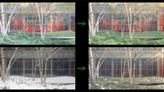
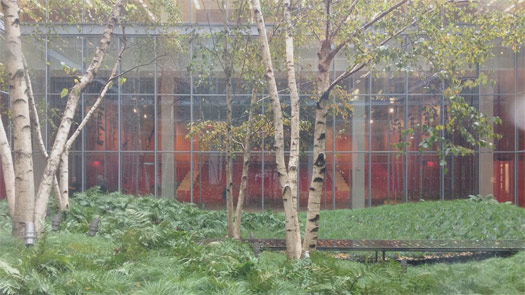
I know many of you were at the Dome last night, but I wanted to start this morning with a Cube.
Behind me, behind this screen, is a 70-foot cube planted with birch trees.

And because it’s a cube it casts these deep, very linear shadows.

And it’s a fitting backdrop for this conference because the position of the trees is based on a visualization.
A visualization of average sunlight during the growing season.

And when I walk in the building in the morning, it’s a nice reminder that visualizations don’t have to be one way, from the real world to print or the real world to the screen.
Sometimes a visualization can escape that screen and find its way back into the natural world.

Here are the trees as they appeared earlier this week, on Monday ...

... and here’s how they looked last October, the week that the speakers were announced for this conference.
And here are the days in between.
I took three photos every time I entered the building, so this is about three and a half months condensed into one minute.
I’ll let this run ... we’re entering November ... December ... January ... and finally approaching this week.
Notice that this kind of progression doesn’t require a lot of explanation. We all have a deep understanding of the passage of time and the changing seasons: leaves falling, snow melting, time passing.
So if I was trying to make some kind of graphic out of this, I wouldn’t spend a lot of time explaining that leaves change color and fall, or snow melts, because I expect the reader to already have that understanding.
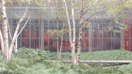
But I might point out something like this, a small change that jumped out at me.
This image is from late November, during Thanksgiving week. And this is the same image, 24 hours later.
I’ll show that again. Notice how every living thing — every green thing — is pressed down a few inches?
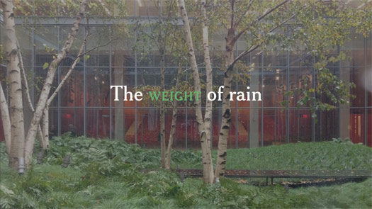
That’s the weight of rain.
So when I’m looking at data, or working on an explanatory graphic, these are the moments I’m looking for.
Little "Aha!" moments that I can point to, and say "Look here, something happened," and then try to explain.
Often those small moments can help lead a reader into the graphic, or help to explain the whole.
The trees are a simple example, and it only took a few seconds a day to take the pictures.
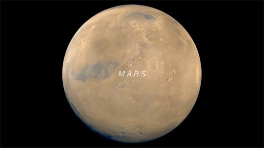
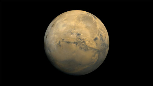
But for the past six months I’ve been trying to do something similar ... on Mars.
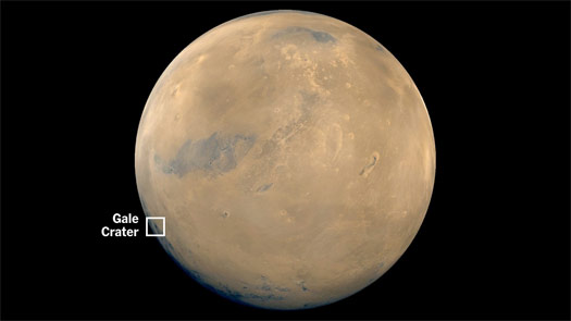
Specifically right here, in Gale Crater.
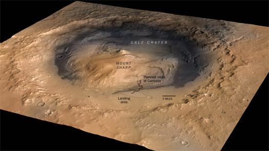
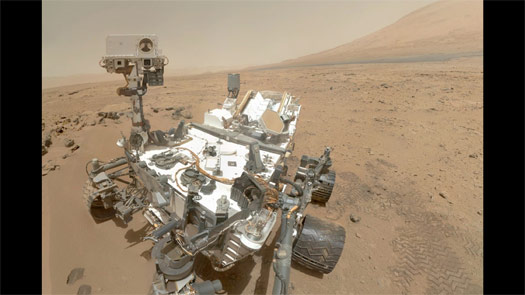
Many of you may know that, a year and a half ago, NASA dropped a rover into this crater, and it’s been driving around and exploring ever since.
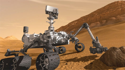
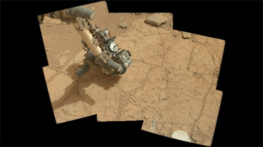
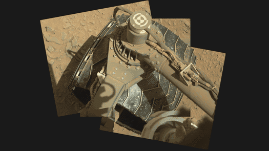
This is roughly what it looks like. The rover is called Curiosity, and it’s about the size of a car.
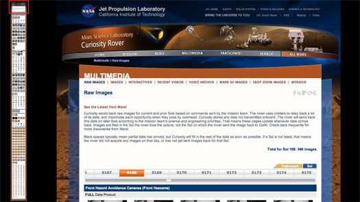
And it sends back lots of data, much of it in the form of imagery.
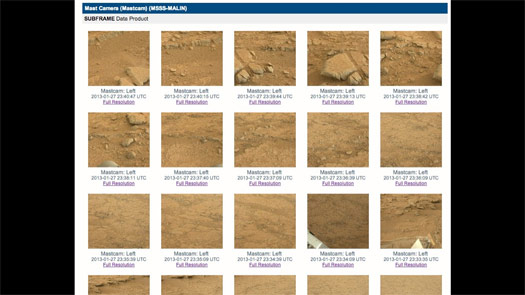
Here’s a typical page of images for one Martian day.
And I noticed these raw images coming back to Earth, but I couldn’t find any coherent overview of what the rover was up to each day. NASA has some information, but it’s often days or weeks behind.
So the work is in sorting through these images and trying to find what’s important or interesting for that day.
For example, for this day of images the rover was examining possible drill sites.
I’m taking images like these ...
... and turning them into panoramas that help put the reader there.
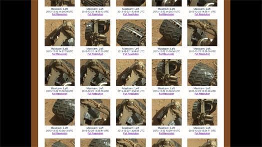
Or taking scattered shots like this, these small slices of time ...
... and trying to stitch them into animations.
Little "Aha!" moments that hint at how the rover moves, like this ...
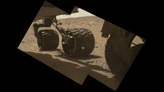
... or like this.
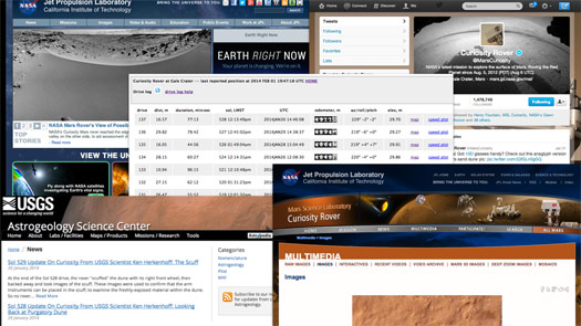
And since there’s no single narrative of what the rover has been up to, I tried to pull information from multiple sources, and string that into a simple, continuous narrative.
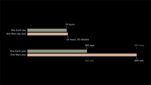
Along the way I had to explain to myself, and then to readers, differences in time on Earth and Mars. A Martian day, a Martian year.
And I’ve also tried to find ways to show the changing seasons.
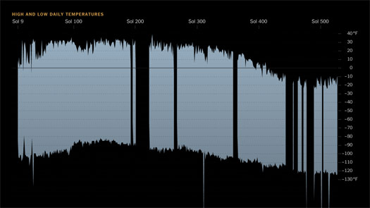
There’s no snow on Mars, and no visible changes to indicate seasons, so I tried to use daily temperature data to show the rover entering Martian winter.
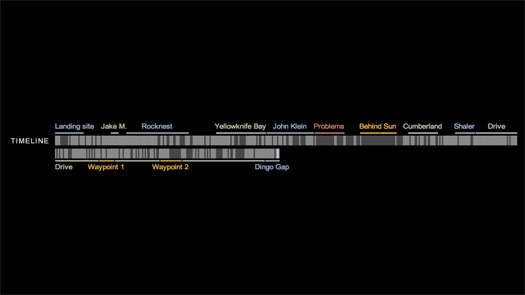
I built a simple timeline showing the major stops the rover has made ...
... and then tried to wrap it all into a framework.
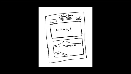
Here is a simple sketch, showing a map and photograph.
(As I get older my sketches get uglier, but maybe clearer.)
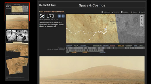
And here is the final framework, for one day.
And so far the Mars Curiosity Rover Tracker has imagery for about 350 Martian days.
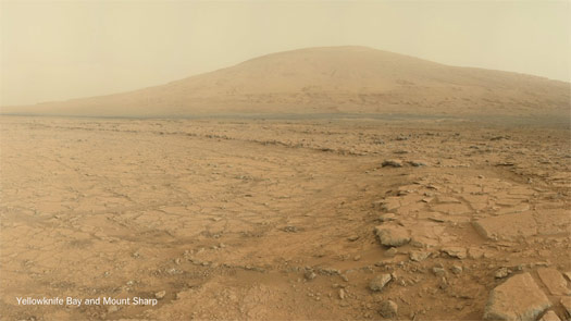
And this project is still going on. The rover is still making its way to the mountain you see here in the distance.
I mostly work with science graphics, so most of my graphics are done after the scientific paper, after the discovery has been made, after the press conference.
So it’s been a luxury to work on science as it’s happening, and to try to make an interesting narrative when the end has not been reached.
Mars has lovely imagery, but what do you do with projects that are all numbers?
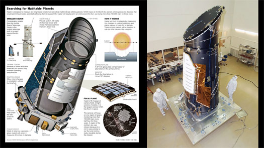
One example is the Kepler space telescope, which launched in 2009.
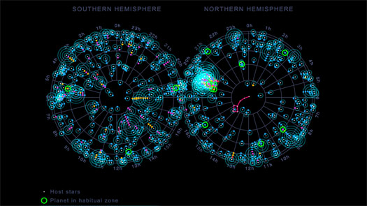
The print graphic at left is a nice rendering by Frank O’Connell.

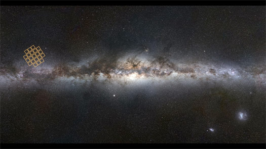
This is the visible sky we can see from the Northern and Southern hemispheres. Kepler was designed to stare at a small patch of the sky for several years.
It tracks more than 100,000 stars, looking for small, regular dips in light that might be an orbiting planet passing in front of the star.
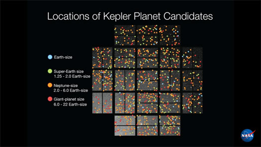
And it found hundreds of possible planets, all across its field of view, which scientists then worked to confirm.
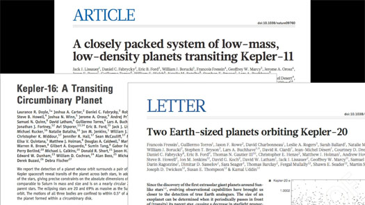
And as new planets were confirmed, the scientists would write a paper: single planets, multiple planets, planets orbiting binary stars (two stars together), and planets of different sizes.
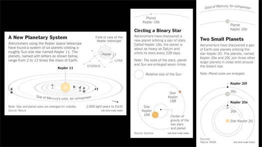
And as these papers came out I would make small graphics.
I tried to add some scale by comparing the orbits with the orbit of Mercury, for example.
But it still felt very responsive: paper, graphic, paper, graphic, paper, graphic.
I was still only showing one planet system at a time.
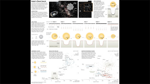
One possibility was to take several of the early discoveries and make a larger graphic explaining how the planets were found and what the dips in light look like. Showing a bit of the data that contains these dips and trying to put the new planets in context with other known planets, like those in our solar system.
This was a half-page print graphic, but it’s a lot to explain and a lot for readers to try to hold in their heads.
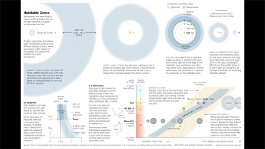
Another attempt was to try to explain the goal of the Kepler mission, finding planets in the habitable zone, the area around a star where liquid water might exist on a planet’s surface.
Here’s another half-page graphic that compares different stars to our Sun and Earth, which is near the inner edge of the habitable zone.
But in all of these graphics, it seemed like something was missing.
We’re finding planets, which is amazing when you think about it.
But I was only showing a small slice of the data.
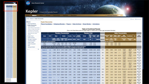
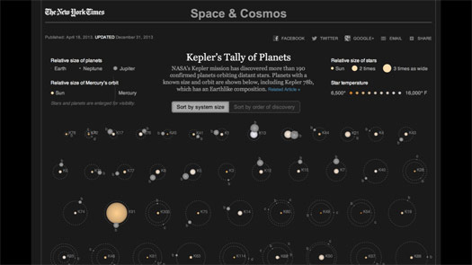
The data is not hard to find. Here is the current list of Kepler’s confirmed planets.
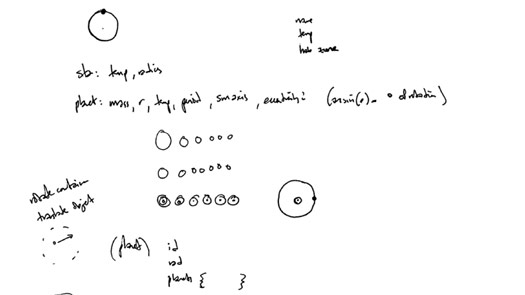
And so I looked at this and tried to find the smallest subset of data I would need to draw a planet orbiting a star.
This was my fairly ugly sketch.
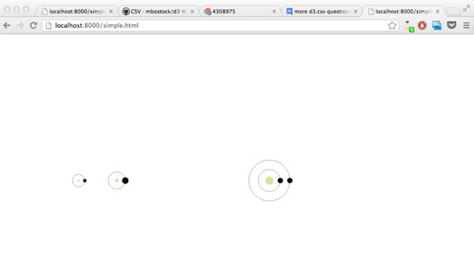
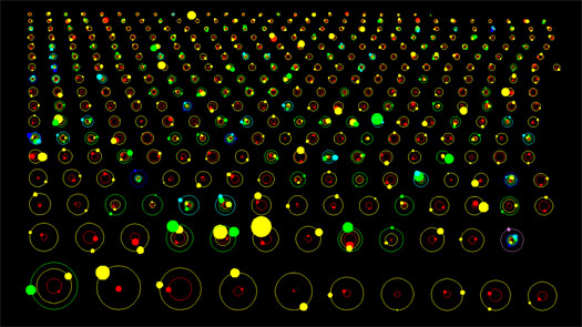
And after a few days swearing at my computer trying to learn d3, I came up with this.
Pretty basic, right? But the nice thing about d3 is that, once you put in the work to get here ...
... it’s not that much more work to get here.
This is the first working draft of the graphic.
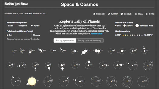
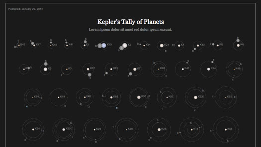
The graphic tends to get washed out in projectors, so I made a brighter version.
If you haven’t seen this before, it currently shows more than 190 planets in about 100 star systems.
I gave a quick video walkthrough, but you can see the actual graphic here: Kepler’s Tally of Planets.
So what are the traps in making a graphic like this?
What are some of the things I try to avoid?
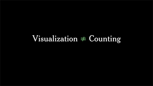
I think many of the infographics we see are really just counting: 190 beers, 190 cups of coffee.
If the only thing you’re doing is coming up with a single number, then you’re doing arithmetic, not visualization.
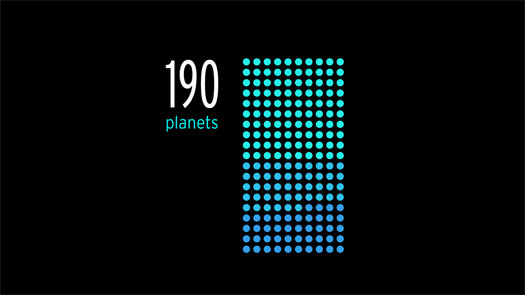
So I want to make sure that in showing planets I’m not doing some variant of this: 190 planets.
This might be an exaggeration, but it’s the kind of thing I want to avoid.
And I think that the goal of visualization is not finding elaborate ways to encode information. I try to encode as little as possible.
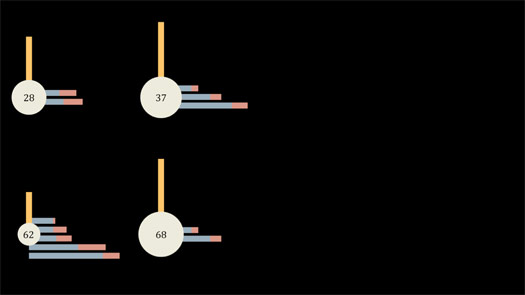
You could imagine taking the same planet data and coming up with any number of geometric shapes to encode it. Maybe the vertical bar is star temperature and the horizontal bars are planet orbits.
But to me this feels like imposing a design on the data, and drawing attention to the design more than the data.
I don’t want my readers to have one finger up here on the key, and another finger down here on the graphic, looking back and forth trying to understand the design. I want the design to disappear.
And I don’t want the reader to have to work hard to decode the information — that’s my job as the designer.
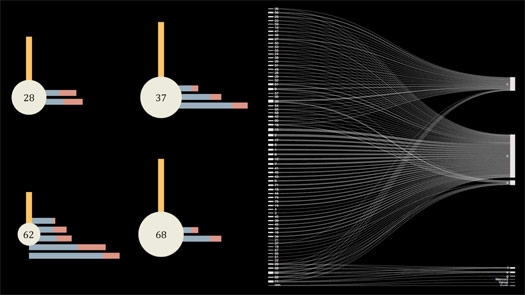
I also want to make sure that I’m not introducing any patterns that don’t exist in the data.
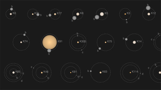
For example, this diagram has the star numbers on the left, and the planet names — the planet letters — on the right. It looks impressive, but the X-like patterns of connecting lines are meaningless. It’s just a reflection of the way the items are ordered, and doesn’t have any interesting meaning in the real world.
There are an infinite number of ways of encoding information.
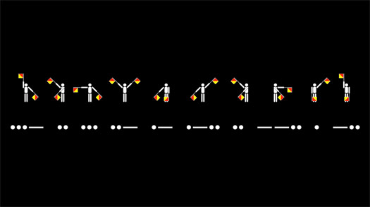
But just as I wouldn’t ask my readers to learn semaphore or Morse code to read one of my graphics — both of these say "Visualized" — I also don’t want to write microlanguages for my data that readers have to translate. If I do that, I’ve lost my reader before I’ve even started.
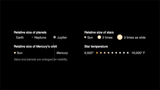
Kepler does have a key with four interlocking scales: two for size, one for orbital distance and one for temperature.
But I spent a lot of time trying to make them feel intuitive and natural. I tried to make the graphic understandable on first viewing, even if the reader doesn’t look at the key.
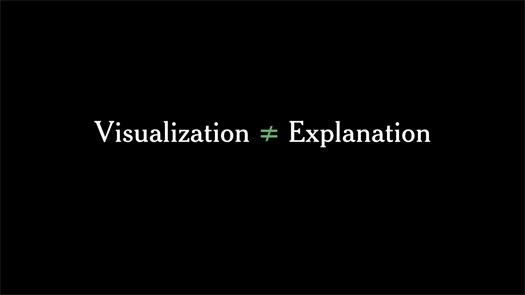
And most importantly, I try to keep in mind that visualization is not the same thing as explanation.
If I visualize something and walk away, I’ve only done half the job.
I’m certainly not the first person to use planet data.
There have been many attempts to use and explain similar data sets, including a lovely piece by Jan Willem Tulp, who is speaking next.
But some attempts are visualizations that don’t try to explain, like this one by NASA. It’s animated, but I’m only showing a still. It’s fine as a visualization — the designer clearly understands the data, and has made many design decisions: colors and sizes, large planets and invisible stars.
And the graphic raised questions when I saw it. For example, what is that big yellow planet near the bottom? But it gave me no way to answer those questions without looking for the data and trying to find the largest planet.
I didn’t show this slide, but another example of visualizing without explaining is the Kepler Exoplanet Candidates video by Jer Thorp, which is impressive but hard to decipher.
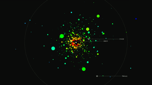
Kepler’s Tally is self-updating. I run a script, and it updates itself with any recently-confirmed planets.
The last time I updated it this large star appeared, and immediately caught my eye.
My first thought was that it was a mistake, so I went to look at the script and the data. Both looked ok.
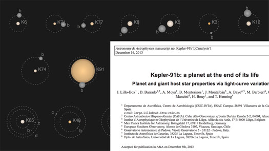
Then went to find the paper announcing planet Kepler 91b, and it turns out it’s a dying planet. The star is expanding and will swallow the planet within about 300,000 years.
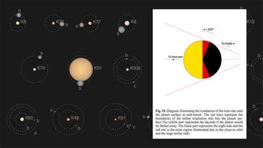
And the star is so big, and the planet so close to it, that sunlight falls on more than half of the planet at once.
If the yellow here is the light that Earth receives, the red is the extra area in sunlight.
I wouldn’t have found this without the interactive, and without the graphic giving me some way to answer my question.
And I tried to put some of that "Aha!" moment back into the graphic, for the next reader who notices that star and has a question about it.
I haven’t shown you many projects this morning, but they do have a theme.
The Curiosity mission is a search for evidence of past water on Mars.
And the Kepler mission is a search for Earth-sized planets in the habitable zone, where liquid water might exist on the surface of a planet.
Both are examples where we — we as humans — are looking for evidence that another form of life might have responded to, or felt, or perhaps even been conscious of ...
... the weight of rain.

Thanks very much.

Thanks to Eric Klotz and everyone else at Visualized for the invitation to speak.
For another one of my talks, see Storytelling with Data.
