

Dec. 19, 2025
After 20 years at The New York Times, I gave a farewell talk to the Graphics desk on Dec. 17.
Here's a lightly edited transcript:

So 21 years ago, I was a freelance designer who occasionally posted information graphics online.
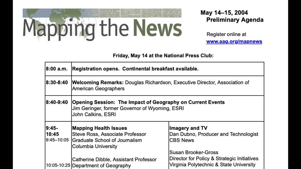
And I was invited to give a talk at Mapping the News.
I was not in the news industry, I was not in the mapping space ...
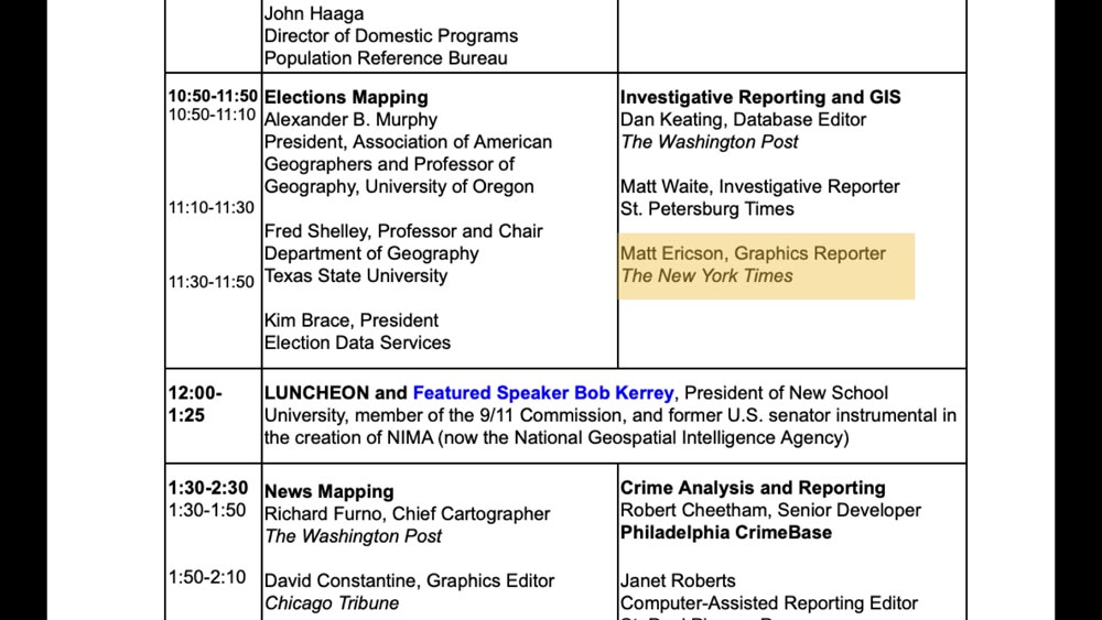
... and so these names weren’t familiar to me, but Matt Ericson from Graphics was right before lunch.
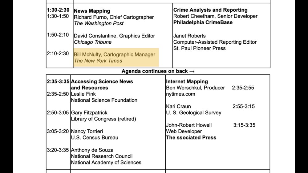
Bill McNulty was there from Maps.
And I was way down at the bottom, in one of the last sessions of the day.
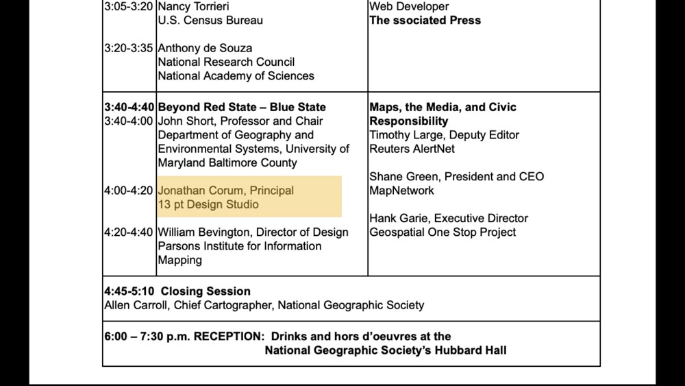
That session was on election mapping, and it was called “Beyond Red State – Blue State.”
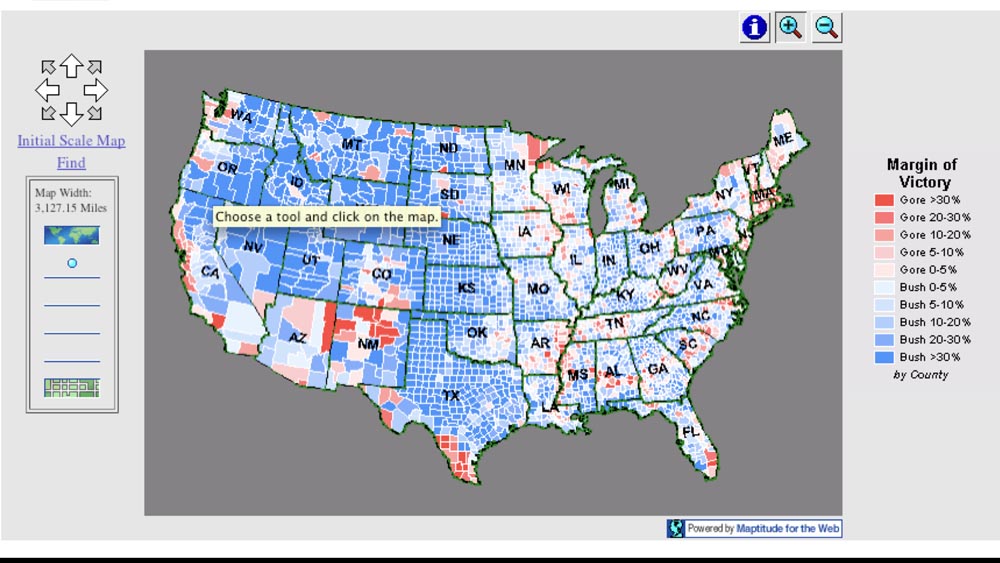
And this was 2004, so we had just started having things like interactive maps.
This one says “Choose a tool and click on the map.”
You may notice the colors look a little off on this one.

Going into my talk, I knew that the choice of red or blue for Republicans and Democrats had been in flux, and it had been up to each publication to decide, at least through the start of the 2000 election.

What I didn’t know going in was that in the month it took to count the votes for the 2000 election, and thanks largely to The Times and to Archie’s work — he’s shaking his head — that those colors had become fairly standardized.
News organizations had settled on “R” equals “Red” equals “Republican.”

But I didn’t know this, and I didn’t realize it until about 20 minutes before my talk!
The source I’d been using was nationalatlas.gov, and I figured that would be fine.
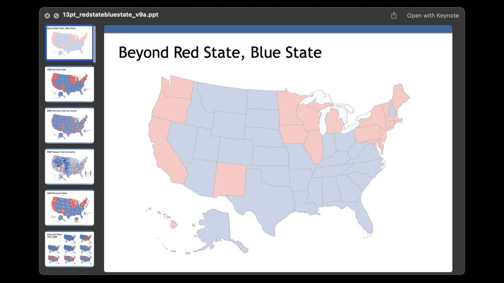
But when I got there — I was the second speaker in this session — I realized that every one of my slides was essentially inverted from what my audience was expecting.
And it wasn’t really until the 2004 election, in fairness, that the red state, blue state concept became widely popular. But I felt horrifically unprepared, even though I’d done all this background work for it.
I almost said no when I was asked to give that talk. But I figured, if I’m putting these graphics out there, if someone is seeing them and asking me to talk about them, then I should at least try.
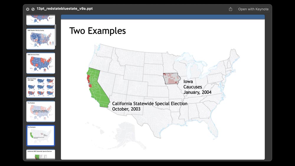
I really had only two mapping examples to show. And I definitely would pick different colors if I were doing this today!
I don’t remember anything about the talk or how it went, but I do distinctly remember Matt and Archie and Bill walking towards me after my talk.
And I was thinking, who are these business casual guys? But we had a great chat.
And then about a year later, I started working at The Times.
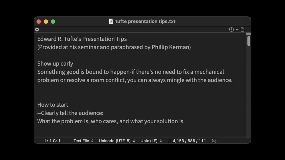
Going into my first professional talk, all I really had was a text file of advice from Edward Tufte that had been paraphrased by someone who went to one of his talks.
I read through and tried to get every piece of advice I could out of it. I didn’t do everything it recommended, but I tried a few things that helped me get through Mapping the News and successive talks.
So I thought, 21 years later, that I could summarize some of the mistakes I’ve made and some of the things that have helped me prepare and give talks.
Specifically, this is a talk about how do you give a talk with slides. We’re all visual people here, we have things to show.
This is about how to speak over slides in a presentation format.

And this is also about giving a talk in person. So I apologize to everyone who’s dialing in. It does feel like a different skill set to give a talk if it’s going to be streamed. And I have definitely not learned many of those lessons.
So this will focus on being at a conference or convention, and giving a talk in front of an audience.
So I think the first question might be: How do you write a talk?
And I think for me, the answer has always been: Don’t write your talk.
Your time is better spent working on your slides, it’s better spent trying to smooth out your presentation of the information.
And so I generally never sit down and write exactly what I’m going to say. If I give a talk 10 times, it’s going to be different all 10 of those times.
But what can help is to write out an introduction, something to help you get started. Usually those first two sentences are the hardest part of the talk, and after that, hopefully you ease into it a little bit.
Often I’ll start with an anecdote or a statement. Some people start with a question. It’s really up to you.
But writing that out and memorizing it, or half memorizing it, can help you get into the talk and just get it started. And from then on, you can speak to the slides.

One thing I have to remind myself is to avoid putting in disclaimers. It’s very tempting, and it’s very easy to say things like: I’m not an expert, or I’m a beginner at this.
And so there are many ways that you can undercut your talk in that first sentence or two, even though as journalists we tend to want to put qualifiers and disclaimers on things. If that’s mandatory, try to find some other time to do it, not at the start of your talk when the audience is just getting adjusted to you.
If you still feel like you need to write something, then I think drafting an outline can help.
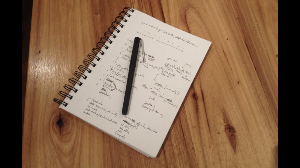
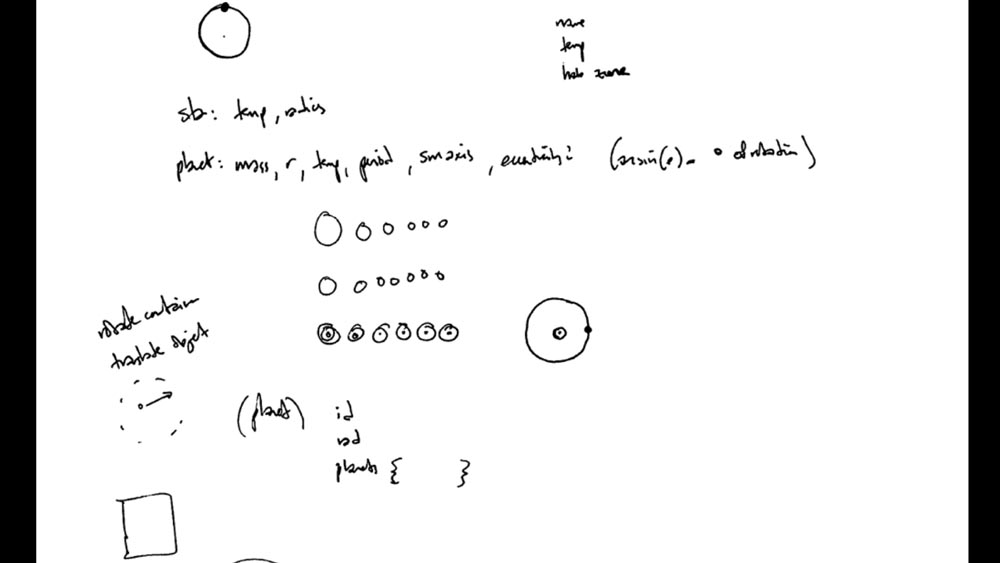
Often I do this on paper, just sketching it out.
Or if I have a talk coming up, I’ll often wake up at 2 a.m. and need to jot something down — just to get it out of my head and get back to sleep.
So these are some notes from 2013 for a series of talks. And notes can be really helpful. Not that you’re going to go back and read them, necessarily, but just to get them out of your brain.
So you can tell yourself: OK, I’ve stored this note for later. If it’s needed, it’s there, and I don’t have to keep thinking over and over about it.
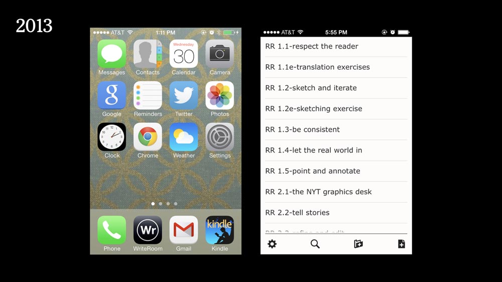
That was my phone in 2013, and you can see how phones have changed over the years.
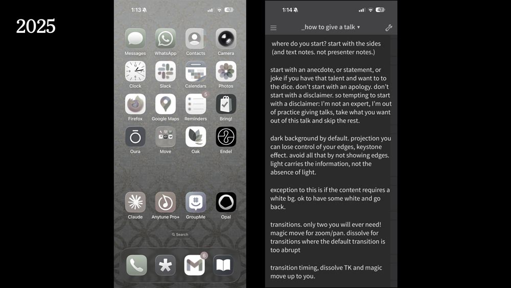
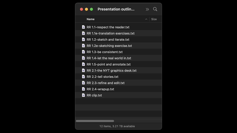
And these are notes for this talk, that I typed out weeks ago. And then not necessarily went back to read them, but just felt like I had them out there. They’ve been through my brain. I put them down somewhere. They were there if I needed them.

But really, I try to focus on the slides because that is what people are going to see.
My audience is never going to see the contents of these notes. The rough outline that I put in these text files, that’s purely for me.
They are going see your slides, and that’s where your prep time should happen.
So how do you assemble a talk? If we’re not writing it, if we’re not trying to figure out every word we’re going to say, how would we assemble it?
And over the years I’ve come to appreciate using a simple structure.
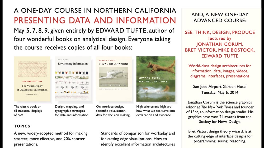
So when I was asked to give a talk with Tufte and a few other speakers in 2014 ...
... I distinctly remember — my son was two years old at the time — I distinctly remember leaving home on a Saturday, going upstairs in the Whole Foods in Tribeca and thinking: I’ve got to put this talk together.
It’s less than a month to go. I have all this material, I have these slides, and I have no idea how to pull it together.

And I was really desperate at that time to figure out: How can I combine all this different material in a way that makes sense?
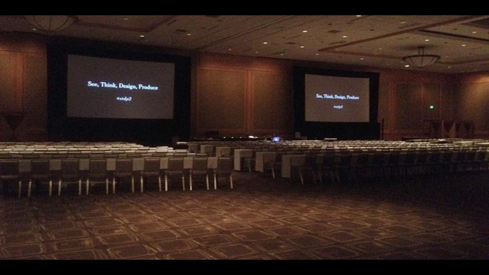
And so out of desperation, I sat there and read “Show and Tell” by Dan Roam, who I used to work with.
You can see that I purchased it on April 10th. I think the talk was on May 6th, so I was cutting it close.

But what the book did was give me permission to adopt a simple linear structure for the talk, and to think that that was going to be OK.
It’s a very quick read, and once I saw this page, I thought: This makes sense to me. This is something I can build a talk around.
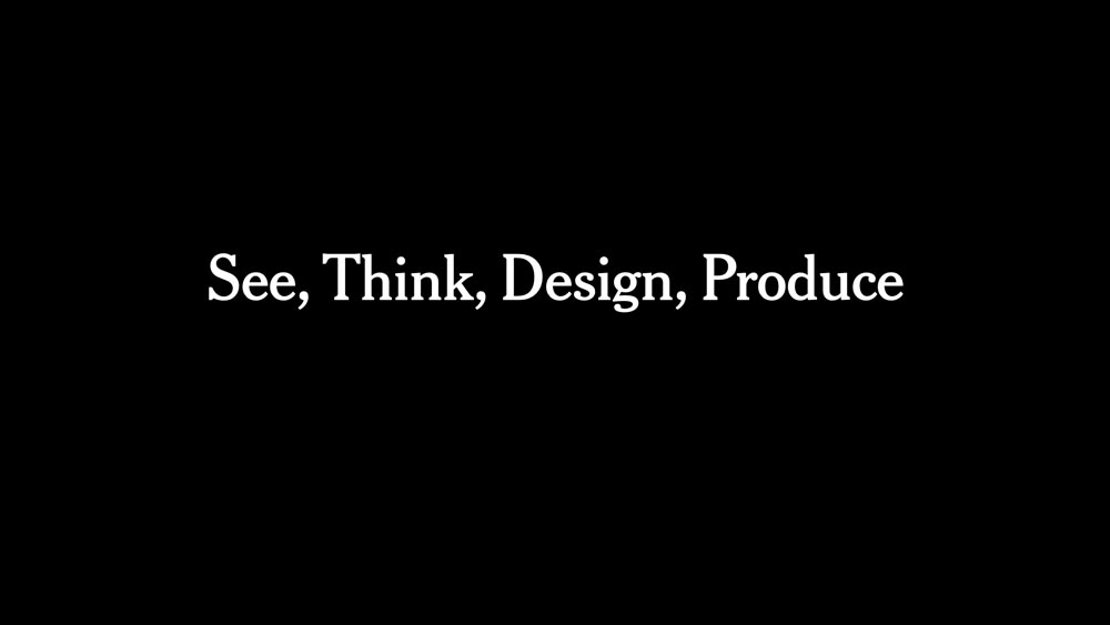
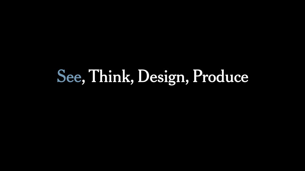
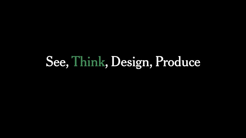
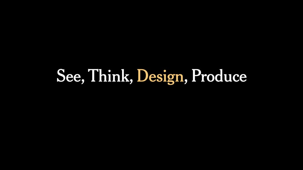
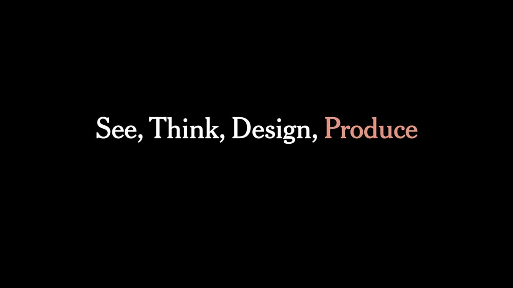
So I went back and I thought: OK, well, if the title of the event is “See, Think, Design, Produce,” then I’ll just steal that as the title of my talk. Right? There’s no reason to invent something else.
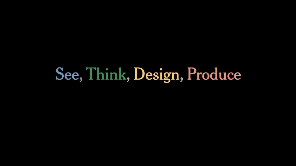
But what I can do, is assign a color to each of those sections.
I’ll break it into four sections, and then as I work my way through, it becomes almost like a progress bar, so the audience can follow along, can see where I’m going, where we’ve been.
It sort of becomes a glue that holds the talk together.
And then within each of those four sections, I can pick up that highlight color for my headlines, and that helps further link it together.
And then as I work through, the audience can see: How much do I have left on this talk?
Or maybe: How long until we get to the end?
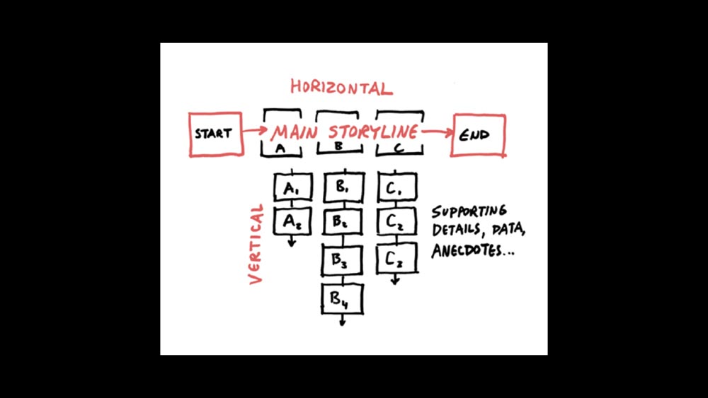
And the other nice thing about this idea of a linear structure with supporting details, supporting anecdotes ...
... is that it mimics slide software.
So whether you prefer Google Slides or, in this case, Keynote, you have that ability to nest slides. And that’s something that I use frequently.
This is one little mini section within the broader piece. These three slides go together, these six slides go together. Those groups can be rearranged within the linear structure, and I have the supporting material as part of it.
This mimics the shape of the talk as a whole.

So even though it’s a linear progression and it’s progressing in time, I still try to think about: What can I set up at one point in the talk that has a payoff later?
That could be a payoff from one slide to the very next, or it could be one slide that has a delayed payoff at the end of the talk — or even a few minutes later — that refers back to the setup.
So even though it’s a linear talk with a fairly simple linear structure, I’m still trying to find out: Can I close a loop, or can I refer back to something that happened earlier?

Has anyone seen this, has anyone seen “Cabin in the Woods?” Yes? OK!
(The only person in the audience who has seen it says: “I don’t know how it’s related.”)
Well, we’re going to get there!
My 10-year-old daughter loves horror movies, so I made sure to show her this one.

Early in the movie, you’re not sure who this man is, but there are two men in ties, they’re talking. And one of them says something like: “I just can’t believe I’m never gonna see a Merman.”
I was reading an interview — I couldn’t find it, I really tried to find it — but I was reading an interview with the director after the movie came out. And he said that this setup took just a few seconds on screen — and he had the exact number of seconds worked out — but this little conversation about not seeing the Merman, it’s just a tiny window of time in the movie.
But then once you get to the ending, when they finally do see the Merman — and see the horrific consequences of that — that setup conversation became one of the things that the audience really remembered, and they felt it was a wonderful moment in the movie.
I’m not doing setups on that scale, but I’m still trying to set the groundwork for something that can then appear later.
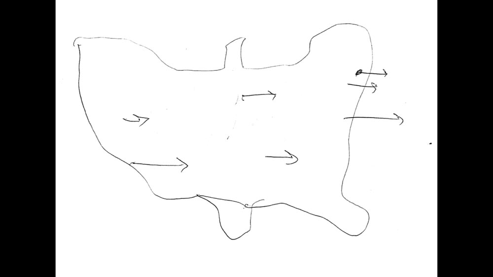
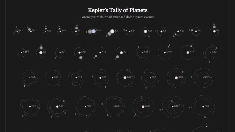
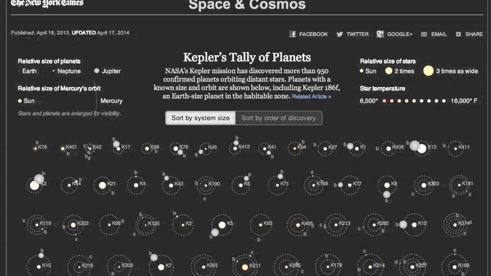
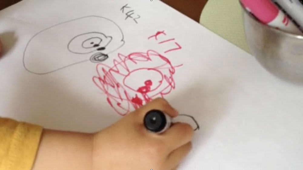
So this is, I think, one of greatest sketches in the history of The Times’ Graphics department. So if you haven’t seen this before, this is Kevin Quealy's.
He’s from Minnesota.
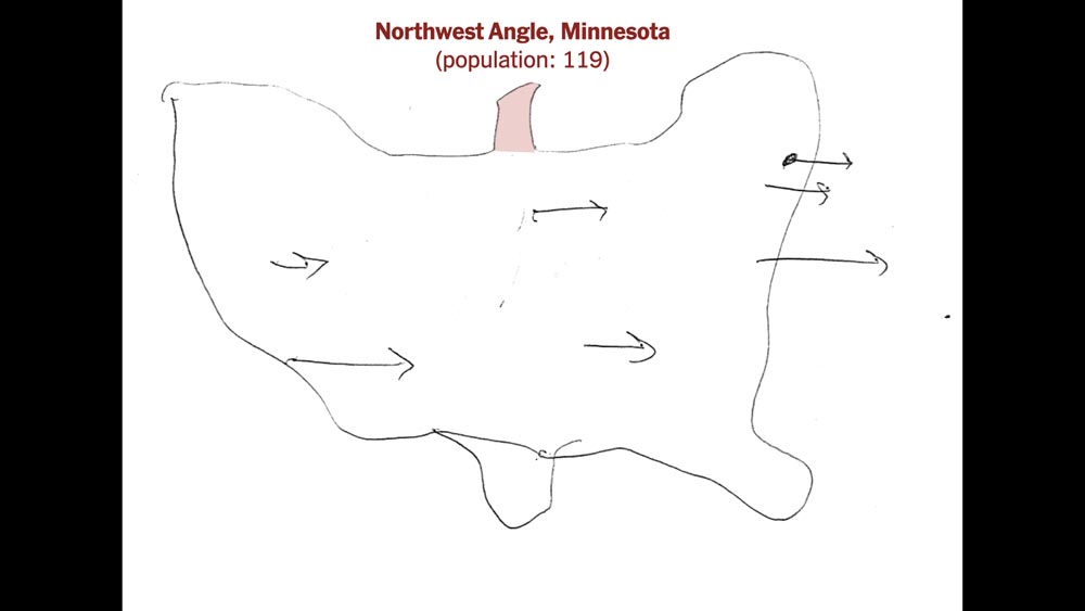
So when he drew this map of the United States, he’s adding in the Northwest Angle here. It’s that tiny little piece of Minnesota that sticks up into Canada, with a population of 119.
But then he forgets to add Texas here. And he has to come back later and draw that in another line.
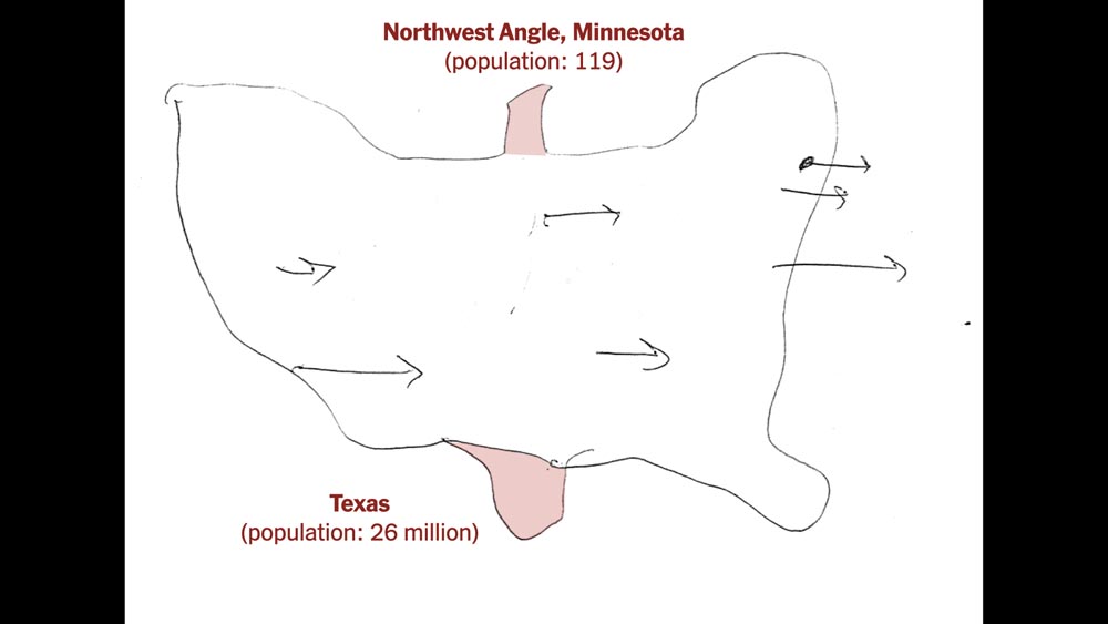
And that’s a population 26 million people.
So in the talk structure, this is perfect.
It’s a perfect little setup and then an immediate payoff.
But it’s also a great sketch for other reasons, and if I were doing a full graphics presentation, I could talk about how it relates to what comes later.
I could show: OK, how did that sketch develop into a real graphic?

Here are small multiples. I can talk about how it looks backwards in time.
So I can go on a diversion and explain this graphic. But you still have that initial setup lingering there.

So one way to wrap up this little mini section of the talk is to point out the Northwest Angle at real size, at scale.
And this gives you a tiny section of your talk that you can move around to different places, depending on how you feel it best fits in your linear argument.
But it makes this nice little setup and payoff.

So by the time I run through all four sections in ”See, Think, Design, Produce,” people have been listening to me for an hour.
I’ve run through, I’ve hit them over the head with this linear progression.
How am I going to get out of this linear thing?

And after a lot of thinking, I realized: Actually there’s a pretty easy way I could do this. I could just add another layer up or down, depending on how you think of it.
I can say: OK, well, the first two parts are about Understanding ...
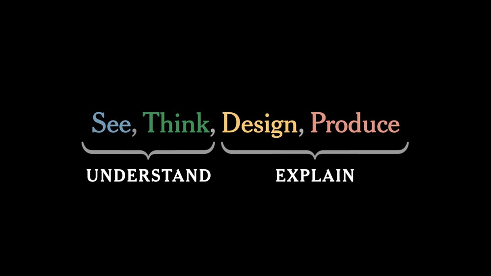
... and the second two parts are about Explaining.
And so what that did was it gave me a way to have a little bit of a conceptual payoff from where I started at the beginning.
And it gave me a nice way to exit out of the talk.
I also do a lot of immediate setup and immediate payoff.
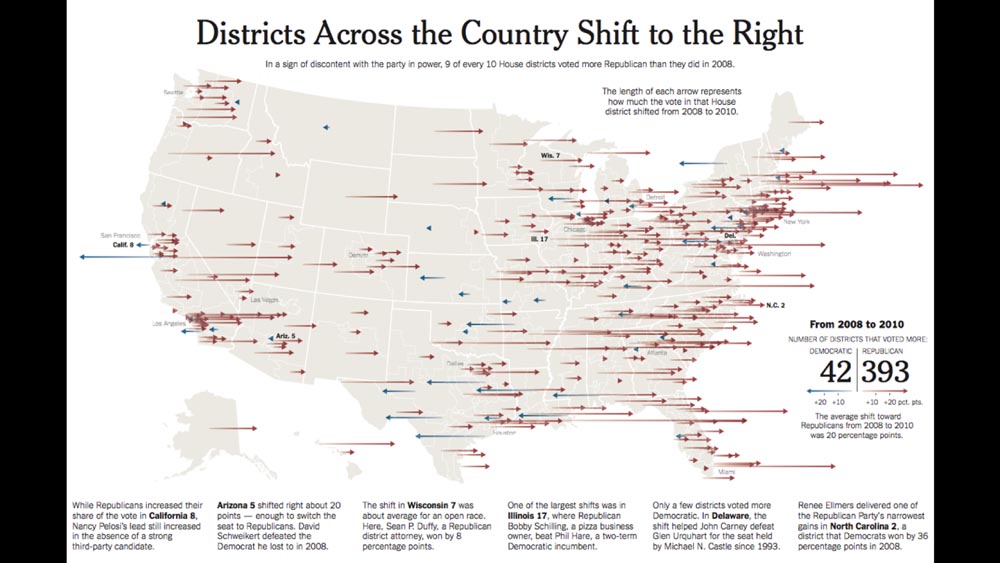
There are any number of ways that I could frame some kind of comment around this photo at The Times ...
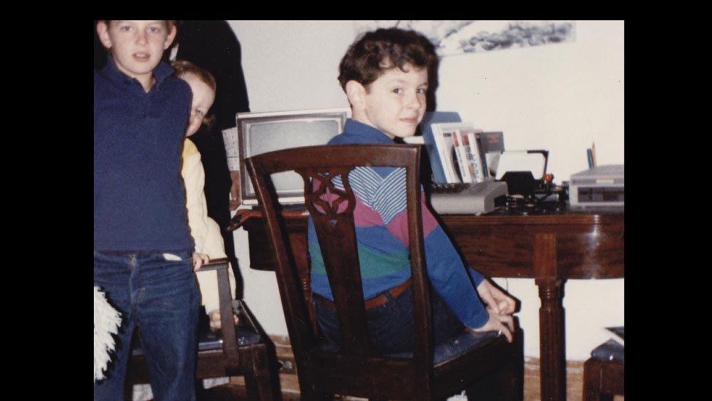
... and then flip to myself as a child. Or I could do the inverse, I could start as a child and go to an adult.
So those before-and-after, or then-and-now, or sketches like Kevin’s, those are all great examples to set something up and then have it payoff immediately.
As opposed to just: “Here’s something I did. Here’s something I did. Here’s something I did.”
That was one frustration when I was starting out as a designer. I’d go to talks and I would see how people speak, and sometimes you’d get a designer who would just give a portfolio talk, like: “Last spring we did this, last summer we did that, then we did this, this led to that piece.”
And sometimes there wasn’t much discussion about what the thought process was, or what the sketches were like, or what things went wrong and then were solved.
So I’d encourage you not to — not that anyone here does — I’d encourage you not to give portfolio talks where it’s just: “Here’s a thing I did, here’s a thing I did, here’s a thing I did.”
When I was starting as a designer and watching other people to see how they gave their talks, that seemed like a trap that is very easy to fall into.
As designers, as journalists, our job is to show and explain things.
And I think the same applies for talks, that you put up a slide and then you explain it. And the exact words can change each time you do that, but you don’t need a piece of written paper to give you the exact word you’re going to use at that place. It’s more important to just explain to your audience what you’re showing.
So you’ve assembled your talk, then how do you design it?
Well, I keep things very, very simple. I only use one template for every slide, and then delete what I don’t need.
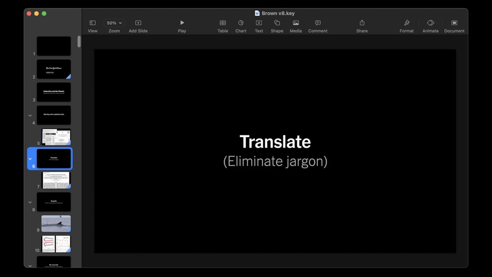
So this is my standard. The fonts will change depending on the context of the talk. But usually, it’s a simple “hed and subhed” structure.
Often, I don’t need that subhed and delete it. Or if I have an image, I’ll just delete both. So I don’t go out of my way making elaborate templates.
I try to make every word count on my heds, just to minimize reading, and to have large type that people can read depending on the size of the screen, the size of the audience.
And the text is really a reminder to me, right? Because I’m not using notes, I’m not using presenter notes, I’m not looking at my laptop to see the next slide coming up. It’s a reminder to me about what to talk about. And it’s also a reminder for the audience of how we’re moving and progressing through the talk.
I tend to use dark backgrounds. I don’t know when I started that, but in part it’s to minimize the effect where if you’re speaking in a darkened room, you can get this glaring light.
So I try to have the light show the information that I’m giving to the audience, and not the absence of light, if that makes sense, to avoid effects like that. And also if you’re in a bright room you can have wash-out effects on the screen, so you also need to be a little careful about that.

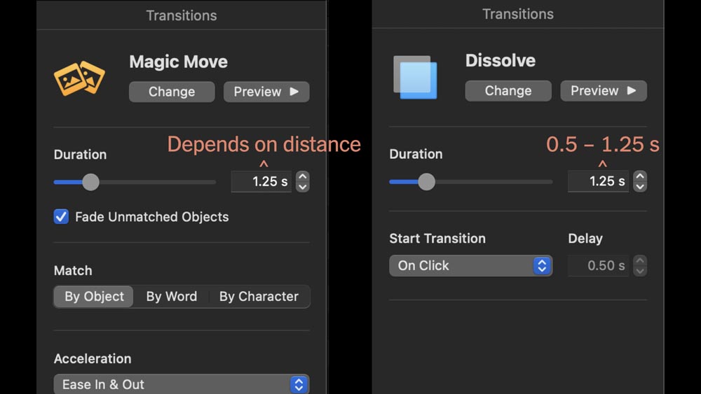
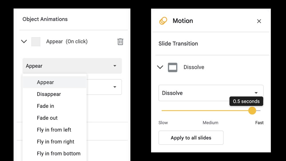
And then I only use two transitions — as well as the default transition, which is none.
So if you look at Keynote, there’s something like two dozen or more different transitions that you can use, but I think it’s safe to just ignore all of them. The only ones that I find helpful are Magic Move and Dissolve.
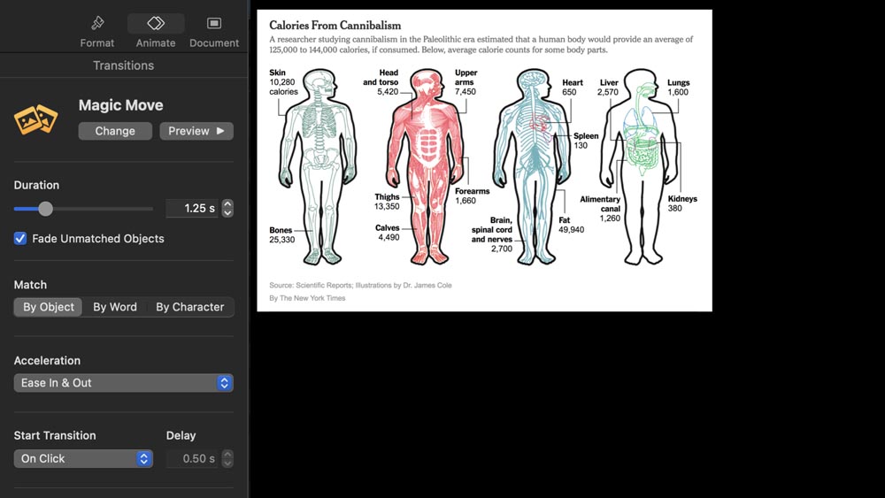
So Magic Move, if you haven’t used it before, the way it works is you take an image. You put it in one location on this slide ...
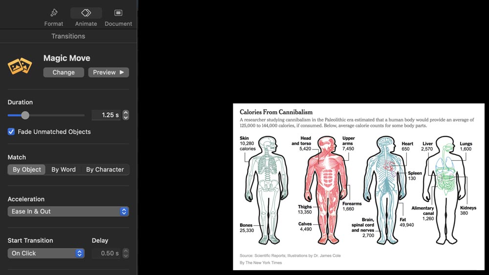
... then on the next slide, you put where you want it to go. And then you set the transition, you set duration, and then when you advance the slide, the object will move.
And it’s typically very seamless, though it depends on the screen. I use this quite a lot.
Depending on how you place things, you can make things zoom. You can zoom into an image ...
... then on the next transition, you can pan across, or zoom out.
So it’s a very flexible way of simulating a video or a video walkthrough.
But you are controlling the steps for the audience.
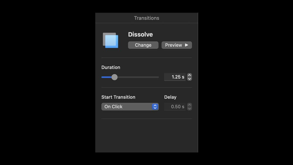
The other transition is Dissolve.
Dissolve is a transition where you don’t want a hard break between slides, and that can be useful in setting a tone.
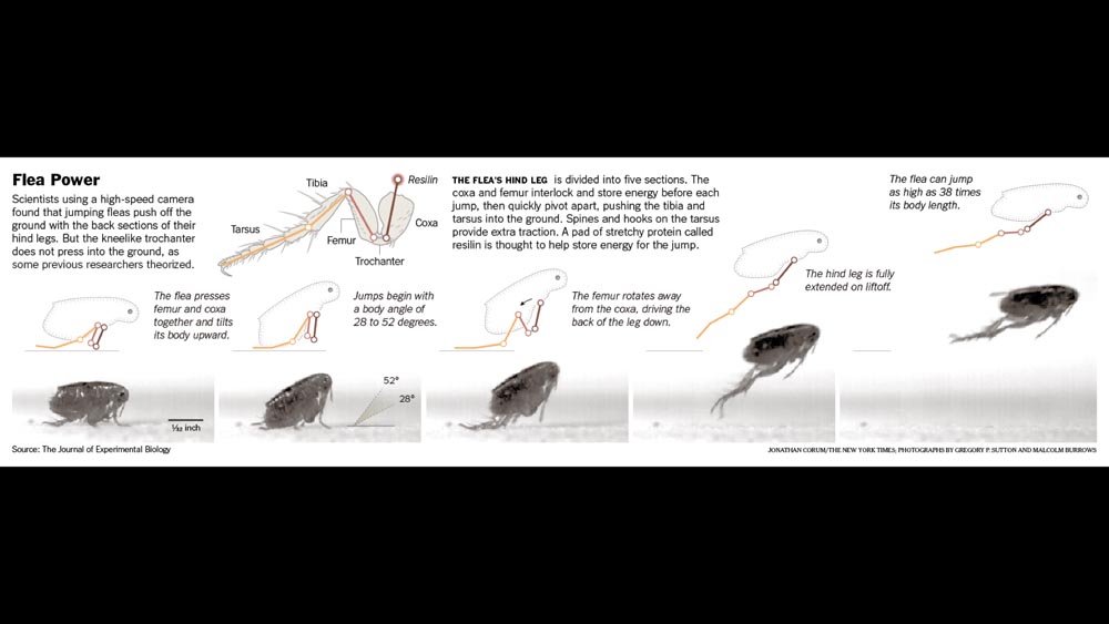
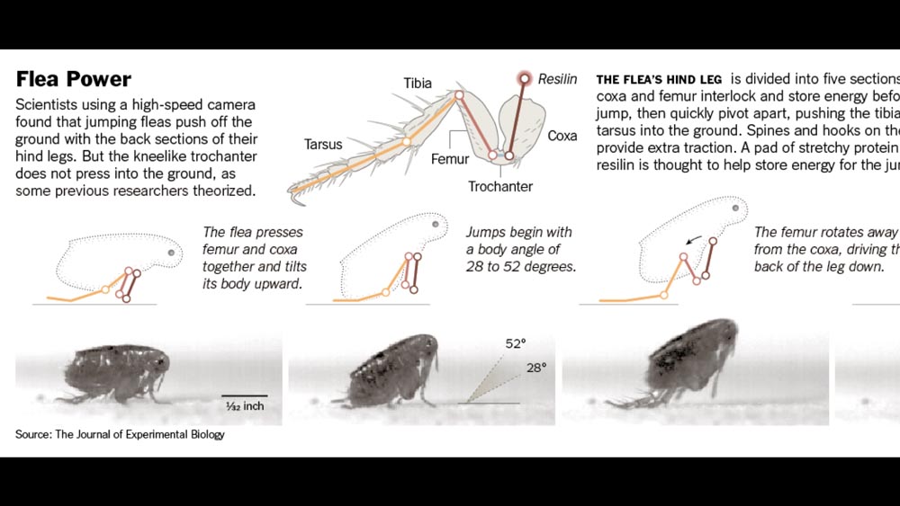
So if this were a full graphics talk, I could take this sketch ...
... and I could speak about how a sketch can become a proof of concept ...
... and that proof of a concept can become a mockup ...
... and then from the mockup we might work towards an animated graphic, a full graphic.
And that graphic is then published. It goes out into the world.
We hope that a reader will pick it up. We hope that a reader might see it and be inspired by it in some way.

And then sometimes — maybe once in 1,000, once in 2,000 graphics — sometimes a graphic can leave that world ...

... and find a new home, a new space to exist in.
So if you notice, when I was talking through those slides with Dissolve transitions, it tends to smooth the slides together a little bit.
Sometimes it can lower the tone of the talk, then you can bring it back up afterwards. And that feeling is very different than, watch this —
— a quick break like this, which is the default transition.
Quick breaks can be good to keep you progressing through a talk. But occasionally, every now and then, I will put every slide on a very tight Dissolve. Especially if I have a tone where I want things to be smooth throughout and I’m not necessarily hopping between topics.
Typically for Dissolve I use between half a second and 1.25 seconds, depending on the effect. You have to check, because if you overdo it then it can really weigh things down.
And then Magic Move, it really depends on how far you’re moving. I’ve used up to 12 or 16 seconds if I have a very tall graphic that I’m slowly proceeding through. So that’s really just your judgment as a journalist.
I tend to use Keynote.
I know that Google Slides is used here a lot as a way to collaborate. They do have a Dissolve function, and there are ways to animate things, but it looks like there’s no simple Magic Move.
So for a department talk, Google Slide is fantastic. But if you’re talking at a conference then you could take a look at Keynote just to have that extra tool in your pocket.

So these can be combined, you can combine Dissolves and Magic Moves.
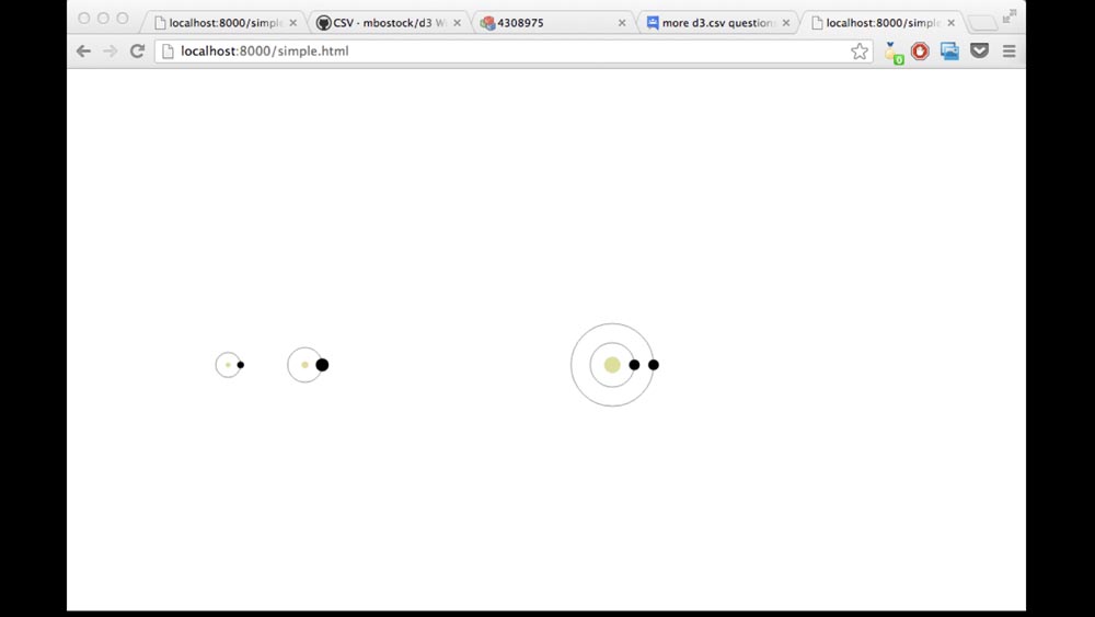
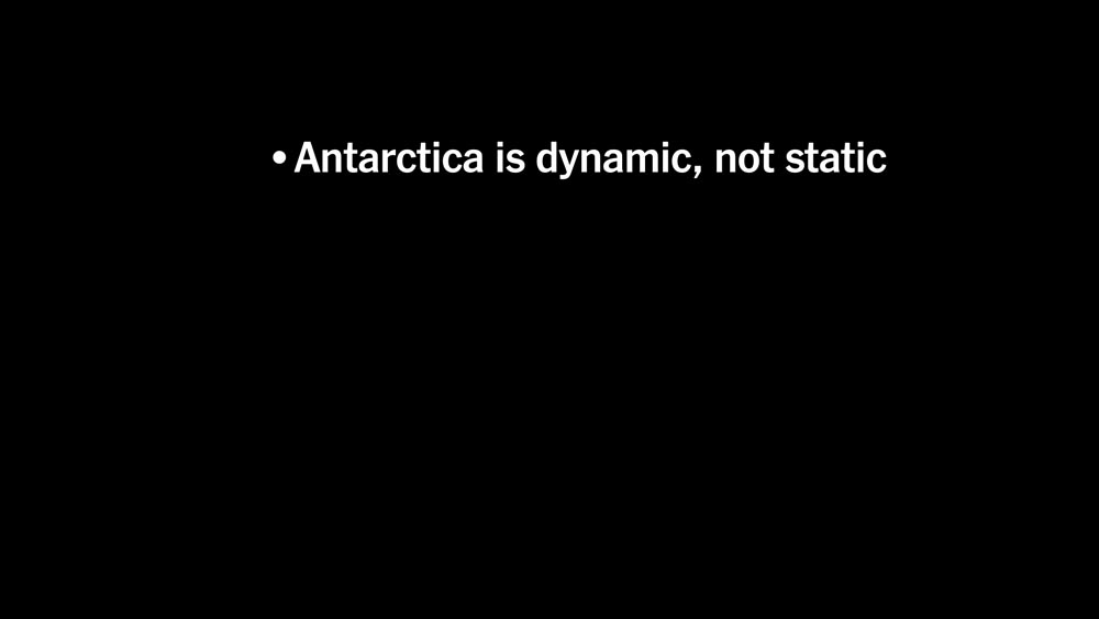
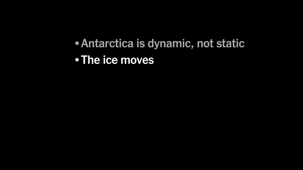
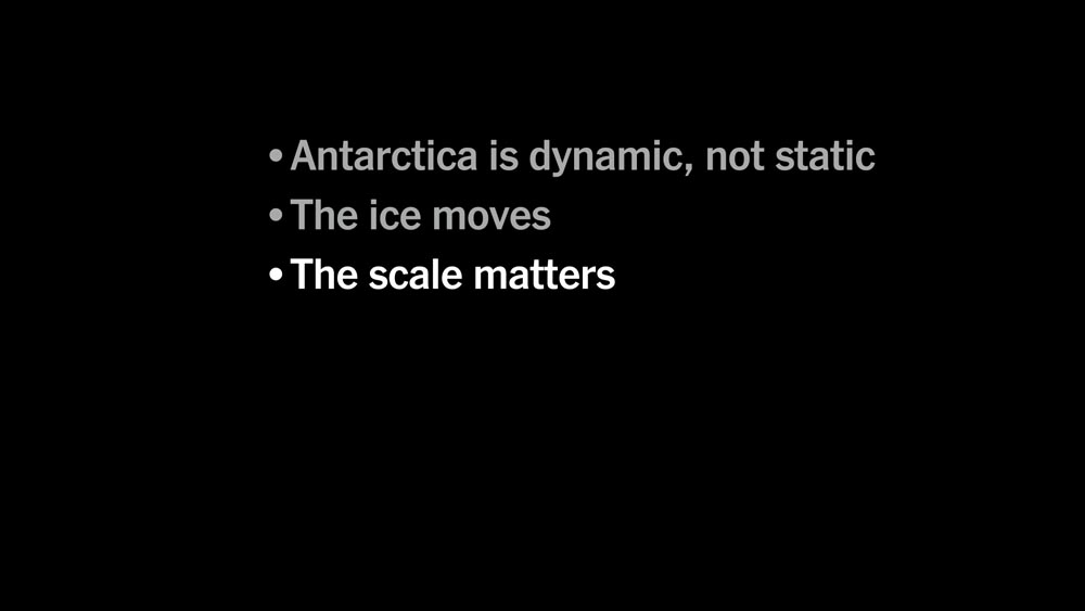
So this was for a talk, just showing how we took Antarctica data ...

... and then how it changed.

How we, as we were sketching through it, how we were looking at data, how the way we presented the data changed.

And then you can also rotate things into position with Magic Move ...

... like this.
So it’s a nice way to simulate video, but I am controlling when it happens.
If I stop and want to say something more about that third slide, then I’m not trying to chase a video or wait for a video to catch up with me.
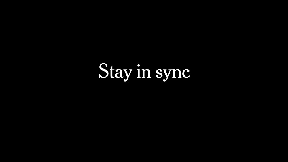
I’m trying to stay in sync with the audience — with what they’re seeing — and those tools are both good ways to do that.
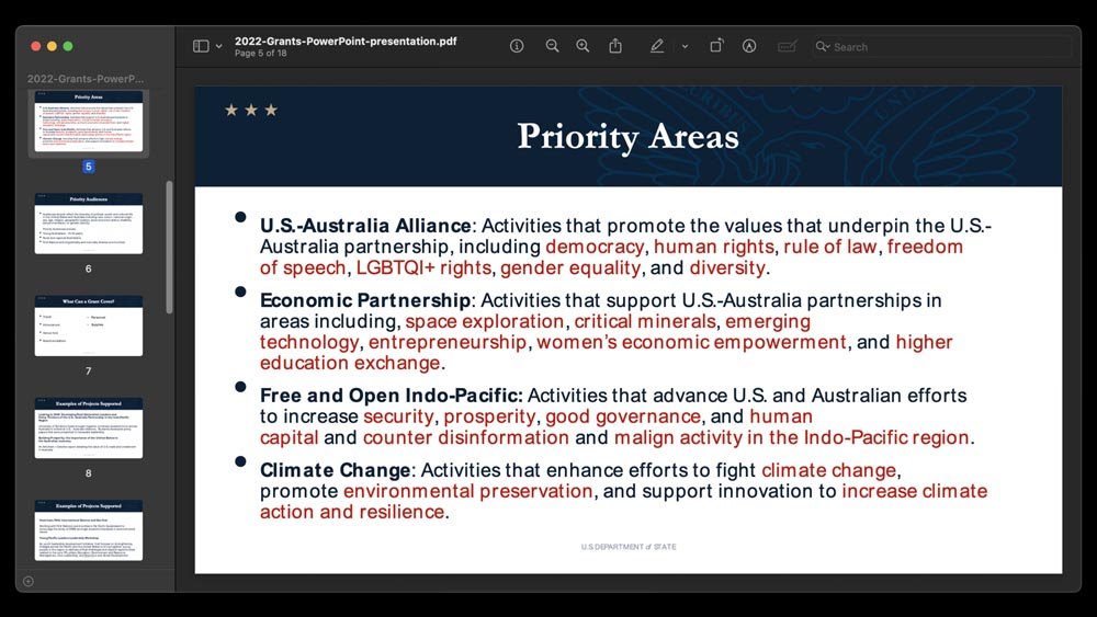
I spent a lot of time last week looking at State Department fonts, so I thought I’d look at State Department PowerPoints. This was one example.
And part of the problem of bullet points and this type of slide is that if I’m here and I start talking about the U.S.–Australia alliance and adding details, by the time I’ve reached the end of that bullet most of the audience has probably read to the end of the slide.
I’ve gotten out of sync with the audience, and the audience is waiting for me to catch up to them, to where they are.
And also it may give the audience a sense of: OK, he’s still talking about this first bullet point, and we’ve got three more to go before we get off this slide. It’s kind of pushing the audience into the future, and you’re slowly catching up with them. And then it all happens again on the next slide, right?
If you are using bullet points, you can give them progressively in time so that you stay in sync.
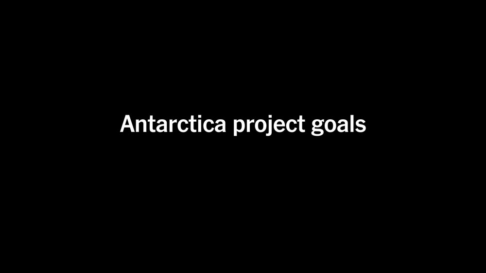
I tried to find examples where I've used bullet points, but I only found maybe one or two, in a less formal talk.
This was wrapping up our Antarctica project. And in that case, I did, I just showed one point at a time ...
... and then lightly grayed out the ones that came before just so that I could talk to each point.
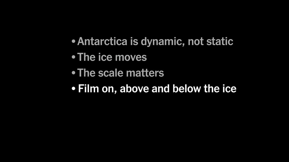
And not have people skip ahead, right?
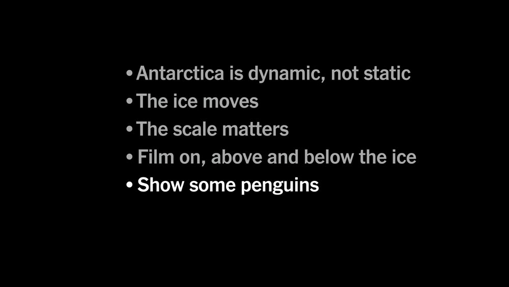
So this was the final bullet point. “Show some penguins” was our end goal.
You’ve designed your talk, you’ve assembled your talk. So how do you rehearse a talk?
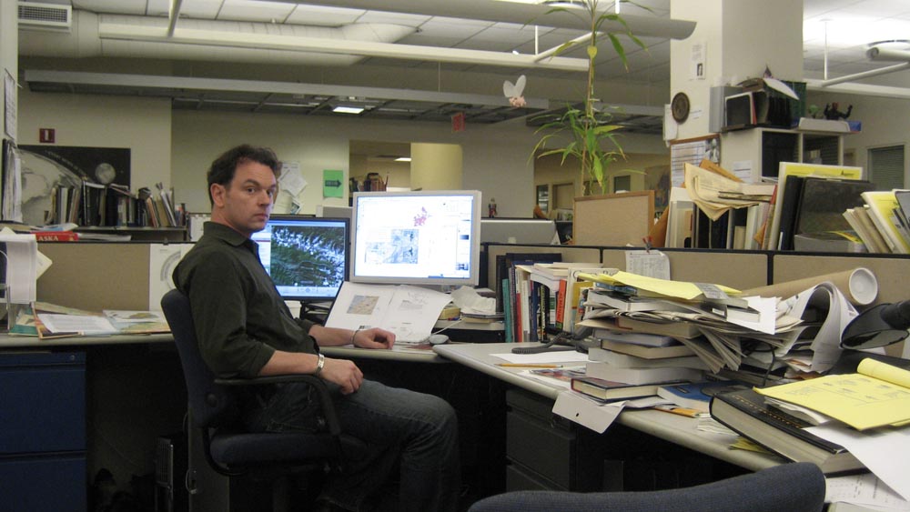
I’ve done a lot of rehearsals in this very room, and other places around The Times.
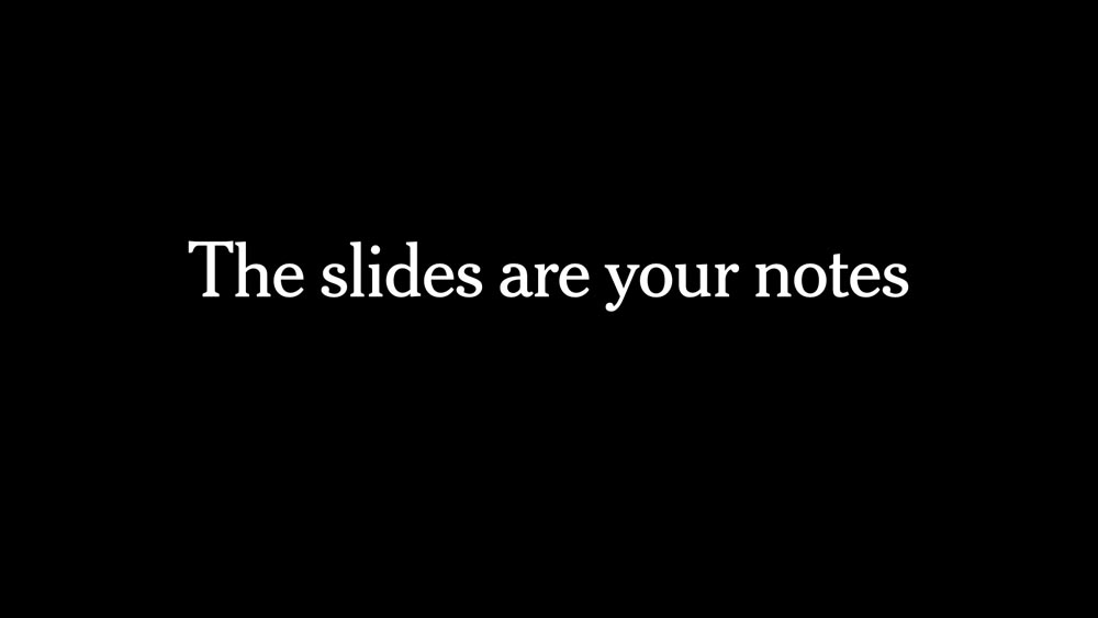
Whenever I’m rehearsing or writing or working on a slide deck, I just think: The slides are my notes, and I want to be easy on myself.
I want to make sure that things are progressing, that I’ve rehearsed the sequence, and that I can work through that sequence with hopefully not too many hiccups or issues along the way.
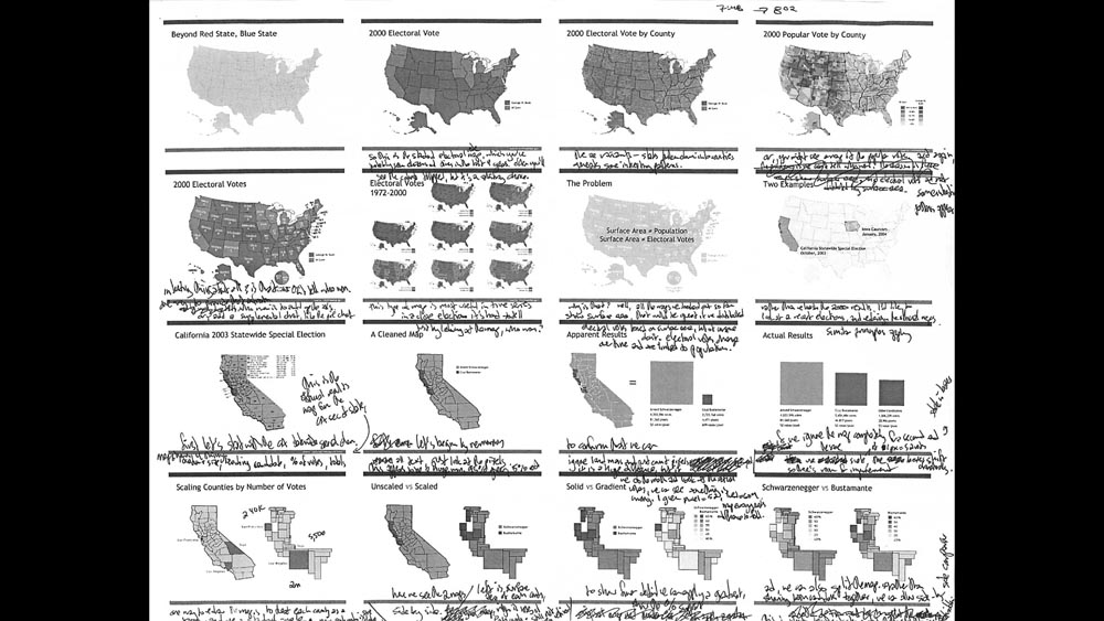
This was a printout from my very first talk 21 years ago. I was probably writing notes so that I could rehearse on the train down to D.C., or maybe remind myself what I was going to talk about on the train down.
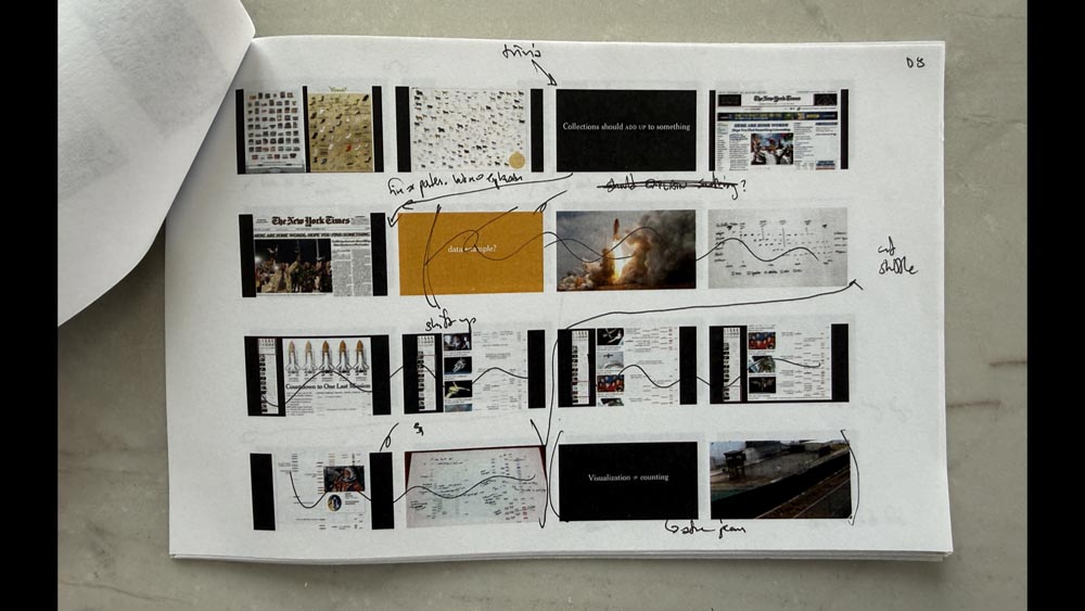
I’ve used this format for every talk I’ve given. And usually I think of them as contact sheets from an old camera or something.
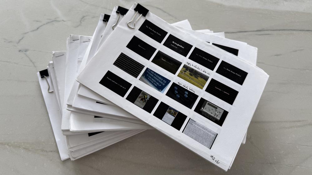
I have stacks of these from different talks, and I just find them incredibly helpful at getting away from your small screen, getting an overview of your talk and seeing how it fits together as a coherent whole.
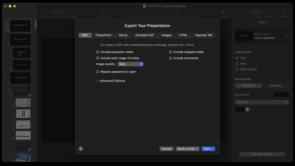
And so the way that you make these is you open up your presentation and export every slide to PDF.
So you’ve got one PDF with all the pages in it.
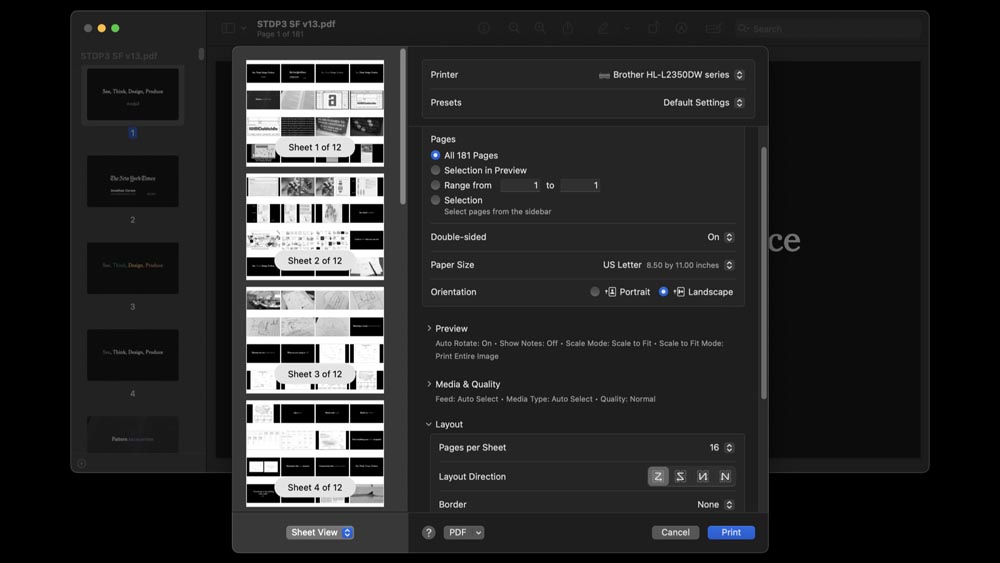
You open up that PDF and set it to print with 16 pages per sheet, and then you print that to a PDF.
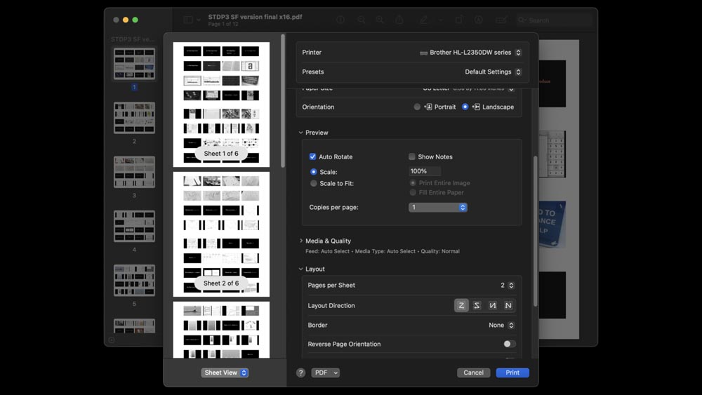
Then open that new PDF, and print it to PDF again with two pages per sheet.
So it sounds a little cumbersome, but you can get it done in a minute, basically.
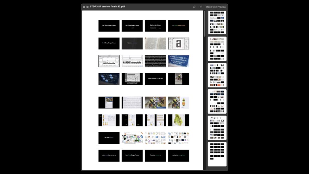
And at the end, you get 32 slides on a single page.
Cut that in half, staple or clip it together, and that becomes your roadmap for the talk that you’re going to give.
So this is one of my talks. It’s a full hour, and it fits on six pieces of paper.

And so once you have a booklet of contact sheets, that and your clicker are really the only things that you need to practice.
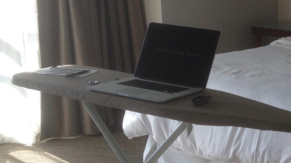
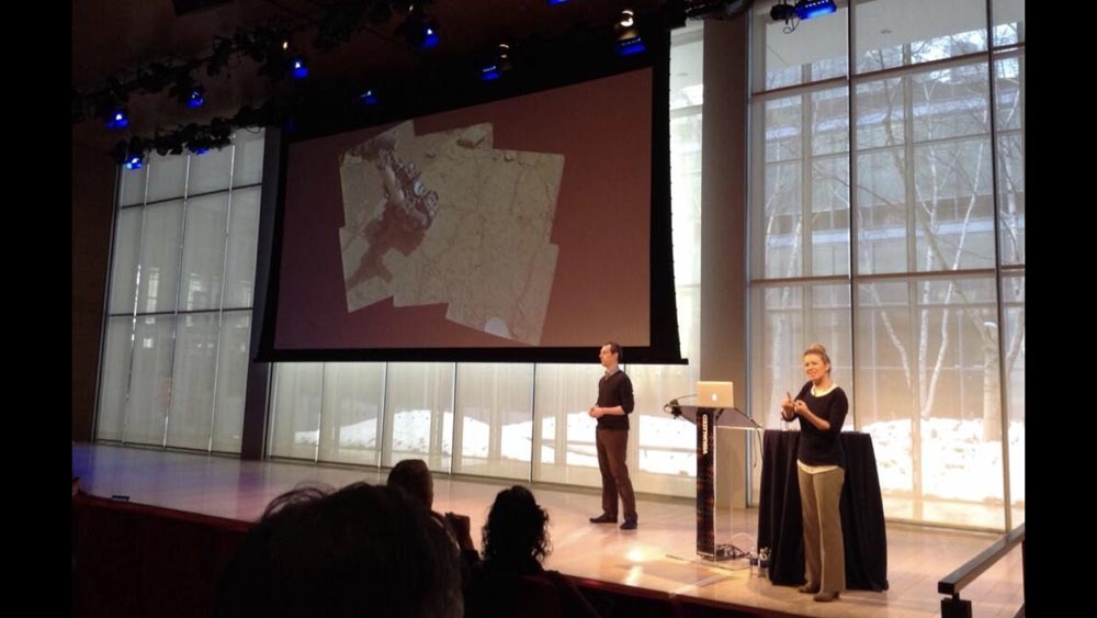
So this is me the day before one of those “See, Think, Design, Produce” talks.
I’ve got my pen, my contact sheet and a stopwatch just to make sure that I’m staying on time.
This is an ironing board as my counter ...
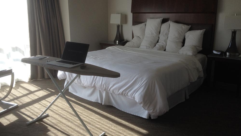
... and then I set up the pillows to be the audience.
So people differ, but I have a hard time making direct eye contact during a talk, because then I start to think: OK, what facial expression are they making? Are they nodding off? I start to thing about that person.
So if you can’t make eye contact — which many people cannot — then you can look at their ear. You can look a point just above their shoulder. And then it appears like you’re making eye contact, without focusing on a face and your brain starting to process the emotions that are on that face.
So maybe you set this up and then practice peering at the gaps between the pillows — that’s a way to do it!
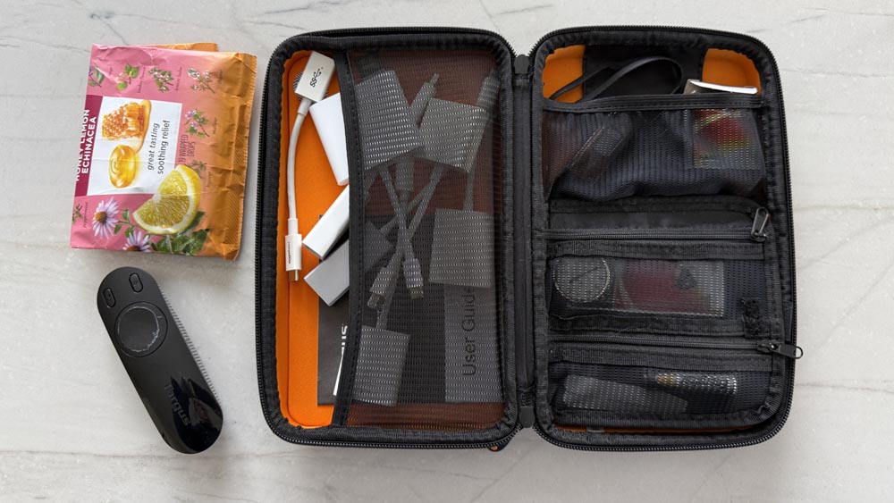
I used to carry an equipment case around to talks. When I made a mistake and I wished I’d had something, I’d put it in here.
This was back in the days where the Apple dongles were changing over and over — every few months, it felt like.
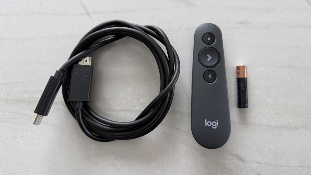
Now with the current design of laptops, all you really need to bring is an HDMI cable — just in case — and then some kind of clicker.
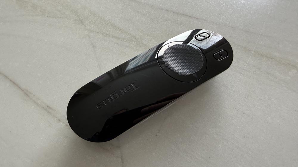
Depending on the design, some of these have really bright lights on the advancing dial.
So I would tape those up, because if I’m in a dark room I don’t want this little dot of light that is moving around with my hand. I want this clicker to be as invisible as possible, and seem like it’s not there.
And for the same reason, I’ll put a little electrician’s tape to cover the laser pointer. So I don’t accidentally lase someone in the face.
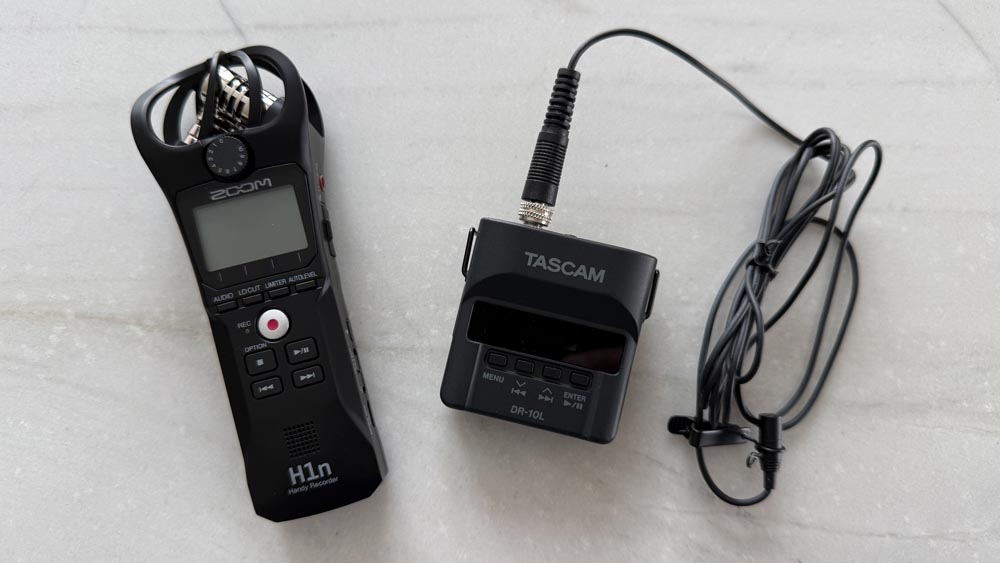
I definitely don’t like listening to my talks, but I like recording them and looking at the transcripts.
And I like wearing a jacket at talks because you can know where everything is. I can keep my clicker in a side pocket. I can have a lav mic on my lapel without wiring something up my back.
Or you could use your phone, or a standalone recorder. But it’s very valuable — for a number of reasons — if you record yourself. I think it will only help your talks as you go forward.
Time yourself!
I think from the very first time you do a rehearsal, I think it’s important to see: How long does it actually take? And usually that first one is very long.
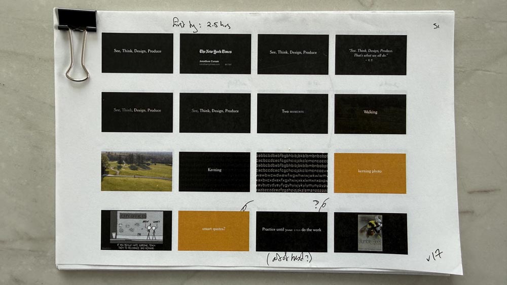
When I did a first runthrough of my first “See, Think, Design, Produce” talk — if you can read here at the top, the first try was two and a half hours. That was in this room, late at night.
But after two hours, I was like: “Oh, this cannot still be going on. How am I going to get this down to an hour?”
And usually that first run through is pretty terrible, but it gives you a lot to think about. And it lets you figure out: OK, where were the parts where I stumbled? Where were the parts where it felt like I was hammering a point too much, or I was showing too much detail about a topic, or where wasn’t I showing enough?
These orange slides here are placeholder slides.

And this process lets you say: “OK, well, here’s where I’m starting from. And now that I’ve done it once, I have a sense of relief.”
And now, I can go through and decide: How can I refine this? How can I smooth it? How can make it easier on myself when I give the talk in a week, or a month, or three days from now?

Usually if I’m doing a rehearsal, I wouldn’t stop to fiddle with the slides, but I would have the contact sheets and a pen.
So if I really stumbled over a section, or one of those little subunits of the talk, I’d just scribble it out, right? Or make a note that this is not working here, move it later.
We’re all editing graphics. This is a similar process of: Where are the stumbles? Where are traps? Where can I smooth things out and make the sequence more clear?
And by giving a full practice run through from the start, you also begin to learn your pacing. So if I’m giving a normal design talk, my average is 10 seconds per slide. And that includes transitions and things like that.
So I tend to use more slides than probably most presenters will. But I know that even if I have 200 slides that I’m getting through them at a rapid pace.
In this talk I’m not trying to give a detailed breakdown of specific graphics, so I’m probably moving even faster.

And one thing I also think about when I’m preparing a talk, I think about the cumulative time of the audience.
So if there are — let’s say there are 40 people here, and this is an hour block. That’s 40 hours of audience time that I’m taking up. Whereas a Tufte talk might be 300 people and 300 cumulative hours.
I should be giving some portion of that time into the preparation of my talk. And that ratio is up to you. But I think over time you start to figure out how much prep time you need, based on the scale of a talk.
And then this is one of the hardest things for me — or it was hard when I was giving a lot of talks — just trying to sleep.
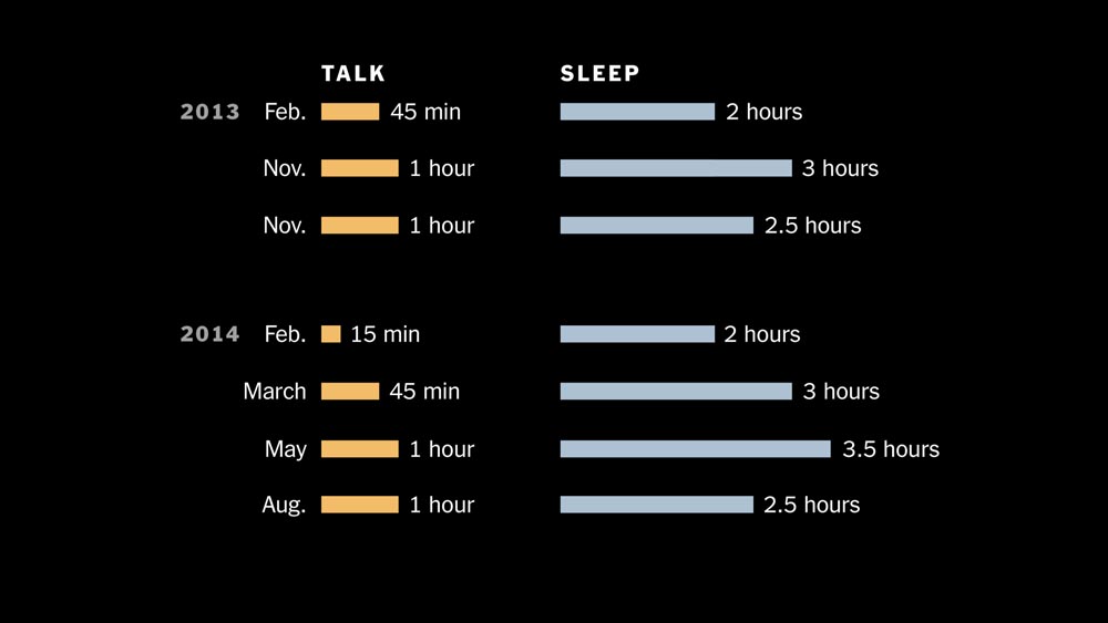
So at one point I tried to quantify this for a talk. So this was 2013 and 2014. These were the lengths of the talks that I was giving. And then, this is the sleep that I got the night before.
I actually had a pretty good night of sleep last night. But it’s definitely a challenge — even those nerves as you’re working through and rehearsing on your own are real. And that’s one of the challenges of giving talks is getting through that.
So now you’ve done all this work, how do you actually present it, on the day?
So showing up early, I think, was in that original Tufte text file from 2001 that I had. That was one of the points.
Show up early. You’ll have nerves, but someone will walk in. You’ll talk to them, or you’ll meet them for the first time. You’ll start to talk. You’ll interact with someone in your audience, as we did.
And that starts to take your nerves down, hopefully. And you at least know that you have one person in the audience who you’ve interacted with, immediately before the talk.
Calm your nerves. I’ve definitely had that feeling, backstage, thinking: I can’t believe this, I can’t walk out there, I can’t figure out how I’m going to get through this.
There are some techniques — we can talk about this more later, during questions — but one that definitely works is abdominal breathing and square breathing. Have you heard of this?
Breathe in for four counts, hold for four, exhale for four, hold for four.
And my daughter is in a communications class at school, and she was teaching me a nice variation of this that I’m going to use in the future. Instead of counting, just use your hands.
[Put the tip of one index finder on the base of your other palm, and slowly move it in a square around that palm, with each side taking roughly the count of four.]
And using your hands is nice because it gives you something physical to do, it gives a sensation of touch on your hand, as well as the calming effect of the breathing. So if you do get stage fright before you get up to talk, I recommend that.
The other thing that I definitely try to insist on when I’m giving talks is that there is no podium — or if there is, that I’m free to leave it.
On some of the bigger talks, I’ve written ahead and asked: What’s the mic situation? Can I have a wireless mic, or can I walk away from the podium and still get picked up?
I don’t want to be stuck behind a podium.
Someone here posted the recent NACIS talks in Slack.
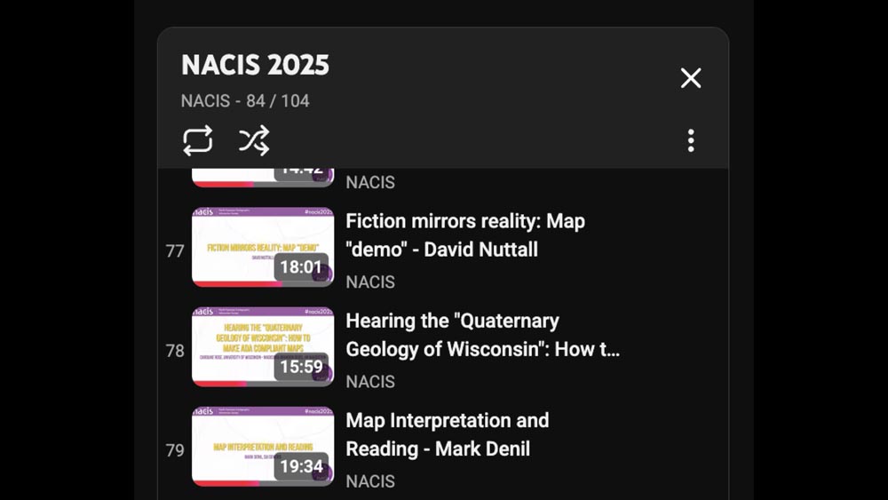
And so actually, I skimmed through all 84 of the talks that were publicly available.
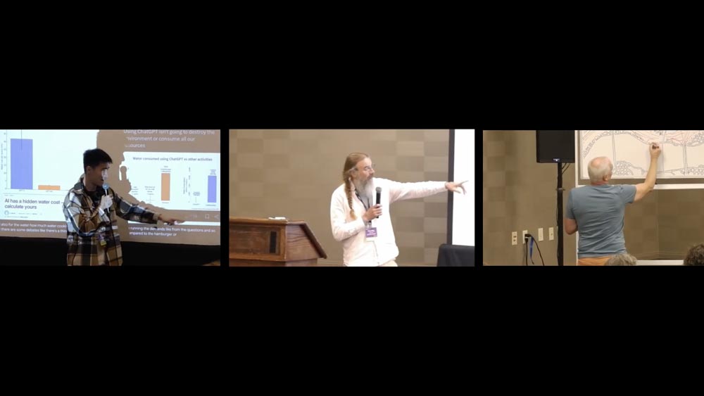
And in those 84 talks, I only found three people who left the podium to give their talk.
Though I could have missed someone — it’s possible someone walked away and I missed it.
Everyone else was behind a podium.
So I would encourage you, wherever you go — it doesn’t matter how big the talk, if it’s two people, eight people, 200 people. Find a way to get away from the podium and away from looking at your laptop, looking at your notes. Just be out there.
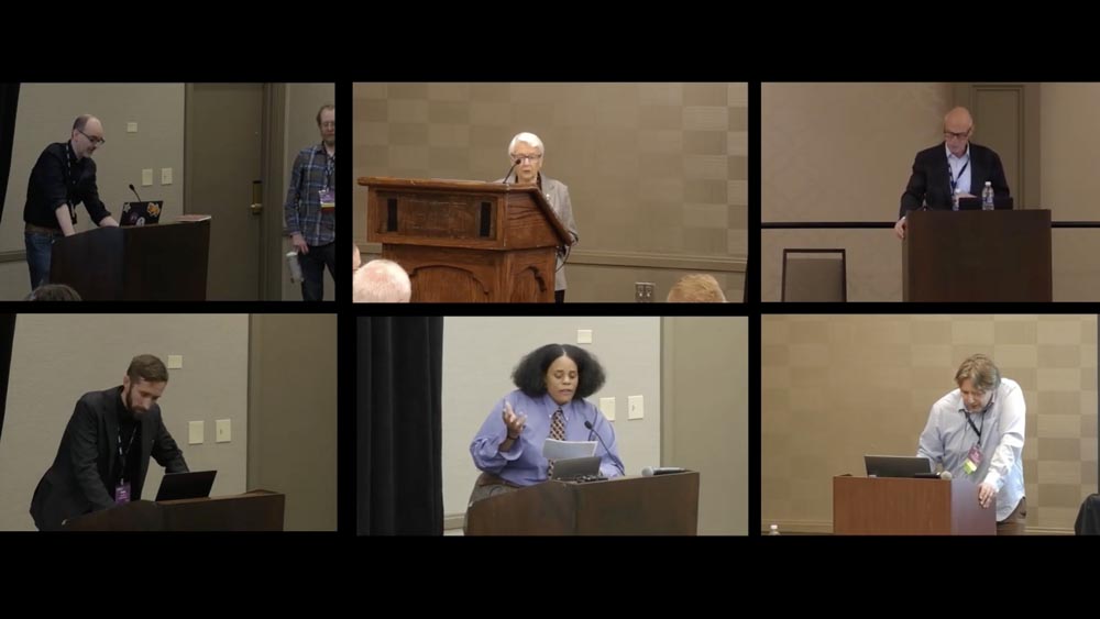
The problem with a podium is that they’re not one size fits all, right?
This is in no way a criticism of these speakers. It’s a criticism of the environment that they are placed into, of a podium that is not adjustable.
And so they’re forced to contort themselves to that podium, and it’s really getting in the way.
It’s an obstruction between them and the audience, and that’s what we’re trying to minimize.
So when I say no podium, it really is just: Can you give your talk with no obstructions, or with as few obstructions as possible?
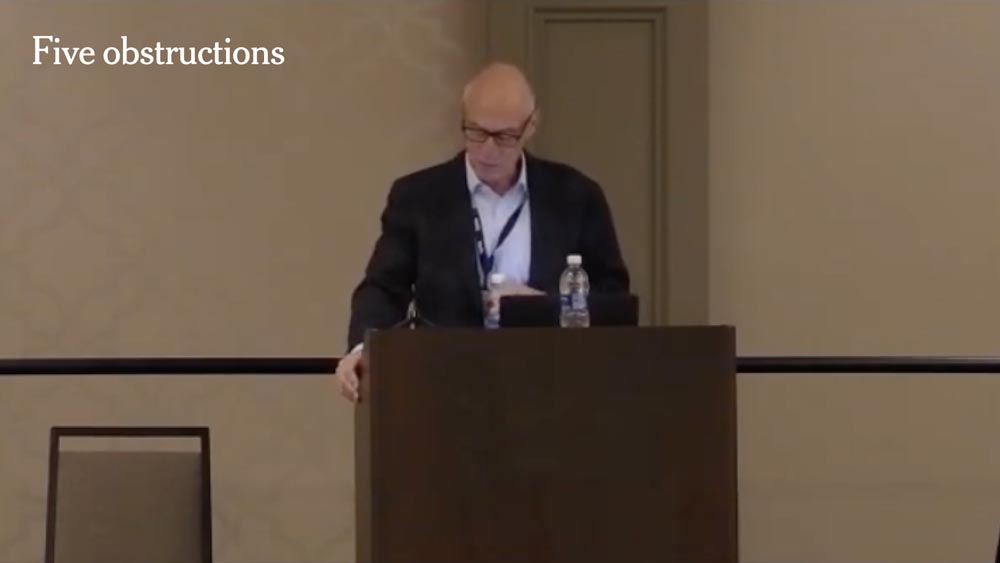
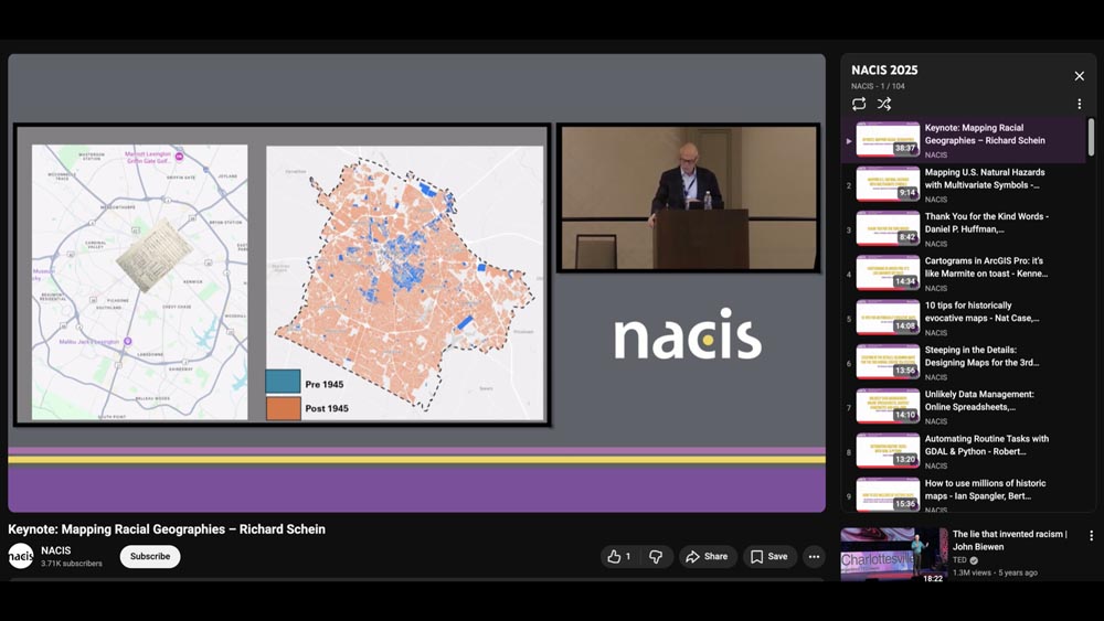
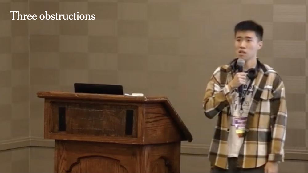
So this was the NACIS keynote, and there are at least five obstructions here.
You’ve got a lanyard, holding a water bottle, a laptop, another water bottle, the podium itself, and then maybe looking down if you count that. So there are five or six obstructions or distractions just in this setup.
I don’t know, it might have been a fantastic talk! But all these things are between you and the audience, and that is very hard to overcome. It can be done, but you’re setting yourself up for extra work to connect with your audience.
This is one of the three people who stepped aside — so this huge, right? Just leaving the podium, leaving the laptop.
That is an incredible change, an incredible improvement. There are still three obstructions here. There’s the lanyard, the headphones, the mic. But this is a big improvement.

Here are two obstructions: lanyard and mic.
And sometimes you can’t get away with none. Sometimes you need a mic and there’s no wireless, or the room’s large enough that you can’t project to the back of the room.
So yes, you may have one, you may have two. But if you can get it down to that number, you’re well ahead of the game, well ahead of the average presenter.
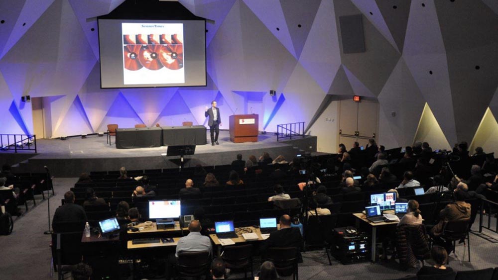
And so this is a good setup. Look at that. He’s out in front of the audience. He’s able to interact with the screen.
The lights are probably a little bit high. A little dimmer could be a nicer environment, or make it feel more intimate and let the slides really pop without overhead glare. But this is great setup.
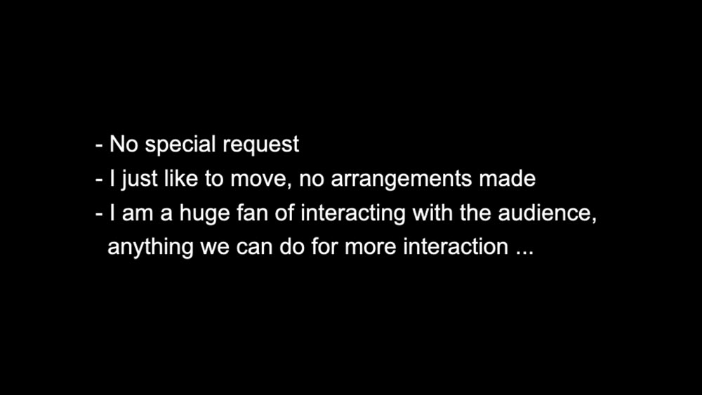
And so I emailed him and I asked: “Did you have to make a special request to use your mic? I noticed you were one of the few people who were actually out speaking with the audience.”
And he said there wasn’t any special prep: “I’m just a huge fan of interacting with the audience.” And so I definitely would agree with that, and encourage that. And that’s what I try to do.
So this looks pretty familiar, right? It’s me pointing at slides!
But sometimes this is only possible if you’re working with the people who have asked you to speak. Can I have a wireless mic? Do I need a mic at all?
That email, or that discussion, is well worth your time. Both so you know what you’re walking into — so that you can factor that into how you rehearse — and so you can help your audience through the talk.
So Tufte’s room setup is designed with that in mind. He has two screens. The audience is set up to be quite wide instead of deep. And there’s a nice runway so you can walk back and forth.
But you have to be a little careful about that. After, I think, my first Tufte talk, someone came up to me and said: “Great talk. I coach speakers for a living, and you do too much wandering!”
And so I guess I’d been at times walking around and talking. He said don’t do that. You’ve got to post up, say what you’re going to say to this side of the room. Then you can walk over there, stop there and talk to that side of the room.
And it was encouraging to me: Don’t wander around! It does makes you feel good because you’re moving, but it can be a distraction for the audience. It can be an obstruction. So I took that advice, I wrote it down, and I tried to work on it in my next rehearsal.
And sometimes you’re kind of stuck. This was another stage where there wasn’t much runway. I felt like I was kind of trapped in this little space between table and podium. But even then, just get out from behind the podium. Many speakers were stuck behind that podium, reading from text, looking down and just not interacting with the audience in any way. So do what you can.
Some spaces will be more limited than others, but that’s why you should get there early and see what the setup is like.
Today I came in a few minutes early and moved some chairs so that I could move. Try to feel comfortable with the room, even if you’ve only seen it for the first time, 20 minutes before your talk.
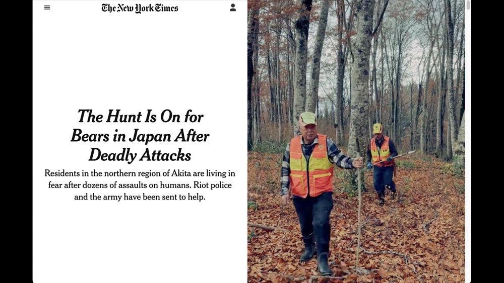
This was a Times story from about a month ago, about bears in Japan.
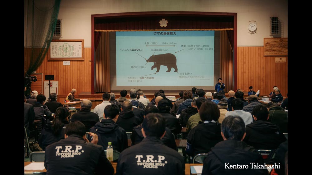
And about halfway down the page, there was this fantastic image of this talk. And this is just such a great setup.
Look at the size of the screen! He’s got no obstructions, no podiums. He’s a got free room to walk. His only obstruction is the mic. The room could probably be a little darker so you could see the slide.
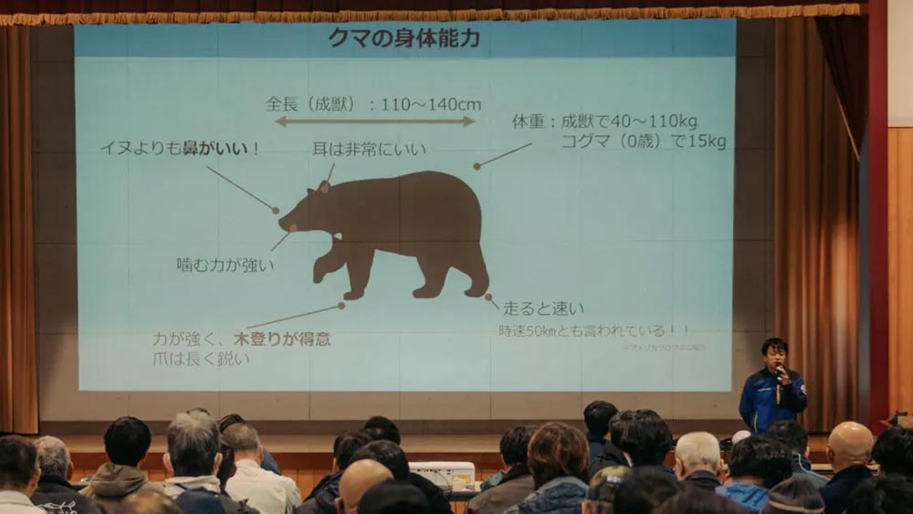
And these are annotations, right? These are not just labels. This one says inu yori mo, hana ga ii (イヌよりも鼻がいい!). Meaning “more so than a dog, the nose is good.” The bear is able to smell better than a dog.
So these are annotations! Which is what we should be putting in our graphics and in our spoken talks. So I thought this was fantastic.
Oh, and his posture — he’s there facing the audience with posture.
This is something I need to continually remind myself when I’m giving my talks.
We’ve seen what podiums can do to lecturers. If you’re given a podium and you use it, then you tend to contort your body to the podium.
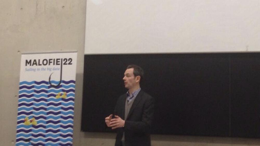
Malofiej was one of the larger spaces that I’ve spoken at.
I’m trying to have a posture so that — there’s kind of ramp of people you’re looking at, extending up toward the back — so that I’m open to this large audience. I can look in all directions and I’m not collapsed and looking down.
Even in a smaller group setting, I still want to be open and present.
I used to think good posture was military style, pinching your shoulder blades back behind you — and it took me years, but I realized that it’s not.
So what I’ve been told, and what makes sense to me, is that if your abdominal muscles give up or relax, then your shoulders and your head tend to come with it. This is if you’re sitting or if you’re standing.
So if you can — yes, I see people are adjusting in their chairs right now! — if you can lightly brace your stomach like someone’s going to poke you or pat you there, then you can forget about your shoulders, they’ll naturally fall in line.
And then once you have that working, if you remember to lightly tuck your chin in, this will give you a nice upright posture.
It's the same thing if you’re sitting down and working. And as I’ve grown older, and have sat more and more in front of a computer, I’ve come to appreciate that.
Posture is another way that you can interact with, or just be open to your audience — as opposed to hunching over a laptop as you speak, looking down, only occasionally looking up.
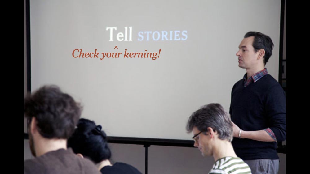
The other thing that I noticed when I was looking at this slide during rehearsals is that I must not have been checking my kerning!
So check your own posture and the posture of your letters.
Before I leave The Times, there’s this fantastic Matthew Carter story:
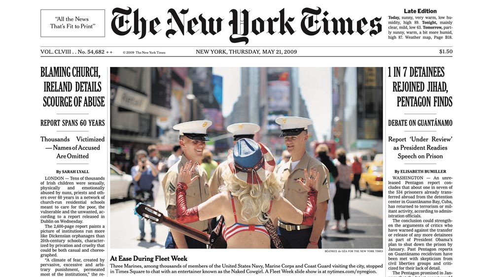
Matthew Carter is the designer of pretty much all of our fonts. But he mentioned at one point that when he was doing the kerning for our display faces, he did not kern the accented uppercase characters, this accented Á.
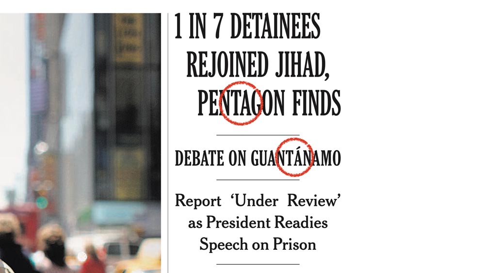
So when he saw GUANTÁNAMO — this has since been fixed, but every time he saw GUANTÁNAMO in print — he would cringe.
So I feel that if Matthew Carter and The Times can get their kerning just a little off, then think about it a bit for your talks.
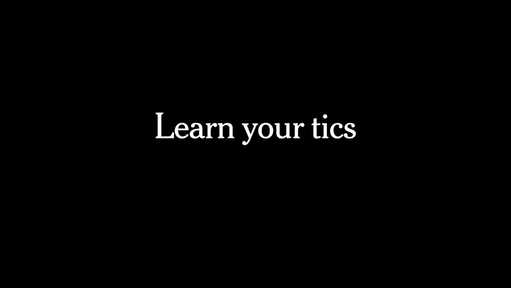
Learn your tics. Everyone has vocal tics, I had so many when I started.
I worked really um — there was an “um”! — I worked hard to get rid of most “um”s, to get of most “like”s. But as soon as I got rid of those, then “sort of” became my go-to. This is sort of this, or this is sort of that, and I had to really work hard to get rid of those.
I’ll see from this transcript whether or not that was successful. [While cleaning up this transcript, I noticed that “kind of” has replaced “sort of” as my most frequent filler.]
It feels like every time I knock one filler word down, another one pops up in its place.
So even if you don’t listen to yourself, just looking at the transcripts, seeing what words you’re using, that can be very helpful to see what you need to work on in the future.
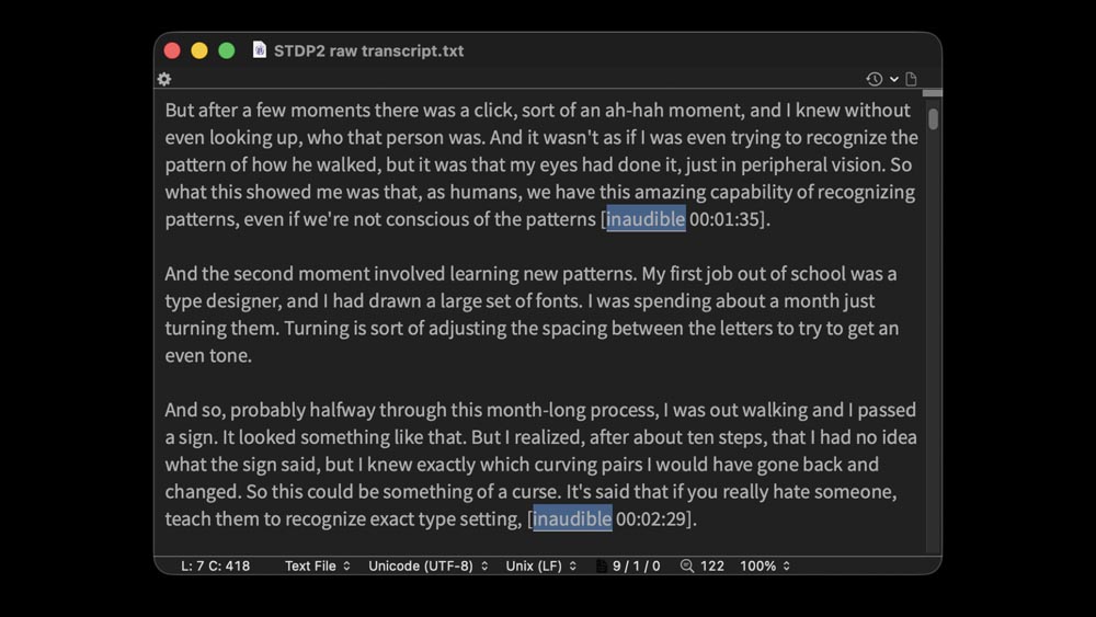
So this was the transcript for the second “See, Think, Design, Produce.” And I noticed going through it — this was before Trint, so I paid someone online to make the transcription — that there were a number of “inaudibles.”
I was wearing a mic, so there shouldn't have been inaudibles, and it looked like they tended to be at the end of sentences. So I was wondering: What’s going on?
I knew there was a third talk coming up. And I figured, I’m just going to go to a voice coach once, just to see if they have any idea.
And he said that, yes — after I gave the first three minutes of the talk — he said, what you’re doing is, at the end of your sentences, you’re trailing off. You go to make a statement, and at the very end, you trail off. You’re not being firm with your ENDINGS! And that’s why you’re getting the inaudible.
And this would never have occurred to me. I wouldn’t have known if I hadn’t gone through the transcripts — or listened to the audio, which is even more painful to do.
So I think just have that awareness — or if you can, ask people for their impressions. I’ve had a lot of people come up afterwards and say: Oh yeah, you have great posture, but you’re doing this when you give your talk. Those comments are a gift. Take anything you hear and see: Can I incorporate that into a future rehearsal?
I think that for any talk, the goal is to make it yours.

I’m aware that not everyone wants to hear me talk, or hear other people talk the way that I do.
So I’m not saying that you need to do all of these things when you give your talks. Really, just make it yours. Figure out what works for you, what structures work for you. What way of speaking, what way of ordering your slides.
There’s so much involved in talk preparation, but it’s so rewarding to have a moment where you have to pull together your work, explain it, show it, justify it in some way.
And that process of thinking about “What have I been doing, how could I improve, how do I explain this to someone?” is incredibly, incredibly valuable.
One thing that’s helped me when putting talks together is reflecting the event. Thinking about: Where am I going to be talking? And then trying to find a way to pull that into the talk.
I think the first time I really did this was for Visualized.
After The Times moved in to our new building and we started having birch trees in our atrium, one day I started taking three photos from the same place every time I walked in the building. And I wasn’t sure how I was going to use these.
But then when I was asked to give a talk in the Times Center for the Visualized conference, I thought: Well, if I’m speaking here, I have all these photos. I’m going to put them into a time-lapse video and see what happens.
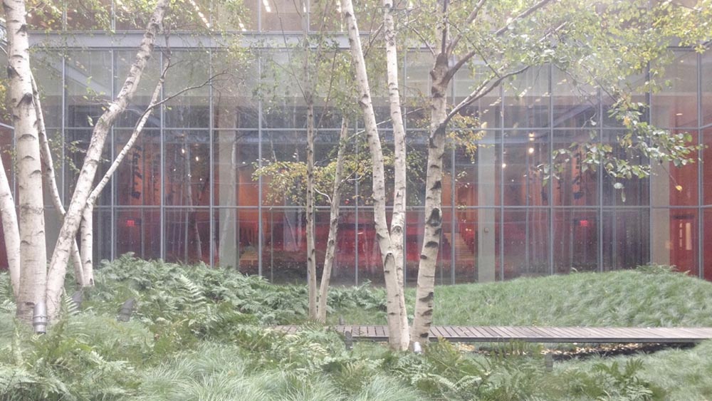
But I wasn’t sure how I was going to incorporate this video into the talk. And I was watching this over and over and again.
And there was a moment that we just passed. There was a moment where the static view — the arrangement of the leaves and the plants — when it rained, I realized that everything just drooped slightly.
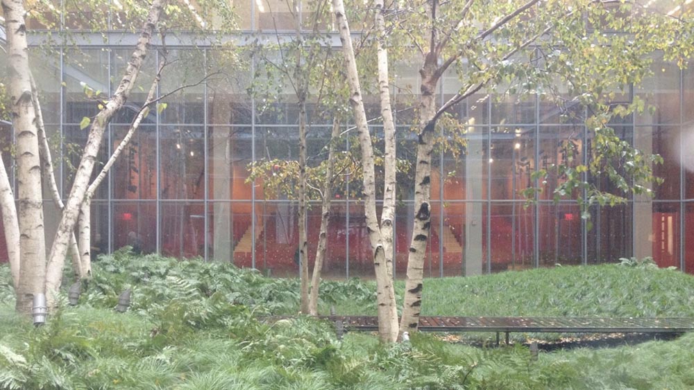
And this just popped out at me. And that became a metaphor that I used in the talk, for how we look at data, how we look for things that pop out.
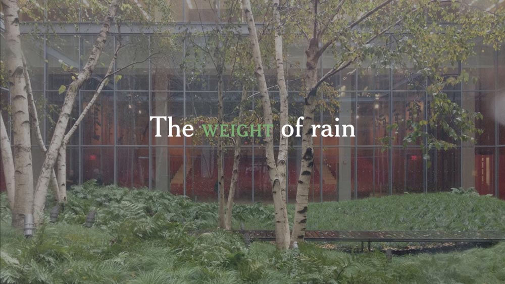
And it became the title of my talk. And that wouldn’t have happened if I hadn’t started randomly gathering things, keeping an archive of things from the past, and then looking for ways to incorporate them.
The ability to show an audience a time-lapse of the space that I’m talking in, that was a unique opportunity that won’t happen again.
But you can find other ways to do this.
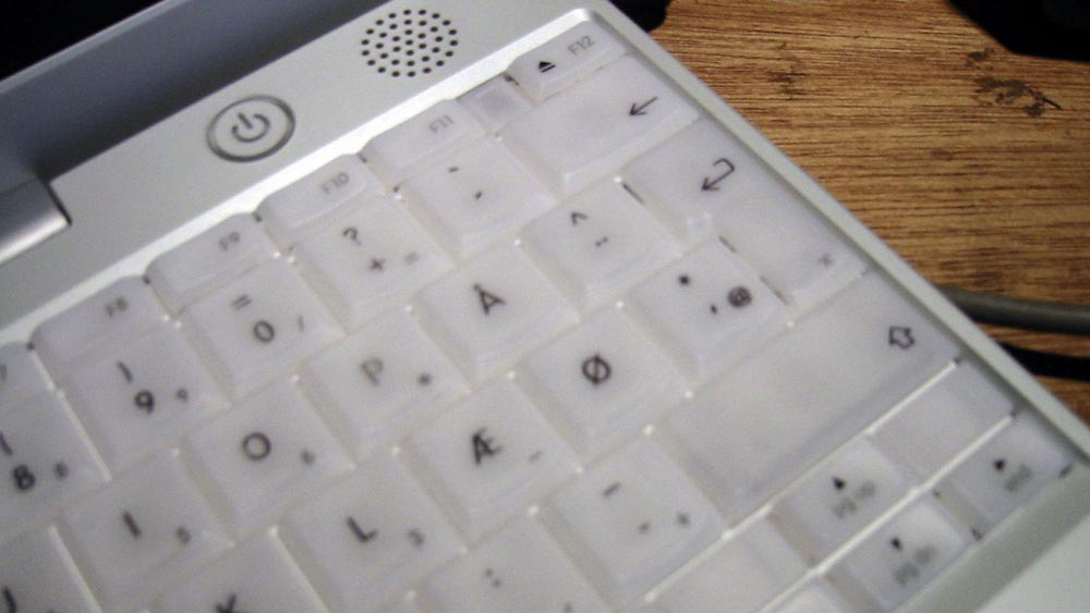
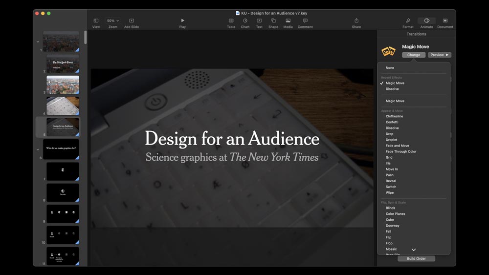
So I gave a talk in Copenhagen, and I opened that talk with an image and a discussion of a Danish keyboard that I used to have — and how it wasn’t designed for me, right? And I could tell it wasn’t designed for me every time I used it.
And that gave me the title and theme of that talk, Design for an Audience.

And as I went through that talk, I could show them: OK, here’s a bridge in downtown Copenhagen.
Here’s what it looked like this morning ...
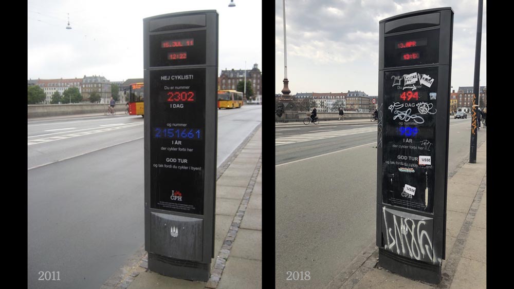
... and the last time I was in Denmark, it looked like this.
So I could give them a visual example of time passing. And it let me try to reflect the space that I was in, the audience I was speaking to.
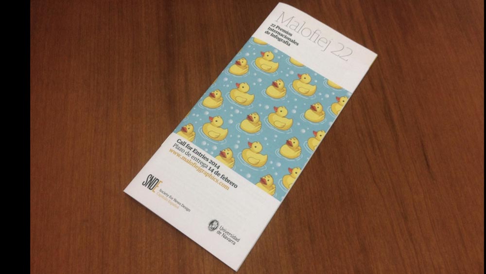
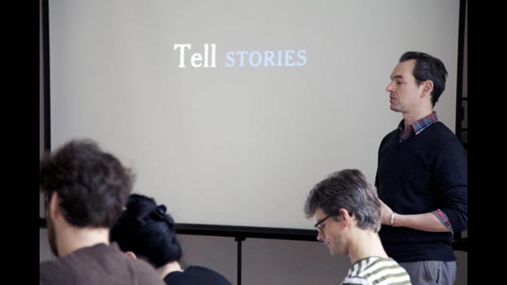
For Malofiej, I was there for the 22nd conference.
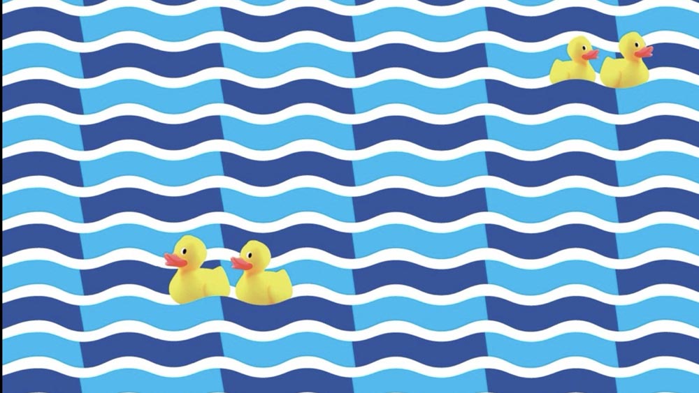
And they had taken ducks as a metaphor — or as an image — because the two ducks look like a 22.
And when I was trying to plan my talk, I was like: “Well, I’m just going to explain this. I’m going to talk about ducks.”

So I kind of stole their idea and then made that the core of my talk, and tried to make it explicit. And I worked this in as a setup and payoff.
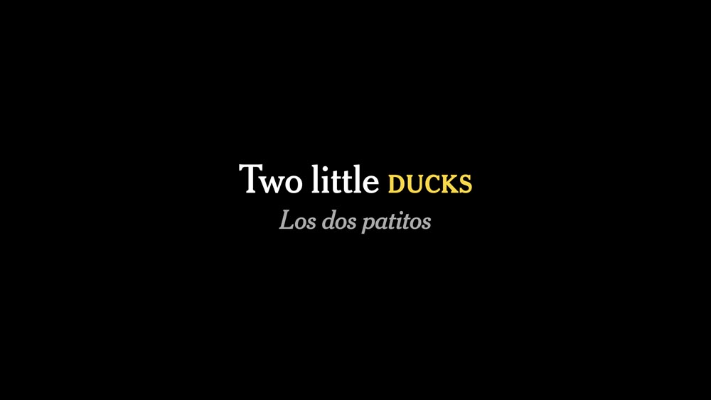
And then I closed out the talk with this. Ducks became a recurring theme in my talk.
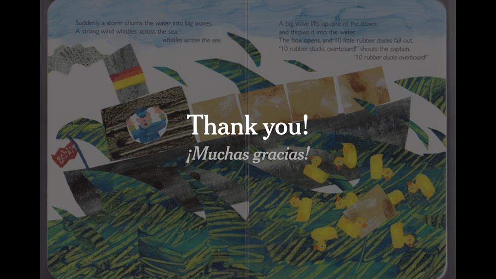
Two things here. One is that, if I’m speaking in another country, then I’ll try to put subtitles in. I asked for help when I got there, and the wonderful students helping out made sure that I had correct subtitles for all of my slides.
I felt that it was a sign of respect, especially because many people in the room were getting live audio translations.
And then also I try to say “thank you” at the end of each talk.

And if you search for that, you’ll see there’s a lot of advice online saying “don’t say thank you” because it’s a weak way of ending a talk. And I don’t quite agree with that.
And so even if it’s the last word — for my Denmark talk I only had one slide in Danish — but at the end it was just “Tak,” thanks.

And I felt like that respected the audience in a way, because when I try to give talk or when I try to prepare a talk, I try to think of it as a gift.
And it’s a two-way gift. It’s a gift that I’m trying to give to an audience, and I hope that they’ll enjoy it or take something away from it. And then the audience itself is giving me their time, that cumulative time that I’ve thought about and tried to reflect and tried to respect. Saying thank you is a way of acknowledging the audience for that.
So to me it doesn’t feel weak, but you should figure out how it feels to you.
This is also, for me, a bit of a farewell talk.
This is 21 years after my first professional talk, 20 years after joining The Times.

I’ve been to some incredible places. I’ll never forget some of the places that I’ve been ...

... some of things that I’ve seen ...

... and we did get to show penguins, after all.
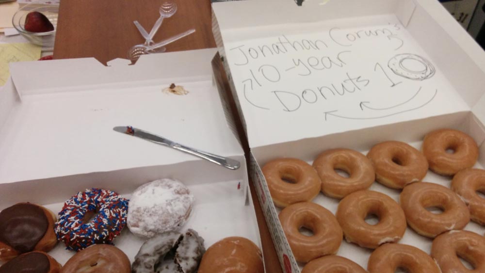
10 years ago, I got my 10-year donuts.
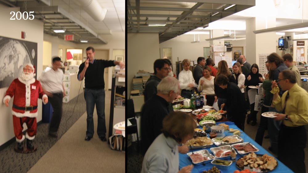
20 years ago, I went to my first Graphics holiday party. And I’m looking forward to sharing that with you tomorrow.
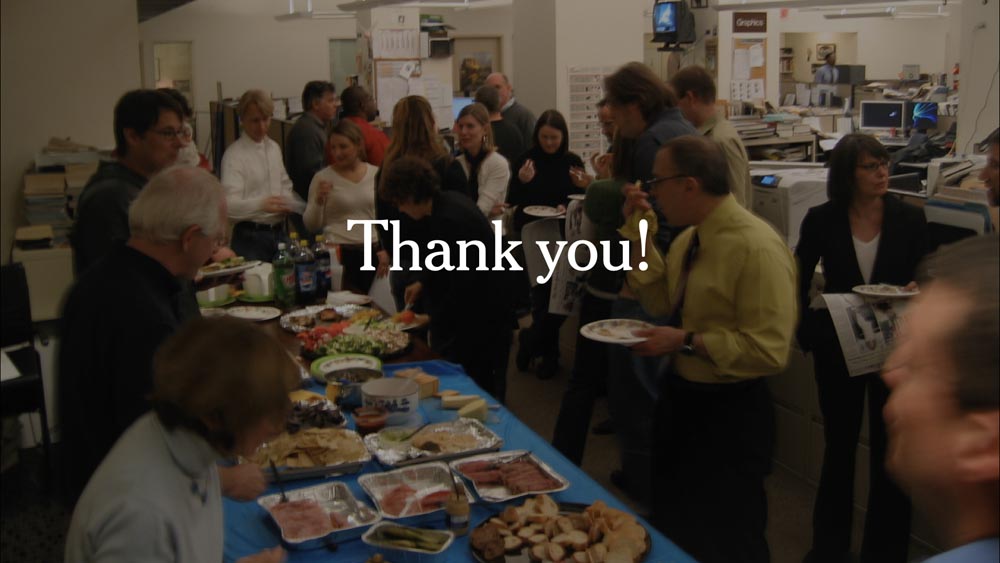
Thank you very much!
And thank you, everyone dialing in online, for watching and for putting up with my walking back and forth.